
 By Bowen Hobbs
Last week, the Round Rock Express switched affiliations from the Houston Astros to the Texas Rangers, and with the switch, they re-worked their identity. Here is a breakdown:
Colors
The Express were navy, red, and silver when affiliated with the Astros. With the affiliation change, the Express edited their color palette to show the new relationship. The new scheme, although fairly predictable, is much more unique within the context of the Pacific Coast League. Currently, five PCL teams use some form of navy and red: the Colorado Springs Sky Sox, Memphis Redbirds, Oklahoma City RedHawks, Reno Aces, and Tacoma Rainiers. Royal and red, by contrast, was used by only two teams last season: The Iowa Cubs and Omaha Royals. The O-Royals are now the royal/gold or black/gold Omaha Storm Chasers, leaving the Express as one of two royal/red teams in the PCL. A definite upgrade.
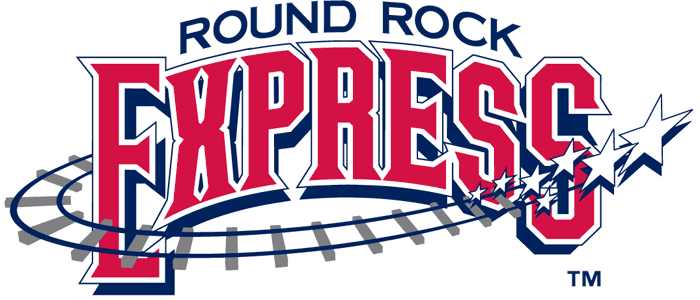
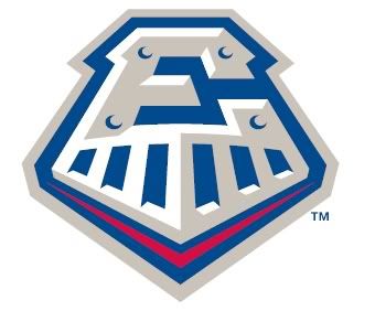
Primary Logo
The previous primary logo, although well thought out, suffered from an illustration quality that was not befitting of a sports logo. The line quality was too thin, not conveying the impact that a team identity should. It also didn't help with reproduction: the thin lines mean that the printing (or embroidery, etc.) has to be even more precise than usual, as the design does not provide for any leeway. In addition, the secondary typeface used for the old logo(on ROUND ROCK) was too generic. The new logo shows a much bolder illustration style, complemented vastly improved typography. The design firm, Studio Simon, also worked to include symbols representative of the parent club, such as the Texas-flag motif in the background. The "ROUND ROCK" in the primary gets a little close to the edges of the half-circle it is contained in, but that is a minor quibble for the gigantic graphic upgrade that this logo represents.
Supporting Logos
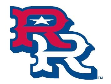
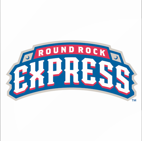
The team retained its RR logo from the previous identity, simplified and re-rendered in the new colors. The removal of the drop shadow helps give the star its own space, as it was cluttered before. The team also has a standalone wordmark that matches the primary logo, as well as a new E logo. The old E logo suffered from many of the same issues as the old primary logo. Once again, the new marks represent a major upgrade.
Uniforms
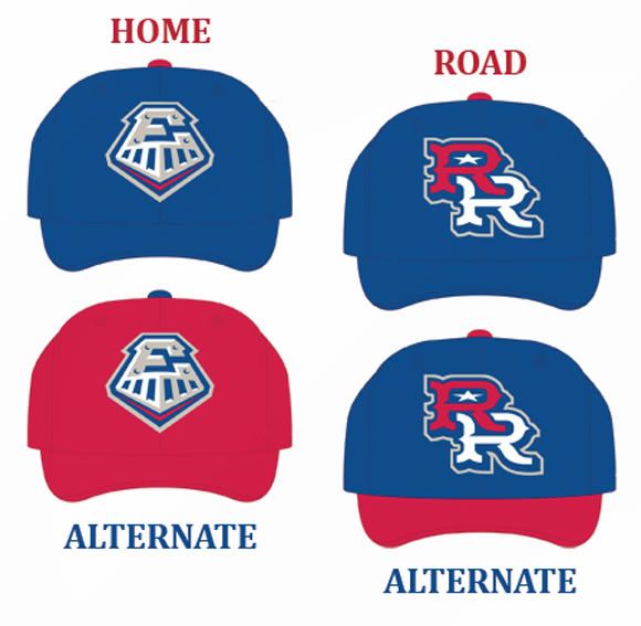
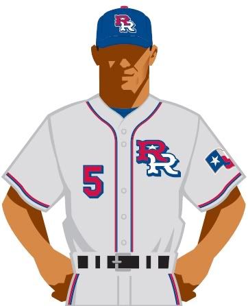
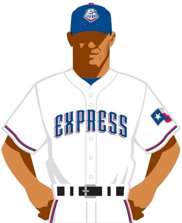
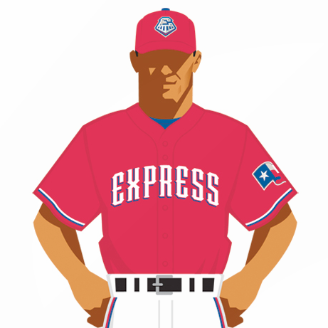
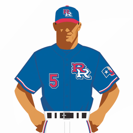
The team's new uniforms further show the Express's relationship with their parent club, the Rangers. There are four caps: a solid blue cap with a red button and the E logo, a blue RR logo cap with a red button, a red E logo cap with a blue button, and another blue RR logo cap, complete with a red brim and button. The uniforms use two-tone trim throughout the set, a la the Rangers, with all the jerseys except the road greys using said trim on just the sleeves and pants legs. The grey jersey adds the piping to the placket as well (although that may not have made the final cut, as evidenced by this photo). The white and red jerseys use a different "EXPRESS" wordmark from the standalone version above. The grey and blue jerseys use the RR logo as a crest and include the player numbers on the fronts of the jerseys. Unfortunately, the number sits considerably lower on the jersey than the RR crest does, giving the shirts a slightly unbalanced look. The Texas flag patch is placed on the left sleeve of every jersey, paying homage to the parent-club Rangers. Overall, the uniforms are a mixed bag. It's good that they match the parent club, and the individual wordmarks and logos are well done, but the possible inconsistency of the road jersey's extra piping and the low number placement on the grey and blue jerseys are not ideal. In addition, it would have been nice to see the team use the current Texas Rangers numbers instead of defaulting to MLB Block.
Sugar Land Skeeters
While the Skeeters are still in the formative stages of fielding a team, they have their identity taken care of. The team's primary logo features a mosquito with a baseball in its hand in front of Texas. The color palette consists of black, light royal, red and a muted, buttery yellow. The secondary logos include a standalone mosquito with the baseball on its nose, a mosquito in front of Texas sans wordmark, and a sugar cane SL mark with a lone star. The team still does not know which league it will be in, let alone what level of the Minor Leagues it will compete in. It will be interesting to see how the uniforms look when the Skeeters open play in 2012.
A Few Other MiLB Happenings
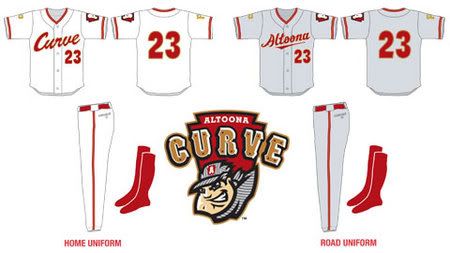
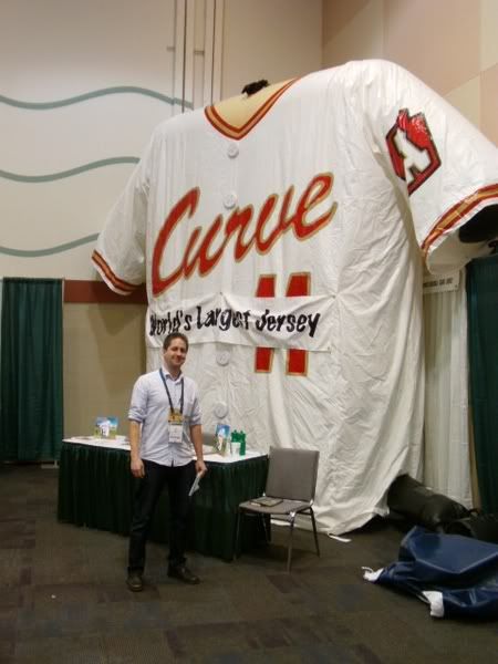
• The Altoona Curve unveiled their new uniforms. (Here's an enlarged home jersey.) The look uses no black outside of the logos and the wordmarks look somewhat generic.
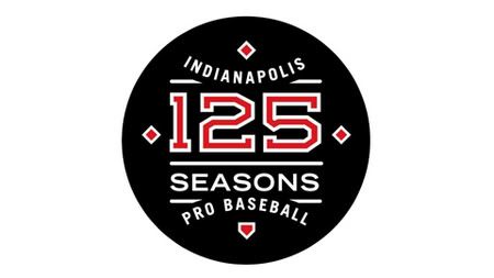
• The Indianapolis Indians are celebrating 125 seasons with this patch.
In Other News… The Packers wore their 1929 throwbacks. (Full write-up here.) They looked pretty good on TV. I've heard a lot of people gripe about the helmet, but I thought the team did a pretty good job, since they couldn't cover their domes in leather like the old days… The Buccaneers were also bit by the throwback bug, opting for the Creamsicle uniforms on Sunday against the Falcons… The Chargers wore their powder blue alternates against the Raiders… The Redskins continued Stripe-O-Rama in New York… The Dolphins went with their Storm Trooper look at home against the Browns… The Titans looked as bad as usual against the Jaguars… The Ravens did something they haven't done since their inaugural season on Sunday night against the Steelers: they wore their purple jerseys with black pants. It looked pretty good too… USC and UCLA continued their rivalry in color-vs-color… The (Oregon) Civil War was also very notable, as Oregon State wore their Pro Combat uniforms and the Ducks wore a white/carbon/silver combination…
Designer's Corner
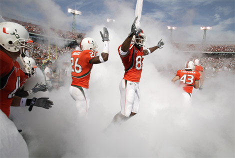
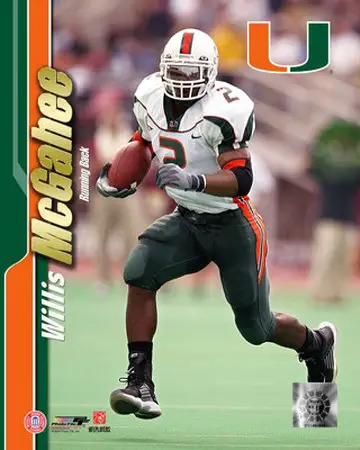
Today's designs come from the world of college football. The University of Miami (Florida) is no stranger to bold, modern uniforms. Their current uniforms play on the stylistic split of their famous U logo, but the execution does not fully realize that end goal. The Canes have also had two different Pro Combat uniforms: the all-whites from last year and this year's orange uni with the green helmet. I drew inspiration from the current uniforms and both Pro Combat sets. The current uniform helped me think about how to go about emphasizing the split color concept in my version, with the all-white Pro Combat uniform giving me the idea of split player numbers. The most recent Pro Combat set inspired me to add a secondary green helmet, since this year's green helmet looked great.
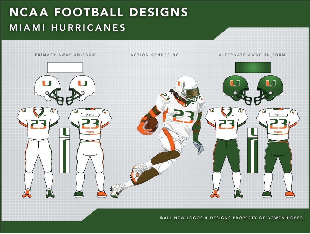
For the logo set, I kept the U logo, as it is iconic and, quite frankly, irreplaceable. I also kept the "MIAMI" wordmark. The numbers are slightly edited, featured a stroke width more consistent with the rest of the typography, as well as a split in the numerals. I edited Sebastian the Ibis, removing the black and yellow from the current version, and adding a second green in place of the black. My Sebastian also comes with two shirts: orange and green. The uniforms, like I mentioned before, use the U logo for inspiration. I removed the striping from the white helmet (the green helmet didn't have stripes) because the traditional rectilinear striping didn't match the forms in the U logo or the uniforms. The jerseys feature side panels that taper and curve around the player's back in the shape of the U logo. The pants also have the tapered, curved accents, but rotated 180º. The accents, along with the jersey collar and shoes, play on the split color theme, with orange (or white on orange garments) appearing on the player's right and green (or white on green garments) appearing on the player's left side. While the numbers on the orange and green jerseys are all white, the numbers on the white jersey use the split color to add more balance between the two hues to the set. There are a myriad of combinations possible with the three jerseys, three pairs of pants, and two helmets. The pieces are designed to be mixed and matched, a la Oregon, but I have taken the liberty of showing some of the better combos below.


Feel free to leave a comment on the new Round Rock Express identity, the Sugar Land Skeeters, the concept above, or anything sports branding related.
No comments:
Post a Comment