

By Bowen Hobbs
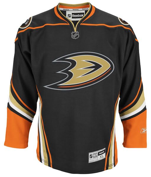
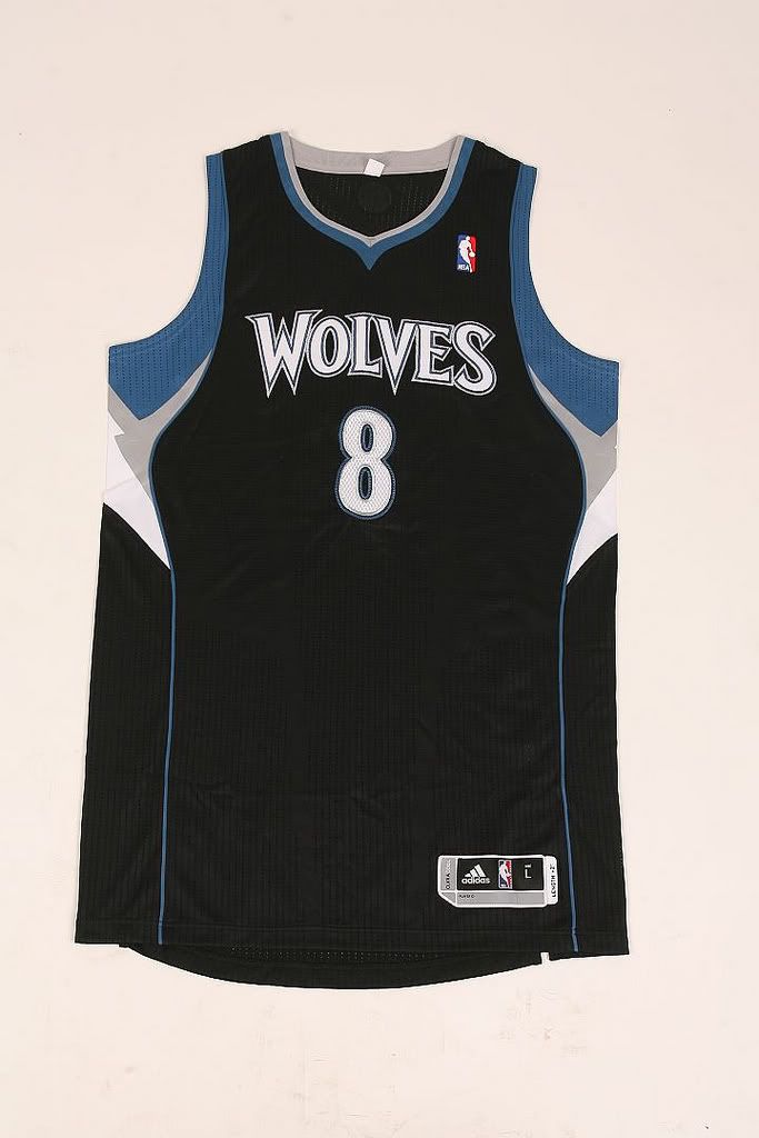
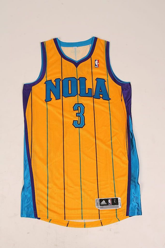
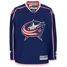
The Columbus Blue Jackets managed to do something that has proven to be more difficult every year: Keep a secret. While the Ducks had their new third jerseys leaked (as did the NBA's Timberwolves and Hornets), the Jackets managed to stay tight-lipped until the unveiling. Kudos to the Columbus brass for managing to keep the secret. Anyways, to the new uniforms:
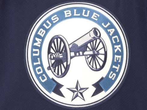
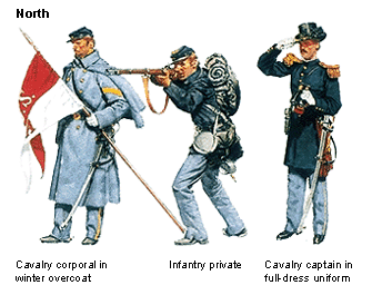
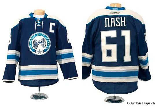
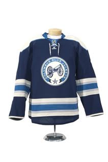
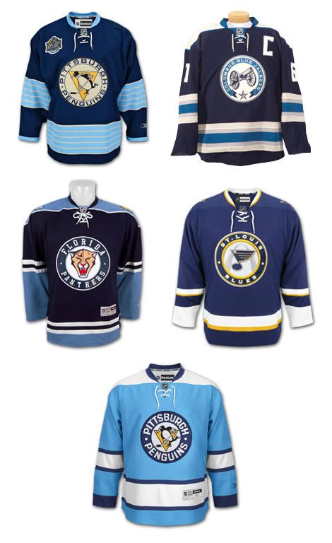
The jerseys are navy blue, like the home jerseys, but do not use any red or the sleeve piping design that the home and away sweaters use. Instead, the new sweaters feature a circular crest that primarily consists of a cannon and a ribbon. The cannon plays into the Blue Jackets' Civil War theme and is a tribute to the actual cannon at Nationwide Arena. The ribbon that wraps around the cannon says "COLUMBUS BLUE JACKETS", while a beveled star appears at the bottom of the crest. The color palette is also different from the Jackets' standard navy/red/silver, as the new thirds use a navy/light royal/silver/cream combination. The desired effect is to create a faux-back look that gives fans of classic hockey sweaters a jersey to identify with in addition to using a color palette that is based on the Union Army's uniforms. The breezers (shorts) that the sweater is paired with are navy blue with a simple off-white stripe running down the side of each leg.
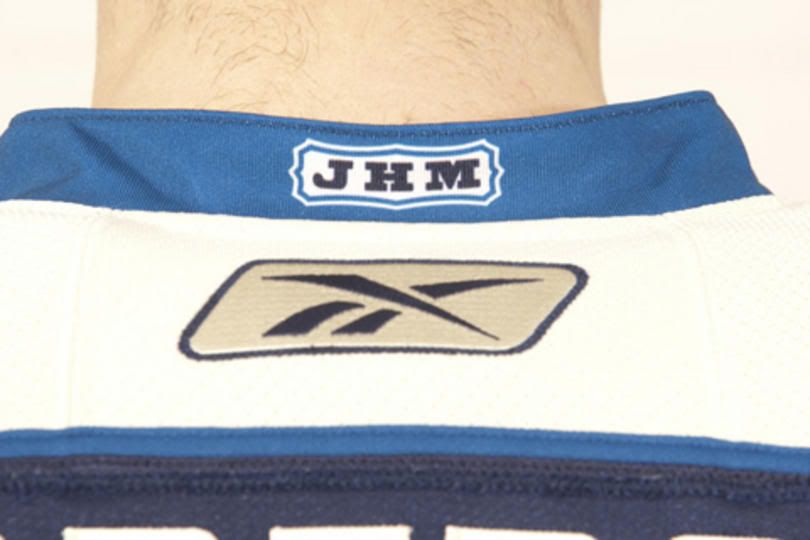
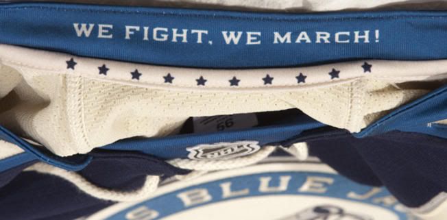
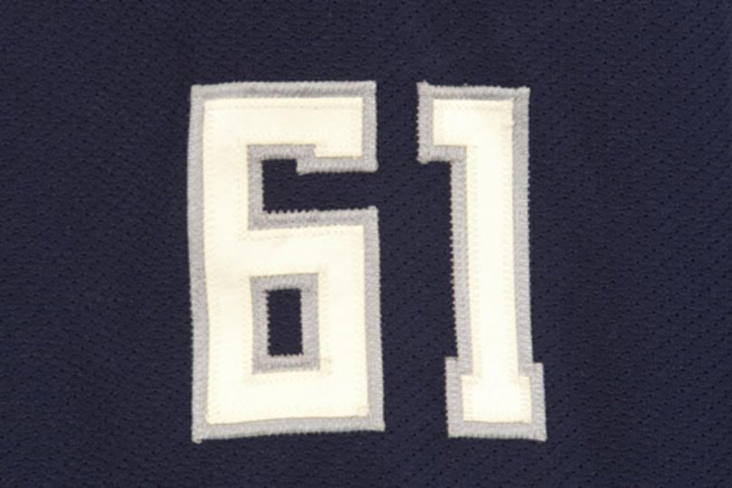
Now that we've covered the basics, let's get more specific. The sweaters use a new number font, as the home and away sweaters use the dreaded Copperplate. Although the new numerals are a bit square, they are far better than the awkward serifs and rounded forms of Copperplate. The new sweaters also have a couple of details on the collar. The back of the collar features the initials "JHM" in honor of John H. McConnell, the team's founder. On the other side, the Jackets have jumped on the bandwagon of placing inspirational messages inside the collar, similar to what the Cleveland Cavaliers and some college football teams have done. The player numbers also appear on the sleeves, while the jerseys are accented with a tie-up collar.
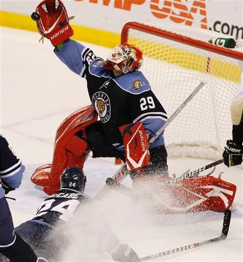
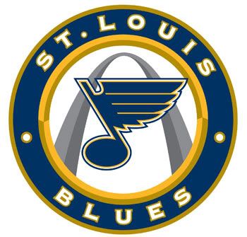
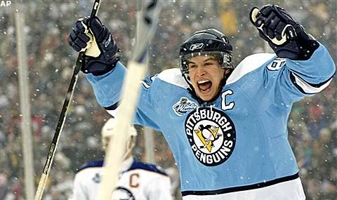
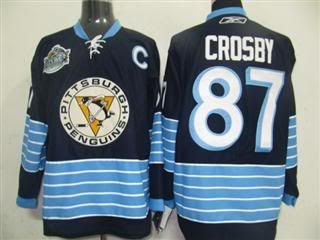
Now that we've covered what the new jersey looks like, let's look at the context in which the sweater has appeared: the jersey, while not bad on its own, marks another step in a growing recent NHL trend. It would seem as there have been a slew of two-toned blue jerseys with roundel crests flooding the NHL scene. Not only do the Blue Jackets have a navy/royal jersey with a circular crest, but the Florida Panthers also use a navy jersey with a circular crest, albeit the Panthers' third jersey inexplicably uses powder blue as a secondary color. It looks even more ridiculous when you see the goalie in all-red gear that matches the other two sweaters. (It's no match for this Panthers look, my all-time favorite.) Further compounding the subject, the Blues unveiled a third jersey this season that is… navy and features a… circular crest. Guess what type of collar it has? Yup, lace-up, just like the Blue Jackets and Panthers. Yet another team has also jumped in on the trend, although it could be said they were at the forefront: the Penguins. The Pens primary colors are black and vegas gold, but that didn't stop them from going dual-blue last year for their alternate jerseys. So, what did the team do for this year's Winter Classic? They got a navy jersey for the Winter Classic, complete with powder blue accents, circular crest, and lace-up collar.
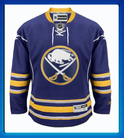
And yet these alternates aren't the only blue jerseys with lace-up collars new to NHL this year. The Islanders switched to royal blue jerseys, with a circular crest and lace-up collar, and across town, the Rangers unveiled their thirds, which are also navy and feature a lace-up collar, but differentiate from the pack with diagonal lettering across the chest. The Predators also adopted the navy and lace-up trend, but not the circular logo trend with their thirds that combine navy and black in an almost indistinguishable way. And who could forget the Buffalo Sabres, who ditched the Buffaslug and modern jerseys and promoted their navy jersey with a circular logo to home jersey status from alternate.
Although the two-tone blue jersey with circular crest has become almost a standard for third jerseys around the NHL, where did the trend start? Well, circular logos and lace-up collars have been around for ages, but powder blue was recently brought back to popularity by the aforementioned Penguins and the Atlanta Thrashers. It was unique when it was just those two teams, but with the Panthers using powder blue for what appears to be no logical reason at all, and the Blues and Blue Jackets using navy jerseys with circular crests and lace-up collars, it's time for a new trend to sweep through NHL. My hope: original color schemes and logos.
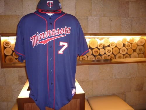
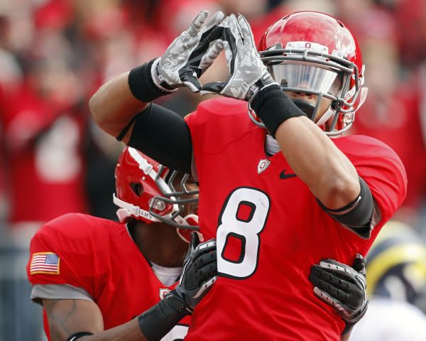
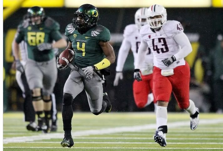
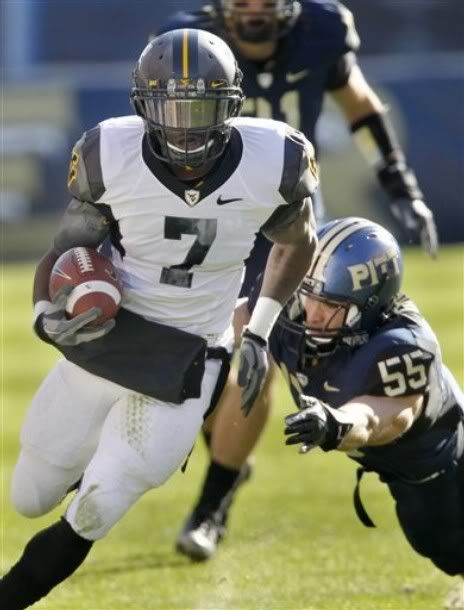
In Other News… The Minnesota Twins quietly unveiled a new road alternate jersey… The Kansas Jayhawks football team wore white helmets Saturday… Ohio State wore their Pro Combat uniforms Saturday and got penalized for showing off the artwork on their gloves… The Ducks officially won the Pac-10 Saturday, wearing green helmets and jerseys with grey pants in the process… Pittsburgh and West Virginia celebrated the Thanksgiving weekend by wearing their Pro Combat uniforms in the Backyard Brawl… The Gator Bowl has a new logo, although it's as bad as the old one… The Preakness also has a new logo for 2011… The Patriots and Lions squared off with a red-vs-blue matchup on Turkey Day… The Cowboys wore navy at home! It was their throwbacks, though… The Bills also threw back to an earlier time on Sunday… The Ravens wore their black alternate jerseys with white pants, as did the Cardinals… The Broncos went all-navy over the weekend… More stripe-o-rama from the 'Skins… The Chiefs broke out their seldom-seen red pants… Matt Bryant, kicker for the Falcons, had a major Badge of Cowardice problem Sunday, as both of his sleeve patches were facing backward. Apparently, he been wearing them backward all season…
Designer's Corner
This week's design goes back to the Eastern League of Minor League Baseball. A while back when I covered the branding of the Eastern League, I received a comment from someone who wanted to see my idea for the Akron Aeros. Well, here it is. While the current logo features an amalgamation of colors and a cartoon cat in a space suit, my concept narrows the color palette to navy, lime green ,and two shade of a steely light blue. The primary logo uses a 1960s-style spaceman catching a fly ball behind an "AEROS" wordmark with a moon in the background. (At the time, I honestly had no idea that the Asheville Tourists were months away from unveiling a moon-centric identity.) The moon in the background doubles as a baseball with subtle stitching that could also be seen as tracks. The typography is custom (except for the lime green "AKRON" in the primary logo; that's an existing font), featuring an æ ligature in "AEROS" and an "AK" ligature in "AKRON". The supporting logos play the the moon shape interacting with the spaceman, the A mark, and a rocket. The A and the spaceman can also stand on their own. The caps show options in multiple color with multiple marks. The majority of the caps use the standalone A, which works for both the home and away caps, but the rocket logo and standalone spaceman also appear in the cap concepts. For the uniforms, I decided to go in a very modern direction, as the a standard baseball uniform template wouldn't do the futuristic nature of the concept justice. The primary home and away jerseys feature vests with sharp, bold accents around the neck and shoulders, while the alternate home, alternate away, and alternate 3 uniforms use the same accents, but with sleeved jerseys. The pants on the primary home and away, alternate home, alternate away, and alternate 3 uniforms feature sharp tapering accents down the sides of the pants. The primary home uniform uses a navy cap with a white A outlined in lime green. The jerseys uses lime accents and navy sleeves with the "AEROS" wordmark . The away uniforms start with a steely light blue base, with the primary away uniforms featuring a light blue vest with navy accents and sleeves. The home alternate jersey is lime green and is paired with a navy cap the features a lime green A, while the away alternate jerseys are navy blue with steely light blue accents. Alternate 3 is an all-navy uniform with lime green accents. If this uniform were ever produced, I would intend for the lime green on it to glow in the dark, similar to what some of the new Asheville caps use. Alternate 4 is the most traditional uniforms in the set, but steps away from baseball uniforms convention with a lime green cap. The jerseys use faux v-neck trim, while the same style of trim runs down the sides of the pants.


Feel free to leave a comment regarding the new Blue Jackets third jersey, the designs above, or anything sports branding related.
No comments:
Post a Comment