Tuesday, December 28, 2010

Florida State League: The Good, The Bad, & The Ugly

By Bowen Hobbs

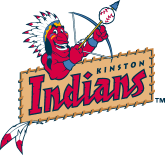
44th & Goal is back with the eighth part of its 14-part series, The Good, The Bad, & The Ugly. This week, we will look at the Florida State League. Like every other league within the world of Minor League Baseball, certain teams understand the power of branding, while others need a push in the right direction. Let's take a look:

The Good

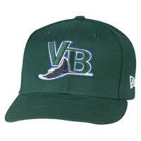
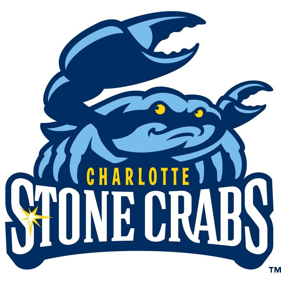
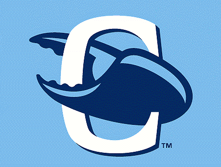
Charlotte Stone Crabs: The Stone Crabs are a relatively new team, replacing the Vero Beach Devil Rays before the 2009 season. The Stone Crabs, like their predecessor, worked closely with the branding of the parent club Tampa Bay Rays. Their primary logo consists of a blue crab standing on a Stone Crabs wordmark. They also use two cap logos with Rays-inspired typography and a standalone crab logo. Anytime you can take one of the worst graphic identities in Major League Baseball and carve a great Minor League identity out of it, you know you've done your job.

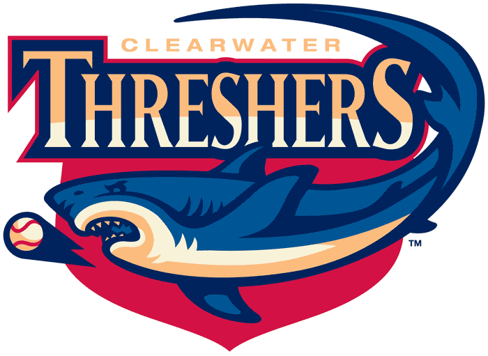
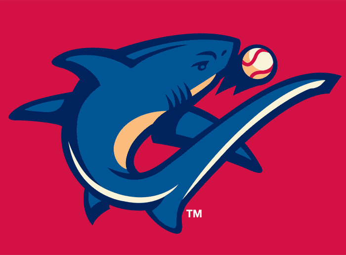
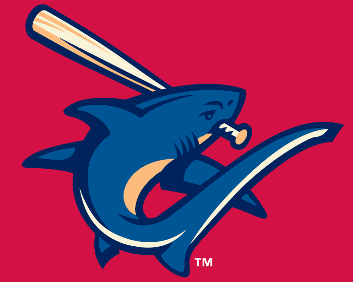
Clearwater Threshers: The Threshers' identity is the work of Plan B Branding and they couldn't have done a better job. Within the primary logo, you have a shark closing in on a ball below a custom wordmark with a shield holding shape. The primary and alternate cap logos feature a shark in a C shape, while the batting practice cap logo adds a bat. The jerseys use an arched version of the wordmark from the primary logo. Overall, one of the better identity sets in Minor League Baseball.

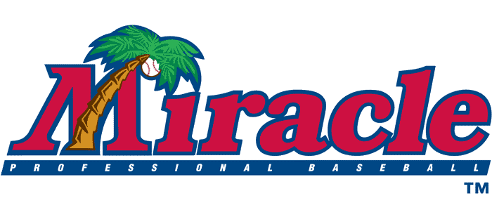
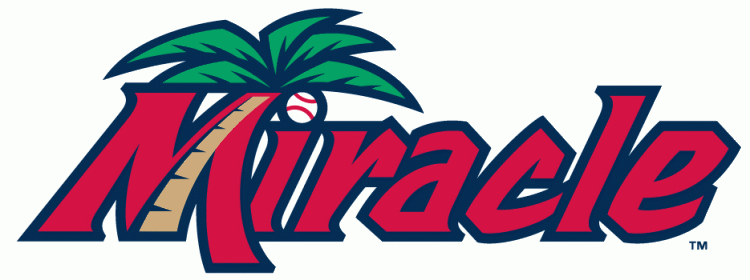
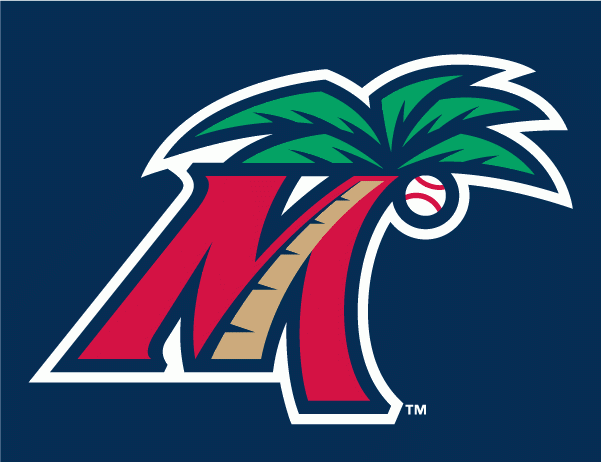
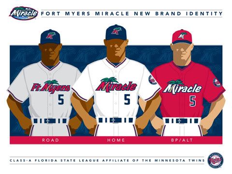
Fort Myers Miracle: The Miracle had used this logo since 1992, but will be entering the 2011 season with significant changes including a much more scenic logo and new typography. In addition, they have revamped their cap logo and uniforms. The island feel of the new typeface adds some character to the set. It's a good update to a solid identity package.

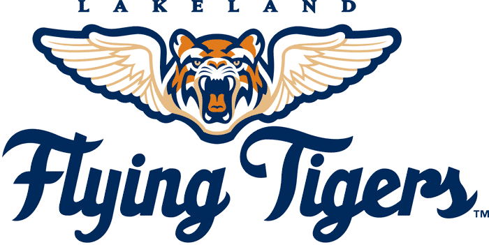
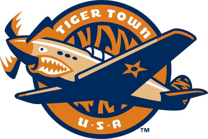
Lakeland Flying Tigers: I realize there are reasons for using the parent club's moniker. There can be a lot of equity in relationships with the Yankees, Braves, or Cubs. The Paw Sox advertise the Sawx of tomorrow. But how does one go about presenting the team's relationship with the parent club while maintaining an identity of its own? The Flying Tigers are one example. While using the Detroit squad's color scheme and general theme as a starting point, the A-ball club added its own twist to make the team name even more relevant to its fan base. The alternate logo pays homage to the city's World War II history, as does the team's alternate cap (the standard one is the same but without the brim decoration) and jersey number typography. While I don't like brand borrowing, this is well thought out brand incorporation.

The Bad

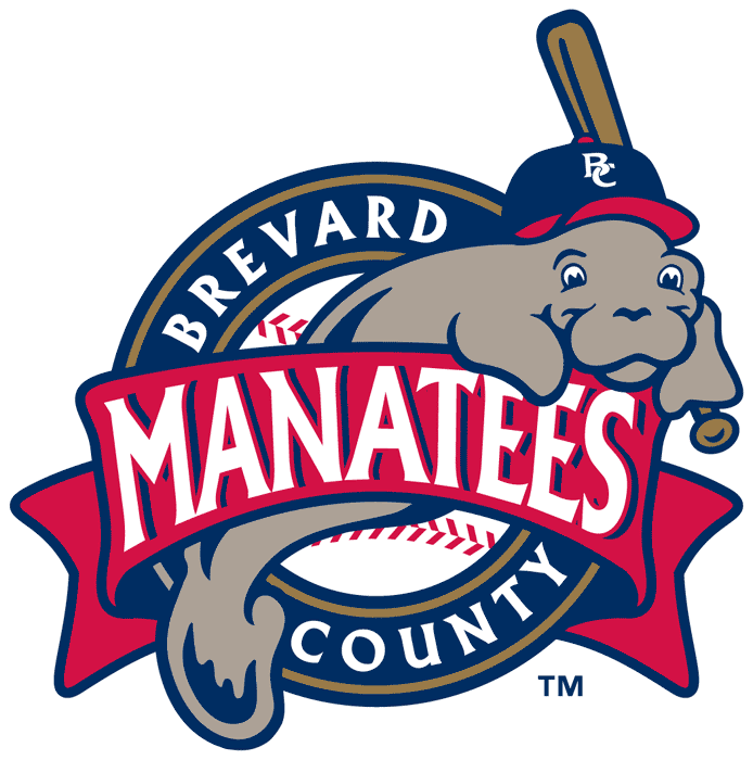
Brevard County Manatees: Admittedly, a manatee is a tough animal to work with. Their general ability to fill in for the Blob on short notice is a challenge to anyone tasked with trying to develop an identity based around them. But unfortunately, this is not the complete answer. While I like the intention of covering up most of the manatee's body, wouldn't it make more sense to eliminate it and focus on the creature's head, where most of its definition is? Maybe add an accent reminiscent of the tail within the typography… The team's cap logo is also problematic as the typeface of the BC is too thin to handle the mass that people associate with manatees when they see the animal. And really, navy and red? With the Threshers, Cubs, Miracle, Cardinals and Yankees also in the Florida State League, why not try something different?

Dunedin Blue Jays: Brand borrowing. Plain and simple. Just take the bird from Toronto's logo and shove it next to a D. I do like the Dunedin adaptation of the script though. Also, the choice to follow the parent club and use black as the team's primary color despite being named the Blue Jays is a mistake.

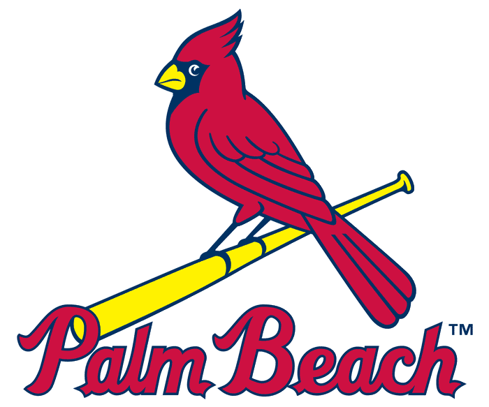
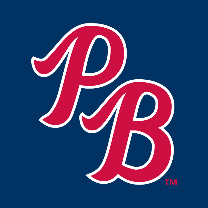
Palm Beach Cardinals: The High A affiliate of St. Louis uses the parent club's colors and logos. They have their own PB mark though. It's not the worst brand borrowing design in the Florida State League.

The Ugly

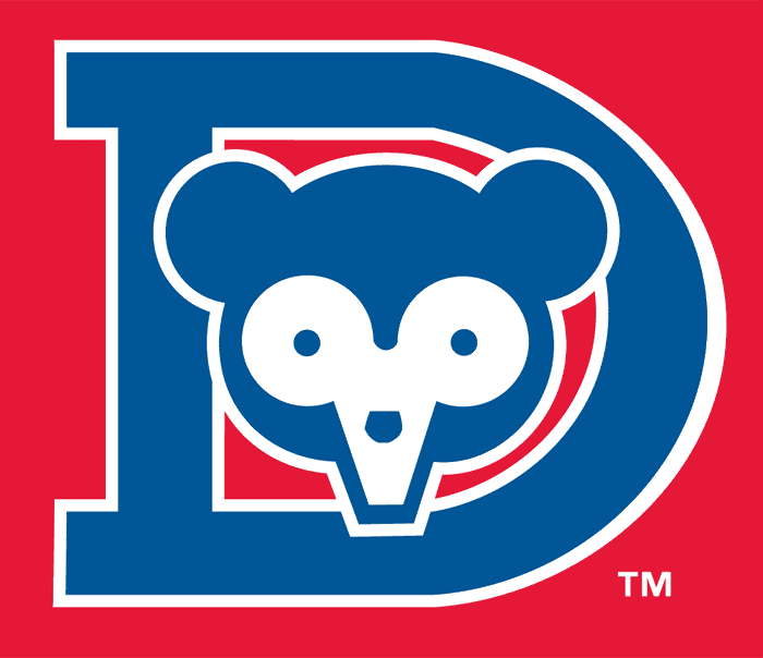
Daytona Cubs: At this point, are they just keeping their logo to be ironic? Is this a baseball logo or an an for Budweiser from 1987? There are better ways to work this the 1980s and the Cubs. Or they could try something really classic. Maybe they should craft an identity from their BP cap logo

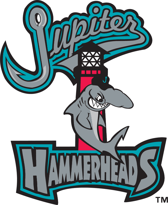
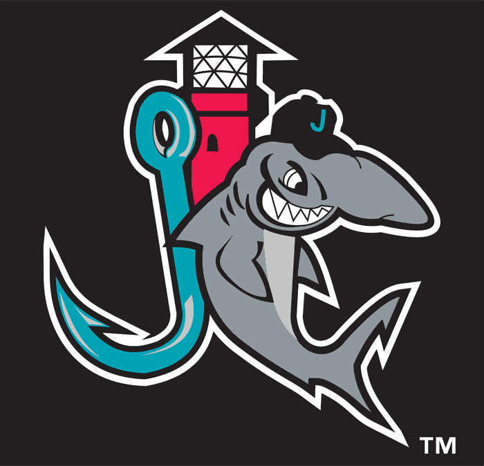
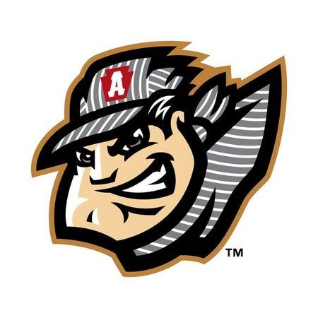
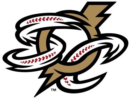
Jupiter Hammerheads: This is what happens when you cram 15 pounds of design into a 5-pound bag. While the Jupiter and Hammerhead wordmarks are duking it out for attention, the the lighthouse and the hammerhead are competing in the middle of the "composition". They couldn't even get the cap logo down to two elements. It wouldn't be as bad if any of the elements matched each other. And what's the point of the red lighthouse? Neither the red nor the lighthouse help the design in any way. Then we have the type. While the Jupiter wordmark could be decent if it wasn't overstylized, the Hammerheads wordmark looks sloppy and doesn't work with the script of the Jupiter wordmark. It's as if someone took something they liked from four different identities and smooshed them into one mess of color and form.

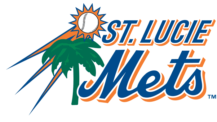
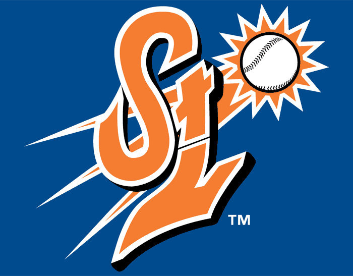
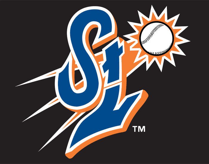
St. Lucie Mets: As if rehashing the New York Mets graphic design wasn't bad enough, St. Lucie went a step further and slapped together a clip art palm tree and a streaking sun-ball with a Mets wordmark. It's a six color logo. It really only needs to have three colors: blue, orange, and green. The hat logo is even worse. I didn't know Nickelodeon had a minor league team. Seriously though, the tL combination doesn't fit against the S. And the streaking ball behind it doesn't help. There has to be a better way.

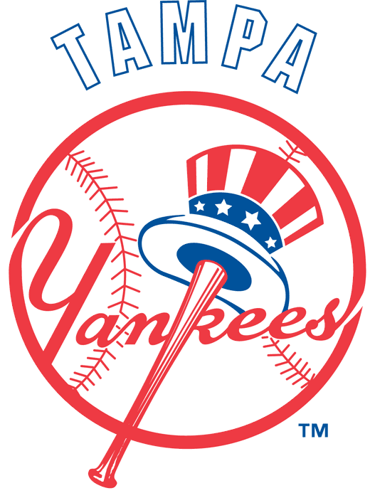
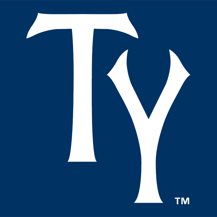
Tampa Yankees: Sometimes you come across an identity that really says something. That's what I thought when I came across the Tampa Yankees identity. But what did it say? Afterthought. From the tacked-on block letters of the Tampa script to the fact that the T and Y in the cap logo aren't integrated into one mark says that there wasn't very much effort out into this. With all the money the Yanks have to throw at players, maybe a fraction of that could go to creating a timeless identity for years to come. Just sayin'.

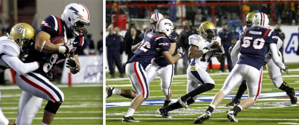
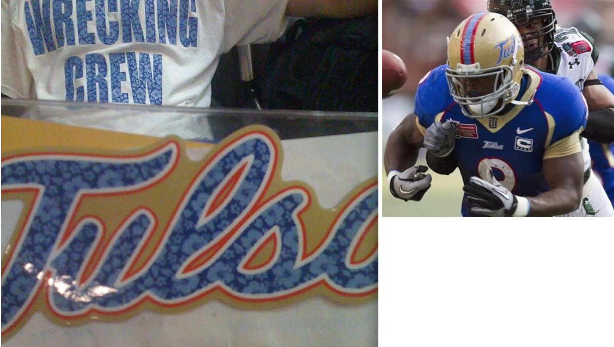
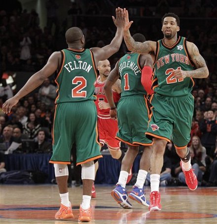
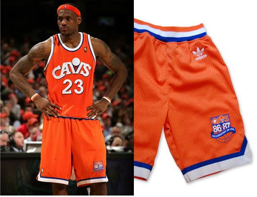
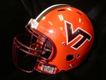
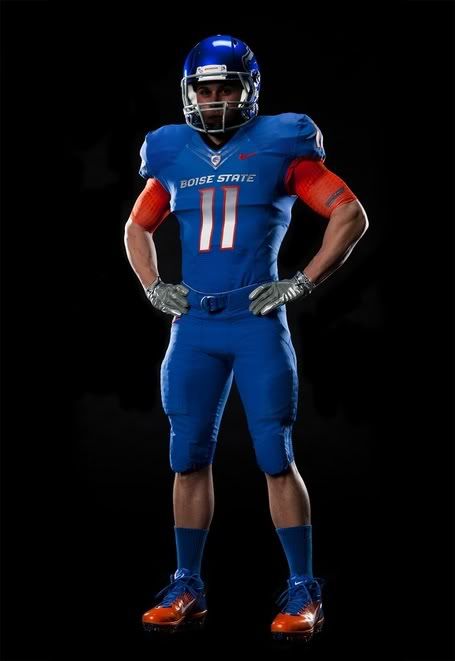
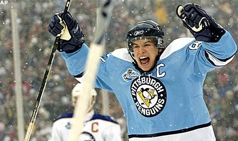
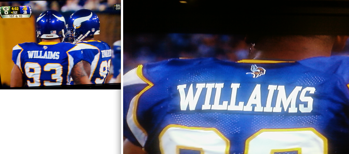
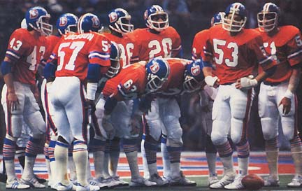
In Other News… The Air Force Academy looked very patriotic in the Independence Bowl… Tulsa had the island mentality during the Hawaii Bowl… The Pacers have been wearing a mistake all year… The Knicks and Bulls got into the holiday spirit… The Cardinals were a sea of red against Dallas… The Rams went all-navy, as did the Broncos… With the free fall the Dolphins are in, maybe they should try something other than wearing all-white at home… Why can't the Bengals wear this full time?

Designer's Corner
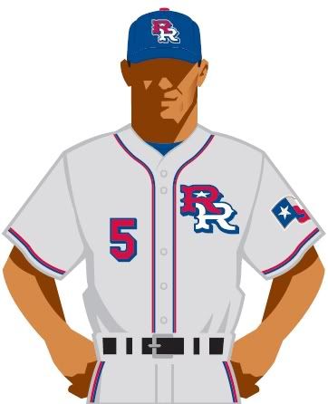
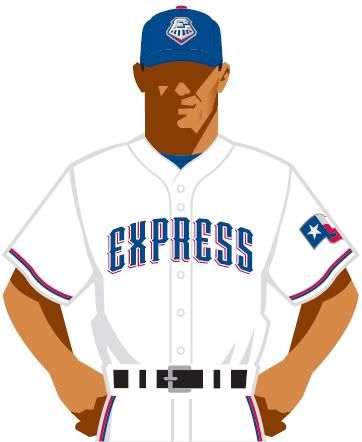
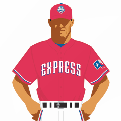
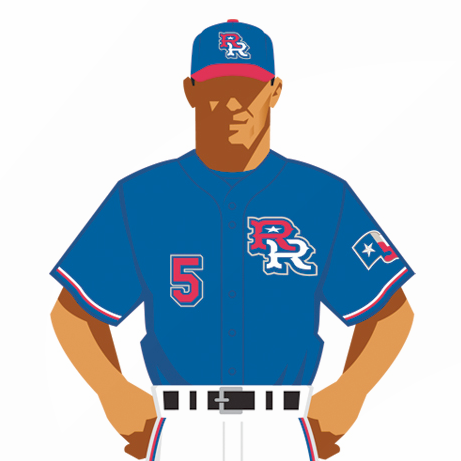
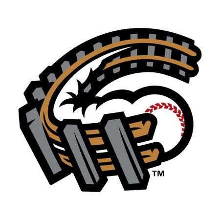
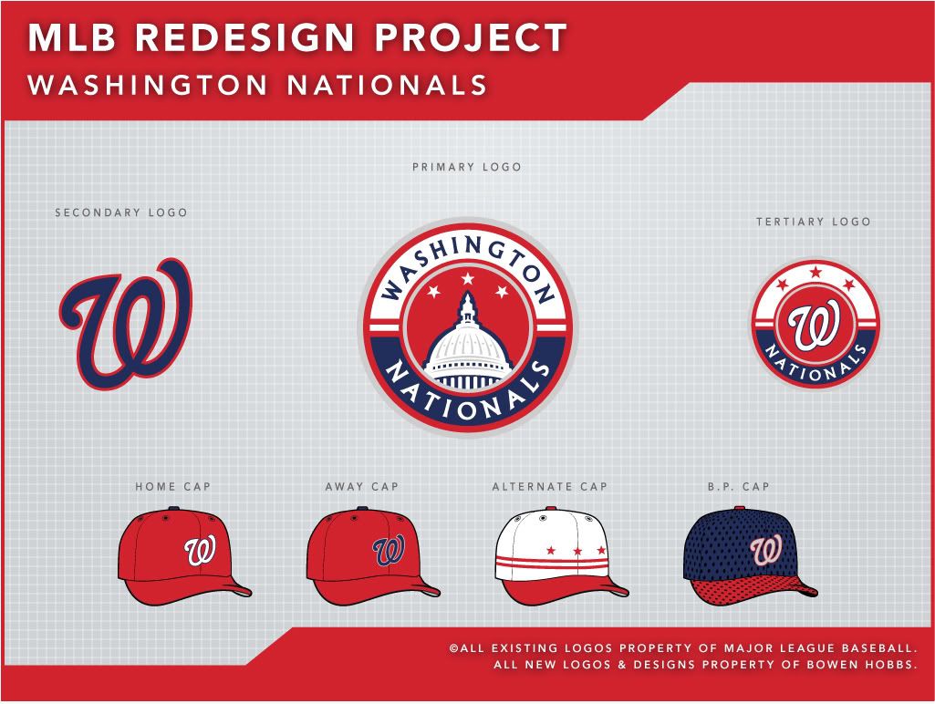
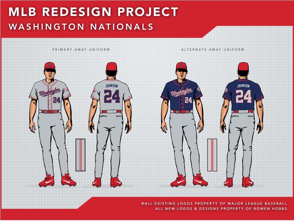
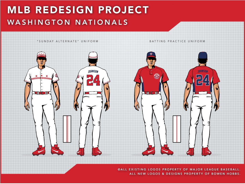
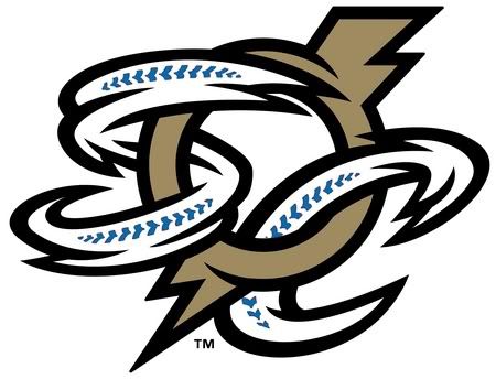
As I mentioned (or ranted) earlier, the Jupiter Hammerheads have an amalgamation of mismatched parts the they've visually duct taped into an identity. The first thing I did was streamline the identity. No mroe splashes of red, no more lighthouse. The primary logo is actually fairly stark, using a Hammerheads wordmark in combination with a revised fish hook J. The Jupiter wordmark was re-rendered into a subordinate typeface so it no longer competes with the Hammerheads wordmark. The alternate marks include a standalone J and a circular logo featuring a hammerhead shark with a basbeall cap. The typography combines a traditional script with the added touch of barbs in the letterforms that resemble the end of a fishing hook. Many of the cap options utilize the hook J, but the bases come in a variety of colors and patterns. Some of the caps use the hammerhead logo as well. But my personal favorite cap is the wraparound shark head cap, complete with toothed brim. The home and away uniforms use simple black type with teal piping that is wavy on the sleeves. The home alternate features a teal jerseys with the hook J in black, while the road alternate uniform is all-black. Alternate 3 relies on subtle silver pinstripes and Alternate 4 features a two-tones shark-inspired jersey with gills on the shoulders.


Feel free to leave a comment about the graphic identities of the Florida State League, the Hammerheads concept above, or anything sports branding related.

Tuesday, December 21, 2010

Isn't the Point of a Uniform to Be Umm…… Uniform?


By Bowen Hobbs

With the unveilings of the Indians' and Nationals' new uniforms in November, I started to think about the concept of matching. I've always been of the opinion that a team's brand should be as consistent as possible. And yet, three of the four major sports have examples of inconsistency. I do also enjoy alternates that differ from the norm, but I believe a team only needs one of those, if any, depending on the sport.

When I say matching, I'm referring to a team's primary home and away uniforms matching in their general templates. For example, the Cleveland Indians use a placket piping scheme on their "primary" home uniforms, but use sleeve trim and a line of neck trim on the road jerseys. Furthermore, the homes use a script with multiple outlines, while the roads use simple, single-outlined block letters. The Tribe's home alternate cream uniforms would work far better as the primary home option, despite the lack of matching v-neck and sleeve trim.

The Nationals went through great lengths to make their home uniform and two alternate jerseys consistent with two-color placket piping and sleeve trim, but the road uniforms use a three-stripe v-neck trim. I understand using the full Washington script, but if you are going to re-do the trim style of the other three jerseys, why not finish the job? Although other teams use two-color trim, only the Nationals use two-color placket piping.

But home and away uniforms not matching is nothing new in MLB. Just ask any pinstriped team not named the Rockies. (White Sox, Twins, Yankees, Cubs, Marlins, Astros, and Phillies) The Twins used to have pinstriped road greys, but traded them in for relative anonymity. And the Yankees are even nicknamed the "Pinstripes"! Wouldn't a pinstriped road uniform make sense? Maybe some of these teams should think about demoting their pinstriped uniforms to home alternate status.

The NHL has a few teams with inconsistency between the home and road sweaters. The Thrashers (home/away), Blackhawks (home/away), Oilers (home/away), Wild (home/away), Canadiens (home/away), and Rangers (home/away) all show significant differences between white and dark jerseys. The Thrashers are a menagerie of mismatched design elements, while the Wild and Oilers can't decide whether they want a modern or an old school look. The Blackhawks, Canadiens, and Rangers all ahve striping inconsistencies.

The NFL only has three teams with different templates. The Bears and Giants have different striping patterns while the Cowboys are a total mess. Some teams add a splash of color (Cardinals, Bengals, Bills), but the overall template of the uniform is the same. The NBA is amazingly consistent in this regard, as every team's home and away uniforms use the same template. However, the Cavs routinely wore various jerseys that were alternates, throwbacks, and fauxbacks when LeBron James played there.

The main reason that the home and away uniforms should be consistent is that it builds a brand. However, many of the teams I mentioned have a long tradition wearing the two different looks (Canadiens, Giants, Rangers), but why not adapt the team's more established looks to unify their sets.
In Other News… The Bucks wore the red fauxbacks in LA last night… The Ravens wore all black on Sunday, while the Cardinals opted for red pants on the road… The Vikings added to the throwback atmosphere of playing outdoors by wearing throwbacks… The Chargers wore their powder blue alternates last Thursday… The Dolphins wore white at home again, this time against the Bills… The Bengals went 1.5-o-chrome against the Browns… Virginia Tech is going with an orange helmet for the Orange Bowl… Turns out ugly sweaters aren't just for grandmas anymore. They're starting to become a holiday tradition in minor league hockey…


Designer's Corner
This week, I decided to work on a uniform concept for the University of Arizona Wildcats. Arizona has a very strong mark in its A. The existing wildcat logo needs a touch-up, and that is exactly what I did to it. I made the lines crisper and outlined the mark in red to unify it with the rest of the set. The Wildcats also have a wordmark based logo which was upgraded from this to this. While it is a good logo on its own, I felt it needed to be re-styled to match the rest of the identity package. With that in mind, I developed a new desert logo with typography consistent to the rest of the package, including the A logo. The numbers play on the Old West theme, a nod to Old Tuscon. For the uniforms, I wanted to keep a version of the Wildcats' signature helmet striping. The jerseys and pants feature striping that reinforces the helmet striping, as too many teams in college football have helmets that stylistically do not match the rest of the uniform. While the jerseys come in navy, white and red, the helmets and pants only have navy and white options. I could have added red, but I did not feel it added much value to the brand.


Feel free to comment on the uniformity (or lack thereof) of sports uniforms, the Wildcats design above, or anything sports branding related.

Tuesday, December 14, 2010

The Big Mess II: When Conference Logos Don't Add Up


By Bowen Hobbs

In June, I wrote about the looming conundrum the NCAA will face. With the Big Ten soon having 12 teams and the Big XII soon having 10 teams, the names "Big Ten" and "Big XII" will be misnomers by the start of the 2011–12 academic year. Speaking of academics, you would think the NCAA would want to teach their youngest viewers how to count correctly. But no, tradition trumps common sense.

On to the logo package. (For the sake of critique, I will ignore the fact that "Big Ten" doesn't accurately describe the conference, unless the conference brass is making fun of Northwestern and Indiana behind everyone's backs.) The shade of blue used is quite bright, modern, and quite frankly, not befitting of a conference hanging on to tradition like it's the last barrel of oil in a post-apocalyptic world. (It's about as fitting as Brittney Spears performing the Super Bowl halftime show… in 2011.) The typeface is very nice, however. It appears to be a custom slab serif, and the IG in "BIG" doubles as a 10. In addition, the conference unveiled numerous alternate marks to round out the identity package.

There isn't too much to the logos (like, say, the Pac-10 logo), but there doesn't need to be. Whereas the Pac-10 instantly conjures up ideas of the Pacific Coast, and by extension, the mountainous areas that surround it, the Big Ten doesn't have a defining geologic symbol (aside from the Great Lakes, but the time for naming the conference after 2% of the world's fresh water has past). Penn State is in Central Pennsylvania, Appalachian Country, while Northwestern is in urban Chicagoland and Nebraska is in the plains. With a topographic symbol out of the picture, the conference only had two options: 1) a text-based logo, which they went with, or 2) artificially creating a symbol for a league best known for the teams within it and now the mismatching numbers game they have played over the past 20 years or so. Since the designers who developed the logo package had no say over the name, they did what they could. And to be honest, they did a great job with what they had to work with, which wasn't much. Don't believe me? Just look at the SEC logo.

An aside: If you didn't think calling a 12-team conference was bad enough, get a load of the division names: Legends and Leaders? Really? Just another reason why an East (Michigan, Michigan St, Ohio St, Penn St, Indiana, Purdue) – West (Wisconsin, Minnesota, Nebraska, Iowa, Illinois, Northwestern) format would have been superior.

Dear Nike, What's So Special About These?
Nike unveiled "special" bowl game uniforms for Oregon, Florida, Boise State, and TCU. Overall, these uniforms look like either re-hashings of the teams' Pro Combat sets or a mix of traditional and Pro Combat elements. The annoying stitching from the 2009 Pro Combats has moved to the collar. Oregon is pairing their carbon helmet with white jerseys and pants. To top it off, the Ducks will wear highlighter-colored socks and shoes. There has been speculation of the Ducks wearing black pants instead of white, stemming from this photo. I guess we'll have to wait to see. Florida's set pairs the Gators' Pro Combat helmet with a Pro Combat-templated version of the teams standard all-white set. Boise State is also re-using their Pro Combat helmet, but with surprisingly plain uniforms. TCU abandoned all traces of their signature color, purple (except for the socks), for a black, silver frog skin, and red ensemble that is also rather plain by comparison. For Nike, this is playing it safe, although the gratuitous use of black, silver, and carbon remain.

In Other News… The Redskins managed to have only two styles of striping on Sunday against the Buccaneers… It's been a while since I've seen the Rams with gold pants on the road… The Cardinals looked awfully cardinal against the Broncos… The Texans were seeing red as well… Remember Eastern Washington's red field? Here's how it looks with players on it… The Oregon Ducks basketball team wore throwbacks Friday night… The Meineke Car Care Bowl will be the Belk Bowl starting next season… Navy wore the football equivalent of their dress uniforms Saturday… That's one way to celebrate the holidays…

Designer's Corner
This week, we look at the Maryland Terrapins. The Terps current uniforms, while not necessarily terrible, have flaws. The jerseys and pants feature black accents and black and yellow piping on a template that isn't that bad. The real problem is the helmets. The modern style of the jerseys and pants in no way whatsoever match the very classic styling of the rectilinear helmet stripes and "Terps" script. If the team wants to keep the über-modern uniforms, then they should change their helmet. If they want to keep the classic-style helmet, they should alter the rest of their uniforms to match.

My concept reconciles the discord by integrating modern and classic elements throughout the set. I kept the M logo and Testudo in tact. In addition, I developed a Maryland script to match the typography of the M logo. I also replaced the standard block numerals with the school's proprietary typeface. The uniforms feature mix-and-match combinations galore (I've only shown six combinations, but more can be used), with three of everything: helmets, jerseys, and pants in red, white, and black. The helmet and pant striping feature a thin alternating black and yellow stripe that mimics the Maryland flag with two thick red stripes flanking it. The thin alternating stripe is worked onto the jerseys as well, outlining the shoulder yoke, which is always red. The jerseys also pay homage to the other half of the state flag with the red and white cross pattern appearing on the collar. The red helmets feature a slightly different finish than the white and black helmets, as they use a metallic shine to avoid looking too much like the Kansas City Chiefs. The black jerseys deviate from the standard, as they have yellow numbers on the chest and back. It's not that black and white doesn't work as a color combination, it just doesn't work as well as the black and yellow in this situation, as the black and yellow represent the other half of the Maryland flag and complement the primarily red and white home and away jerseys. The overall look gives Maryland football a distinct, consistent look.


Feel free to leave a comment on the new Big Ten identity, the "special" Nike bowl game uniforms, the Maryland concept above or anything sports branding related.

Wednesday, December 8, 2010

Texas Two-Step

By Bowen Hobbs

Last week, the Round Rock Express switched affiliations from the Houston Astros to the Texas Rangers, and with the switch, they re-worked their identity. Here is a breakdown:

Colors
The Express were navy, red, and silver when affiliated with the Astros. With the affiliation change, the Express edited their color palette to show the new relationship. The new scheme, although fairly predictable, is much more unique within the context of the Pacific Coast League. Currently, five PCL teams use some form of navy and red: the Colorado Springs Sky Sox, Memphis Redbirds, Oklahoma City RedHawks, Reno Aces, and Tacoma Rainiers. Royal and red, by contrast, was used by only two teams last season: The Iowa Cubs and Omaha Royals. The O-Royals are now the royal/gold or black/gold Omaha Storm Chasers, leaving the Express as one of two royal/red teams in the PCL. A definite upgrade.

Primary Logo
The previous primary logo, although well thought out, suffered from an illustration quality that was not befitting of a sports logo. The line quality was too thin, not conveying the impact that a team identity should. It also didn't help with reproduction: the thin lines mean that the printing (or embroidery, etc.) has to be even more precise than usual, as the design does not provide for any leeway. In addition, the secondary typeface used for the old logo(on ROUND ROCK) was too generic. The new logo shows a much bolder illustration style, complemented vastly improved typography. The design firm, Studio Simon, also worked to include symbols representative of the parent club, such as the Texas-flag motif in the background. The "ROUND ROCK" in the primary gets a little close to the edges of the half-circle it is contained in, but that is a minor quibble for the gigantic graphic upgrade that this logo represents.

Supporting Logos
The team retained its RR logo from the previous identity, simplified and re-rendered in the new colors. The removal of the drop shadow helps give the star its own space, as it was cluttered before. The team also has a standalone wordmark that matches the primary logo, as well as a new E logo. The old E logo suffered from many of the same issues as the old primary logo. Once again, the new marks represent a major upgrade.

Uniforms
The team's new uniforms further show the Express's relationship with their parent club, the Rangers. There are four caps: a solid blue cap with a red button and the E logo, a blue RR logo cap with a red button, a red E logo cap with a blue button, and another blue RR logo cap, complete with a red brim and button. The uniforms use two-tone trim throughout the set, a la the Rangers, with all the jerseys except the road greys using said trim on just the sleeves and pants legs. The grey jersey adds the piping to the placket as well (although that may not have made the final cut, as evidenced by this photo). The white and red jerseys use a different "EXPRESS" wordmark from the standalone version above. The grey and blue jerseys use the RR logo as a crest and include the player numbers on the fronts of the jerseys. Unfortunately, the number sits considerably lower on the jersey than the RR crest does, giving the shirts a slightly unbalanced look. The Texas flag patch is placed on the left sleeve of every jersey, paying homage to the parent-club Rangers. Overall, the uniforms are a mixed bag. It's good that they match the parent club, and the individual wordmarks and logos are well done, but the possible inconsistency of the road jersey's extra piping and the low number placement on the grey and blue jerseys are not ideal. In addition, it would have been nice to see the team use the current Texas Rangers numbers instead of defaulting to MLB Block.

Sugar Land Skeeters
While the Skeeters are still in the formative stages of fielding a team, they have their identity taken care of. The team's primary logo features a mosquito with a baseball in its hand in front of Texas. The color palette consists of black, light royal, red and a muted, buttery yellow. The secondary logos include a standalone mosquito with the baseball on its nose, a mosquito in front of Texas sans wordmark, and a sugar cane SL mark with a lone star. The team still does not know which league it will be in, let alone what level of the Minor Leagues it will compete in. It will be interesting to see how the uniforms look when the Skeeters open play in 2012.

A Few Other MiLB Happenings

• The Altoona Curve unveiled their new uniforms. (Here's an enlarged home jersey.) The look uses no black outside of the logos and the wordmarks look somewhat generic.

• The Indianapolis Indians are celebrating 125 seasons with this patch.

In Other News… The Packers wore their 1929 throwbacks. (Full write-up here.) They looked pretty good on TV. I've heard a lot of people gripe about the helmet, but I thought the team did a pretty good job, since they couldn't cover their domes in leather like the old days… The Buccaneers were also bit by the throwback bug, opting for the Creamsicle uniforms on Sunday against the Falcons… The Chargers wore their powder blue alternates against the Raiders… The Redskins continued Stripe-O-Rama in New York… The Dolphins went with their Storm Trooper look at home against the Browns… The Titans looked as bad as usual against the Jaguars… The Ravens did something they haven't done since their inaugural season on Sunday night against the Steelers: they wore their purple jerseys with black pants. It looked pretty good too… USC and UCLA continued their rivalry in color-vs-color… The (Oregon) Civil War was also very notable, as Oregon State wore their Pro Combat uniforms and the Ducks wore a white/carbon/silver combination

Designer's Corner
Today's designs come from the world of college football. The University of Miami (Florida) is no stranger to bold, modern uniforms. Their current uniforms play on the stylistic split of their famous U logo, but the execution does not fully realize that end goal. The Canes have also had two different Pro Combat uniforms: the all-whites from last year and this year's orange uni with the green helmet. I drew inspiration from the current uniforms and both Pro Combat sets. The current uniform helped me think about how to go about emphasizing the split color concept in my version, with the all-white Pro Combat uniform giving me the idea of split player numbers. The most recent Pro Combat set inspired me to add a secondary green helmet, since this year's green helmet looked great.

For the logo set, I kept the U logo, as it is iconic and, quite frankly, irreplaceable. I also kept the "MIAMI" wordmark. The numbers are slightly edited, featured a stroke width more consistent with the rest of the typography, as well as a split in the numerals. I edited Sebastian the Ibis, removing the black and yellow from the current version, and adding a second green in place of the black. My Sebastian also comes with two shirts: orange and green. The uniforms, like I mentioned before, use the U logo for inspiration. I removed the striping from the white helmet (the green helmet didn't have stripes) because the traditional rectilinear striping didn't match the forms in the U logo or the uniforms. The jerseys feature side panels that taper and curve around the player's back in the shape of the U logo. The pants also have the tapered, curved accents, but rotated 180º. The accents, along with the jersey collar and shoes, play on the split color theme, with orange (or white on orange garments) appearing on the player's right and green (or white on green garments) appearing on the player's left side. While the numbers on the orange and green jerseys are all white, the numbers on the white jersey use the split color to add more balance between the two hues to the set. There are a myriad of combinations possible with the three jerseys, three pairs of pants, and two helmets. The pieces are designed to be mixed and matched, a la Oregon, but I have taken the liberty of showing some of the better combos below.


Feel free to leave a comment on the new Round Rock Express identity, the Sugar Land Skeeters, the concept above, or anything sports branding related.

Wednesday, December 1, 2010

44th & Goalie: Blue Is the New Black


By Bowen Hobbs

The Columbus Blue Jackets managed to do something that has proven to be more difficult every year: Keep a secret. While the Ducks had their new third jerseys leaked (as did the NBA's Timberwolves and Hornets), the Jackets managed to stay tight-lipped until the unveiling. Kudos to the Columbus brass for managing to keep the secret. Anyways, to the new uniforms:

The jerseys are navy blue, like the home jerseys, but do not use any red or the sleeve piping design that the home and away sweaters use. Instead, the new sweaters feature a circular crest that primarily consists of a cannon and a ribbon. The cannon plays into the Blue Jackets' Civil War theme and is a tribute to the actual cannon at Nationwide Arena. The ribbon that wraps around the cannon says "COLUMBUS BLUE JACKETS", while a beveled star appears at the bottom of the crest. The color palette is also different from the Jackets' standard navy/red/silver, as the new thirds use a navy/light royal/silver/cream combination. The desired effect is to create a faux-back look that gives fans of classic hockey sweaters a jersey to identify with in addition to using a color palette that is based on the Union Army's uniforms. The breezers (shorts) that the sweater is paired with are navy blue with a simple off-white stripe running down the side of each leg.

Now that we've covered the basics, let's get more specific. The sweaters use a new number font, as the home and away sweaters use the dreaded Copperplate. Although the new numerals are a bit square, they are far better than the awkward serifs and rounded forms of Copperplate. The new sweaters also have a couple of details on the collar. The back of the collar features the initials "JHM" in honor of John H. McConnell, the team's founder. On the other side, the Jackets have jumped on the bandwagon of placing inspirational messages inside the collar, similar to what the Cleveland Cavaliers and some college football teams have done. The player numbers also appear on the sleeves, while the jerseys are accented with a tie-up collar.

Now that we've covered what the new jersey looks like, let's look at the context in which the sweater has appeared: the jersey, while not bad on its own, marks another step in a growing recent NHL trend. It would seem as there have been a slew of two-toned blue jerseys with roundel crests flooding the NHL scene. Not only do the Blue Jackets have a navy/royal jersey with a circular crest, but the Florida Panthers also use a navy jersey with a circular crest, albeit the Panthers' third jersey inexplicably uses powder blue as a secondary color. It looks even more ridiculous when you see the goalie in all-red gear that matches the other two sweaters. (It's no match for this Panthers look, my all-time favorite.) Further compounding the subject, the Blues unveiled a third jersey this season that is… navy and features a… circular crest. Guess what type of collar it has? Yup, lace-up, just like the Blue Jackets and Panthers. Yet another team has also jumped in on the trend, although it could be said they were at the forefront: the Penguins. The Pens primary colors are black and vegas gold, but that didn't stop them from going dual-blue last year for their alternate jerseys. So, what did the team do for this year's Winter Classic? They got a navy jersey for the Winter Classic, complete with powder blue accents, circular crest, and lace-up collar.

And yet these alternates aren't the only blue jerseys with lace-up collars new to NHL this year. The Islanders switched to royal blue jerseys, with a circular crest and lace-up collar, and across town, the Rangers unveiled their thirds, which are also navy and feature a lace-up collar, but differentiate from the pack with diagonal lettering across the chest. The Predators also adopted the navy and lace-up trend, but not the circular logo trend with their thirds that combine navy and black in an almost indistinguishable way. And who could forget the Buffalo Sabres, who ditched the Buffaslug and modern jerseys and promoted their navy jersey with a circular logo to home jersey status from alternate.

Although the two-tone blue jersey with circular crest has become almost a standard for third jerseys around the NHL, where did the trend start? Well, circular logos and lace-up collars have been around for ages, but powder blue was recently brought back to popularity by the aforementioned Penguins and the Atlanta Thrashers. It was unique when it was just those two teams, but with the Panthers using powder blue for what appears to be no logical reason at all, and the Blues and Blue Jackets using navy jerseys with circular crests and lace-up collars, it's time for a new trend to sweep through NHL. My hope: original color schemes and logos.

In Other News… The Minnesota Twins quietly unveiled a new road alternate jersey… The Kansas Jayhawks football team wore white helmets Saturday… Ohio State wore their Pro Combat uniforms Saturday and got penalized for showing off the artwork on their gloves… The Ducks officially won the Pac-10 Saturday, wearing green helmets and jerseys with grey pants in the process… Pittsburgh and West Virginia celebrated the Thanksgiving weekend by wearing their Pro Combat uniforms in the Backyard Brawl… The Gator Bowl has a new logo, although it's as bad as the old one… The Preakness also has a new logo for 2011… The Patriots and Lions squared off with a red-vs-blue matchup on Turkey Day… The Cowboys wore navy at home! It was their throwbacks, though… The Bills also threw back to an earlier time on Sunday… The Ravens wore their black alternate jerseys with white pants, as did the Cardinals… The Broncos went all-navy over the weekend… More stripe-o-rama from the 'Skins… The Chiefs broke out their seldom-seen red pants… Matt Bryant, kicker for the Falcons, had a major Badge of Cowardice problem Sunday, as both of his sleeve patches were facing backward. Apparently, he been wearing them backward all season…

Designer's Corner
This week's design goes back to the Eastern League of Minor League Baseball. A while back when I covered the branding of the Eastern League, I received a comment from someone who wanted to see my idea for the Akron Aeros. Well, here it is. While the current logo features an amalgamation of colors and a cartoon cat in a space suit, my concept narrows the color palette to navy, lime green ,and two shade of a steely light blue. The primary logo uses a 1960s-style spaceman catching a fly ball behind an "AEROS" wordmark with a moon in the background. (At the time, I honestly had no idea that the Asheville Tourists were months away from unveiling a moon-centric identity.) The moon in the background doubles as a baseball with subtle stitching that could also be seen as tracks. The typography is custom (except for the lime green "AKRON" in the primary logo; that's an existing font), featuring an æ ligature in "AEROS" and an "AK" ligature in "AKRON". The supporting logos play the the moon shape interacting with the spaceman, the A mark, and a rocket. The A and the spaceman can also stand on their own. The caps show options in multiple color with multiple marks. The majority of the caps use the standalone A, which works for both the home and away caps, but the rocket logo and standalone spaceman also appear in the cap concepts. For the uniforms, I decided to go in a very modern direction, as the a standard baseball uniform template wouldn't do the futuristic nature of the concept justice. The primary home and away jerseys feature vests with sharp, bold accents around the neck and shoulders, while the alternate home, alternate away, and alternate 3 uniforms use the same accents, but with sleeved jerseys. The pants on the primary home and away, alternate home, alternate away, and alternate 3 uniforms feature sharp tapering accents down the sides of the pants. The primary home uniform uses a navy cap with a white A outlined in lime green. The jerseys uses lime accents and navy sleeves with the "AEROS" wordmark . The away uniforms start with a steely light blue base, with the primary away uniforms featuring a light blue vest with navy accents and sleeves. The home alternate jersey is lime green and is paired with a navy cap the features a lime green A, while the away alternate jerseys are navy blue with steely light blue accents. Alternate 3 is an all-navy uniform with lime green accents. If this uniform were ever produced, I would intend for the lime green on it to glow in the dark, similar to what some of the new Asheville caps use. Alternate 4 is the most traditional uniforms in the set, but steps away from baseball uniforms convention with a lime green cap. The jerseys use faux v-neck trim, while the same style of trim runs down the sides of the pants.


Feel free to leave a comment regarding the new Blue Jackets third jersey, the designs above, or anything sports branding related.

Wednesday, November 24, 2010

If the Arizona Diamondbacks and Frankenstein Had a Baby…


By Bowen Hobbs

A couple weeks ago I found the new Timber Rattlers "re-brand" (and I use that term loosely), and I was going to include it with last week's post about the Nationals. But the more I looked at the new "identity" (once again I'm using the term loosely), the more I thought it deserved its own post. So here we go:

Name: Now, I know the team had no intentions of changing the name from Timber Rattlers, but they probably should. As I have detailed before, the name Timber Rattlers has absolutely no association with northeastern Wisconsin outside of the baseball team. There are no timber rattlers in Northeastern Wisconsin. A look at this map shows that timber rattlers only inhabit the great state of Wisconsin along the Mississippi River. Furthermore, "Timber Rattlers" is a mouthful. Since moving to Oshkosh, I have noticed more and more people calling them the "T-Rats", which sounds more like genetically engineered super rats that will take over the world in some bad science fiction movie. As for the distinction of being "Wisconsin", it's at least mildly insulting to the Snappers, but that isn't terrible because they are rivals (trash talking is allowed). The team used to be the Appleton Foxes, and one day I hope they return to it, as "Foxes" gave the team a regional moniker that was more targeted (and meaningful) to the fan base than "Timber Rattlers".

Colors: I have never been much of a fan of the T-Rats color scheme. It's a muddled amalgamation of dark colors. Black, burgundy, red, metallic gold, and silver (plus white)… Really, when you think about it, there is no useful application of having black, burgundy and red in the same logo. The burgundy is too similar to the black, and the red just seems unnecessary. The logo would be improved by removing the red, but removing the black and darkening the red is the best way to go.

Primary Logo: I actually like the primary logo (shown above) for the most part. The snake received a much needed update, and the overall look of the logo is much bolder and intimidating. The only things I would like to see changed are the typefaces. The "RATTLERS" typeface is far too similar to the Arizona Diamondbacks, which wouldn't be a problem if the T-Rats were a D'backs affiliate, but over the past two years the team has spent much of its marketing time on emphasizing its relationship with the parent club. Then they adopt a logo that looks all too similar to the identity of an NL rival? Why? The "TIMBER" typeface is also troublesome, as it sticks out in an awkward way. Why not use the typeface from "WISCONSIN"?

Secondary Logos: This is where the "identity" (there I go again) falls apart. The team kept its longstanding W logo, which not only uses a typeface that doesn't match the rest of the set, but the snake on it has a thinner outline than the snake in the primary. In fact, the team is using three different versions of the snake's head: one in the primary, one for the W logo and BP cap snake-head logo, and another for the R logo. Why have three snake heads? What's the point? I do like the TR logo, though. It is well-balanced (not always easy to do with a T on one side) and matches the primary logo. On the other hand, the R logo clearly looks like it was inspired more by the old typography (it is from the old identity) although it doesn't really match that either.

Uniforms: The uniforms also received an update in the latest redesign, with the home threads now featuring a burgundy cap as the primary option. (It was an alternate cap last year.) The jerseys are pretty straightforward, with the "TIMBER RATTLERS" wordmark placed across the chest and black piping accenting the sleeves and pants. The away uniforms try to stay consistent with the homes, but something's a little off. Between the top-heavy type and the curved I's, the "WISCONSIN" wordmark looks like it belongs in a campy vintage Frankenstein movie or on The Munsters. Too bad they didn't unveil the set on Halloween.

Overall, the inconsistency keeps me from truly appreciating some of the good updates within the set, like the re-rendering of the snake (if only they used it more) in the primary logo or the TR logo. Looks like I still won't be buying a T-Rats cap (unless it's the one with the TR logo… maybe…).

Altoona Curve

Primary Logo: The Curve's old primary logo featured a baseball whizzing by on a train-like "CURVE" wordmark set inside a diamond. The new primary logo uses a conductor flanked by a keystone and a new "CURVE" wordmark. It is an upgrade, but the logo is far from perfect. The conductor doesn't look right. The conductor's chin should line up with the nose, but it is pushed over to the viewer's left, giving the guy a Stan Smith look. In addition, The angle at which the conductor's head meets his neck gives the logo a football feel, as it appears the conductor is hunched over, running full-speed like a linebacker. The other parts of the logo are well done. The keystone holding shape is unique and specific to Pennsylvania. In addition, the type is very interesting, as the "CURVE" wordmark is excellently rendered.

Secondary Logos: The team has three supporting marks: a standalone conductor head, a speeding baseball on train tracks, and a Keystone A. The standalone conductor head looks even more like a football logo than the primary. The baseball on tracks logo is well rendered, but the color isn't quite right. Aren't most train tracks built with wood planks and steel rails, not the other way around. Here's a mock-up I found on the Chris Creamer message board with the bronze and grey swapped. Looks better, right? As for the Keystone A, it's good, but part of me wants to see it with less outlines, since the outlines on the current Keystone A don't match the effect on the wordmark in the primary logo anyway.

Uniforms: They have yet to be unveiled. I'll keep you posted.

New Hampshire Fisher Cats

Colors: That's all that has really changed for the Fisher Cats this year. While the Cats used black, kelly green, yellow, and silver last year, next season they will compete wearing navy, red and silver. Here are the logos: Primary Logo (old/new), NH Logo (old/new), FC Logo (old/new), and the Paw Logo (old/new). Personally, I think the new color shceme is a step in the wrong direction. While black and kelly green was a unique color combination in the Eastern League, navy and red is used by the Harrisburg Senators, the Portland Sea Dogs, and now the Fisher Cats. So much for originality…

Kannapolis Intimidators

Alternate Logo: While Kannapolis's primary logo could use some work, this new alternate logo is certainly a step in the right direction. The script I and rendering of Number 3 are spot on with the NASCAR feel of this identity. Now if only they did something about the primary logo

In Other News… The Kansas City Wizards have re-branded, becoming Sporting Kansas City. Good thing there's a non-gradient version, because they're gonna need it… Oregon State's men's basketball team wore turquoise uniforms for the launch of Nike's new N7 shoes. Kind of looks like the Vancouver Grizzlies… The New Orleans Hornets and Minnesota Timberwolves new alternate uniforms have been leaked. That Hornets jersey looks pretty spiffy. And yes, they will still wear the Mardi Gras uniforms this year… The Jets wore green pants at home Sunday… The 'Skins took their stripe-o-rama act on the road to Tennessee… The Rams went all-navy again… The Saints wore their black pants against the Seahawks… Kevin Williams had a typo on Sunday. Just another mishap for the Vikings this year… The Bengals wore their orange jerseys against the Bills… The U (of Miami) broke out their Pro Combat uniforms against Virginia Tech… Iowa State wore gold jerseys against Missouri last Saturday. They looked less like USC than usual… Northwestern wore black jerseys for their Wrigley Field game, while Notre Dame wore green jerseys at Yankee Stadium…

Designer's Corner
This week's designs lead into Turkey Day with the Thanksgiving perennial Detroit Lions. I did this design right after the Lions first unveiled their updated logo. While I am still a big fan of the updated logo, my concept eliminates black from the team's color scheme. I have updated the primary logo by switching the outline to silver. I also created a new mark by combining the logo with a revamped wordmark that features an Olde English L. The uniforms do not rely on the large sleeve stripes that Lions fans have become accustomed to. Instead, the primary home and away uniforms use piping around the shoulder pads with white accents in the shape of the accents in the lion. There are also two alternate uniforms, which are based on the Lions' throwback uniforms.


Next up are the St. Louis Rams. My main issue with the Rams current uniforms has to do with where they play. The Edward Jones Dome is very dimly lit compared to newer domes and outdoor stadiums. That dim lighting makes the Rams' current navy and metallic gold scheme look very lackluster at home. In the interest of injecting a little excitement into the atmosphere in St. Louis, I have restored the team to royal and athletic gold (yellow). Although I did not changed the logos, I have changed one very iconic piece of the Rams' identity: the horned helmet. Nothing too drastic, I just added the highlights from the logo to the horns on the helmet for a more consistent look. The uniforms use accents with a similar style to the updated horns on the shoulders and pants. I have also added a gold jerseys to pay homage to the team's history.

Feel free to leave a comment on the new Timber Rattlers identity, other changes in the identities of MiLB teams, the designs above, or anything sports branding related.

Wednesday, November 17, 2010

'Tis the Season


By Bowen Hobbs

Lots to get to today, as not only did the Nationals unveil their new uniforms and logos last Wednesday night, the Kinston Indians and Omaha Royals made significant changes to their on-field brands. Starting with the…

Washington Nationals

Logos: The Nats' previous logo displayed "NATIONALS" in a monument-style font with "WASHINGTON" in a ribbon above it, and baseball-style bunting below it. In fact, the whole set was petty consistent when the Nats entered the league, except for the Curly W. The story goes that the Nationals were originally supposed to wear a W on their caps that matched the beveled type from the logo. But at the last minute, Bud Selig stepped in and made the switch to the Curly W, thus entering the Nats into a period of schizophrenic identity. The new identity system focuses on the Curly W, a decision that should have been made in the in the early stages of the last identity design. (Can't blame the designer, Todd Radom, though. It was out of his hands at that point.) The new primary logo features the Curly W in a circle, flanked by "WASHINGTON" and "NATIONALS". It is a solid design, albeit a little boring. The standalone Curly W stays, as you had probably guessed. The Nats also have a new Nationals script, which does not appear on any of the jerseys (more on that later), and a revised DC logo, which also makes no appearances on the uniforms. The Washington script from last year's away uniforms stays. Overall the logo set is much more consistent and, therefore, represents an improvement.

Home Uniforms: The team kept its red cap with the Curly W, as expected. But the jerseys are much different. Last year's jerseys used the monument script and three-stripe trim in the faux v-neck pattern, while this year's home jerseys use a two-stripe placket piping scheme and feature the Curly W as a crest on the left chest. I like the use of the W, as well as the two-color trim, but I have one complaint. Last year's jerseys applied the trim inconsistently, placing the neck trim on the edge of the jersey while the sleeve trim was placed off the edge of the cuff. With all the effort the team put into making the logo set more consistent, you'd think that mindset would have been useful when applied to the uniforms. This year's home uniforms place the sleeve trim on the edge of the sleeve, but it doesn't match the placket piping's placement off the edge. Making the jerseys worse is the placement of the player numbers on the front. Generally speaking, baseball jerseys with crests look better when the number is aligned to the crest, not dropped low. While I like the W as a crest, the inconsistency of the trim and the low number placement keep the homes from reaching their full potential.

Away Uniforms: Why do the aways keep the three-stripe faux v-neck trim when the other jerseys have a two-stripe pattern. It just looks lazy. Even if the team didn't want to use the placket piping in the interest of readability, the sleeve trim should be in the two-stripe pattern, and the faux v-neck could probably be removed. Also, and the Nats aren't the only team doing this, why do they need the extra white outline around the script? Red outlined in navy is perfectly legible on light grey, making the white outline superfluous. In addition, the old-school look that the team appeared to be going for would have been helped by ditching the white on the roads. The away jerseys will feature a new cap that is similar to their previous away caps, but with a red brim. Not bad. It adds a little red to the away uniforms, which is needed with the red type on the jerseys.

Alternate Uniforms: The Nats will have two this year. The first alternate jersey is a red version of the home uniform, while second alternate is navy blue, and features a "stars & stripes" pattern in the logo, like last year's DC jerseys. Neither is bad on its own, but when combined with the home jersey, the Nats will have three jerseys with the Curly W as a crest. Since the home jersey looks great as a contrast to the division rival Phillies, and second alternate couldn't work with the full script, the red jersey should probably have said "Nationals", similar to a prototype jersey that has been floating around.

While the Nationals have made some good changes, some of their decisions aren't consistent with the other changes they've made. While the new identity is an overall improvement, the team is still another red/navy team with red type outlined in navy on the jerseys. Whether they wear red or navy caps, they will resemble another team in MLB. If they had used red caps all around with navy type on their jerseys, they could have coined the only truly unique red/navy scheme in MLB. Here's a sample: Logos / Home / Away / Alt. (If you're curious, the double piping and three stars on each sleeve are meant to evoke the DC flag.)

Kinston Indians

Logos: The Indians have made a major improvement, ridding themselves of this ridiculous caricature of a logo. The new logo is simpler, as it is primarily made up of a stylized wordmark flanked by a bat and feathers. The team also has two alternate logos, a K that is comprised of a bat and feather, and a different stylized K.

Uniforms: The team's uniforms are fairly basic. The homes use red piping and an "Indians" script that differs from the primary logo. The aways opt for a matching "Kinston" script, and the alternates pair the home caps with the stylized K from the away caps. The old cap logos are as follows: Home / Away / Alternate / BP. The alternates would be better if the K's matched, but overall it's an upgrade. I also believe the I-feather logo is still in play, and it would have helped the uniform set if it had made it onto one of the caps (preferably home or alternate).

The team had nowhere to go but up, but the new set is significantly better than just eliminating the caricature.

Omaha Storm Chasers

Name: Yes, you read that right. The Omaha Royals have become the Omaha Storm Chasers. As an advocate against "brand borrowing", I think it's a step in the right direction. It ties to the region, as anyone in Tornado Alley knows, and gives the team a unique moniker and theme.

Logos: The O-Royals' primary logo was laughable. (If you aren't a graphic designer that is, then it was just sad. For a more detailed rant, go here.) The new Storm Chasers logo, isn't great either. I will admit that the lightning in the lettering is a nice touch, but the two-tone effect on the wordmark has way too much contrast. From there, the logo set gets weirder. The alternate marks inculde an O-Bolt logo, an SC lettermark, a combination of the O-Bolt and SC, two mascot marks, and an affiliation patch. The main issue is an utter lack of consistency. The primary logo is royal and gold, Stormy the mascot is green and wears blue and white, the affiliation patch is blue and white, and the rest of the package is rendered in black, white, gold and red. The package uses blue, black, gold, red, green, and silver (plus white). Counting white, that's seven colors! Are you telling me that Stormy couldn't have been gold or blue, as to not look like the Philly Phanatic? Or that the OSC logo couldn't have been black, royal and gold? Or the SC couldn't have been blue and gold? A little consistency goes a long way, and this logo set looks like a collections of marks and illustrations, not a unified brand.

Uniforms: If you were expecting the team to get it right on the uniforms after seeing the logo, you are going to be disappointed. The home uniforms are what you'd expect after seeing the primary logo, but the away uniforms only match the O-Bolt. Also, what's the point of arching "Omaha" on the jerseys? It doesn't match the homes or the primary logo. Are the Storm Chasers a blue/gold team or a black/gold team? With this set, we may never know…

Overall, the logos, individually, each represent an improvement. But since this conversation is about branding, it falls flat. Too many colors. If the Omaha Royals were a hot mess, then the Storm Chasers are a well-rendered hot mess.

Next Week… I will review and analyze the new branding efforts of the Wisconsin Timber Rattlers, as well as the New Hampshire Fisher Cats.

In Other News… The Alabama Crimson Tide broke out their Pro Combat uniforms, complete with sublimated houndstooth… The White Sox are swapping out the sock-in-a-diamond logo with their primary logo for the sleeve patch of their road jerseys… The Atlanta Falcons wore their throwbacks against the Ravens Thursday… The Miami Dolphins went storm trooper at home against the tri-color Titans… The Jets went storm trooper on the road in Cleveland… Here's something you don't see every day: The Vikings wore their purple pants on the road against a throwback-clad Bears team… The Buccaneers went tri-color against the Panthers… The Broncos wore their orange alternate jerseys again, and some people, including coach Josh McDaniels, want to make the orange jerseys the team's primary home uniform… The Rams wore their navy pants in San Francisco… The Steelers threw back to a time when they weren't getting beaten by the Pats Sunday night… The uniform gods weren't pleased with the stripe-o-maina the 'Skins wore on Monday… Here's your newest Ducks combo, worn Saturday in Berkeley…

Designer's Corner
This week's designs focus on nostalgia, a sentimental longing or wistful affection for the past. Starting the section, we have the Atlanta Falcons. The Falcons wore one of their throwback uniforms Thursday night. The combination featured a red helmet, black jersey, and white pants. Seeing as only two teams in the NFL currently rock red domes (Chiefs, Bills), the Falcons going crimson-helmeted would be fairly unique in the pro football landscape. My concept seeks to blend old and new. I opted for the red dome and paired it with a red home jersey. My red helmet uses the updated F-logo, outlined in black instead of silver, and is paired with a black facemask and a single tapered white stripe. The jerseys use a modern style with inserts and black piping around the sleeves to create a winged effect, while a similar style is carried over to the design of the pants. The red home jersey can be paired white or red pants, while the white road jersey can also be paired with white or red pants. The alternate jersey is black, with options for black and white pants.


Next up, we have the Denver Broncos. The Broncos have had multiple trendsetting styles throughout their history, from their brown and yellow inaugural season gear and the uniforms they reused during the NFL 75th Anniversary season, to their classic "Orange Crush" look and their Super Bowl-winning current threads. Of those looks the Orange Crush and current uniforms are the most notable in Broncos history. My goal was to combine those two looks into a signature style for the team. I changed the color palette from navy, orange and white, to orange, dark royal and white. The dark royal is a compomise between the current navy and the light royal the team used during the majority of the Elway years. The helmets use the new royal, complemented by a white facemask and a thin white streak added to the tapered orange helmet stripe. The jerseys are modern, using the famed Broncos side panels that have been replicated time and time again, but with a twist: the side panel striping truncates and wraps arouund the back before it reaches the pants, allowing for mix-and-match combinations that are not confined to matching the side panels. The jerseys also have piping around the shoulder yoke, with accents on the shoulders themselves, re-working what many feel is too blank a sleeve area for the Broncos. The home jersey is orange and can be paired with white or orange pants (or blue if necessary). The away jersey is white, naturally, with blue type and accents and best pairs with white or blue pants. The alternate jersey is blue, and is paired with blue or white pants.


Feel free to leave a comment about the new looks of the Nationals, K-Tribe, or Storm Chasers, the designs above, or anything sports branding related. And check back next Wednesday for the full scoop on the new Timber Rattlers uniforms.