Wednesday, December 30, 2009

Grey Facemasks: Do they fit the brand?

By Bowen Hobbs

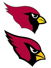
This week the Packers are set to play the Arizona Cardinals. Overall, I really like the Cardinals current uniforms. However, one thing that has bothered me about Arizona's most recent update isn't something they changed, but rather something they didn't change. More specifically, I can't figure out why, after changing the logo, the jerseys, the pants, and even the color scheme (by adding black), they didn't make the facemask red. Aside from the mask, there are no grey elements in the scheme. The logo features red and black with yellow accents, and the current uniforms added black piping into the scheme, but no grey. Although one could make the argument that the Cardinals franchise is the league's oldest and the grey mask is a sign of the team's tradition, please take this into account: The Cardinals have moved from Chicago to St.Louis to Phoenix and changed their name to the Arizona Cardinals since then. Combine that with the concept that nothing else in the scheme was too "traditional" to change, and the facemask just doesn't make sense.

The Cardinals aren't the only team with grey facemasks, and they aren't the only team that has no grey elsewhere. The Browns made the switch from a white mask to a grey one between the 2005 and 2006 seasons. The grey just flat out doesn't match the brown and orange when it hasn't been worked into the scheme elsewhere. The 49ers and Colts round out the group of teams that use grey facemasks without using grey. The Colts have worn both white and blue masks in the past, which I vastly prefer. I think it makes for a cleaner, more "put together" look.

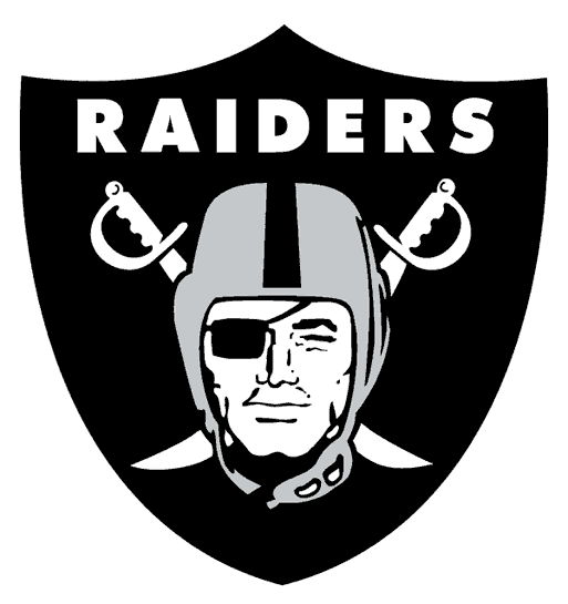
Another group (or pair) of teams in the grey facemask camp are the silver-domed teams with grey masks. Let's start with the Raiders. While "Silver and Black" was edgy and fresh when the Raiders first implemented it, most teams' logos and uniforms have become fiercer and sleeker. The Raiders need an update to keep up. Get rid of the grey mask (which, depending on the light, doesn't quite match the silver) and the white shoes in favor of adding black. And while they're at it, they should update the logo. More perplexing is the Dallas Cowboys' use of a grey mask. But then again, the Cowboys use seven different colors in their scheme: navy blue, royal blue, silver, a greenish-tinted silver, white, black and grey. Can Jerry Jones see the inconsistency on his giant JumboTron? Most other teams use four colors or less in a scheme. The Cowboys could have some of the best classic-style uniforms in the league if they simply decided what their colors should be and ran with it.

Although the previous six teams I've mentioned fail to use grey masks in a design-friendly way, there is one team that offers hope on how teams could integrate this element correctly: The New York Football Giants. Why do the Giants look better on the field than the other grey-masked teams? Because they incorporate grey pants into the scheme as well. The result is a throwback feel that also shows a unified color palette.

This week, I have decided to show my concept for the Oakland Raiders. My first task was to modernize this logo. The current logo looks exactly like what it is: a drawing of a raider on a shield from the 1960s. My edits include:

• Changing the typeface to something less generic

• Re-rendering the raider into a clean logo that features the tough, gritty look the team is known for

• Adding highlights and shadows to the helmet and face, as well as a couple facial scars

• Developing a secondary mark and updated wordmark to complete the set


On the uniforms, I wanted to focus on the interaction of "Silver and Black", so I:

• Changed the shoes and facemask to black

• Updated the numbers to be consistent with the new wordmark

• Added side panels in black with silver trim, so the uniforms aren't so plain

• Created options for a silver jersey and black pants (the pants could be used for a "Black-Out" game)


The result is a more intimidating look for the Raiders as they move to the future. Feel free to comment on grey facemasks, the Raiders, or anything about Sports Design. Thanks for reading!

Wednesday, December 23, 2009

How Lighting Conditions Affect a Team's Color Scheme

By Bowen Hobbs

Anyone who has seen enough NFL games will notice that the venue of a matchup can influence the look of team's color palette, and therefore, uniforms. Is it a coincidence that the Chargers (alternate) and Dolphins jerseys have bright colors that seem well-suited to where they play? Or that many northern teams use a more traditional palette that features darker tones? As a Wisconsin native, I first noticed this trend with the Packers. Early in the season, the Packers jerseys give off more of an emerald hue, while later in the season, the green appears less saturated and darker. There are multiple influences regarding this phenomenon. First, of course, is the fact that Wisconsin gets far less sunlight in November and December than it does in August and September. The second factor that influences color schemes is whether a team plays in a dome and the lighting that dome features. For as long as I have been watching football, I have never seen a dome as dimly lit as the Edward Jones dome in St. Louis. Just compare this photo of the Rams in Washington in Week 2 with this photo of the Rams hosting the Packers the very next week. Why would the Rams want to wear such a color-less scheme eight games a year? Did they look at the colors in the dome before they released the current scheme? They almost look like the Saints when they don metallic gold with a blue that almost looks black.

The Packers next opponent, the Seattle Seahawks, have a unique lighting situation. Their jerseys stay fairly consistent in various types of light, but the helmet changes color. On TV, the Seahawks main blue tends to come off a bit grey, which does not look as striking as the blue actually is in person.

The color-changing phenomenon isn't nearly as noticeable on teams' white away jerseys. This is in part because the numbers on most jerseys are tackle twill, not mesh like the body of the jersey. The tackle twill tends to be more reflective on most teams uniforms.

This week, I bring you my take on the Seahawks. While I like their current duds, parts of the overall design seem a little plain, and don't necessarily say "Seahawks" as much as they say "Football Team: Insert Name Here". While I like their unique blue, it can read a too dark or too grey in certain situations. I would also like to see more lime green worked into the scheme, without going to the extent of this. There are multiple teams that currently feature a two-tone blue look, but since the Seahawks shifted, no team features a primarily blue and green combination. Other ideas I brought to this concept include:

• Swapping the navy for a slightly blue-toned silver.

• A much more modern design with striping more comparable to the skunk-stripe in the seahawk's head.

• An updated number font to correspond with the striping pattern.


As a holiday treat for the fans/followers of this blog, I have decided to show off an extra design. I have generally been showing designs related to the Packers' schedule, but I felt this concept was too good not to show. The Washington… (drum roll)… Warthogs! Since the issue of the Redskins' name has been in and out of the Supreme Court this season, here is my attempt to salvage some of Washington D.C.'s football tradition, while moving away from what I believe is the worst name in sports. The name Warthogs is derived from the 'Skins fans who wear this. I also set out to feature the Redskins unique shade of burgundy, which is not used elsewhere in the NFL. The shading of the warthog head is stylistically carried through to the two-tone wordmark and jersey numbers. The home uniforms feature burgundy and metallic gold with orange accents, while the away jerseys are an off-white, similar to the San Francisco Giants' (MLB) home uniforms. The end result is a new chapter in Washington football that still addresses and cherishes the tradition of the past.


Wednesday, December 16, 2009

Welcome to 44th & Goal

By Bowen Hobbs

Welcome to 44th & Goal, a blog about Sports Identity and Uniform Design. Since this is the first post of 44th & Goal, I wanted to choose a topic that would be noticeable and thought provoking. I've decided to talk about the difficulty some teams have with getting their sleeve stripes to look right on their modern-cut jerseys.

The worst violator of this appears (at least to me) to be the San Francisco 49ers. The Niners have a history of wearing three white stripes across the sleeves of their red home jerseys and three red stripes across the sleeves of their white road jerseys. The recent installation, however, leaves much to be desired. It's not so much three stripes as it is one stripe and parts of two others (as it appears on receivers and running backs) or two stripes (what I've seen on the linemen). A uniform is part of a brand, and branding needs consistency to communicate a unified image to the consumer. To further confuse the matter, the jerseys from the 80s had the TV numbers on the sleeves, which have since been moved to the shoulders for… (drum roll, please) lack of space on today's tiny sleeves. Other teams have this issue too. The Lions decided to keep dealing with this issue in their most recent re-design. (Look at #51) The Browns and Cowboys (as well as a few others) deal with this too. Kudos to the Packers for realizing this trend and moving from a 5-stripe pattern to a 3-stripe pattern between Super Bowl appearances in the 90s.

The Packers' upcoming opponent, the Pittsburgh Steelers, also feature the large, difficult-to-fit-on-a-sleeve stripes. Although they do try to put the stripes high enough on the sleeve, I can't help but think of the 70s when I see them. (And this is coming from someone born in the 80s.) My vision for them takes the idea of the sleeve stripe and brings it into the 21st century, while maintaining their brand of representing Pittsburgh's long-fabled Steel Industry. Other changes I have made include:

• Editing the color palette by removing the red and blue and adding a second grey. I think people can still see it's a US Steel-based logo without being so literal.

• Editing the number font to something tougher than the Kordell Stewart era numbers.

• Making the facemask grey, for a touch of tradition.

• Adding a yellow alternate jersey and black and white pants, to add the opportunity to switch the look for special occasions (i.e. night games, or Saturday games, etc.)

(Click image to enlarge.)


Feel free to leave a comment regarding your thoughts on sleeve stripes, the Steelers concept above, or just anything to do with Sports Branding.