Wednesday, April 28, 2010

From Ballparks to Uniforms: The Cookie Cutter Era

By Bowen Hobbs

As the years go by, we see fewer and fewer of the "cookie-cutter" ballparks that were built in the 1960s and '70s. Parks like Shea Stadium (Mets) and Riverfront Stadium (Reds) have been bulldozed for ballparks that have subtle nuances like Minute Maid Park (Astros) and AT&T Park (Giants). It took Camden Yards in Baltimore to help people realize that originality and atmosphere still had a place in the baseball universe.

What does this have to do with uniforms? Well, as the saying goes, "Those who cannot remember the past are condemned to repeat it." In the case of stadiums, one of the motivating factors for the cookie-cutter aesthetic was that it saved costs, as the parks generally accomodated both baseball and football. In the case of uniforms, cost also plays a part. It is, in fact, cheaper to manufacture baseball uniforms when so many teams wear similar styles. While the '70s featured cookie-cutter stadiums and inventive uniforms, the opposite is true today.

There are really only six different templates for baseball jerseys today. They are pinstripes; plain; placket piping; sleeve trim; vests; and the newest addition, the faux v-neck. Although there are some slight variations, including the number of stripes (one or three, generally) and the placement (on-the-cuff or off-the-cuff) of said stripes. Below is a breakdown of the six styles:

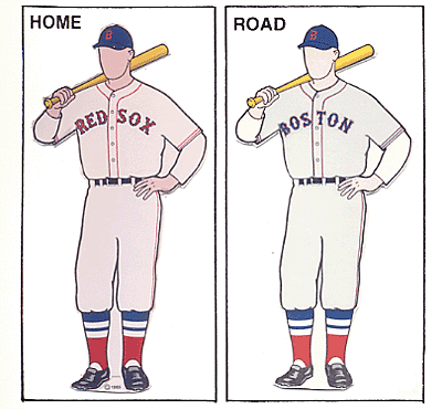
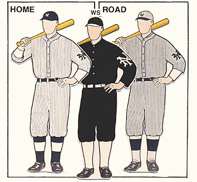
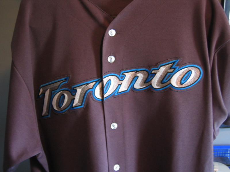
Pinstripes: This one is pretty self-explanatory. All pinstriped jerseys are paired with pinstriped pants. But the lack of originality, or "cookie-cutter-ness" of this template is evident in two ways. The first is color: every team that uses pinstripes, except the Rockies and Phillies, uses royal, navy, or black for the stripe color (the Rockies use purple, and the Phillies opt for red). The second (and even more cookie-cutter) aspect is the spacing of the stripes. I was very disappointed when the Mets unveiled the new 2010 home alternate uniforms because wide-set pinstripes would have given the team a unique look with a throwback feel.

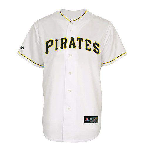
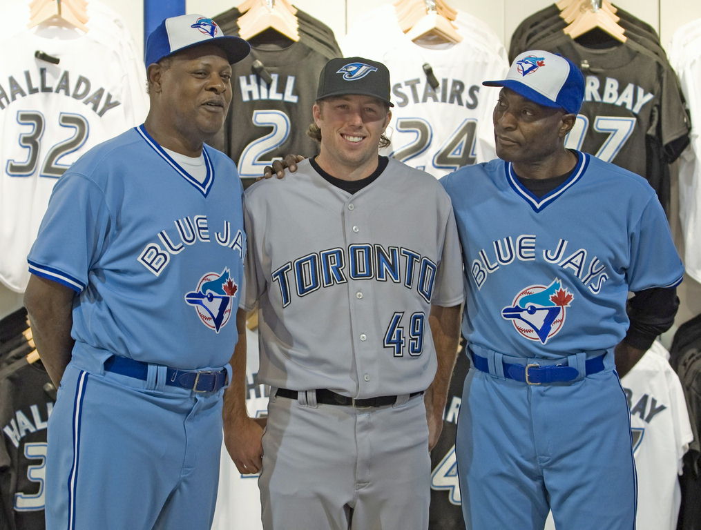
Plain: This style is extremely overused (especially compared to the NFL, where only two teams use "plain" jerseys). Currently, seven teams (Blue Jays, A's, Cardinals, Red Sox-away, Cubs-away, Astros-away, and Dodgers-home) use the plain uniform, and that is only counting the primary options. To me, the plain uniform seems like a lost opportunity for design. The Cardinals' uniforms of the '60s are a great example of this, as they featured a unique placket piping scheme with a stripe running down each sleeve connecting the placket and sleeve trim. The A's used to wear vests that showed off more of their signature green. The Blue Jays used to be a poster child for innovative uniforms before they unveiled the current conservative duds.

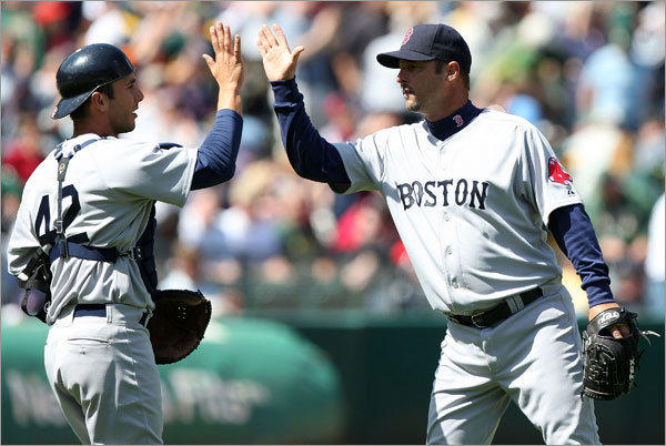
Placket Piping: Placket piping is a fairly common style with a few variations. The Tigers, Mariners, and Red Sox (home) sport the minimal requirements for this category. Other teams, such as the Rays and Mets add a simple sleeve trim to the style. The Braves current uniforms have the most distinct version, with three stripes sandwiched together on the placket and sleeves. Placket piping could include other variations if teams simply looked into their history (see: Cardianls above). For example, the Red Sox previously had a version of the style similar to what the Mobile BayBears recently unveiled.

Sleeve Trim: This is the style of the Milwaukee Brewers and many other teams. There are multiple options within this category including simple, compound, on-the-cuff, and off-the-cuff. As of late the compound, off-the-cuff style has made a resurgence. Like the placket piping style, sleeve trim jerseys are usually paired with pants that feature the striping style running down the leg. This style could also be expanded if teams decided to adopt unique patterns, such as the Rangers' two-stripe pattern. Teams could also incorporate patterns or unique shapes with their sleeve trim to create a unique one-of-a-kind look that MLB sorely lacks.

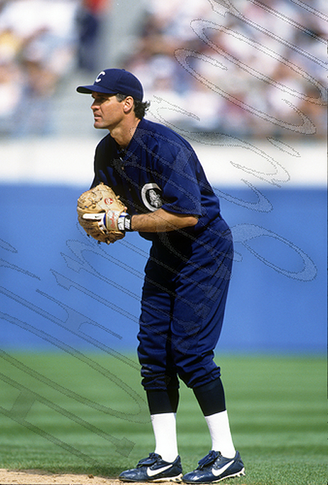
Vests: The vest style peaked in the '90s, with the pinstripe fad. One of the main benefits to the vest option is that it allows the team to show off more of a signature color. In addition, the vest option can be paired with pinstripes, trim, or piping. The vest is generally a great option for teams in hotter climates.

Faux V-Neck: The newest style that MLB has mass produced, it is the adaptation of an '80s classic for today's button down jerseys. Since the Giants debuted the style in 2000, a number of teams have adopted it. With the exception of the Angels, the style usually consists of a three-stripe trim. It will be interesting to see if a team takes a chance and expands on this style in a unique way.

There are a few styles from the Golden Era of originality that I believe are due for a comeback. For example, if a team adopted the contrasting raglan cut sleeves that Hank Aaron graced in the '70s, they would enhance their brand with instant recognition. The Mets could give fans a taste of past glory by reintroducing the classic '86 racing stripes. One of my favorite baseball uniforms is the late '80s/early '90s Astros uniforms. Another team could reach way back into the history books for the contrast placket style. And to think, I haven't even begun to discuss how teams could adopt more original caps.

This week is another "Double Play" design post. Starting with the Brewers' current opponent, the Pittsburgh Pirates. I have tweaked the logo set to eliminate the superfluous red, and transition the pirate head logo into a more concise color scheme. The home uniforms begin with a cream-colored base, to give the look a little extra age. The primary home and road jerseys feature vests and a triple stripe pattern on the undershirt unique to MLB. The black alternate jersey carries over the striping pattern and adds it to my adaptation of the classic pillbox caps the Pirates sported in the '70s. The away uniforms feature a warm grey base to complement the yellow in the scheme. The Sunday Alternate places the triple stripe across the chest, in addition to the sleeves, and is paired with a yellow version of the pillbox hat.


On deck, we have the Colorado Rockies. I have placed an emphasis on purple and light blue, giving the Rockies a unique scheme in MLB and all of sports. The primary logo features a mountain with a low-angle perspective and ROCKIES underneath it. The secondary logo is based on the Colorado state flag, complete with mountains and a baseball in the center. The tertiary is a partial of the secondary. The jerseys feature what I like to call "mountain trim". The ROCKIES wordmark appears on the home jerseys, while the COLORADO wordmark is emblazoned across the chest of the away sets. Speaking of the away sets, they feature a powder blue base. The tertiary logo appears as a sleeve patch on all of the jerseys except the Sunday Alternate, which features powder blue caps and pinstripes. The Sunday Alternate makes use of the secondary logo as a patch and features the mountain trim with a twist.


Feel free to leave a comment regarding templates in baseball uniforms, the concepts above, or anything sports branding related.

Wednesday, April 21, 2010

Oh Say Can You See, Originality…

By Bowen Hobbs

Last week, I discussed the lack of color in MLB as it pertained to the overabundance of grey road uniforms. There is, however, a second factor in the relative "colorlessness" of MLB compared to other sports leagues such as the NFL. As I have mentioned previously, 29 of 30 teams in MLB feature one of four primary colors: black, navy, royal blue, or red. The lone exception is the Oakland A's, who enjoy instant recognition when they play (except when they wear their ridiculous black alternates). The NFL, by contrast, has teams that wear predominantly black, navy, red, royal, burgundy, green, purple, teal, brown, and even certain shades of blue that defy traditional classification.

MLB hasn't always been so formulaic. The Marlins used to be primarily teal, and the 80s featured the Phillies in burgundy, the Padres in brown, and the Astros in orange. Nowadays, it seems to take a special promotion for teams to sport a cap that isn't one of the four main colors. Baseball is starting to swing the pendulum back toward color, however. The Giants just implemented an orange alternate jersey this year, and the Rockies have a purple alternate as well, but these are alternates and these teams' primary home and road options are still predominantly black.

To further muddy the branding waters, seven teams in MLB use a color scheme of navy and red (Angels, Cardinals, Braves, Red Sox, Indians, Twins, and Nationals), while an additional four teams focus on royal and red ( Cubs, Dodgers, Phillies, Rangers). MLB has essentially let one-third of the league wear some combination of red and blue. Other popular combinations include red/black (D'backs, Astros, Reds); black/silver (White Sox, Marlins, Rockies, Blue Jays); black/orange (Giants, Orioles); and navy/metallic gold (Brewers, Padres). And I didn't even count the similarities between the Yankees' and Tigers' home uniforms. Not counting the Yankees and Tigers, 22 of 30 MLB teams share their color scheme with another team. That leaves eight teams with original schemes (Rays, Yankees, Tigers, Royals, Mariners, A's, Mets and Pirates).

Speaking solely about the navy/red complex, I find the lack of diversity in the application of the colors further complicates things. Only the Red Sox' road uniforms, the Braves' navy alternates, and the Twins' home alternates and road uniforms attempt to use a navy script, with the Red Sox abandoning red on the jersey (except for the patch) and the Twins using red numbers on their away set. Furthermore, the Twins are the only team in the navy/red group to use pinstripes on any of their jerseys. I know baseball prides itself on being America's Pastime, but they don't have to wrap themselves in the flag's colors to prove it.

This week, I have decided to go with a "Double Play" design section. Starting with the Phillies, I reverted the color scheme back to the 80s, when the Phils were the only team in MLB to sport burgundy. I used the existing logo set because it has become synonymous with victory over the past few years. Why did I scrap the current color scheme then? Two reasons: the aforementioned reason of originality, and the fact that the Nationals play in the same division and also wear red. The home uniforms remain fairly similar to the current duds. I did, however, make the pinstripes light blue to remove the slight pink hue the red pinstripes give the current set. I also subbed out the sleeve number for a Liberty Bell patch. The home alternate features a burgundy jersey with light blue trim and white type. Both home uniforms utilize a cap with a contrasting light blue brim, while the away sets opt for an all-burgundy cap with a light blue P. Speaking of the away uniforms, the primary road option also makes use of subtle pinstripes, but this time they are white pinstripes on a light blue base. The road alternate jersey is similar to the home alt, but with light blue type to match the hat. The "Sunday Alternate" features a blast from the past as the cap draws inspiration from Phillies teams of the 1910s. The cap is paired with a white uniform featuring collar and sleeve trim. The jersey showcases the P monogram with the jersey number on the right chest.


Next up, I have an example of how a navy/red team could actually conceive original uniforms. I started with the Washington Nationals. From there I removed the beveled wordmarks and DC logo and gave the team a new primary logo. The logo is an ode to the DC area, as it features the three stars and two bars of the DC flag, as well as a rendering of the Capitol Building. The secondary mark remains the Curly W, and the tertiary is a sleeve patch that reconciles the two themes. The uniforms feature something no other navy/red team in MLB has done: a red-centric design (red caps, belts, shoes, trim) with navy type. The uniforms once again draw inspiration from the DC flag with doubling piping trim and three stars on each sleeve. The home uniforms use the Curly W on the chest with a front number flanking it to the player's right. The road uniforms feature the "Washington" script currently in use on a grey base. The road alternate jersey is the one navy piece in the set, but once again, makes for an original look when paired with the red hat. The Sunday Alternate showcases a white DC flag hat and jersey with a red number on the back.


Feel free to comment on the lack of color diversity in MLB, the designs above, or anything sports design related.

Wednesday, April 14, 2010

That Old Grey Mare Just Ain't What She Used To Be…

By Bowen Hobbs

Back in December, I penned a post discussing the inconsistent use of grey facemasks. Well, I also have another issue with the use of grey in sports: the default use of grey as the away uniform base for 29 of 30 teams in MLB. Recently, some teams have added cream-colored uniforms as home alternates, but only the Padres have decided to move away from grey on the road. Combine that with the fact that 29 of 30 teams feature royal, navy, red or black as their primary color (the Oakland A's are the exception, but even they have a black alternate jersey), and you get some repetitive (and boring) combinations. The solution to this lack of diversity rests in baseball's long, storied history. There are quite a few teams that used all-navy or all-black looks during the early 20th Century, and many teams opted for powder blue in the 70s and 80s. The Padres and Pirates even wore all-yellow duds.

Further reducing the opportunity for a colorful comeback, the Royals and Rays wear light blue jerseys with white pants, and the Blue Jays wear an all-powder set at home. If the Royals, Rays and Jays decided to convert these sky-hued garments to their primary road options, they could get rid of some of their worst-selling jerseys in favor of some of their best-selling. Most Brewers fans I know love the powder blues and would relish seeing them on the field again (with the ball-in-glove logo, of course). Another deterrent for a color revolution in baseball is the Cool Base™ jersey. Since MLB introduced Cool Base™ and teams have adopted it, the unique shades of grey that some teams used have gone by the wayside in favor of a standard "Cool Base™" grey. There have been exceptions, however. The Padres are still using their sand-colored away set, and the Blue Jays almost unveiled a graphite away set in their last re-branding.

From a sales/marketing perspective, if MLB wanted to profit from a segment of uniforms that hasn't seen the popularity of home jerseys and dark-colored alternates, it would embrace the idea of adding color to road uniforms. And when you stop to consider the amount of love the fans generally show to throwbacks and retro sets, it seems like a no-brainer.

This week's design features the Milwaukee Brewers. My concept for the Brewers attempts to blend various eras in the team's history. The color scheme pairs Lake Michigan blue, powder blue, metallic gold and white. The primary logo prominently displays the ball-in-glove logo (which is probably the best use of typography in a sports logo) with MILWAUKEE and BREWERS arched over the top and the date the Brewers moved to the Badger State flanking the glove. The secondary logo is a standalone version of the ball-in-glove, which I have updated by adding shading to show the roundness of the ball and glove. The tertiary logo is an M inside a baseball, which appears on the left sleeve of the away uniforms A standalone M graces the alternate cap, while the primary home and away caps feature the ball-in-glove.


The home uniforms utilize the BREWERS wordmark from the primary logo and the ball-in-glove on the sleeve. The jersey number appears on the front of the jersey, as well as on the back, in its usual spot. The numbers echo the type treatment of the wordmarks, and tie the current Brewers era into the scheme. The uniforms feature a three-stripe trim that ties the set to the 80s throwbacks. The away sets are powder blue and emblazoned with MILWAUKEE across the chest and the M-Baseball on the left sleeves. The "Sunday Alternate" (a term I use for a once-a-week retro inspired uniform) features metallic gold pinstripes for a uniquely beer-y feel and is paired with the M hat that evokes memories of the Barrelman era. The BP jersey follows the template that MLB currently uses, complemented by the ball-in-glove on the chest and the M-Baseball logo on the hat.


Should baseball adopt more diversity in their away uniforms? Should the Brewers return to the ball-in-glove? Feel free to sound off on these questions or anything sports design related by clicking the COMMENTS link below.

Wednesday, April 7, 2010

Buy Me Some Logos and Cracker Jacks (Pt. 3)

By Bowen Hobbs

An aside: Last week there was a rumor that my Timber Rattlers concepts were speculated to be official changes for the team. I have stated clearly in this blog that the designs I post are ideas on what the teams could do, not what they are doing, design-wise. If I ever were to be contacted by a professional team for the purposes of a re-design, I would never post such sensitive information on the internet before it was unveiled by the team. I do, however, appreciate the complement of someone taking the time to "officially" debunk my design as actual changes. It's good to know that upon viewing my designs, there was no clue that they weren't real (except the paragraphs I've written describing them). Now, on to the topic at hand:

Continuing the discussion of MiLB's logo and uniform changes, Part 3 of the series will focus on the re-branding efforts of the Wilmington Blue Rocks and Delmarva Shorebirds. I will also outline some of the tweaks, alterations, anniversary logos, and All-Star Game logos that will appear in the 2010 season.

The nation's first state seems like a good place to start, so here we go. The Wilmington Blue Rocks unveiled their new logos and uniforms at the end of January. The old logo consisted of a B and an R with a pick axe and radial motion lines. The colors were royal, yellow, navy, silver and white. The new logo shifts the color scheme away from royal toward powder blu. In addition, the newly unveiled mark focuses on Wilmington's primary mascot, dubbed "Rocky Bluewinkle". Rocky appears snorting over a diamond, flanked by the words BLUE and ROCKS. Rocky's hat contains a clever nuance: the state of Delaware appears inside the B of the BR monogram. The type treatment is a little off, however. The navy line under BLUE curves, while the script itself does not echo the curve. In addition, the navy line doe not even appear in relation to the word ROCKS. The centered treatment of WILMINGTON doesn't appear centered because the moose is asymmetrical, not to mention the awkwardness of where it overlaps the antler. The concept is good, but the execution could be refined. The supporting marks, though, are very well done. The standalone moose head is far more pleasing than the primary, while the BR logo looks great in the in the primary and by itself. The Blue Rocks also have a second mascot, and given their kid-friendly atmosphere, they decided to incorporate Mr. Celery into two additional logos. Mr. Celery is a long-celebrated part of Delaware baseball, and his incorporation into the scheme is unique and long overdue. The home and away caps feature the standalone Rocky logo, while the home alternate shows off the BR logo. Mr. Celery makes appearances on the batting practice (BP) cap and as a patch on the left jersey sleeves. Overall, the supporting marks are great, but the primary could use work. B-.

Just a little to the south, in Maryland, the Delmarva Shorebirds also updated their appearance. While a slightly simplified version of the old logo and color scheme (an Orioles tribute) remain, the Shorebirds have made significant changes to almost every other part of their identity.


The team's new primary logo features a fiercer bird and the secondary logo has that bird peaking out from the inside of a D. An interlocking DS is emblazoned on the BP caps. The team also unveiled new SHOREBIRDS and DELMARVA wordmarks for the home and away jerseys. While the package is an improvement, it also leaves something to be desired. I would have liked to see more consistency between the two new bird heads. B-.

The Jacksonville Suns recolored their primary logo over the offseason from royal, red and yellow to black, athletic gold, and old gold. Although I like the athletic and old gold combination, the use of black doesn't make sense, as black is the absence of light, while the sun is a source of light. The team also unveiled an alternate logo of the sun caricature behind a stylized J. The sun in the alternate logo is colored differently than the primary logo version. The team also features an away cap with the alternate logo in greyscale and an alternate cap with a Pittsburgh Pirates-inspired J, which seems out of place given the Suns are a Marlins affiliate. Overall, this set is chock full of inconsistency. C-.

The Reading Phillies unveiled a few new items, including a pair of patriotic caps, a new road cap, and a new road jersey that is very similar to the parent club. The San Jose Giants added a new SJ logo, as seen on the new home and road caps. The Brooklyn Cyclones celebrate their 10th Anniversary this year, and the logo has a nice Coney Island feel. The Casper Ghosts are also celebrating a decade of baseball with a great logo, which features the Ghosts' halftone pattern and script. The Delmarva Shorebirds, in addition to their re-branding effort, unveiled a 15th Anniversary logo for their ballpark, Arthur W. Perdue Stadium. The logo leaves a lot to be desired. The white type on cream is difficult to read, while the overall look would be more at home in 1996, not 2010.

Last, but not least, there are a couple All-Star Game logos that have been unveiled for the 2010 season. The Lehigh Valley IronPigs will host this year's Triple-A All-Star Game with a logo that ties into their branding. There is also an all-type version, as well as jersey wordmarks for the International and Pacific Coast Leagues. To the South, the Texas League's All-Star Game logo slaps together an amalgamation of Americana. Where's the apple pie? Seriously, though, whoever was responsible for this one needed to pick one or two of the images and run with them, not use every idea they had in one logo.

The design section of this week's post features Wisconsin's other Minor Leagure Baseball team, the Beloit Snappers. Beloit's current logo features Snappy the Turtle holding a bat against a field with "Snappers" over him. Thicker, bolder lines and fewer colors would greatly improve the logo, as it currently sports navy, two greens, yellow, metallic gold and white for a grand total of six colors. My re-brand also features six colors (including white), but three of the greens are the same color at different percentages, so in print, it would be three colors ( white would be the paper). The logo I developed features a turtle on all-fours with a baseball-seem shell, standing on Snappers with BELOIT arched over the top. The secondary logo consists of a turtle shell speeding across an S. The tertiary is the standalone version of the turtle, while the quarternary logo is the streaking shell. I have included options for four different cap styles that correspond to jersey options. The home uniforms feature a "Snappers" wordmark with a speeding shell, as well as the turtle on the left sleeve. The primary option for the away uniforms takes a grey base and adds a "Beloit" wordmark and the turtle as a patch. I have also included options for alternate jerseys, one of which is emerald green and could be worn at home or on the road. The yellow alternate would be strictly for home games, and features a yellow cap with the S logo. The lime green alternate features the streaking shell on the cap with emerald green contrasting raglan-cut sleeves. Lastly, I have included a pastel yellow option for the away uniform that truly stands out from the plethora of grey road uniforms in baseball.


Feel free to leave a comment on the concept above, MiLB's new 2010 designs, or anything sports design related. Thanks, for reading!