

By Bowen Hobbs
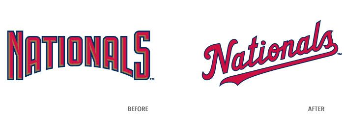
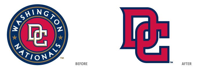
A couple weeks ago I found the new Timber Rattlers "re-brand" (and I use that term loosely), and I was going to include it with last week's post about the Nationals. But the more I looked at the new "identity" (once again I'm using the term loosely), the more I thought it deserved its own post. So here we go:
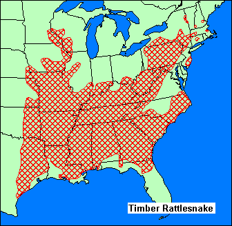
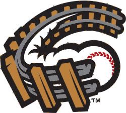
Name: Now, I know the team had no intentions of changing the name from Timber Rattlers, but they probably should. As I have detailed before, the name Timber Rattlers has absolutely no association with northeastern Wisconsin outside of the baseball team. There are no timber rattlers in Northeastern Wisconsin. A look at this map shows that timber rattlers only inhabit the great state of Wisconsin along the Mississippi River. Furthermore, "Timber Rattlers" is a mouthful. Since moving to Oshkosh, I have noticed more and more people calling them the "T-Rats", which sounds more like genetically engineered super rats that will take over the world in some bad science fiction movie. As for the distinction of being "Wisconsin", it's at least mildly insulting to the Snappers, but that isn't terrible because they are rivals (trash talking is allowed). The team used to be the Appleton Foxes, and one day I hope they return to it, as "Foxes" gave the team a regional moniker that was more targeted (and meaningful) to the fan base than "Timber Rattlers".
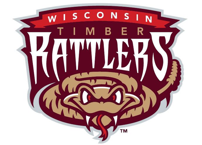
Colors: I have never been much of a fan of the T-Rats color scheme. It's a muddled amalgamation of dark colors. Black, burgundy, red, metallic gold, and silver (plus white)… Really, when you think about it, there is no useful application of having black, burgundy and red in the same logo. The burgundy is too similar to the black, and the red just seems unnecessary. The logo would be improved by removing the red, but removing the black and darkening the red is the best way to go.
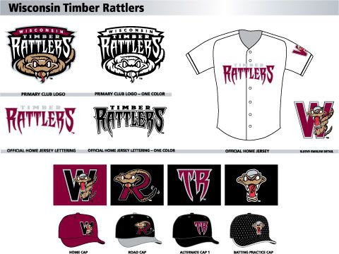
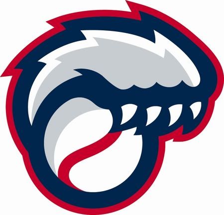
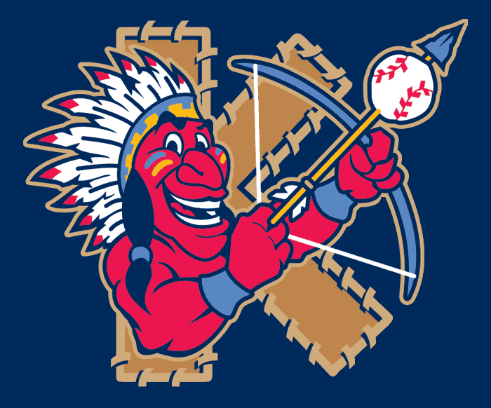
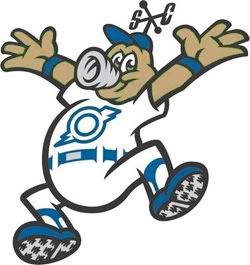
Primary Logo: I actually like the primary logo (shown above) for the most part. The snake received a much needed update, and the overall look of the logo is much bolder and intimidating. The only things I would like to see changed are the typefaces. The "RATTLERS" typeface is far too similar to the Arizona Diamondbacks, which wouldn't be a problem if the T-Rats were a D'backs affiliate, but over the past two years the team has spent much of its marketing time on emphasizing its relationship with the parent club. Then they adopt a logo that looks all too similar to the identity of an NL rival? Why? The "TIMBER" typeface is also troublesome, as it sticks out in an awkward way. Why not use the typeface from "WISCONSIN"?
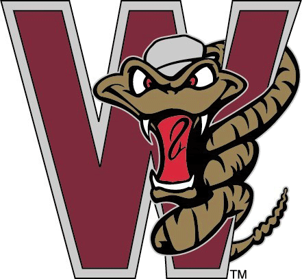
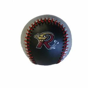
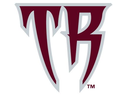
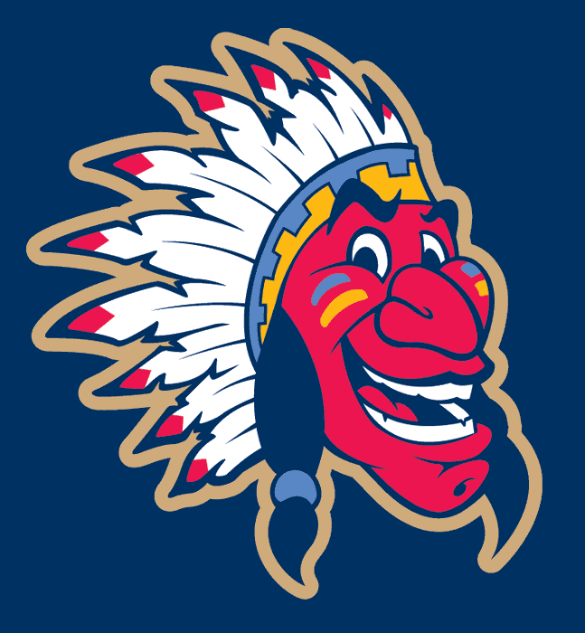
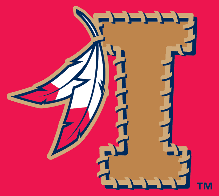
Secondary Logos: This is where the "identity" (there I go again) falls apart. The team kept its longstanding W logo, which not only uses a typeface that doesn't match the rest of the set, but the snake on it has a thinner outline than the snake in the primary. In fact, the team is using three different versions of the snake's head: one in the primary, one for the W logo and BP cap snake-head logo, and another for the R logo. Why have three snake heads? What's the point? I do like the TR logo, though. It is well-balanced (not always easy to do with a T on one side) and matches the primary logo. On the other hand, the R logo clearly looks like it was inspired more by the old typography (it is from the old identity) although it doesn't really match that either.
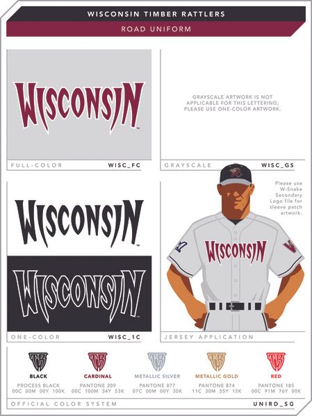
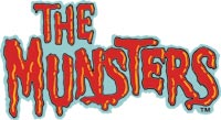
Uniforms: The uniforms also received an update in the latest redesign, with the home threads now featuring a burgundy cap as the primary option. (It was an alternate cap last year.) The jerseys are pretty straightforward, with the "TIMBER RATTLERS" wordmark placed across the chest and black piping accenting the sleeves and pants. The away uniforms try to stay consistent with the homes, but something's a little off. Between the top-heavy type and the curved I's, the "WISCONSIN" wordmark looks like it belongs in a campy vintage Frankenstein movie or on The Munsters. Too bad they didn't unveil the set on Halloween.
Overall, the inconsistency keeps me from truly appreciating some of the good updates within the set, like the re-rendering of the snake (if only they used it more) in the primary logo or the TR logo. Looks like I still won't be buying a T-Rats cap (unless it's the one with the TR logo… maybe…).
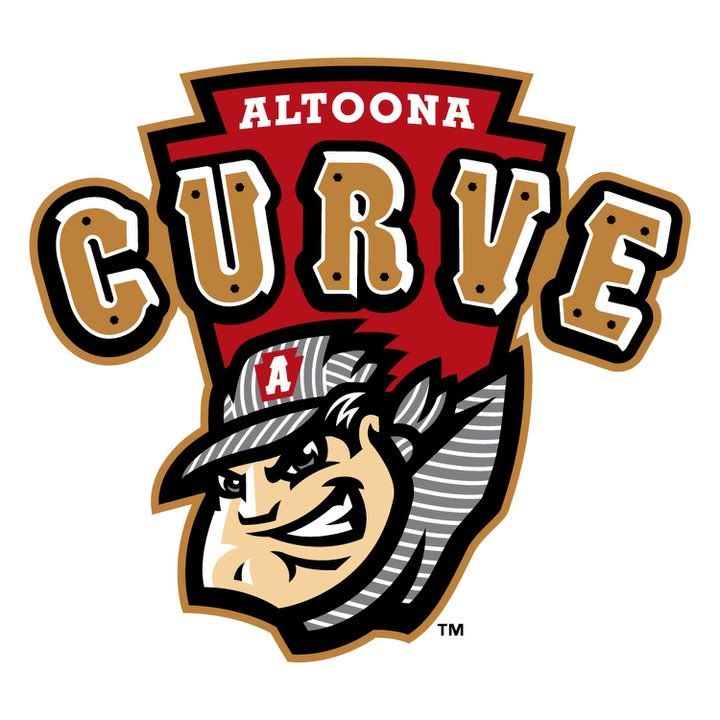
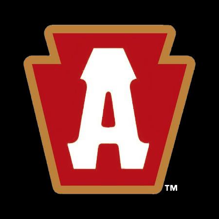
Altoona Curve
Primary Logo: The Curve's old primary logo featured a baseball whizzing by on a train-like "CURVE" wordmark set inside a diamond. The new primary logo uses a conductor flanked by a keystone and a new "CURVE" wordmark. It is an upgrade, but the logo is far from perfect. The conductor doesn't look right. The conductor's chin should line up with the nose, but it is pushed over to the viewer's left, giving the guy a Stan Smith look. In addition, The angle at which the conductor's head meets his neck gives the logo a football feel, as it appears the conductor is hunched over, running full-speed like a linebacker. The other parts of the logo are well done. The keystone holding shape is unique and specific to Pennsylvania. In addition, the type is very interesting, as the "CURVE" wordmark is excellently rendered.
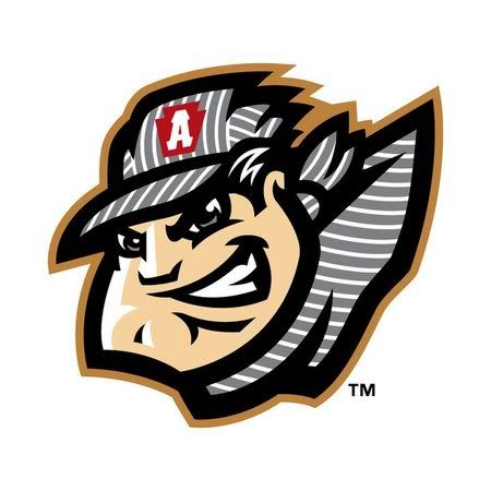
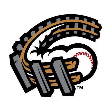
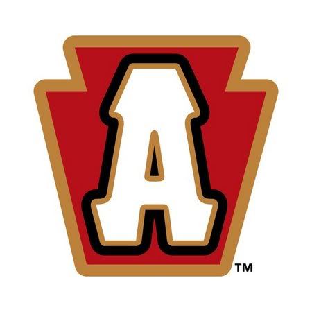
Secondary Logos: The team has three supporting marks: a standalone conductor head, a speeding baseball on train tracks, and a Keystone A. The standalone conductor head looks even more like a football logo than the primary. The baseball on tracks logo is well rendered, but the color isn't quite right. Aren't most train tracks built with wood planks and steel rails, not the other way around. Here's a mock-up I found on the Chris Creamer message board with the bronze and grey swapped. Looks better, right? As for the Keystone A, it's good, but part of me wants to see it with less outlines, since the outlines on the current Keystone A don't match the effect on the wordmark in the primary logo anyway.
Uniforms: They have yet to be unveiled. I'll keep you posted.
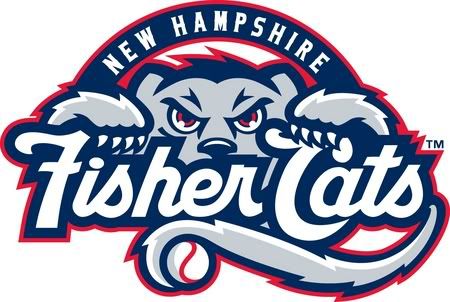
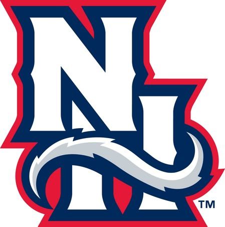
New Hampshire Fisher Cats
Colors: That's all that has really changed for the Fisher Cats this year. While the Cats used black, kelly green, yellow, and silver last year, next season they will compete wearing navy, red and silver. Here are the logos: Primary Logo (old/new), NH Logo (old/new), FC Logo (old/new), and the Paw Logo (old/new). Personally, I think the new color shceme is a step in the wrong direction. While black and kelly green was a unique color combination in the Eastern League, navy and red is used by the Harrisburg Senators, the Portland Sea Dogs, and now the Fisher Cats. So much for originality…
Kannapolis Intimidators
Alternate Logo: While Kannapolis's primary logo could use some work, this new alternate logo is certainly a step in the right direction. The script I and rendering of Number 3 are spot on with the NASCAR feel of this identity. Now if only they did something about the primary logo…
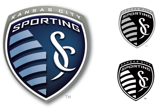
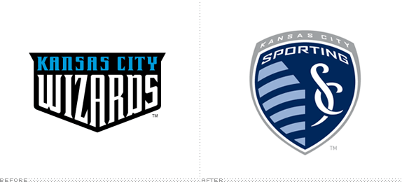
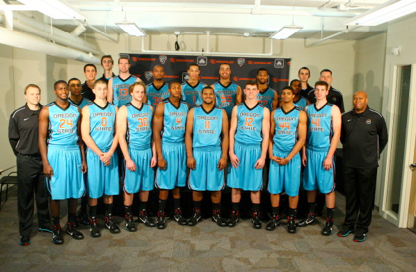
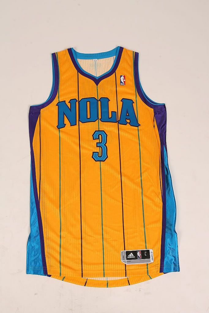
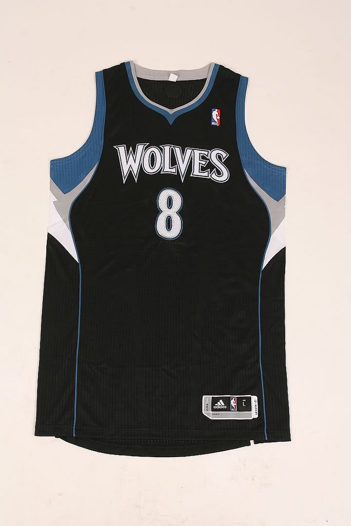
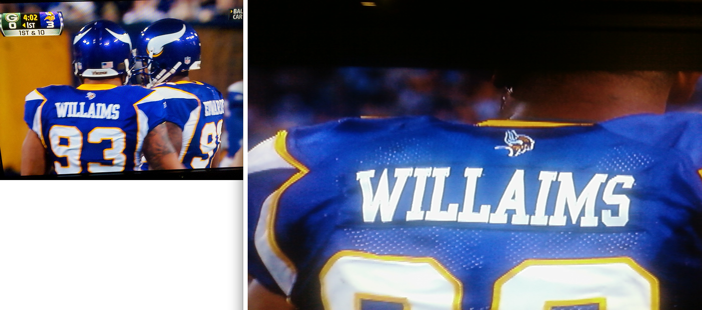
In Other News… The Kansas City Wizards have re-branded, becoming Sporting Kansas City. Good thing there's a non-gradient version, because they're gonna need it… Oregon State's men's basketball team wore turquoise uniforms for the launch of Nike's new N7 shoes. Kind of looks like the Vancouver Grizzlies… The New Orleans Hornets and Minnesota Timberwolves new alternate uniforms have been leaked. That Hornets jersey looks pretty spiffy. And yes, they will still wear the Mardi Gras uniforms this year… The Jets wore green pants at home Sunday… The 'Skins took their stripe-o-rama act on the road to Tennessee… The Rams went all-navy again… The Saints wore their black pants against the Seahawks… Kevin Williams had a typo on Sunday. Just another mishap for the Vikings this year… The Bengals wore their orange jerseys against the Bills… The U (of Miami) broke out their Pro Combat uniforms against Virginia Tech… Iowa State wore gold jerseys against Missouri last Saturday. They looked less like USC than usual… Northwestern wore black jerseys for their Wrigley Field game, while Notre Dame wore green jerseys at Yankee Stadium…
Designer's Corner
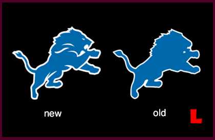
This week's designs lead into Turkey Day with the Thanksgiving perennial Detroit Lions. I did this design right after the Lions first unveiled their updated logo. While I am still a big fan of the updated logo, my concept eliminates black from the team's color scheme. I have updated the primary logo by switching the outline to silver. I also created a new mark by combining the logo with a revamped wordmark that features an Olde English L. The uniforms do not rely on the large sleeve stripes that Lions fans have become accustomed to. Instead, the primary home and away uniforms use piping around the shoulder pads with white accents in the shape of the accents in the lion. There are also two alternate uniforms, which are based on the Lions' throwback uniforms.


Next up are the St. Louis Rams. My main issue with the Rams current uniforms has to do with where they play. The Edward Jones Dome is very dimly lit compared to newer domes and outdoor stadiums. That dim lighting makes the Rams' current navy and metallic gold scheme look very lackluster at home. In the interest of injecting a little excitement into the atmosphere in St. Louis, I have restored the team to royal and athletic gold (yellow). Although I did not changed the logos, I have changed one very iconic piece of the Rams' identity: the horned helmet. Nothing too drastic, I just added the highlights from the logo to the horns on the helmet for a more consistent look. The uniforms use accents with a similar style to the updated horns on the shoulders and pants. I have also added a gold jerseys to pay homage to the team's history.
 Feel free to leave a comment on the new Timber Rattlers identity, other changes in the identities of MiLB teams, the designs above, or anything sports branding related.


