Wednesday, July 28, 2010

Eastern League: The Good, The Bad, & The Ugly

By Bowen Hobbs

Continuing my breakdown of the branding efforts of teams within Minor League Baseball (look here for the International League and Pacific Coast League), today we will look at the Double-A Eastern League. Like much of MiLB, the Eastern League features some teams with crisp, dynamic identities, while other teams could use a total re-brand. Without further adieu:

The Good

Harrisburg Senators: The team re-branded between the 2005 and 2006 seasons, shifting from a red and black scheme to a look that clearly associates the Senators with their parent club, the Washington Nationals. The home and road caps use a stylized H with the flag/streaking baseball as the crossbar of the letterform. The home jerseys use the Senators wordmark across the chest while the away jerseys opt for a matching Harrisburg wordmark. The Senators did a good job of associating with the parent club while carving out a niche of their own.

New Britain Rock Cats: The old logo, while it has some good points, needed to become more of a sports logo and less of a cartoon. The new logo, unveiled before the 2007 season, accomplishes just that focusing on the cat as a baseball player and not as an extra from Grease. The team also uses a secondary RC-Paw logo on its home caps, while the away caps should be updated from the 1996 design. Aside from the out-of-place road caps, the identity is well executed.

New Hampshire Fisher Cats: The old logo wasn't terrible, but the color scheme certainly benefited from the update. The forest green and brown/gold was swapped out for kelly green and yellow, giving the new look more contrast and family-friendliness. The logos and type are very professional and clean. The home caps are green with an NH, while the away caps are black with an FC. The jerseys are what one would expect with the Fisher Cats wordmark on the homes and New Hampshire on the aways. Overall, the set is well done and serves as an example of what a Minor League Baseball logo should be.

Richmond Flying Squirrels: I have already covered the Flying Squirrels here, but in case you missed it, here are the main points: The logo is very well-rendered throughout the face and the body (which is abstracted to convey speed), but the hands are slightly awkward, as they are somewhat ambiguous in terms of which direction they face. That aside, the logo set and typography were developed with a lot of attention to detail. Overall, the set is very good, which is why it's in this section of the Good, Bad, & Ugly.

Trenton Thunder: The difference between the old logo and the new one is night and day. Whereas the old logo uses six colors plus white and is rendered poorly, the new mark uses bold lines and only four colors (plus white). In addition, the old emblem could be used for almost any team with the name Thunder, while the new logo implies a baseball context with the cloud holding the lightning bolt like a bat. The home and road caps use the thunder cloud from the primary logo, and the team also has an alternate cap with a secondary logo of a lightning bolt holding a bat. The designer in charge of this identity did a great job of giving the team a new take on its mascot.

The Bad

Akron Aeros: Let's start with the colors: the Aeros use black, purple, silver, red, aqua, and yellow, plus a percentage of black laid over the red for the cat's stripes. Including white, the team uses eight colors. That is far too many for any team. Second, looking at the type, the warping on the AEROS wordmark is a little awkward. Furthermore, AKRON is in Copperplate. What is the point of using a typeface that belongs on the side of old buildings within the context of a futuristic scheme? The motion line and planet aren't bad, nor is the rendering of the cat (although a cat doesn't necessarily say Aeros to me). It's time to update the entire package. Both caps (the away uses a black brim) use the cat over an A, but there is no precedent within the rest of the scheme for using the style of A from the caps. While some of the pieces are good, they don't come together as a unified brand.

Bowie BaySox: It's not the worst logo in MiLB, but it could be more interesting. The colors are unique, combining the parent-club Baltimore Orioles' black and orange with teal to establish the BaySox part of the identity. The stylized B makes a good cap logo, but the type could be better. The BOWIE BAYSOX wordmark and the word BASEBALL under it are typeset in Copperplate, and while they could have gotten away with using it on the main wordmark, the serifs on BASEBALL are quite difficult to see at smaller sizes, making the word less legible. The home jerseys use a different wordmark, which is a script designed to look like the Orioles' wordmark. The issue is that the B in Baysox has too much of an opening at the bottom, causing it to read as "Raysox". Once again, I've seen worse identities in MiLB, but I've also seen numerous schemes that were better.

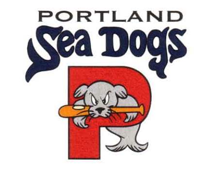
Portland Sea Dogs: Once a Marlins affiliate, the Sea Dogs changed their color scheme when switching to the Red Sox, but didn't change the logo or wordmark. The logo isn't a bad concept, but there is certainly room for improvement. The P is rather generic, and the sea dog could use some bolder lines to give it more attitude. The caps use the P logo, and the home jerseys use the Sea Dogs wordmark. The away jerseys, however, use the word PORTLAND typeset in the Red Sox jersey letters, which should probably be incorporated into the identity if the team is going to use them in that capacity.

Reading Phillies: I generally do not care for the idea of using the parent club's name because it leads teams to take the easy way out. By "easy way out" I mean using the parent club's graphic identity without the team establishing it's own brand. The R-Phils, did however, establish their own graphic identity. They have a custom wordmark and are the only team in MiLB using pink (if only as a highlight color for the red type). The wordmark isn't great, but at least it is unique, and the team was somewhat handcuffed by being named after its parent club's home town. The R-Phils use a number of caps with variations on their R logo , but the primary jerseys use the Philadelphia team's font, while the batting practice jerseys use the custom wordmark.

The Ugly

Altoona Curve: The logo is a great idea, but the color scheme and illustration style make the mark appear dated. The color scheme (black, burgundy, forest green, silver) lacks pop as most of the colors are on the dark side on the scale and the two lighter colors (silver & white) are desaturated. The secondary logo, an A with a smoking/speeding baseball, is adequate for the identity, while the tertiary logo look rather unbalanced. The jerseys don't match the rest of the identity since the team used the Pirates' typeface.

Binghamton Mets: When I mentioned the "easy way out" this is exactly the type of brand-borrowing I was talking about. The illustration of the bee could use an update, and it is slapped against an existing Mets wordmark. The caps put the bee inside a B, and the jerseys just say Mets.

Erie SeaWolves: The logo competes with the Omaha Royals for the title "Worst Logo in MiLB". It's supposed to look like an old sailor's tattoo, but unfortunately for the SeaWolves it's a sports logo, not a tattoo. The hat shading is illogical, the fur looks unrealistic (even for a logo), the wolf is wearing two bandanas (which isn't necessary), and the crossed bats look like clip art. Furthermore, the typography is downright awful. Nothing says SeaWolves like a vertically arched sans serif typeface with drop shadows combined with a gradient on the supporting type (making it illegible). The caps use the same wolf head and crossed bats, and the jerseys use the same generic wordmark. This identity is in the ugly category for every reason.

Today's design features my attempt to re-brand the Erie SeaWolves. I scrapped everything: the wolf head, the type, even the colors. Speaking of colors, I chose to work with navy, orange, and grey to show the team's affiliation to the Detroit Tigers. The primary logo takes the idea of the existing SeaWolves logo of a pirate-wolf over crossed bats, but re-renders it. The wolf-head is no longer a three-quarters view, but instead is a straight-on view over the crossed bats for more of a Jolly Roger feel. I have also added scars and a meaner scowl to the wolf. The wordmark in the primary logo is a custom typeface with notches removed from the letterforms to match the distress on the wolf's hat as well as the wolf's scars. The supporting logos include two partial logos, an E monogram, and a ball-and-bats Jolly Roger that could become a secondary mascot a la Mr. Celery.


The caps allow for multiple options of using the wolf head and crossed bats logo and the E monogram. In addition, there is also a wraparound cap that mimics the captain hat the wolf is wearing. The primary uniforms are somewhat conservative, yet not the expected templated jerseys that many teams use. While the collar and pants use a double orange stripe, the sleeves use a triple stripe that gives the subtle impression of a sea captain. The alternate home and away jerseys are navy versions of the primaries. The home jerseys use the SeaWolves wordmark and the Jolly Roger patch, while the away jerseys use an Erie wordmark and the wolf head and crossed bats logo. Alternates 3 and 4 are a bit less conventional. Alternate 3 uses the wraparound cap design and pairs it with a jersey featuring horizontal broad stripes for a uniquely pirate feel. Alternate 4 is an all-navy set paired with a white cap for an old-timey vintage appearance.


Feel free to leave a comment on the Good, Bad, & Ugly of the Eastern League, the SeaWolves concept above, or anything sports branding related.

Wednesday, July 21, 2010

Your 2010 Georgia Tech "White" Jackets

By Bowen Hobbs

Over the course of the last week, Georgia Tech unveiled its new football uniforms for the 2010 season. The school did something different than in years past: while Tech unveiled a "home" and an "away" uniform, both jerseys were white. The reason the team went double-white is because they traditionally wear white at home, and every year (at least it seems like it lately) they would have a dark jersey that they unveiled that was almost never worn (if at all). The team thus decided to go double-white as a way to have two signature looks in white. Now, Georgia Tech is certainly not the only team in college football with two white jerseys, but I believe they are the only team with no dark-colored jersey. Here's a look at teams with multiple white-jerseyed uniforms:

Oregon: The Ducks have five different jerseys (green, white #1, white #2, black, and yellow), four helmets (green, white, black, and carbon fiber), and three sets of pants (green, white, and black), not counting their throwbacks. They are known for their mix-and-match combinations to the point that there is a website that tracks their weekly uniform combinations. The Ducks have two different white jerseys (one with green numbers, the other with silver), but both are designed to be worn on the road. The team's three colored jerseys (green, black, yellow), as well as the throwbacks (kelly green), are worn at home.

Nike Pro Combat Schools: Seven of the 10 schools that were part of Nike's new Pro Combat line chose white for their new jerseys. Those schools are Miami, Texas, Oklahoma, Virginia Tech, Missouri, Ohio State, and LSU. And let's face it, most of these schools have or will wear the new duds at home (as they should, fans appear to be very interested in the new unis), leaving the visiting teams to wear their dark uniforms. But all of these schools have more traditional home uniforms that they wear routinely at home. Well, except…

Louisiana State: The Tigers consistently wear white at home. In fact, it's rare to see the team in its purple jerseys, although there is usually a team (I'm looking in your direction, Mississippi State.) that usually wears white at home for a week just to mess with the Tigers.

This begs the question: What happens if Virginia Tech (a Pro Combat school) or perhaps Clemson decides to wear white at home? Will Georgia Tech have to scramble back to Russell Athletic for new alternate jerseys? Will they just wear white anyways and forfeit a timeout like USC did when wearing red while visiting crosstown rival UCLA (who wore light blue) in 2008? There is a major competitive issue regarding how teams could exploit the Georgia Tech uniforms. Theoretically, Tech could be forced to play all of its conference road games (The NCAA requires teams to agree on a home team wanting to wear white, but in-conference games are governign by the conference in this case.) with only two timeouts in the first half. Who's to say a team like VT, Clemson, or even Georgia wouldn't want or need to use this type of tactic for a shot at a bowl game?

The NCAA isn't the only sport in which teams opt to wear white at home. The NFL has a few teams, most notably the Cowboys and Redskins, who consistently wear white at home. The Redskins are rumored to have started the trend to mess with the Cowboys, and they apparently aren't the only team to employ the tactic. The Eagles and Panthers have worn white just to mess with Dallas, and they have had some success in it. There are also a few teams, such as the Buccaneers, Dolphins, and Jaguars, who have went with white at home because they believe it helps them "beat the heat". The Siants wore white at home during parts of the 2008 and 2009 seasons just because they wanted to. And in a twist of events that could only involve Al Davis, the Raiders wore white at home in 2008 against the Chargers at the behest of then-coach Lane Kiffin, who wanted to stick it to the Raiders' eccentric owner.

In MLB, every team has at least one white uniform, while some teams have two, and others use off-white. And the NHL, a staple in the white-at-home landscape for many years, switched their policy after the lockout to have the home team in a colored jersey, while the away team is relegated to the white sweaters.

The NBA has the "white-at-home" rule, but has relaxed it a bit. The Cavs wore multiple different colored jerseys at home over the past couple years, from throwbacks to CavFanatic promotions. And the Pistons have worn their red alternates at home a few times. San Antonio used a silver uniform as a home alternate before they were outlawed, while the Lakers were grandfathered into the NBA's white-at-home rule and wear their yellow uniforms as their primary home set, with the white only being worn at home on Sundays and for special occasions.

Personally, I would like to see the NBA go to a system in which the home team wears their colored jerseys. With the advent of alternate uniforms and throwbacks, teams could use the opportunity to wear color at home as a merchandising tool, similar to what the Cavs have done the previous couple years. The Lakers wouldn't have to be grandfathered in to a new rule, and could wear their white jerseys more often, while the purple sets could become the alternates. Fans would get to see their teams' alternate uniforms (like the Suns' orange, the Bucks' red, or the Mavs' royal blue) in person, and not just on TV. As a general rule, the dark jerseys sell more than the whites (unless the team in question wears a color like purple, which isn't terribly popular among most fans). Teams could use that trend to market their primary dark jerseys, as well as their alternates, using the idea to actually "wear what the players are wearing" while having the entire arena blanketed in a sea of color, from the court and the fans, to the players.

This week's Double-Play Design features one of the greatest rivalries in sports. The Boston Red Sox and the New York Yankees. Starting with the Sawx, I had two main objectives: 1) To make the Red Sox the "Red Sox", and 2) to give the team's identity an essence of vintage baseball, thus showing respect to the team's rich tradition. Objective #1 was easy to figure out, while #2 forced me to look into Boston's baseball past. I found that the current typeface is a modernized version of their original font, so I reverted back to the original version, which is more legible and consistent. I also changed the team's white to off-white, giving the identity an affinity for yesteryear. I kept the cap logo the same, but with the slightly modified typeface, and I added a navy stroke to the tertiary logo to avoid this issue (look at his right sleeve). The uniforms use a piping style from the team's history, as seen in this Norman Rockwell painting, and the socks patch is moved to the right sleeve, so it no longer looks like it is running away from its opponents. The home sets focus on red as the primary color, using red caps to accent the red type and trim on the off-white uniforms. The home alternate is a red jersey with navy type, matching the home cap. Boston's current away uniforms look more like Yankees knockoffs than Red Sox uniforms. Although they share the style of the 1986 aways, what Red Sox fan would want to be reminded of Bill Buckner? In my concept, I returned the aways to using red type, which sits on a grey base. I used an all-navy cap for the road sets, allowing the Red Sox to reclaim this look to a certain extent. The away alternate jersey once again matches the look of the cap, this time as a navy jersey with red type. The Sunday Alternate uses the socks logo as a chest patch and is paired with a navy cap that features the socks logo and a red brim.


Next up are the New York Yankees. My main issue with the current Yankees identity is consistency. The Evil Empire uses two different NY logos on the hats and jerseys. And the Bronx Bombers' current primary logo is royal and red, while the team only wears navy and grey on its uniforms. So with those issues in mind, I changed the primary logo to navy and grey, and decided to keep the cap NY while eliminating the others, as they are superfluous. I also developed a tertiary logo that plays off the idea of the Yankees' being known for their signature pinstripes, which are the background within a navy circle containing the NY logo. As for the Pinstripes' uniforms, I refuse to believe that they are too classic, and changing them would be blasphemy. I do understand the logic of preserving the primary home uniform, but I took the opportunity to use the cap NY on the jerseys, thus unifying (and improving) one of the greatest uniforms in sports history. The home alternate is a navy jersey with the NY logo on the chest in white. The Yankees' current away uniforms are nothing special and have not changed since the 1970s. They are actually very similar to the current White Sox road uniforms. In this situation, I decided to have the Yankees resemble their nickname and wear pinstripes. The aways start with a slightly darker grey base than the standard Cool Base grey and feature NEW YORK in block letters. They are paired with a navy cap that uses the NY logo in grey, creating a simplified look that doesn't unnecessarily contain white. The away alternate follows this trend of simplicity by using grey type on a solid navy jersey. The Sunday Alternate provides a unique take Yankees' history. Starting with a cream-colored base I developed a pinstriped cream-colored cap with navy pinstripes and a navy bill. The jerseys are blank on the front but have the tertiary logo as a patch on the left sleeve, providing the team with an alternate uniform that pays tribute to the past, and fits with their storied history.


Feel free to comment on Georgia Tech's all-white campaign, the use of white vs. colored jerseys in sports, or the Red Sox and Yankees concept above.

Wednesday, July 14, 2010

Top & Bottom 10 MLB All-Star Game Logos

By Bowen Hobbs

With the NL winning last night's All-Star Game 3-1 in Anaheim, California, I have decided to look at the rich history of the Midsummer Classic. The following is one person's opinion of the ten best All-Star Game logos in MLB history. Staring in the "top of the inning":

#10 Philadelphia Phillies (1952): Great design, and an excellent combination of the Liberty Bell and baseball. The type actually uses scale (not typical in this era), which gives the viewer a cue as to which information is the most important.

#9 New York Yankees (2008): The logo is well-designed. The ambiance of old Yankee Stadium is noticeable, but not overpowering, and the pinstripes are a great touch. The logo does get a little outline-happy when placed on a dark background, however.

#8 Detroit Tigers (2005): The Old English capitals letters give the logo a unique, Detroit Tigers, look. The architecture at the top of the logo, with the bats on the sides, crop the logo well, giving it the shape of a baseball field. Lastly, the whole design has a steely look, which is a great tie-in the the Motor City.

#7 San Diego Padres (1978): Simple, but effective. The type is clear and readable, while the swinging friar gives the whole package a fun, albeit somewhat campy, feel. In addition, the brown and yellow color scheme is unique in a league where about one third of the teams are blue and red.

#6 Texas Rangers (1995): This logo would be just as at home in 2010 as 1995. ALL-STAR GAME is clear and readable, while the rest of the sheriff's badge theme supports the primary information. Sometimes less is more, and this logo is a great example of that.

#5 San Francisco Giants (2007): This mark is quite a departure from the general theme of stars and bold lines. The logo has a vintage feel that would look just as good in the 1940s or 50s as it does today, in part because of the typeface used. The mark displays a scene that Giants fans are all too familiar with: a home run ball flying over the right field seats and into McCovey's Cove. This is the definition of expertly designed and incredibly original.

#4 St. Louis Browns (1948): So simple, yet so fitting… or fitted. This cap-based logo is one of the best marks to come from the first 50 years of the game. The type, while not developed to today's standards with custom typefaces and the use of scale for impact, is effective because there aren't a bunch of graphic elements cluttering the space. The colors are unique and help position this logo among the best.

#3 Boston Red Sox (1999): This logo excels at promoting the Fenway Park's "Green Monster" as the Home Run Derby continued to gain popularity among fans. The mark displays the left field wall as an insurmountable feat, giving those who launched baseballs over it a type of "hero" status. The type is beautifully placed to look as if it was part of the wall, instead of just floating over it. All in all, a great logo. I don't know how they will top it the next time the game returns to Boston.

#2 Seattle Mariners (1979): Any time an All-Star Game logo becomes the primary mark of a team's identity, it deserves to make the list. And that was exactly the case with this mark. The Seattle Mariners adopted it as their primary logo over this after the '79 season. While the type isn't great, the mark itself more than makes up for it.

#1 St. Louis Cardinals (2009): Where do I begin? Everything is wonderfully put together. The custom wordmark is excellently rendered, while the bird-on-a-bat is the perfect subtle nod to the team. The arch in the background pays homage to the city of St. Louis for hosting the event as well. The only thing I don't like about this logo is the use of Copperplate, but it's pretty small and not the focus of the mark, so I can live with it.

Now moving to the "bottom of the inning" with the worst 10 All-Star Game logos:

#10 San Francisco Giants (1961): It looks like the Golden Gate Bridge is going to fall into the Bay. While the individual pieces of the logo are well-rendered, the way the pieces were put together leaves a lot to be desired.

#9 Chicago White Sox (2003): Once again, the individual pieces aren't terrible, but they don't relate to each other. The typeface of 2003 is fairly curvy, and doesn't look right next to the squared-off look of ALL-STAR GAME. The logo also uses too many colors: black, dark grey, light grey, red, blue, and even green for a total of six colors (plus white). It's unecessary. The mark could be streamlined to use only black, two greys, and red, making it four colors (plus white). Not the worst logo, but on the list.

#8 Cincinnati Reds (1953): Don't get me wrong, I think Mr. Redlegs is a fantastic mark. But everything else in this logo is poorly done. The way CINCINNATI and ALL STAR GAME are positioned is incredibly awkward, and the straight-on placement of 1953 only adds to the uneasiness of this mark.

#7 Houston Astros (1986): This logo has too much going on. It's to the point where the game had an alternate logo because they couldn't reproduce all of the gradients and text effects in the primary mark. Although the logo represents Texas, it says nothing about the Astros or Houston's space program, which the Astros have used as inspiration in their identity throughout most of their history.

#6 Baltimore Orioles (1993): Although this logo does say "All-Star", it doesn't give the viewer any clue about the host city or team. It just looks rushed and/or lazy. A little effort could have gone a long way.

#5 Detroit Tigers (1971): This logo looks like a mark for an American Legion Fourth of July softball game more than a Detriot Tigers hosted All-Star Game. There is no indication of the Tigers, the city of Detroit, or All-Stars. This logo is terribly misguided.

#4 Atlanta Braves (2000): Kudos on incorporating the All-Star elements, but shame for not letting anyone read them. Red type with a blue drop shadow = more vibration than your eyes can handle. The subtle baseball is good, but this logo could desperately use refinement and a typographer who has a clue. It's a mess.

#3 Chicago Cubs (1990): My eyes! Wow, this is poorly constructed. First off, CHICAGO isn't properly centered. Second, why is there a white outline between the gold and black on the outside of 1990, but the inside of the number goes directly from gold to black? And I'm only now getting to the gradients, which are awful. Whose job was it to make this?

#2 Los Angeles Dodgers (1959): If this logo were made today, the All-Star Game would be boycotted quicker than next year's game in Arizona. Why on earth, when Hollywood is next door, would this be your inspiration. I realize it was a different time, but there are numerous other things they could have used as the basis of this logo.

#1 Pittsburgh Pirates (2006): I'll call this the "Technicolor Dreamlogo". It features every color in the rainbow, plus black and a second blue. For those of you scoring at home, that 8 colors (plus white). An 8-color logo is ridiculous no matter how rich the client is. Furthermore, the illustration looks like it belongs in 1996, not 2006. Given that the business of sports branding has evolved into a multimillion dollar industry, it's surprising something this bad was used so recently.

This week, we have another "Double Play Design" section. Up first, are the San Diego Padres, who are rumored to have new uniforms for next year. I've always thought the current Padres colors looked like a knock-off of the Brewers. In addition, the Padres' most unique color schemes (and they've had plenty) involved brown. So I started with brown, and I added yellow and orange to round out the scheme and remind fans of the 1984 National League Champion team. For the primary logo, I kept the swinging friar and developed a wordmark that match the style and theme of said friar. In addition, the friar is outlined in orange and yellow, giving the logo a "heavenly glow". The secondary logo is the current incarnation of the SD, but brown with the orange and yellow outlines. The tertiary is a standalone friar, to be worn as a sleeve patch. The uniforms are a significant departure from the current scheme, with contrasting raglan-cut sleeves. The homes start with a white base and the PADRES wordmark appears across the chest in yellow. The sleeves are brown and the jerseys feature a yellow/orange/yellow faux v-neck trim. The home alternate jerseys are brown with yellow sleeves and white type. The away sets use a pastel yellow base and SAN DIEGO wordmarks. In addition, the alternate road jerseys are brown with yellow sleeves and pastel yellow type. The Sunday Alternate starts with a modified version of this cap, complete with all-yellow uniforms. The SD logo appears on the left chest, and the pants use an orange/brown/orange stripe.


Second, we have the Oakland Athletics. The A's are also rumored to be getting a new uniform, replacing their nonsensical black alternate jerseys with throwback-inspired yellow jerseys.For the A's I wanted to use more of their signature colors, as they are the only team in MLB to not use black, navy, royal, or red as their primary color. I also added kelly green (which is closer to what they wore in the 70s) to give the team a multi-tonal look, allowing for more versatility in their color scheme. The primary logo is a modified version of what the Philadelphia A's used from 1940 to 1953, while the secondary is the classic A's logo, but with a beveled effect. The tertiary is based an alternate logo the team used during the 1993 and 1994 seasons. With that mark, I altered the eyes and further developed the shading. The home uniforms start with a white base, as the A's are the only team in MLB to mandate white shoes. They are paired with a green cap that features a yellow brim. The jerseys are vests (to show off more of their signature colors) with trim the wraps around the shoulders. The A's logo appears on the left chest of all the jerseys as a nod to the teams of yesteryear. The player number also appears on the right chest. The home alternate jerseys are green vests with yellow undershirts, matching the color scheme of the caps. The away sets use a grey base that has a tinge of green in it. The road caps are solid green with the beveled A's logo. The away alternate jerseys are the same green vests as the home alternates, but are paired with a green undershirt. The Sunday Alternates take the concept of a yellow jersey and add thick sleeve stripes for a distinctly retro look. The yellow jerseys are paired with a yellow hat that has a kelly green brim.


Feel free to leave a comment on the best and worst MLB All-Star Game logos, the designs above, or anything related to sports branding.

Wednesday, July 7, 2010

Rolling Out the Red Carpet

By Bowen Hobbs

Back in February, Eastern Washington University announced it would be rolling out the red carpet. No, the school wasn't inviting Hollywood A-Listers for a celebrity gala; it was literally going to install a red turf football field. And they've already started installing it. Apparently, inspired by Boise State's "Smurf Turf", the school was looking for a way to market itself and increase ticket sales. So far, there are four collegiate football programs in the NCAA with unusual turf designs: Eastern Washington (red), Boise State (blue), the University of Oregon (two-tone green), and Division II University of New Haven (also blue).

While I applaud the team's initiative, the bright playing surface does raise some questions:

• Will the Eastern Washington players be able to see each other during games?
It's hard to say because red has never been done before, but I would have to guess yes. Teams wearing green while playing on the old AstroTurf seemed to do fine, while Boise State wears head-to-toe blue at home and has played well enough to join the Mountain West Conference. I think the players will get used to it (at least the EWU players will), especially if they get some practice time on the new field before their first game against Montana, who has been very vocal about their dislike of the crimson surface. I think it could help visibility if EWU changed to white helmets, as they currently wear red domes, but it doesn't seem to be a deal-breaker.

• Will the players be able to see the ball?
This has never been an issue with the green- and blue-turfed schools, since there is plenty of contrast between those cool hues and the brown of the ball, but what about the lighter-reddish-brown of the ball against a red background? I still think the players will adapt, especially those at EWU, they will have the experience of practices and multiple home games to help. In addition, if Vinny Testaverde, who is colorblind and has difficulty differentiating between greens, browns, reds, and oranges, can have a successful career in the NFL, I think the players should be fine locating the ball against the blood-colored surface.

• Will the referees be able to see how much blood a player has lost in the event of an on-field injury?
This was brought up by people over at Montana, and it's a tricky question. For starters, most football injuries that I have seen (and I have seen plenty in my football-viewing life) don't really involve blood. They include damage like ligament tears, muscle pulls, broken bones, and concussions. But in the rare situation that a player is bleeding on the turf, I would think the blood would differ in hue from the field enough to show some visual difference at close range.

• Will the turf fade? If it does, will it fade all the way to pink?
First off, red generally does not fade to pink, it fades to an orangey-cantaloupe color. Pink is at a different place in the color spectrum since its hue is just as close to purple as it is red. Second, FieldTurf (the red turf suppliers) has assured the university that the field will not fade drastically. It will only become a lighter shade of red over time.

• Will the red field cause eye strain for viewers?
This is actually a possibility, especially on TV, as the red in the RGB spectrum (which almost all TVs use) will be saturated in large quantities. But EWU is only drawing about 5,000 in attendance per home game, so the chance of a televised game would be rare, at least in the near future.

Overall, I love the idea. Granted, I'll have to see how it looks during a game, but EWU has generated more publicity than quite a few teams, and probably all of it Big Sky Conference opponents since the announcement. Part of this publicity has been the desire for sports media and others to nickname the field. here are some of the names being tossed around:

"Blood"
"The Slaughterhouse"
"The Blood Rug"
"The Bordello Bowl"
"The Lava Pit"
"Hell on Turf"
"The Red Zone"
"The Red Sea"

And here are some nicknames I've come up with for the newly re-named Roos Field:

"The Red Carpet"
"Field of Screams"

EWU's switch to red turf has caused a stir at other schools as well. There are rumors that Michigan State will get "Spartan Green" turf for the upcoming season, and LSU played an April Fool's joke stating it would switch to a purple field. It will be interesting to see if colored turf becomes a trend, and if it does, which schools will make the switch. Virginia Tech is generally willing to aesthetically go out on a limb, and burgundy turf could look pretty cool, with orange endzones, of course. And TCU could really add to its notoriety with a purple field, while either San Diego State or Idaho could create an intimidating environment with black turf. Utah State or Nevada with a navy field? North Carolina playing on baby blue? The possibilities are endless.

Today's Double Play MLB Design starts with the Milwaukee Brewers' current opponent, the San Francisco Giants. The Giants already have a very solid and timeless identity, so I didn't want to change too much of what they currently use. But that doesn't mean their brand is perfect. I kept their primary logo, and updated the SF logo to better match the team's typography. The tertiary logo is also updated from this. The biggest change is that the SF in the middle is now black and matches the typography of the primary logo. In addition, I have added shading to the ball, and made the seams orange to be consistent with the primary logo. Lastly the typeface of SAN FRANCISCO GIANTS around the perimeter of the logo is no longer Copperplate. Instead, I have used a sans serif typeface with similar proportions that does not include the awkward serifs that Copperplate is known for. As for the uniforms, I made sure to keep the Giants' signature off-white home jerseys. The team single-handedly brought the cream color into baseball and has since been imitated by the Phillies and Indians in the capacity of alternate jerseys. I did however edit the striping on the jersey, moving the trim off the edge of the collar and sleeves in addition to beefing up the sleeve trim for a splash of color. I also changed the sleeve patch from the primary logo to the tertiary because it was redundant to put GIANTS on the jersey twice. The home alternate jerseys is black with orange type. The away uniforms start with a warm grey base, instead of the standard grey the team currently uses. Furthermore, I have ditched the SAN FRANCISCO in block letters that adorned the team current roads for the SF logo, akin to what the team wore in the 80s. I have also placed the primary logo on the sleeve in lieu of the team current SF-circle patch, once again to remove redundancy. The away alternate jerseys, like the home alt, is black with orange type, but uses the SF logo. The Sunday Alternate is where things get different. Inspired by the 1911 New York Giants World Series uniforms, I developed an all-black look that is paired with a large SF on the sleeve and an orange belt. Since baseball is due for more originality in its uniforms, I see this as a fresh, new way of embracing the sport's long history.


Up second, we have the Chicago White Sox. The Southsiders have had numerous identities and color schemes throughout their history. However, in 1991 they went with a black/silver color palette and haven't looked back since. The black/silver scheme works well because it is unique (until the Rockies, Marlins, and Jays copied it) and neutral. My primary logo is based on this gem that the team used from 1949 to 1970. I cleaned up the rendering and shading of the winged sock and placed it over a diamond that makes the O in SOX. The secondary logo is a take on another classic and features a big S with a small O and X. The tertiary is a partial of the primary and appears as a sleeve patch on the home and away jerseys. For the uniforms, I wanted a style that said "Chicago" and came up with a subtle pinstriped look that is reminiscent of the Al Capone days. The home uniforms use silver pinstripes and feature the Big S logo emblazoned on the chest. Across from the logo, on the right chest, the player's number appears in a Tuscan-style typeface. The home alternate jersey is black and features subtle pinstripes as well. The away uniforms are grey with white pinstripes and CHICAGO across the chest. The player's number appears below the wordmark on the left. The away alternate jersey is also black with subtle pinstripes, but uses grey type instead of white. The Sunday Alternates are all-black with a white cap for a turn of the century (1900s, that is) look that celebrates the team lengthy history. The Big S logo appears on the chest, while the player's number takes up residence on the hip of the pants, a la the 1980s Sox. The uniforms also use simple white trim around the sleeves and down the pants, as well as a white belt, to break up the black.


Feel free to leave a comment regarding specialty colored turf, the designs above or anything sports branding related.