
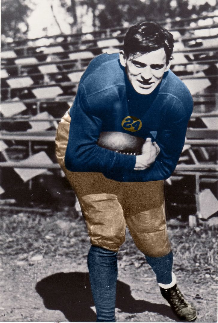
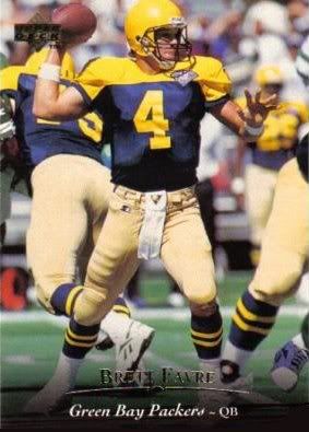
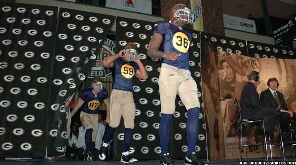
Last Friday, the Green Bay Packers unveiled a new alternate uniform based on what the Packers' first championship team wore in 1929. This is the first significant change the team has made to its duds since 1997, when the jerseys evolved to use a three-stripe pattern, instead of the five-stripe variety. Naturally, the uniforms come from the days of the Packers' navy and gold, but vary drastically from the late 30s model that the team wore in 1994 for the league's 75th anniversary. The Pack also trotted out in a 1939 throwback in 2001 and this 60s model in 2003 for Thanksgiving in Detroit. Here is a comprehensive look at the 2010 incarnation of the 1929 classics:
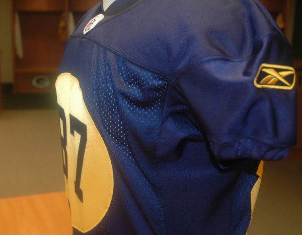
The Jersey: It's the most unique part of the design. Designed in navy and athletic gold, it features the front number in a circle, which was significantly enlarged to fit within today's standards. One of the jersey's benefits is that it is readable (which is not always a given). Overall, I'd give the jersey an A-.
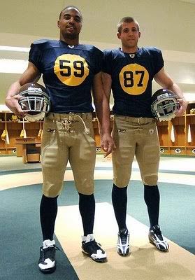
The Pants: Almost every time the Pack opt to wear throwbacks, they end up using some version of plain khaki pants. It works better on the 2010 version than it did in '94, when athletic gold pants would have made more sense. And considering historical accuracy was the goal, I'll give the pants a solid B.
The Helmet: This had to be the trickiest part of the design. Way back in '29, many players didn't even wear helmets, and those who did wore leather headgear. In '94, the team opted for a plain yellow dome, but in 2010 they went brown. Now I realize with the athletic gold on the jersey and the khaki pants, the brown seems out of place, but once again the goal was matching the pieces to history, not matching the pieces to each other. I kind of like the brown helmets, but couldn't they have tried out a khaki or brown facemask? The grey doesn't seem to fit. I get the use of a grey mask as a tool to make the uniform look older, but the era they are working with is so old that facemasks weren't even around yet. Brown would have tied the mask to the helmet, but it might look weird with the rest of the set. Khaki, however, would create the aged effect that grey offers, and it would tie the helmet to the pants, bringing the whole uniform together. Overall, the helmet is a B-.
When looking at the uniforms as a whole, I think the effort the Packers' brass put into making the uniform was as accurate to the 1929 version as it could be was impeccable. Although the uniform isn't perfect (and, really, there is no way it could be and conform to today's standards), it is pretty well done. I give it a B+.
Today's design section features a re-branding concept for the Portland Trailblazers. The current Blazers logo can be seen here. My design brings the Blazers' identity back to a point in which the visual brand corresponds with the team's name. Working with an Oregon Trail theme, I developed ox-and-wagon primary and secondary logos. The colors (black, red-orange, and vegas gold) give the Portland franchise a scheme that is unique to the NBA and cohesive with the frontier style of the logo package. The type is also in the frontier style, giving the viewer a sense of the time period of the Oregon Trail. The tertiary logo is modified from the current logo set, to tie the eras of the Oregon Trail and Blazers' basketball together.
 The uniforms share some similarities with the Blazers' current scheme, but the striping across the jersey now goes up to the player's left instead of down. The striping in the concept also avoids the abrupt ending that the current uniform striping is subject to. The secondary logo appears above the name-on-back, while the tertiary logo appears on the left leg of the shorts.

 Feel free to leave a comment regarding the Packers' new alternate uniform, the design above, or anything sports branding related.
No comments:
Post a Comment