
By Bowen Hobbs
In June, I wrote about the looming conundrum the NCAA will face. With the Big Ten soon having 12 teams and the Big XII soon having 10 teams, the names "Big Ten" and "Big XII" will be misnomers by the start of the 2011–12 academic year. Speaking of academics, you would think the NCAA would want to teach their youngest viewers how to count correctly. But no, tradition trumps common sense.
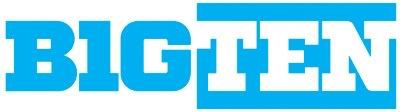
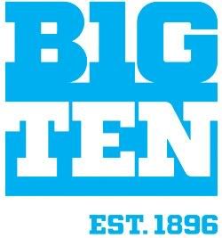
On to the logo package. (For the sake of critique, I will ignore the fact that "Big Ten" doesn't accurately describe the conference, unless the conference brass is making fun of Northwestern and Indiana behind everyone's backs.) The shade of blue used is quite bright, modern, and quite frankly, not befitting of a conference hanging on to tradition like it's the last barrel of oil in a post-apocalyptic world. (It's about as fitting as Brittney Spears performing the Super Bowl halftime show… in 2011.) The typeface is very nice, however. It appears to be a custom slab serif, and the IG in "BIG" doubles as a 10. In addition, the conference unveiled numerous alternate marks to round out the identity package.
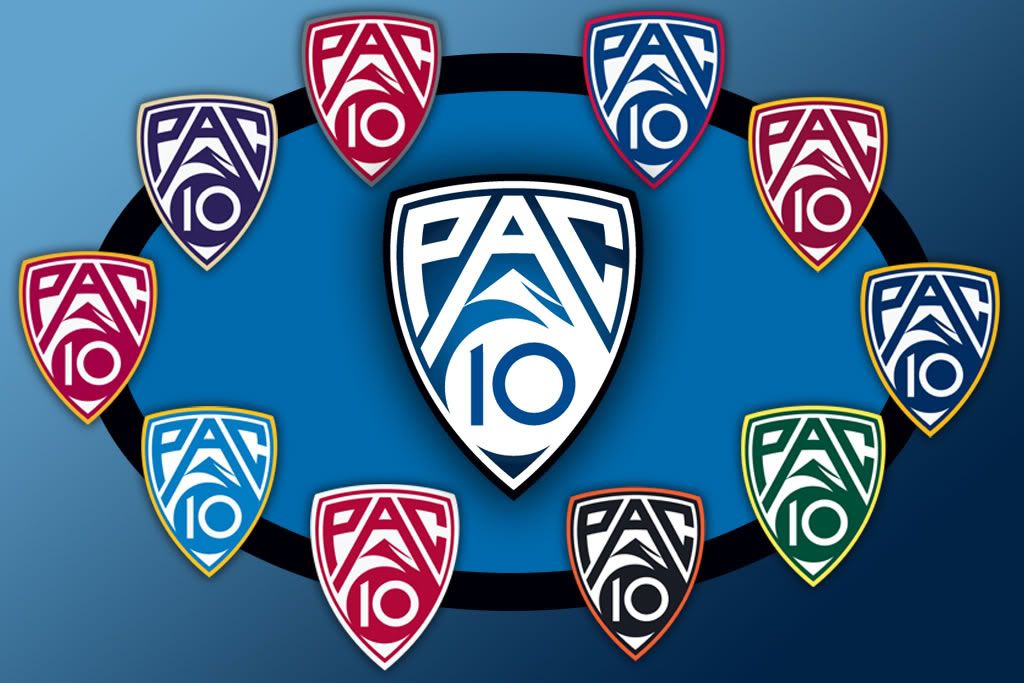
There isn't too much to the logos (like, say, the Pac-10 logo), but there doesn't need to be. Whereas the Pac-10 instantly conjures up ideas of the Pacific Coast, and by extension, the mountainous areas that surround it, the Big Ten doesn't have a defining geologic symbol (aside from the Great Lakes, but the time for naming the conference after 2% of the world's fresh water has past). Penn State is in Central Pennsylvania, Appalachian Country, while Northwestern is in urban Chicagoland and Nebraska is in the plains. With a topographic symbol out of the picture, the conference only had two options: 1) a text-based logo, which they went with, or 2) artificially creating a symbol for a league best known for the teams within it and now the mismatching numbers game they have played over the past 20 years or so. Since the designers who developed the logo package had no say over the name, they did what they could. And to be honest, they did a great job with what they had to work with, which wasn't much. Don't believe me? Just look at the SEC logo.
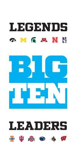
An aside: If you didn't think calling a 12-team conference was bad enough, get a load of the division names: Legends and Leaders? Really? Just another reason why an East (Michigan, Michigan St, Ohio St, Penn St, Indiana, Purdue) – West (Wisconsin, Minnesota, Nebraska, Iowa, Illinois, Northwestern) format would have been superior.
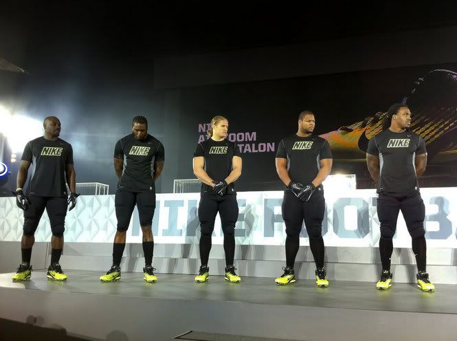
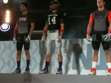
Dear Nike, What's So Special About These?
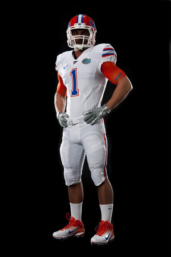
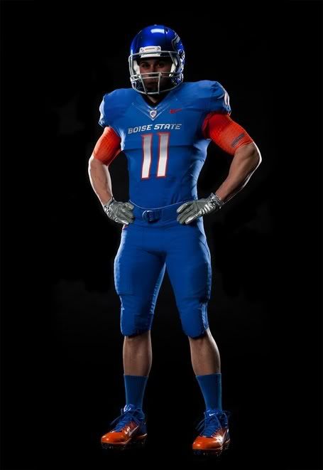
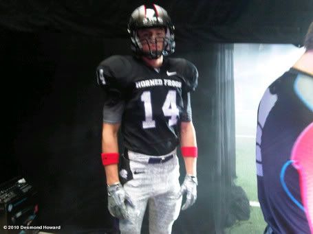
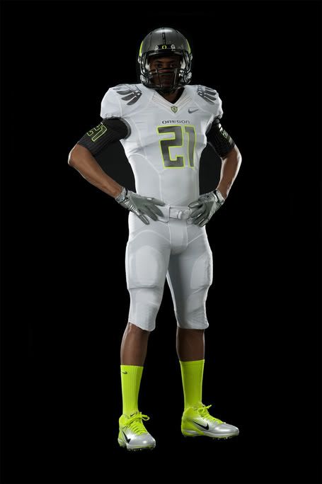
Nike unveiled "special" bowl game uniforms for Oregon, Florida, Boise State, and TCU. Overall, these uniforms look like either re-hashings of the teams' Pro Combat sets or a mix of traditional and Pro Combat elements. The annoying stitching from the 2009 Pro Combats has moved to the collar. Oregon is pairing their carbon helmet with white jerseys and pants. To top it off, the Ducks will wear highlighter-colored socks and shoes. There has been speculation of the Ducks wearing black pants instead of white, stemming from this photo. I guess we'll have to wait to see. Florida's set pairs the Gators' Pro Combat helmet with a Pro Combat-templated version of the teams standard all-white set. Boise State is also re-using their Pro Combat helmet, but with surprisingly plain uniforms. TCU abandoned all traces of their signature color, purple (except for the socks), for a black, silver frog skin, and red ensemble that is also rather plain by comparison. For Nike, this is playing it safe, although the gratuitous use of black, silver, and carbon remain.
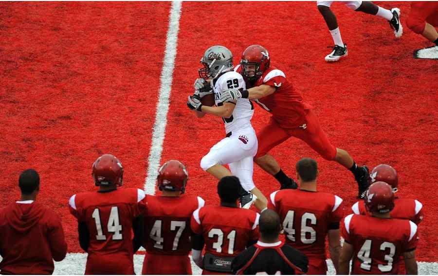
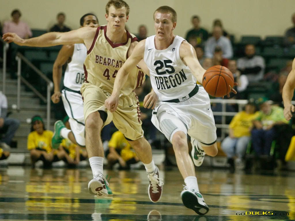
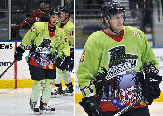
In Other News… The Redskins managed to have only two styles of striping on Sunday against the Buccaneers… It's been a while since I've seen the Rams with gold pants on the road… The Cardinals looked awfully cardinal against the Broncos… The Texans were seeing red as well… Remember Eastern Washington's red field? Here's how it looks with players on it… The Oregon Ducks basketball team wore throwbacks Friday night… The Meineke Car Care Bowl will be the Belk Bowl starting next season… Navy wore the football equivalent of their dress uniforms Saturday… That's one way to celebrate the holidays…
Designer's Corner
This week, we look at the Maryland Terrapins. The Terps current uniforms, while not necessarily terrible, have flaws. The jerseys and pants feature black accents and black and yellow piping on a template that isn't that bad. The real problem is the helmets. The modern style of the jerseys and pants in no way whatsoever match the very classic styling of the rectilinear helmet stripes and "Terps" script. If the team wants to keep the über-modern uniforms, then they should change their helmet. If they want to keep the classic-style helmet, they should alter the rest of their uniforms to match.
My concept reconciles the discord by integrating modern and classic elements throughout the set. I kept the M logo and Testudo in tact. In addition, I developed a Maryland script to match the typography of the M logo. I also replaced the standard block numerals with the school's proprietary typeface. The uniforms feature mix-and-match combinations galore (I've only shown six combinations, but more can be used), with three of everything: helmets, jerseys, and pants in red, white, and black. The helmet and pant striping feature a thin alternating black and yellow stripe that mimics the Maryland flag with two thick red stripes flanking it. The thin alternating stripe is worked onto the jerseys as well, outlining the shoulder yoke, which is always red. The jerseys also pay homage to the other half of the state flag with the red and white cross pattern appearing on the collar. The red helmets feature a slightly different finish than the white and black helmets, as they use a metallic shine to avoid looking too much like the Kansas City Chiefs. The black jerseys deviate from the standard, as they have yellow numbers on the chest and back. It's not that black and white doesn't work as a color combination, it just doesn't work as well as the black and yellow in this situation, as the black and yellow represent the other half of the Maryland flag and complement the primarily red and white home and away jerseys. The overall look gives Maryland football a distinct, consistent look.


Feel free to leave a comment on the new Big Ten identity, the "special" Nike bowl game uniforms, the Maryland concept above or anything sports branding related.
Love your Maryland jersey concepts, especially now that the Terrapins will be heading to the Big TEN, as of July 1, 2014. But I was hoping to see the rest of your concept's jersey combinations. If you like, I can help you on some, and if you let me. Keep it up!
ReplyDelete