Wednesday, February 23, 2011

Quite Possibly The Coolest Hockey Uniform Ever


By Bowen Hobbs

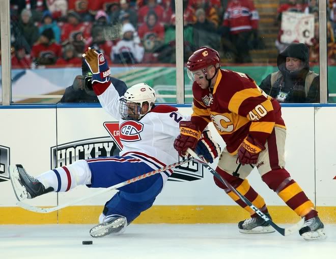
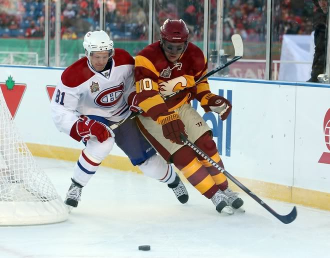
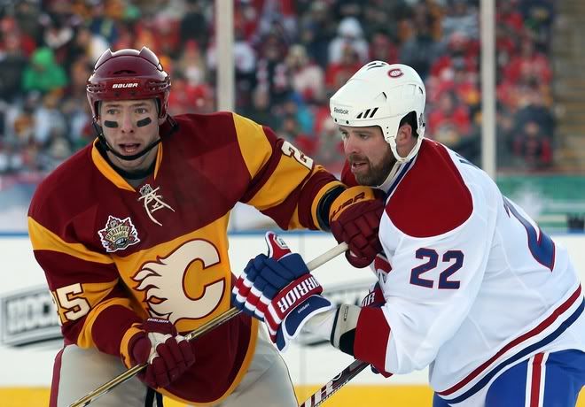
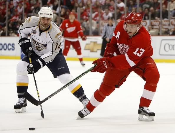
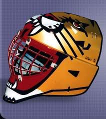
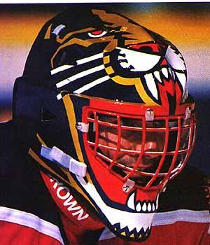
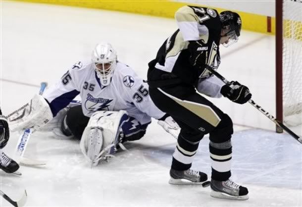
On Sunday, Canada had their version of the Winter Classic: the Heritage Classic. The Montréal Canadiens were in Calgary to play the Flames. Both teams wore throwback inspired uniforms, with the Habs wearing a design a throwback to their mid-70s-to-mid-90s look (the only difference being the outline on the numbers). Calgary, on the other hand, based their uniforms on the Calgary Tigers of the Western Canada Hockey League. The striping is from the Tigers, but is paired with a deeper red and the Flames' athletic gold. In fact, their were quite a few nifty design nuances on the Flames' 2011 Heritage Classic uniforms:

The Stripes
The striping pattern looked great on TV. It was unique, classic, and cool all at the same time. It's a wonder more teams haven't considered bold striping pattern during the Fauxback Era of NHL uniforms. Although some have said the stripes are Ronald McDonald-esque, I didn't find it distracting at all, not to mention Ronald's getup is mostly yellow with sections of red and white striping, not mostly deep red with red and yellow striping. The use of this bold pattern was continued on the socks, which really showed a completeness of the design when everything was worn together.

Lace-Up Collars
The uniforms, like many fauxbacks, use the lace-up style of collar. I'm all for lace-up collars, and this fauxback definitely fit in with the style of them.

A Darker Red
Yes, the red was darker than the Flames' standard red. And the slight hue change looked pretty good, especially considering that red was the darkest color in the entire scheme, instead of black, which the team uses on their standard uniforms. More importantly, the beige numbers were plenty legible against the red and yellow background on the chest-striped sweater.

Beige Breezers
I thought this was particularly interesting because there really aren't any teams that use light breezers. The closest examples I could find were the Rangers and Blue Jackets wearing red breezers with royal or navy jerseys. Not a single teams wears white, silver, metallic gold, athletic gold, or even orange breezers, and then Calgary opts for beige. Although not a modern convention, it worked very well within the context and feel of the uniform.

All in all, I think Calgary's Heritage Classic uniforms were a huge success. The design took some chances, but each decision was made well and the uniforms had a great aesthetic.

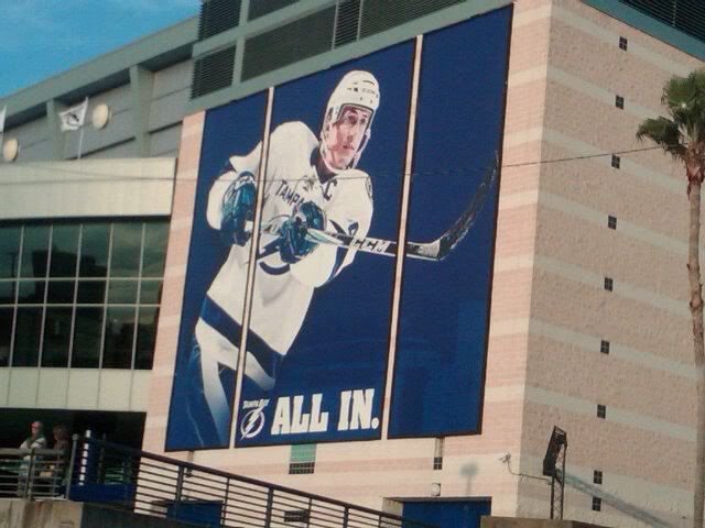
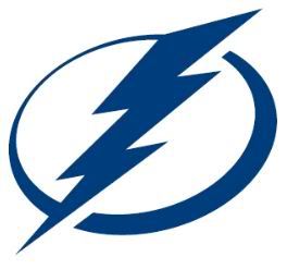
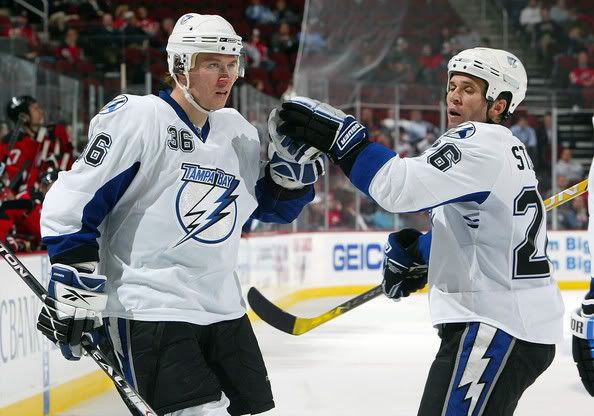
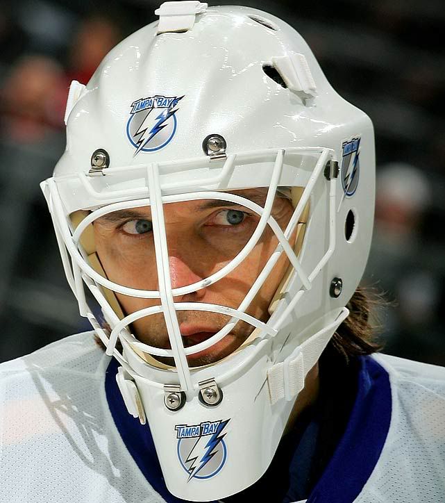
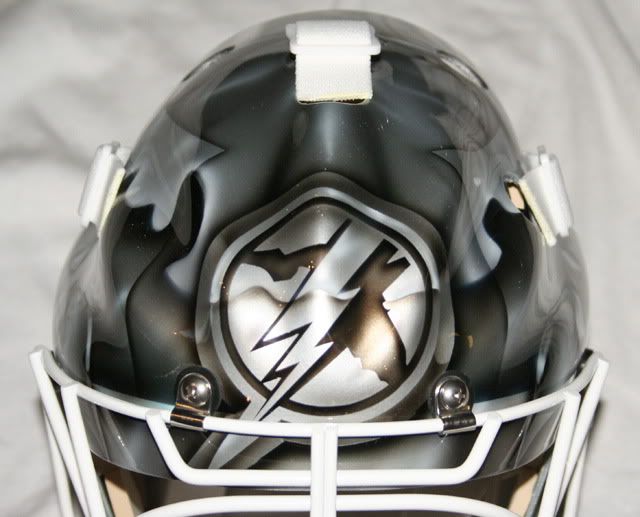
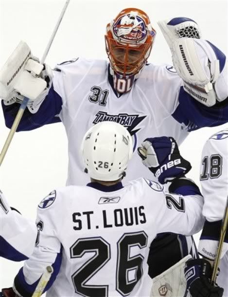
When It Lightnings, It Pours
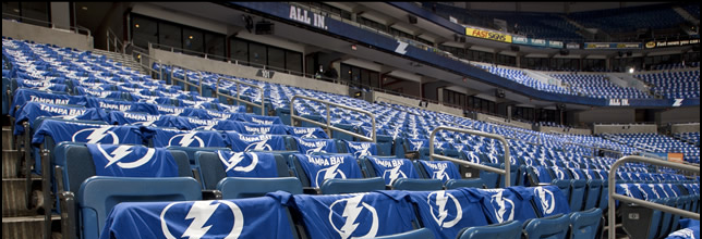
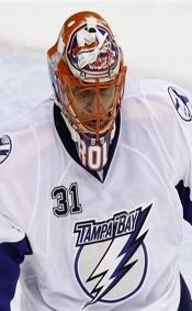
Yup, the Lightning have already made changes to their new uniforms. The have added black trim around the numbers and lightning bolts on the pants. Good ideas, sure, but the execution isn't quite there. The jersey crest and striping has no outlines, while the lightning bolts on the pants have a single outline and the numbers are double outlined. This apparently had to do with fan response, which I'm glad the team executives were savvy enough to take into account. The double outline on the numbers seems the most unnecessary because a single outline would have accomplished what the fans wanted (an added color) while maintaining some semblance on consistency with the treatment of the bolts on the pants.
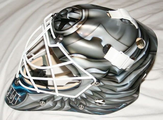
Designer's Corner
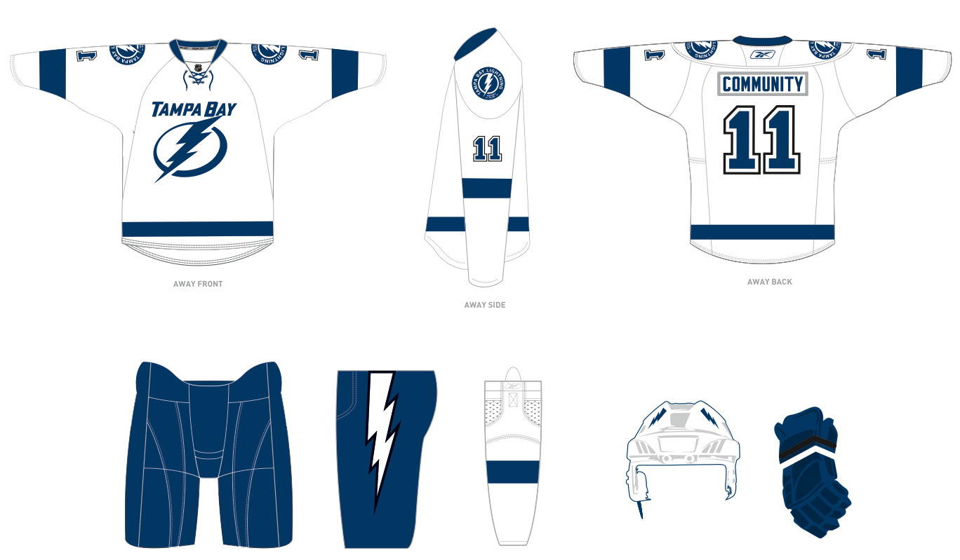
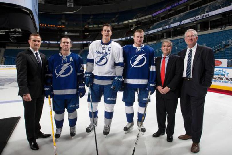
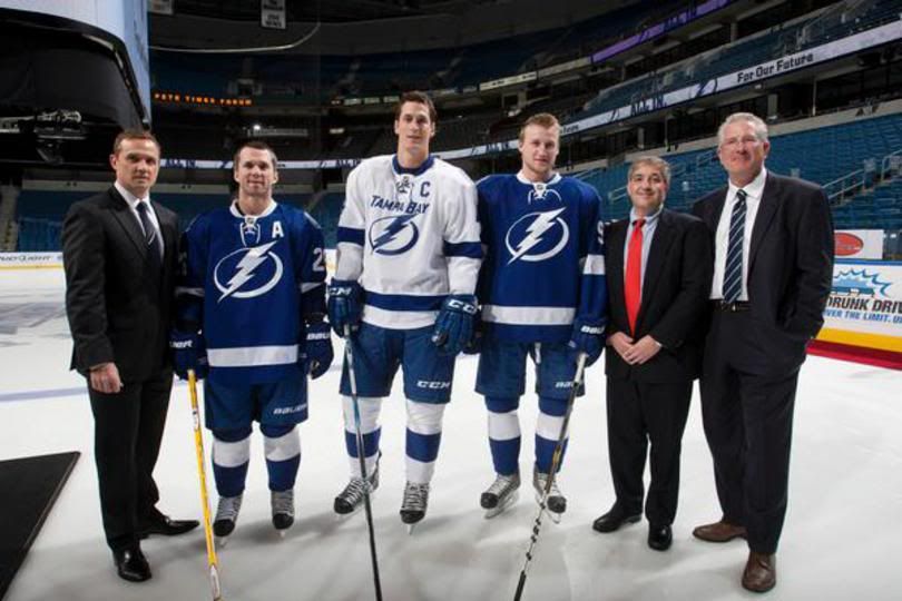
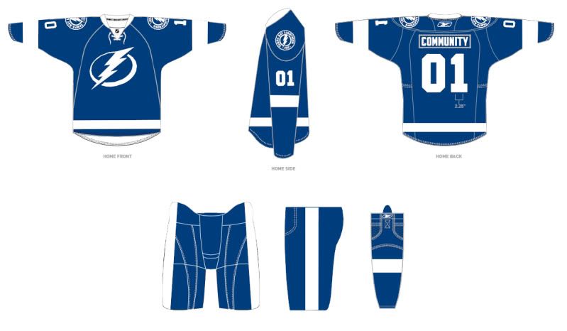
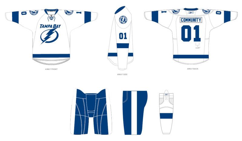
Yup. When it lightnings, it really does pour. This week's design is for the one and only Tampa Bay Lightning. When the Lightning unveiled their new duds, I was bothered by a few of the set's elements, from the two-color scheme that immediately evoked thoughts of the Leafs to the lack a certain signature elements such as the lightning bolts on the breezers and "Victory Stripes". While the lightning bolts are back and the numbers have been altered to showcase a double-outline, the set still leaves a lot to be desired.

My concept uses some of the aspects from the current (upcoming) scheme, yet incorporates some newer elements. I wanted to keep the idea of simplicity, but I also knew that I had to create a look that was uniquely Tampa Bay. This means I couldn't use just royal and white, since it is too similar to Toronto. It also meant I shouldn't add yellow due to the similarities such a combination would have with St. Louis. Ultimately, I decided on royal and silver. On the home uniforms, I used the Michigan Wolverines/Oakland Raiders treatment: no white. This allows for the team's signature look, the home uniform, to be just that: signature. The primary logo is based on the sleeve patch the team plans to wear next season. The numbers are the current (soon to be previous) version, except without the outlines. The secondary logos and wordmarks are new.

The home uniforms use just royal and silver and retain some of the design decisions from the upcoming uniforms. I broad single stripe is placed across the sleeves, hem and socks. However, the breezers have the team's trademark bolts, while the jerseys retain the classic "Victory Stripes" although I moved them down from the armpit to the side. The concept is still the same: the stripes show when a player is raising his arms to celebrate a goal or a win. This just removes the slight ridiculousness of placing a design element in the armpits. The away uniforms use the two-color logo with silver and blue being present. However, aside from that and the bolts on the breezers, the uniforms are exclusively blue and white. And for those who like the Lightning in black and blue, the third combines those two colors (with white) in a traditional way and features a new BOLTS wordmark that is consistent with the identity, unlike the current third.


Feel free to leave a comment regarding the 2011 Heritage Classic, the Lightning concept above, a=or anything sports branding related.

Tuesday, February 15, 2011

Looks Like We Have Our First New NFL Uniform of the Season (If We Have One).

By Bowen Hobbs

The Bills announced to season-ticket holders on the 9th that they would be wearing new uniforms for the coming season, whenever that will be. The uniforms will incorporate the current logo with elements from the team's past. Supposedly, they are going to be based on these uniforms, but with some navy blue trim added in. It seems intriguing, but certain questions remain unanswered. For example, how will the navy blue be added in? Will it be just around the edges like the Lions did with their black trim, or around each stripe? Will the team use the 90s era number typeface? Or a standard block typeface? What color will the facemask be? Grey? Navy? Royal? Will they use the striped socks? Of course there is more to come as details emerge…

I, for one, think a look based on those uniforms would suit Buffalo quite well. Much like Green Bay or Cleveland, football in Buffalo in winter has a certain charm with old school uniforms involved. While I prefer create some very modern concepts, I can understand when a concept incorporates classic elements as part of the design moving forward. But there are certain things the team will have to be sure of before they unveil the new duds.

• Do the sleeve stripes fit on the sleeves, across all players? This is important, because the team will undoubtedly have players of various sizes from defensive backs and kickers to lineman. The stripes can't be too wide because they will get cut off on certain players. Or too low for that matter.

• Is the striping consistent? Well, there is some leeway here. While I appreciate the consistency of the newest Detroit Lions uniform striping, I also don't mind the consistency of a well applied striping system such as that of the Green Bay Packers, in which two sets of stripes fill very distinct roles. Those Packers uniforms would be even better with striped socks though… but I digress. It gets tricky when each element is striped, but none of the patterns match.

• Grey facemask or blue? Well this one is more up for debate, but the team's choices in number font and how the navy is applied will determine whether they should go with a grey or navy mask. While I generally do not prefer the use of a grey mask with a color scheme that doesn't include grey, it can be useful in promoting a classic look. If the uniform numbers have multiple outlines, I'd say navy or royaal facemask, but if they opt for stark typography, then all bets are off.

Not Your Traditional Marketing Strategy
The Lightning have already started phasing their marketing materials over to the new brand, which was bound to happen since they unveiled the new uniforms in the middle of the season. The website has changed over. And there are some new environmental graphics around the arena. And to get the fans ready, they gave authentic home blue jerseys to their season ticket holders and t-shirts to some of the other fans. I understand getting everyone in the team's blue to create a more better fan experience.

But painting the new logo on center ice just looks weird. It crosses the television line: the boundry of experience between watching a game in person and on TV. It's one thing to watch a game and see the whole crowd wearing the new t-shirts and jerseys, since the mob of the crowd would just blend together and create a (mostly) blue field. In addition, the signage and website changes can advertise the new brand while not interfering the presentation of pro sports' most lucrative product: televised events. While ticket and merchandise sales do account for a hefty sum themselves, the television contracts get money from numerous sponsors and allow fans to view many more games than most of them are able to attend. Painting the new logo on center ice while the team is wearing the old uniforms interferes with the seamless ideal fans have in their heads when they are watching a game. On a more general note, the whole timing of the event was really awkward. Unveiling the new brand during the last homestand would have made much more sense, especially as a thank you to the fans before the offseason or playoffs.

Designer's Corner
This week's design is for the University of Cincinnati. The Bearcats have had a fairly modern identity since their affiliation with Jordan Brand in the 90s. Currently, their football team is getting more attention, but the team's uniforms lack finesse. The slashes on the pants do not flow and look gaudy. For this concept, I wanted to incorporate the slash theme in a way that it would make sense throughout the logos and uniforms. The slashes were incorporated into the logo set horizontally to flow across the typography, while also not disrupting the team's trademark C-Claw logo. The uniforms incorporate the slashes down the sides of the jerseys and pants. The more graphic presentation of the slashes creates more impact as it helps the eye flow throughout the uniform. . I also decided to incorporate charcoal grey. Cincinnati is a fairly new football school, especially when it comes to playing in a "power" conference. So while their are other teams with black and red, charcoal grey is a unique shade that has yet to be paired with red on the college football landscape. (Nike has used "carbon" or charocal with yellow for Oregon and West Virginia.) The sleeve are black on all jerseys, creating a consistent presentation of black across the uniforms. There are also options for white helmets and pants, in addition to the grey.


Feel free to comment on the Bills upcoming new uniforms, the Lightning's brand strategy, the concept above, or anything to do with sports branding.

Tuesday, February 1, 2011

For Everyone Who Wanted to Buy A Leafs Jersey, But Hated the Leafs


By Bowen Hobbs

After multiple delays in the unveiling of their new brand, as well as the fact that teams don't generally unveil new branding initiatives during the season. The new 2011-12 Tampa Bay Lightning brand is here. And quite frankly, one word pretty much covers it: meh.

The team's current (soon to be former) primary logo wasn't perfect. In fact, some would say it was over-stylized. The wordmark is unnecessary, and it contained four colors, which may be a lot for traditionalists although many modern designs use that many colors. The alternate logo really wasn't any better. The saying I like to use to describe it is that "it looks like 10 lbs. of design crammed into a 5-lb. bag". The new logo set, however is a stark contrast. The new primary logo features a lightning bolt against a stylized oval. The team's brass wanted iconic. And if this design existed in a vacuum, it would be. But, unfortunately, they couldn't agree on a single icon. The alternate logo adds a wordmark, and the shoulder patch uses a different lightning bolt/holding shape combination. Once again, the primary logo is strong on its own, but some consistency throughout the set would be ideal.

But before we get into the rest of the logo set, let's talk about the elephant in the room: the color scheme. I realize there are teams with the same colors in multiple leagues. Look no further than MLB, for example. How many teams wear navy and red? Too many. And in the NBA, the Nuggets, Mavericks, Grizzlies, and Thunder all wear two shades of blue. The NFL isn't immune either, as the Cardinals and Falcons have their similarities, and Carolina's alternate uniforms look a lot like the Lions' homes. But this goes too far. The Leafs have been a beacon of royal and white in hockey since the NHL since 1927. They have also featured a simple hem striping scheme for a number of years. Then Tampa Bay comes in having only been a team for less than 20 years, and plays a game of copycat? Really?!? I thought the point of branding was to create your own identity, not piggyback off of someone else's.

And the Lightning had a unique color scheme. No one else had black and blue. Once again, I'm not saying it was the best, but it was unique. Even if the new brass (which includes Stevie Y, hence the minimalist influence) didn't want to use black and blue, how about royal and silver? Replace all the white on the home jersey and some of the white on the away jerseys, and you have a unique set of uniforms in the context of the NHL.

Back to the primary logo: while it isn't terrible, I think the circle and bolt from the tertiary would create a stronger mark with a better tie-in to the Lightning's past. In fact, putting the text and circle around that symbol was the worst thing they probably could have done for it, as it looks like they were taking design tips from the Omaha Storm Chasers. Furthermore, the generic typeface goes past understated (which can be achieved with the correct typeface) into the world of boring, generic, and default. Not to mention the generic typeface doesn't match the typeface of…

The secondary is a joke. I think everyone who watches hockey is going to know who the Maple Leaf wannabes are. And those who don't follow hockey will probably just assume it's Toronto they're seeing. They could have created a TB logo, but they decided not to.

As for the uniforms, they use the same single broad stripe pattern as the Red Wings' home uniforms, although the pattern is pretty common overall. And you'd think they would look for a more original design considering the Leafs use a double stripe that is positioned in the same classic hockey pattern. Here are the graphic layouts of home and road for the new Bolts set. As you can see on the layouts, in addition to using two different typefaces on the logo set, the numbers are a third typeface, and it's standard block (the Arial of jersey numbers). In addition, they traded in the one of two original things from their previous uniforms for the generic version on their breezers. They also ditched the victory stripes (look at the armpit of the guy on the right of the previous linked photo).

As I've hinted at, one of the biggest concerns with this set is context. The aesthetic of the new brand is so strikingly Leafs, it can't go without saying. And of course it follows the recent onslaught of blue jerseys with lace-up collars, despite an oval-shaped crest being used instead of a roundel. The new set clearly states, "We're individuals, just like everybody else."

The other huge issue is based on direction. Obviously the team tried very hard to incorporate classic elements into the scheme. Things like a one-color (plus white) scheme, lace-up collar, and round alternate logo all evoke ideas of classic hockey. Then why is the primary logo so starkly modern? And why is the typeface on the "secondary" italicized and stylized? But those two questions are unimportant compareed to the next one: What is so classic about playing a winter sport that needs ice in the middle of Florida? It's not like an expansion team ended up in Milwaukee, where a traditional style could evoke a Winter Classic-like atmosphere. It's Tampa, where sunshine is in abundance. But even that issue could be worked around if the presentation of the brand were more consistently traditional. Instead, they only went halfway and that just isn't enough to make me forget that it's a hockey team in Florida.

In Other News… The Oklahoma Sooners will have new baseball uniforms in 2011… New logo for the Ryder Cup… If you design a logo for it, they will come… It's Hardwood Classics month in the NBA, complete with throwback uniforms for the Bucks, Kings, Knicks, Celtics and Warriors. The Warriors jersey even has a memorial patch for Franklin Mieuli… Thanks Tiki Barber, for teaching me what the Green Bay Packers G stands for… The Los Angeles Angels of Anaheim will have "Flashback Fridays" this season for their 50th Anniversary… The Lakers wore throwbacks Sunday against the Celtics… The Oakland finally unveiled their poorly kept secret: athletic gold jerseys… The Mariners will have a memorial patch for broadcaster Dave Niehaus this season… The Padres finally released the look of their road uniforms for 2011. Needless to say, they removed all traces of originality…

Designer's Corner
This week's design is for the Virginia Tech Hokies. The Hokies' current logo features a stylized VT. I took that idea and added a distinction between the two letters. I also included a segmented gradiation to emphasize the speed that VT displays on the field. Using the proportions of the primary mark, I developed a wordmark for the school, as well as custom numbers. For the uniforms, I drew a lot of inspiration from the Hokies' 2010 Pro Combat uniforms. I really like the way the shoulders were cropped on those jerseys. However, I did not care for the use of black because VT has one of the most unique color combinations in all of sports. The jersey accents fade as they approach the collar, while the accents on the pants fade as they reach the waist. I have also included options for orange jerseys, white and maroon helmets, and all three colors of pants.


Feel free to leave a comment regarding the new Tampa Bay Lightning brand, the Virginia Tech design above, or anything sports branding related.

Tuesday, January 25, 2011

Major League Miscues


By Bowen Hobbs

Washington Natinals? Yes, on April 17, 2009, Ryan Zimmerman and Adam Dunn (pictured) were Natinals, thanks to a typo on their jerseys. It ended up being a pretty big story, with the Nationals being the butt of quite a few jokes. But they weren't the only ones to have committed such an offense.

Within the last week, the Wizards have had two noticeable uniform oddities. On Saturday night Washington called up Mustafa Shakur from the D-League, and didn't have much time to get a jersey ready for him. So his front number was very curiously spaced and his name and back number were far too low. Not to mention his name wasn't arched very smoothly. This uniform miscue is particularly odd because of everything that went wrong on one jersey. But Shakur wasn't the only Wizard with uniform issues. Just two days later big man Kevin Seraphin was seen on the court with his shorts on backwards, which looked especially weird because the Wizards only have a swoosh on one side of their uniforms. There's no way he could have pulled it off. With a more symmetrical uniform design, he may have had a shot.

In hockey, Rob Niedermayer skated around for three games with his name spelled wrong. Jeff Francoeur of the Royals had his E and U reversed for a game when he was with the Braves. The Rockies haven't been perfect either. And Kevin Williams had his A and I swapped. Danny Jennings of West Virginia had his double-N in the wrong spot this season as well. Also in the college ranks, Shane Southwell had some mixed up lettering on his nameplate. And last season Zaza Pachulia, whose name is relatively easy to spell, had this mutation of his last name. But how does someone screw up the name of a sports legend? Just ask Wayne Gretkzy.

There's also another common type of miscue: the team/city name typo. While screwing up an athlete's last name is a mistake, it is generally not as bad since it's usually just one player, and in some cases, the names are difficult in the first place. But team/city miscues are worse because whoever is doing quality control should know how to spell the single word they see on an entire group of jerseys. Also, team name typos usually occur at the manufacturer, while individual player names are sewn on by an independently contracted seamster or seamstress. Large manufacturers should have more levels of quality control. The Natinals debacle falls squarely in the team/city typo category. Joe Carter had to wear a classic example of a team/city typo once. Last year, Nike misspelled Kentucky on John Wall's jersey. Luckily the jersey was only used for a photo shoot. And Eugenio Velez spent a brief one game stint in San Francicso, which isn't far from Minnestoa. And once upon a time in Anaheim (as opposed to Los Angeles of Anaheim), there was a team called the Angees. And women's sports aren't immune to miscues either, as seen in this picture from the fine city of Milaukee.

Yet some miscues fail to fall into either category. For example, the stitcher for the Washington Redskins was channeling the bus when lettering Ladell Betts's jersey. I'm not sure how a backwards letter doesn't jump out at someone. This one's nitpicky, but here goes. Do you see it? Look at this jersey for comparison. Still not seeing it? The number font for #30 is MLB Block, while A-Rod's jersey has the correct block number font. Shakur's isn't necessarily a typo, it's just extermely poor craftsmanship. However, in my research, I cam across this gem of a miscue. That's Ted Kluszewski, although you'd never know it from the backward Z and X for a K. Two typos in one name? Epic typo.

But the most celebrated typo in jersey history is the one that happened twice. Mike Alstott had a typo on his jersey his rookie year. It was a standard last name miscue. But the Buccaneers, decided to honor Alstott by putting the miscue on a jersey plaque for a retirement gift. Congratulations Mike Alsott. Your hard work and dedication will be remembered.

Jersey typos are a part of life. With the proliferation of alternate jerseys and expansions teams, there are more jerseys to manufacture and then personalize. Plus, the typos add an extra little nuance to games and remind us that it is, after all, just a game.

In Other News… The Cavs wore their 2010-11 CavFanatic uniforms over the weekend… UW Green Bay unveiled throwbacks based on this design. The black swoosh looks a little ridiculous; it should have been red… The San Diego Padres just unveiled their new military alternate uniforms… Speaking of the Padres, their former Triple-A affiliate (Portland Beavers) were forced from their home by the MLS's Portland Timbers, an expansion franchise. They have moved to Tuscon, at least temporarily, and they have a new logo. Ladies and gentlemen, the Tuscon Padres… Chad Ochocinco is no more. He's going back to Chad Johnson

Designer's Corner
Sticking in the SEC, this week's design is for the Auburn Tigers, National Champions. Auburn has a lot of tradition, so I didn't want to deviate too much from their current scheme. However, Their striping is painfully inconsistent, and the jersey stripes are named after another school (they are called Northwestern Stripes). More on that later. I tweaked the proportions of Auburn's primary logo and added a serif to the top of the A. I used the proportions of the A to develop the two wordmarks. I also have a tiger-striped version of the primary logo as an alternate option.

Back to the uniforms: I made the striping consistent across all backgrounds (white–navy–tiger–navy–white). On white the outer stripes bleed directly into the background, which was a better option than swapping the navy and white, like the team currently does. This is because of the tiger-striped patter nin the stripes, which I find helpful in enhancing the tiger motif. The player names on the backs of the jerseys are rendered in the different color from the numbers to provide less contrast. This places more emphasis on the numbers and less on the names, which aren't truly necessary information. I added options for navy pants and orange jerseys as well. The fauxbacks combine two eras of Auburn football with the four-striped sleeves and the smaller front numbers. I also wanted to replicate the feeling of leather helmets and the tan pants seen on many old-school uniforms, but I didn't want to replicate the Packers and mismatch the helmet and pants. So I split the difference and used a hue that is roughly half way between the khaki and brown the Packers used. I think it works very well with the navy and orange.

Tuesday, January 18, 2011

44th & Goalie: The Mask In Front of the Man


By Bowen Hobbs

To start 2011, the Tampa Bay Lightning acquired Dwayne Roloson from the New York Islanders via a trade. During his first game, Roloson had that "just traded" look on his face. But it wasn't in his eyes, it was literally sitting on his face. While the team had issued him a new jersey and new breezers, Roloson's mask and pads were hold overs from the 2010 he spent in New York.

This is a fairly common phenomenon among the brethren of recently traded goaltenders. A recently acquired netminder has to wait a while for his custom equipment to not only be made, but broken in as well. And don't be fooled. Goalies are particular about their equipment. A poorly fitting mask can be incredibly frustrating, especially during a bad game. And while I don't usually talk about equipment in these postings, the goalie mask is more than that. It's unique and artistic. A goalie mask design can be team-based or personal. It provides an artistic expression that isn't generally seen in-game in the other major sports. It can incorporate vibrant illustration or crisp eye-catching graphics.

That said, there are some truly memorable masks that I remember. Chris Osgood and Dominik Hasek went old school. Patrick Roy featured an illustrative version of an avalanche. Bu the most memorable mask always belonged to John Vanbiesbrouck. The panther's head from the team logo dominated the shell, with the teeth cropping the the full cage from which The Beezer saw. That mask had it all: crisp graphics and a revolutionary concept.

Back to Roloson: he eventually got a plain white mask, which he used until his new mask came in. I have to say, it's pretty cool. The steely wings are rendered beautifully and the one-color redux of the Lightning's alternate logo is spectacular. But Roloson isn't the only goalie with a great mask. In fact, there are a number of masks with enticing graphics and great references this year. One of Devan Dubnyk masks features a cartoon giraffe on the back, while Martin Brodeur still rocks his signature red and white flames. Thomas Vokoun's headgear shows off a leaping panther that would look at home within the team's logo set. Curtis McElhinney's goes for intimidation with his scary skeleton zombie duck, while Anaheim's other goalie, Jonas Hiller, opts for the minimalist approach. But the best mask of the year has to be Kari Lehtonen's. I'm obligated to say this, of course, as the consequences for not doing so include a vicious roundhouse to the head. But in all seriousness, what goalie wouldn't want to wear a mask with Chuck Norris on it.

Cristobal Huet featured a wraparound design that mimics a Native American headdress last season. And Niklas Backstrom accented the natural shape of of his mask by added a paw clawing through it in the 2009-10 season. Robert Luongo has a strong history of good mask designs. He has played with multiple elements of the Canucks identity, including the team's classic V pattern, the rink logo, and even Johnny Canuck. Luongo's Olympic mask played on the lumberjack idea with an illustrated lumberjack. I am a big fan of the subtle aged texture Luongo incorporates as some of the backgrounds on his headgear.

In Other News… The Jets broke out their seldom-seen green pants again, but with their white jerseys against the Pats… Looks like Eastern Washington's red field is catching one with one Texas high school… Possible new uniform for Purdue football next year. Is it permanent, or a one-and-done? We'll find out… Memphis and Atlanta wore colored uniforms at home on Monday… Oregon's court doesn't look as good in game action… Indiana is thinking of changing its school colors away from crimson and cream, but they wear crimson and white as it is, and were wearing red and white during the Bobby Knight era… The Cubs unveiled the memorial patch for Ron Santo… Air Force Academy has some pretty cool new hockey uniforms, although the wordmark on the front hem could be better… The Kings throwback uniforms look pretty cool, although the striping doesn't all match and that is a lot of purple…Pacers/Hawks ABA style uniforms? Well played Mesa ladies

Designer's Corner
This week's design stays in the college football world. I have always enjoyed the Tennessee Volunteers' color palette of bright orange and white. But the uniforms themselves are pretty basic. Furthermore, the helmet striping doesn't match the pant striping, while the jerseys have no stripes. (They tried matching the striping for one year in the early 2000s, but went back to their current/previous uniforms…) On the away uniforms the numbers have a black outline, while nothing else does. Needless to say, the Vols could use a lesson in consistency.

My concept draws inspiration one of my favorite parts of Tennessee football: their checkerboard endzones. More on that later. The logo set starts with the Vols' iconic T. In addition, black has been completely removed from the identity package (except for one set of number, but I'll get to that). The TENNESSEE and VOLS wordmark were developed from the proportions of the T logo, giving the type a uniquely Vols feel. The O in VOLS pays homage to the Tennessee flag. Back to the uniforms, I made use of the checkerboard pattern on the sleeves, as well as the pant and helmet stripes. In addition, a sublimated checkerboard pattern appears on the front and back numbers. (It's easier to see enlarged; just click on the image to do so.) I added orange pants, which are the primary option for the away uniforms in order to draw more distinction between the Vols and Texas. Since Tennessee has no third color, I decided to create two fauxback uniforms. The first is a nod to the 1947 team, complete with orange helmets and contrasting black belt. The second honors the 1971 team, which the Vols did in 2004. The throwbacks contain black because their aesthetic is based more accuracy, meaning certain details do not match because they didn't in the past. Items like facemasks and shoes were seen as equipment, and weren't designed in the multitude of colors they are now.


Feel free to leave a comment on goalie masks, the Tennessee Volunteers design above, or anything sports branding related. Thanks to all who have commented as well.

Tuesday, January 11, 2011

A Tale of Two Styles


By Bowen Hobbs

Monday night, Auburn played Oregon for the BCS National Championship. In addition being a clash of very successful football teams, it was a clash of two aesthetics: The über-modern and the classic. Oregon being the talk of the season uniform-wise, throwing away pretty much every convention of uniform design and still coming away with a great set. Auburn, however, is for the purists. Good ol' fashioned stripes on the helmet, sleeves, and pants and standard block numbers. And while a lot of people associate classic design with "better", but take a closer look at Oregon's threads. You might be surprised how well-designed they actually are.

Auburn

The Tigers stay true to their navy, white, and orange color palette throughout their unis, but their striping isn't as consistent. Their helmets start with a spaced triple stripe called a Northwestern stripe (a little hard to see with the black outer stripes, but this should work). And the jerseys continue with that trend. But then the pants have a pro stripe.

I personally think striping should be consistent throughout the uniform. Ohio State and Florida are good examples in college, and the Detroit Lions do a great job on striping consistency in the NFL. Ohio State and Florida both keep the striping consistently colored regardless of background. And yes, Florida's helmet fits, with the outer orange stripes blending into the orange helmet shell. Detroit opted to swap the blue center stripe for silver on a blue background. Even the Packers, despite their two separate striping patterns, consistently apply the styles, designating the pro stripe for the helmets and pants, which are always yellow, and their signature stripe for use on green and white backgrounds.

Back to Auburn: if they switch their pant stripe as has been rumored, then they will have good, consistent uniforms. Nothing flashy or spectacular, but solid.

Oregon

So much to talk about with the Ducks. Let's start with color palette: The Ducks colors are technically emerald green and yellow. But the palette has expanded recently, adding black, silver, and grey. Further to that end, the Ducks unveiled a "bowl game" uniform that used no green, tons of silver and highlighter yellow. Well, like TCU, the Ducks weren't wearing quite what people were expecting. They switched to flat black/charcoal pants with the pattern from the carbon helmets set into the Pro Combat stripe area.

Honestly, I know the highlighter yellow gets a lot of flack, but it doesn't bother me. It's a shade of yellow, and with the number of combinations they have worn this year, they should have a little wiggle room. And the carbon helmets looked pretty cool too. But would it have killed them to use some green? Did the compression undershirts and pants have to be black? They could have been green. The carbon inlay could have looked very nice next to green on the pants. But that's the only flaw I saw in them.The numbers looked good with the subtle texture. And the shoulder wings are a signature element that I hope never goes away. Even the numbers are growing on me. I would also like to see the carbon helmet texture integrated with green for a hybrid look. But overall, I am still a big fan of the generation of Ducks uniforms.

In Other News… Miami University (in Ohio) has interesting throwback helmets for the GoDaddy Bowl… The Colts' endzones finally got four stars for the AFC logo endzones, but the A is still the wrong font. Just in time for the season to end… The Tampa Bay Lightning recently acquired Dwayne Roloson. Can you guess who his old team is? Luckily, the equipment manager found him a temporary mask until he gets his custom one… TCU's men's basketball team wore some interesting throwbacks last week…

Designer's Corner
This week's design comes from the bayou. The Tulane Green Wave have one of the most unique color palettes in all of sports: forest green and sky blue. I mixed silver into the scheme. But their logo doesn't do the color scheme justice. I developed a new simplified mark and custom typography. For the uniforms, I scrapped their boring template for something more unique. I created a sublimated wave pattern for the numbers and cap sleeve. In addition, the uniforms have options for two different helmets (silver and green) and two sets of pants (silver and white) in addition to a sky blue alternate jersey. To round out the set, I developed a fauxback that mixes elements of uniform design. The numbers on the helmet and grey facemasks complement the stark jersey design and the simply striped pants.


Feel free to comment on the uniform styles of the BCS Championship, the concept above, or anything sports branding related.

Tuesday, January 4, 2011

Take That, Nike!

By Bowen Hobbs

On New Year's Day Wisconsin and Texas Christian squared off in the Granddaddy of Them All, the Rose Bowl. Except something was different. Leading up to the event, Nike had unveiled this uniform, which was similar to the Horned Frogs' 2010 Pro Combat uniforms. But during the Rose Bowl's media day, TCU players were wearing this jersey, which is their current home jersey (although it is almost identical to last year's Pro Combat jersey). Word on the street is Nike had a little chat with TCU, who was disappointed by the complete lack of purple in the new threads. So the two sides compromised, leading to the Horned Frogs wearing the new black jerseys and flashy shoes, but neither the frog-skinned helmet nor pants. Instead, Texas Christian donned solid purple pants and special purple helmets (I really like the added rose). Glad to see an agreement was reached between the two sides and TCU still got to incorporate a little red in their shoes to match the rose in the frog's mouth.

I have to wonder exactly how much say TCU had during the creative process. Their school colors are technically purple and white, but they have worn black and some silver as far back as the LaDainian Tomlinson era. As a graphic designer, I know you have to listen to your clients, even if you are convinced that another direction is a better option. Did TCU have a chance to preview the design before the unveiling? If so, why didn't they speak up? If not, were they given the opportunity? And if they weren't given the opportunity, why on Earth would Nike unveil a design nationally without the client approval? Clearly, a link in the client-designer communication chain was broken.

But the TCU fiasco illustrates a larger point regarding Nike's design sensibilities: the extreme overuse of black, grey, carbon, and silver. This all started with Oregon. Remember them, that quaint little team draped in green and yellow? Well Nike got a hold of them, and black was pumped into the uniforms. The Ducks then went back to their colors briefly, but after that last stand the flood gates opened. With the last set, green and yellow went from school colors to possible colors. The team had four helmets the first year of the winged shoulder set, with one being green and another white. That meant there was also a carbon helmet and a black helmet. This year, Nike even went to the logical endgame of reducing the role school colors played and completely subverted the Ducks to Team Nike. And then there's the uniforms the Ducks plan to wear for the National Championship. Lots of white, silver, carbon, and… highlighter? Really? I guess when Nike runs out of grey tones, they start with neon hues. Seriously though, would Oregon yellow not have worked for this design? Would it have clashed with all of those greys? (I'm being sarcastic again.) Many of the Ducks more recent combinations look like they came out of a Nike cross country catalog.

And it's not limited to TCU and Oregon. Florida State has used black in their Pro Combat uniforms, Ohio State has swapped out their silver for Nike grey in 2009. And Missouri added dark grey to black that year. But the 2010 set is even more neutrally enhanced, with Boise State getting a silver jersey and Virginia Tech using a black helmet and everything else. Ohio State, naturally, went back to Nike grey for their 2010 Pro Combats, while the U of Miami, perhaps the school with the most interesting colors used black on their numbers. The Backyard Brawl showed degrees of Nike-ness, with Pittsburgh adding black for the occasion and West Virginia almost completely forgetting that they wear navy.

At what point will this black/grey/silver overload end? When will original color schemes, like Miami's green and orange or Virginia Tech's maroon and orange, be celebrated again? While I love some of the things Nike has brought to the uniform design table, like sublimated patterns on numbers (the frog skin numbers are growing on me), segmented gradiation, and Oregon's winged shoulders, their overuse of black, carbon, silver and grey makes those unique elements stand out less than they would if each team used its own, unique color palette. Furthermore, why would teams abandon their color schemes, a major part of their brand, and subvert themselves to Team Nike? It must have been an offer they couldn't refu$e.

In Other News…
Rounding out the bowl game action, the Badgers wore red pants for the first time in a long time. Pro: Upping the red was a nice tie-in to their Rose Bowl appearance. Con: They looked even more like Nebraska… The Washington Huskies went all-black in the Holiday Bowl… Virginia Tech wore their special orange helmets, as promised… The Mountaineers went to the Champ Sports Bowl, but left their school colors back in West Virginia (those pants stripes are awful though)… Also in the Champ Sports Bowl, North Carolina State brought enough red for two teams… As for Florida, their gator skin helmet pattern was so subtle, it was barely noticeable… I hadn't noticed, but Boise State's numerals on their bowl uniforms used a gradient. I thought it was just a lighting effect when I first saw the design… Also on those Boise State uniforms, the left side looked pretty normal, but the right side, with the blank helmet and close-cropped logo on the sleeve, looked pretty weird… In the NFL, the Jets waited for the final week of the season to go all-green… The Dolphins wore their teal pants against the Pats… The Saints went all-black against the Buccaneers… The Broncos were feeling blue about the season… And of course the Redskins and Giants fought in the Battle of the Stripe-o-Maniacs

Designer's Corner
This week, we go back to the Pac-10 (or 12 once this season is over). The Arizona State Sun Devils have an iconic logo, but the rest of their graphic identity is pretty bland. And the uniforms aren't much better. The black trim around the numbers is unnecessary, and the uniforms themselves could be used for any team with a quick change of the colors. I took some inspiration from their previous uniforms, utilizing a less-is-more approach and sticking with a general feel that Sun Devils fans have grown comfortable with. I did add some necessary detail, opting for a custom number font that is worked in throughout the package. For the logo package, I developed several marks that incorporate a large sun with the custom letterforms. The Es in the primary logo and wordmark are stylized into pitchforks. I have also kept Sparky the Devil, as he is simply too iconic to lose. Back to the uniforms, The stylized numbers are complemented by a simple, single-stripe theme that runs throughout the concept. Sparky stays on the helmets, but the ASU Sun logo appears on each hip of the pants, while the A-State logo is placed above the front player number. There are options for maroon pants and a yellow jersey. The fauxback uniform takes the idea of this classic helmet and mixes it with the Packers' throwback uniforms. The result is the ASU-Sun logo residing on the helmets and a large sun on the front of the jerseys for the player number to appear in.


Feel free to leave a comment on Nike's limited color palette, the design above, or anything sports branding related.