Wednesday, August 18, 2010

NBA Uni-Palooza

By Bowen Hobbs

Over the past week, numerous NBA teams unveiled new uniforms for the upcoming season. While some changes were simply tweaks, others were completely new uniform concepts. Here is a team-by-team analysis of the changes:

Minnesota Timberwolves: The T'wolves decided to go with the theory of addition by subtraction in creating their new threads. The new home and road uniforms are sans green, which the previous uniforms used a significant amount of. The streamlined color palette of blue, black, and silver is also accompanied by a simplified collar and an updated number font that is easier to read.

Overall, with the removal of green, the team took away one of its trademarks and now looks rather similar to the Magic. On the upside, the revised collar and jersey numbers streamline the uniforms and remove some of the wonkiness of the previous set. Grade: C

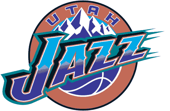
Utah Jazz: The Jazz have been in identity limbo for a while now (and some would argue they've been in identity limbo since they came to Utah). After deciding in 1996 to scrap the music note logo, the team went to a purple/teal/copper/light blue/black scheme and a logo system based on their mountainous home state. While the team played well in those duds, going to two NBA Finals, the uniforms were rather guerish (although they lasted for eight seasons). In 2004, Utah switched to a navy/light blue/purple scheme that lasted for six seasons. Critics of that scheme thought the navy and light blue were too similar to the Denver Nuggets (their biggest rival), and it always seemed the dueling blues were never fully accepted.

The team's new scheme (navy/yellow/green) is unique to the NBA, but not too unique as the Nuggets, Pacers, Grizzlies, and Thunder also use navy and yellow in some capacity. The new uniforms are, like the logo, a celebration of the past. Gone are the piping, wordmark and number outlines, and other modern uniform conventions. Present are simple block numbers and rectilinear side panels. The double outline on the side panels, while matching the trim, looks overdone next to the minimalist numbers. Like the logo set, the uniforms are nothing new, and quite frankly, pretty boring. The uniforms would have been much better with a green-centric scheme. Grade: C-

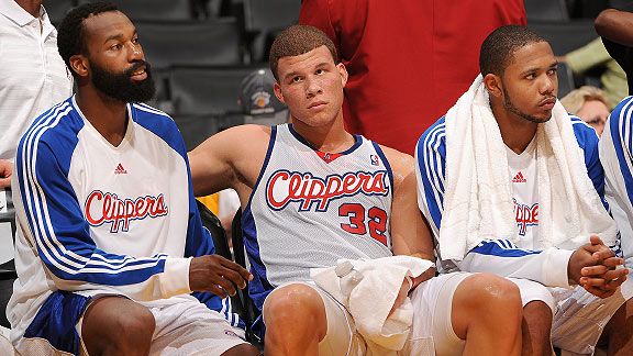
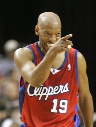
Los Angeles Clippers: Perpetually within the unfriendly confines of the little-brother complex, the Clippers updated their logo. The new logo updated the LOS ANGELES wordmark, the C and S in Clippers, and the basketball (the old version had an extra line that normally doesn't appear on a ball from that angle. The secondary logo was also tweaked, updating the serifs of the letters and adding a silver drop shadow to the LA. The uniforms were edited more substantially, however. The old uniforms used block numbers and solid blue side panels. The new uniforms, however, use an updated number font and a less "default" design for the sides that looks like a modernization of the Bulls uniforms. A Los Angeles script replaces the Clippers script on the road jerseys as well.

Overall, the updated logo doesn't go nearly far enough to differentiate the Clippers from their "big brother" the Lakers. The uniforms, however, are a complete upgrade, giving the Clippers their first semblance of an identity in years. Considering the uniform designers were painted into a corner by having to use a bad logo, their feat is all the more impressive. Grade: A- (uniforms); F (logos)

Cleveland Cavaliers:
The Cavs needed a new identity since their last re-brand coincided with the arrival of a certain someone. It's a weird symmetry, with their latest aesthetic changes coinciding with that player's departure. The new-look Cavs have darkened their red to burgundy and replaced their metallic gold with yellow. The navy takes a back seat in the latest branding effort as it is relegated to the logos only. The uniforms look like the Cavs and Celtics had a baby. The team removed the side panels and piping for a clean, simple, retro-based look. The new uniforms' only embellishment is within the 5-stripe trim and the nuances of the type, along with the phrase, "All for one. One for all." placed along the inside of the collar. The uniforms are designed to remind the Cavs of their history, while allowing them to look forward.

The uniforms, as a whole, are well-designed, clean, and combine the best parts of retro and modern. Pay attention, Utah, as this was the way to go retro but not out-of-date. Grade: A

Golden State Warriors: The Warriors have leaked their home jersey, but they have yet to unveil their full uniforms. The jerseys feature the bridge logo on the front with the player's number with the logo. The trim is problematic, as the armholes are solid blue, the side panels are yellow, and the collar is blue and yellow. A little consistency between the uniform elements would greatly improve the jersey. The side panels and armholes don't look as out of place when paired with the shorts, as on this picture of the away set. However, I will reserve judgment for for when I see the full unveiling. Grade: Incomplete

Dallas Mavericks: The Mavs also have yet to unveil their new uniform set, but it was leaked on the internet. It looks like the team essentially swapped the navy and royal on the road set. It will be interesting to see what the team does with the alternate jersey it unveiled last year.

That covers the NBA's uniform changes up to today. Stay tuned for additional updates on the Warriors and Mavericks.

Today we have another Double Play Design. Leading off are the St. Louis Cardinals, who finish a two-game series with the Brewers today. The Cardinals are one of many teams with a red/navy color scheme. That was the first thing I sought out to change, as the navy (while classic) doesn't say anything about cardinals, and over a third of MLB uses some blue/red scheme. I opted for a red/burgundy/yellow scheme because it was original and worked well for a cardinal. I didn't want to overhaul the iconic "bird on a bat" logo, but I did tweak the typography. I added a slight bevel to bring the team into the 21st century. The jerseys evoke memories of Stan Musial, a Cardinals great by using placket piping with additional piping running down the sleeves and along the belt loops. The numbers are no longer the default MLB Block. Instead, I used a thinner block font, giving the Cardinals a unique look from the back, as well as their trademark jersey fronts. The home uniforms start with a white base and are paired with red cap featuring a white STL. The away jerseys are emblazoned with St. Louis instead of Cardinals. The primary away uniforms are grey and are paired with a red cap that contains a yellow STL. The away alternates use a burgundy jersey with yellow type and are paired with a burgundy cap with a red brim. The Sunday Alternates have burgundy piping on a white base and are also paired with the burgundy caps. The STL logo appears on the left chest of the jersey.


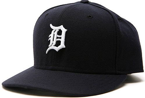
Up second, we have the Detroit Tigers. The Tigers biggest issue is that they use two different D logos: one for the cap, and another on the jerseys. I decided to eliminate the jersey D in favor of the cap D since the jersey D looks a little flat. I developed a new primary logo based on the team's logo from the 80s. The secondary logo is the cap D with a thin outline. The tertiary is a standalone tiger head, which is used on the BP jerseys. The uniforms use placket piping with no sleeve trim, as it is classic Detroit Tigers. The jerseys also uses the primary logo as a patch on the left sleeve. The home uniforms use a white base and are paired with navy caps emblazoned with a white D outlined in orange. One of my goals for the home uniforms was to add some orange in order to differentiate the Tigers from the Yankees (who, like the Tigers, have at least two version of their signature NY logo). The D on the jersey and the numbers are also outlined in orange. The alternate home uniform is similar to the primary home uniform, but uses a navy jersey. The away uniforms feature a new Detroit script that is rendered in an Old English typeface. The new script replaces the cursive Detroit the team currently wears. The away caps feature an orange D outlined in grey and match the colors of alternate away jerseys, which are complemented by orange piping. The Sunday alternates take a different approach than the other uniforms, starting with a white cap that contains orange piping over the seems. The cap is paired with a white uniform that has orange pinstripes, creating a retro look that implies tiger stripes.

Feel free to leave a comment on any of the plethora of new NBA uniforms, the Cardinals or Tigers concepts above, or anything sports branding related.

Wednesday, August 11, 2010

A Mid-Desert Classic?

By Bowen Hobbs

Earlier this week, the Arizona Diamondbacks unveiled their logo for the 2011 MLB All-Star Game. Traditionally, All-Star Game logos are unveiled during the previous year's game and are prominently displayed in the upcoming host city's ballpark for an entire year or longer. The Diamondbacks' unveiling was considerably low-profile in comparison. The logo was not unveiled at this year's ASG in Anaheim, nor is there any visual representation (last I heard) of the logo or event currently at the stadium.

Much of the lack of promotion has to do with SB 1070, the controversial Arizona Immigration Bill. Numerous businesses and some MLB players have, in response to the bill, publicly stated that they will boycott the game and the state. Protestors have even petitioned Commissioner Bud Selig to move the game away from Arizona, although there is no indication that he will oblige.

Regardless of the politics surrounding the event, the logo has been unveiled and the game (barring an unforeseen event) will take place in Arizona. Speaking of the logo, there are some issues with it that could be improved and some things the team did well. The overall shape of the logo combines the ideas of the Southwest and a baseball diamond well. In addition, the use of the Diamondbacks' proprietary typeface instantly gives any viewer with baseball knowledge an indication of the the game's location, while the mountain in the background helps those without baseball knowledge identify where the game will be held. On the other side of the coin, the logo could use help in some areas. The D'backs A logo is placed at the top of the mark and is centered. The issue is that the A logo is italicized and while the bottom of the mark is centered, the top of the mark isn't, leaving the upper right corner of the A logo dangerously close to the edge of the diamond. Color-wise, the team could have chose something other than the sky blue/periwinkle color, which clashes with the black/sedona red/cream color scheme of the D'backs. An orange or a blue closer to aqua would have balanced the color scheme better. Lastly, the black outline on the diamond is noticeably thicker than the black outline of the text and the off-white outline surrounding the mark. If the outlines were evened out the logo would have more impact.

In Other News… The Milwaukee Admirals unveiled a new road jersey. It's black and features the team's skull crest. It replaces the former grey road sweaters. Overall, not bad, but I prefer the crest on the light blue alternate jerseys… The San Diego Padres are rumored to have new uniforms for next season. Here's hoping they're brown!… The Dallas Cowboys are looking into editing their uniforms. Maybe Jerry Jones did see the inconsistency on his giant JumboTron… As I had mentioned before, the New Jersey Nets are considering a name change. They even filed the official paperwork to do so within the last week. The leading rumored new name: Knights… The University of Texas Pan-American has updated its logo from this to this… Lastly, I recently did an interview with the Clinton Lumberkings (Class A; Midwest League) Director of Media Relations, Dave Lezotte. We discuss design, sports, and the 2009 Midwest League All-Star Game. To listen to the interview, click here.

Today, we have another Double Play Design. We start with the Brewers' current opponent, the aforementioned Arizona Diamondbacks. Starting with colors, I wanted to keep the red/black/gold scheme the team currently uses over their old purple/teal/copper scheme for two reasons: The purple and teal are incredibly dated, and the red/black/gold scheme ties in nicely with the color schemes of the Arizona Cardinals and Phoenix Coyotes, giving the Phoenix area (aside for the Suns) a unified color palette, a la Pittsburgh (black/gold). I decided to get rid of the A logo, as it has seen better days. In its place, I developed a new primary logo featuring a modified version of the team's db-snakehead logo within the team name. The secondary is the modified db-snakehead, while the tertiary is a hybrid of the A logo and the D-snake. The uniforms feature a unique style of trim that I like to call "diamond trim", which was somewhat inspired by these jerseys. The home jerseys start with an off-white base, featuring the D-backs wordmark and the tertiary logo on the right sleeve, and are paired with the db cap. The away uniforms use a sand colored base, similar to the current Padres away uniforms. They away jerseys are emblazoned with an Arizona wordmark and utilize the db logo as a patch on the right sleeve. They are paired with the new A logo caps. The Sunday Alternate is similar to the primary home jerseys, except it is a vest with a black undershirt and uses no sleeve patches. The Sunday Alternates also use a black hat with a red brim instead of the all-red cap found on the homes.


Up second, we have the Tampa Bay Rays. The Rays have had a slew of identities in the short existence. The current identity is one of the most generic in MLB. The Rays' current colors are navy, light blue, and yellow. Navy is the team's primary color, which doesn't help them differentiate themselves from the Yankees and Red Sox. With that in mind, I decided to scrap the existing color scheme for a dark green/orange/yellow scheme that gives off a much more tropical vibe. The logo set (aside from the tertiary) is completely new. the primary logo consists of a baseball/sun rising over the RAYS wordmark, which features a segmented gradiation that implies sun rays. The secondary is a custom interlocking TB that also features the segmented gradiation. I kept the manta ray logo as the tertiary but edited the colors to fit within the scheme. The jerseys and pants contain compound placket piping. The home uniforms start with a white base and green caps with orange brims.The RAYS wordmark appears on the front of the jersey while the manta ray is placed on the left sleeve. The home alternate is a green version of the primary home jersey. The aways use a solid green cap and pastel yellow jerseys and pants. Both away jerseys use the TB logo on the left chest in addition to the manta on the sleeve. The Sunday Alternate is an orange cap paired with an orange jersey. Like the home sets, the jerseys have RAYS across the chest and the manta on the sleeve.


Feel free to comment on the new 2011 MLB All-Star Game logo, the Admirals new road jerseys, the rumored changes for the Padres and Cowboys, the Nets possible new name, Texas Pan-Am's new logo set, or anything sports branding related.

Wednesday, August 4, 2010

The Badge of Cowardice

By Bowen Hobbs

Baseball is the most traditional of the four major U.S. team sports. And, for better or worse, that aspect of the game permeates almost every part of the sport, from the look and feel of ballparks and uniforms to the league's reluctance to expand the use of instant replay. One aspect in which it hinders the sport is in the application of sleeve patches. It would seem that the tradition of the left sleeve as the primary placement option for logo patches is completely arbitrary. It also leads to what I will dub the "Badge of Cowardice".

The Badge of Cowardice occurs when a team uses a logo that naturally faces right (like the Marlins' F) and places it on the left sleeve of the jersey (like the Marlins' home jerseys). The result is the logo appears to be moving away from the front of the player, as if it is retreating from any action the player may find himself in. This is especially obvious on logo patches that include a person or animal mascot. The issue, for the most part, is exclusive to baseball, although some hockey teams can be included. Here is a rundown of the offending teams:

The Blatant Offenders

Florida Marlins: As described above, the Marlins' home jersey features the Badge of Cowardice. The black alternate jerseys also feature the Badge, but the grey away jerseys do not. A simple fix would be moving the patch over to the right sleeve, where it looks much more appropriate (as showcased by Hanley Ramirez).

Houston Astros: The Astros also sport the Badge, but it doesn't contain a person or animal mascot. It's of one of the 'Stros alternate logos, the streaking star over Texas. It appears on every jersey the team is using (not counting batting practice or throwbacks). Part of the logo's effectiveness is that it conveys a strong sense of motion, but that only works when the logo is positioned properly.

San Diego Padres: I like the Swinging Friar as much as the next person, but it should be placed on the right sleeve. When it appears on the left sleeve, like on the team's blue alternate jerseys, the Friar doesn't appear to be in mid-swing; instead, it appears the Friar has just struck out.

Boston Red Sox: The Red Sox only wear a sleeve patch on the away jerseys. Maybe that's one jersey too many. It's not that I don't like the hanging socks logo, but it literally looks like two little feet running away when placed on the left sleeve. It definitely looked better on the Home Run Derby jerseys.

Chicago Cubs: The Cubs are an interesting story. As a team known for falling short, they should be doing everything possible to change that mentality. But, since 1997, they have been sporting the Badge of Cowardice on their home and away jerseys. Apparently the cub has had enough of losing and decided to just walk away.

The Borderline Offenders

Milwaukee Brewers: The Brew Crew are flirting with the Badge of Cowardice, as the M-on-Wisconsin logo displays a sense of motion toward the right, while being placed on the left sleeve on the home, home alternate, and road alternate jerseys. At least the primary away jerseys use the Milwaukee logo.

Cincinnati Reds: The Reds use Mr. Redlegs on their home and alternate jerseys, and that patch looks great. The road jerseys, however, are a different story. The primary logo is used, and it is placed on the left sleeve. Although it's not as obvious as the Marlins, the wishbone C implies some movement, and shouldn't be placed "against the grain", so to speak.

Los Angeles Dodgers: The Dodgers qualify as borderline because people in Western culture read left to right. Their home and away jerseys use the LA logo on the left sleeve, although the logo, by nature, would flow better on the right sleeve.

Colorado Rockies: Staying in the NL West, the Rockies primary logo is pretty symmetrical, except for the streaking baseball. That ball, however, is the reason they've ended up in the borderline category, as it gives the logo a direction.

Pittsburgh Pirates: The Pirates barely make this list, but they do because of the pirate's bandana. It may be nitpicking, but great design is in the details.

Kansas City Royals: The Royals also barely made this list. But they did make it (for all of their jerseys), and it's for the same reason as the aforementioned Dodgers.

Washington Nationals: Uniform-wise, they've been one of the most maligned teams in MLB for the Natinals debacle and more recently for placing an upside-down number on Miss Iowa's jersey. They also have the dubious distinction of making this list for the DC logo on the left sleeve of all their jerseys except their navy alternate.

There you have it, 12 teams of 30 are either blatantly sporting the Badge of Cowardice or are on the borderline of doing so. Maybe some day that will change.

Today, we have another Double Play Design. Up first are the current Brewers' opponent, the Chicago Cubs. For the Cubs, I decided the logo set was iconic enough to stay, but the uniforms needed some work. The primary home uniforms keep the pinstripes, and the primary logo stays on the left chest, but the Badge of Cowardice is no more as the patch moves to the right sleeve. The home alternates feature a blue jersey that is similar to the current blue jerseys, with sleeve trim added and the National League logo removed in favor of the primary logo. The home alternates also use plain white pants, which also appear on the Sunday Alternates. The primary away uniforms have a new script that is reminiscent of the Chicago Theatre. In addition, the uniform numbers are no longer red. Instead, all the type on the aways is blue with a single red outline to match the elements within the jersey, as well as matching the road jersey to the homes. The away alternate jersey is the same as the home alternate, but is paired with the grey pants. The Sunday Alternate is a sleeveless jersey and a take on this classic, except altered to fit within today's specifications. The tertiary logo appears on the crest, while the primary logo appears on the right sleeve. To cap it off, the hats feature a white C, similar to the current batting practice caps.


The Toronto Blue Jays are next in the order. Historically, they've had uniforms that were very… un-traditional. In 1997, the team moved slightly toward tradition with these until 2004, when the Blue Jays inexplicably removed most traces of blue to the point where their jerseys simply say Jays. Black took over as the team's main color and remains so today. My goal with the Jays was to take this logo and modify it to create a consistent, unique, and most importantly, fitting identity. The primary logo takes the current blue jay head, places it against a stylized maple leaf, and changes the color scheme to royal and powder blue. The secondary is a standalone jay head, and the tertiary is a partial of the primary without the wordmark (which now features the team's signature inline style). For the primary and alternate homes, I brought back the contrast paneled caps, with white panels at home and light blue for the roads. The home uniforms are bold and feature the wordmark within a broad chest stripe that is complemented by equally broad sleeve stripes, creating a modern, yet retro look. The type is a stylized block font, with the inline added, and the logo appears below the wordmark on the front of the jersey to remind fans of the glory years. The home alternate jersey is blue with a white chest stripe. The away uniforms use a powder blue base (Could you picture anything else for the Blue Jays?) and utilizes the broad stripe theme from the homes. The away alternate jerseys are also blue, but with a powder blue chest stripe. The Sunday Alternate is a sleeveless jersey, worn with a royal blue undershirt, and features a less aggressive chest stripe. The Sunday cap is solid blue and uses the jay-head-and-maple-leaf logo.

Feel free to leave a comment on the Badge of Cowardice, the Cubs and Blue Jays concepts above, or anything sports branding related.