Wednesday, January 27, 2010

The 40-Year-Old Brewers

By Bowen Hobbs

Last week, the Brewers unveiled a new logo to commemorate their 40th anniversary. The logo blends old and new as a visual bridge from the team's inaugural season in Milwaukee to the present. It will be worn on the sleeve of the jerseys (I'm guessing the right sleeve, because the M logo with Wisconsin behind it is on the left) for the duration of the season. While the parts of the logo that correspond to the team's current identity package are fairly obvious (the M logo, number fonts, and colors), the past is shown by what's behind it. Yes, that is a nod to Barrelman, the logo and mascot of the Brewers from their inaugural Milwaukee season in 1970 to 1977. The one-sided shading of the barrel is also consistent with the original Barrelman, and gives the logo added variety and depth. The M logo and ribbon break the outline of the barrel for visual interest. The rarely-seen red makes an appearance on the ribbon for a splash of color. Overall, I would say the logo is well put together and consistent with the two identities the Brewers merged to create the mark.

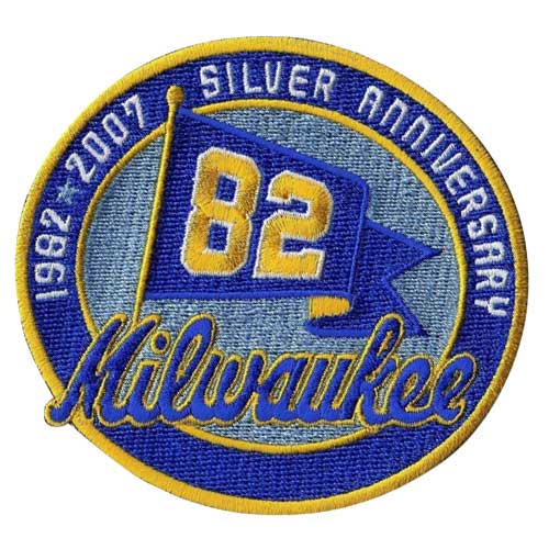
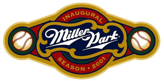
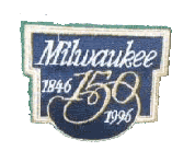
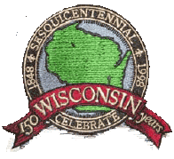
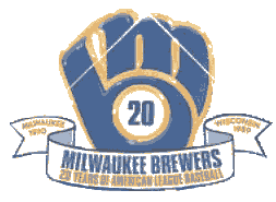
How does it compare with some of the other anniversary logos the Brewers have had? It's on-par with the "82 logo" the Brewers wore in 2007 to denote the 25th anniversary of their lone World Series appearance. Although I prefer the colors on the 82 logo, I understand the rationale for the 40th's color choices. When compared to the Miller Park Inaugural Season logo, the 40th wins hands-down. The Miller Park logo unnecessarily uses green and red together when either color would have worked. The barrel shape of the 40th logo is also far more pleasing than the over-elongated amalgamation of shapes the Miller Park logo utilizes. The Milwaukee and Wisconsin sesquicentennial logos don't really count, as they have nothing to do with sports outside of where they appeared. The 25th Anniversary logo is well done, but only represents one era in Brewers History, while the 40th logo shows two. The 20th Anniversary logo is a product of its time, before most teams understood the full value of well designed marketing.

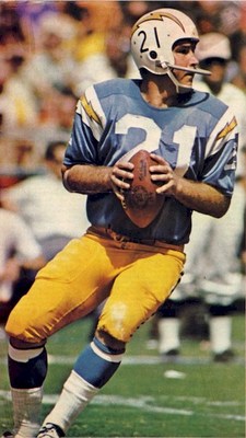
The Brewers have also decided to host four "Retro Weekends", the Fridays of which they will wear uniforms commemorating the four decades of Brewers History. The 1970s weekend is from May 14th-16th, in which the Crew will don the block M hats and 1970s uniforms. The 80s are back from June 25th-27th, and the Brewers will rock the ball-in-glove era look for the occasion. The 90s weekend will feature the German M cap and corresponding uniforms, from July 23rd-25th. And the 2000s weekend is from August 27th-29th and the team will wear their current uniforms for that weekend.

I will start the design portion of this entry with a losing team from the Divisional round of the NFL Playoffs, the Arizona Cardinals. The jerseys feature red sleeve inserts with white accents and black piping, as well as a yellow (white on the alternate jersey) insert on the collar to match the beak of the logo. The pants use sharp curves in a design that matches the look and feel of the sleeves. I have also included options for red pants and yellow alternate jerseys.


Next, we have the New York Jets. I went back to the days of kelly green because I find the forest green outdated and dull. I also modernized the logo they used from 1978-1997. The green helmet features a wraparound design of the jet in the logo. I took the idea of contrasting sleeves that the team currently uses and applied it in a way that fits with the curves of the jet on the helmet. The number font was chosen for its futuristic look, and the wordmark is placed under the collar. The pants also feature a sleek design, in tune with the style of the other elements. Green pants have been added as an option.


Finally, we have the Vikings. The current Vikings logo desperately needs an update. It's pretty obvious that it's a drawing from the 60s, not to mention the face is a little too pink for an NFL logo. I took the liberty of bringing the logo into the 21st century. While the current logo uses purple, gold, black, white, and that pinkish tone, my version only uses purple, gold, white, and a flesh tone that is a percentage of that base gold. This "percentage color" not only fits within the scheme better, but also saves on printing costs when the logo is printed on letterheads on other paper-based pieces. In addition, I have added highlights and shading to what was a rather flat logo. The helmet now shines and the horn looks rounder.


For the uniforms, I updated the horn, so it does not feature black but utilizes a hint of the percentage color for depth. The uniforms are more of an update to rid the Vikings of the issue they have with the way the side panels of the jerseys awkwardly transition into the pants. Gone is this poorly thought out decision to have a white block interrupting the flow of the entire uniform. Now a simple yellow line of piping consistently flows from the jersey to the pants, no matter what combination they are wearing. Speaking of the pants, they now feature a swoosh that resembles the shape of their horn. I have also added options for purple pants and a "Minnesota Wheat" colored uniform as an alternate. In case you were wondering, next time I will remember to include Jared Allen's mullet.


That's it for this week. Next week, I will preview Super Bowl XLIV uniform-style. Feel free to sound off on the Brewers' new logo, the designs above, or that animal pelt glued to the back of Jared Allen's neck!

Wednesday, January 20, 2010

Reebok's New Prototype Jersey: A.K.A. the Video Game Jersey

By Bowen Hobbs

Have you recently noticed that certain Packers players appear to be wearing a different style of jersey than the rest of the team? More specifically, Jermichael Finley, Nick Barnett, and Brandon Chillar are wearing the new Reebok prototype. Here's a rundown of some of the differences between a standard NFL jersey and what I am dubbing the new "video game jerseys". (They remind me of what the players look like in Madden.)

• The names on the back of the video game jerseys are significantly smaller than their traditional counterparts. This doesn't really bother me because referees use a player's number to identify him on the field. Also, we live in the era of hyphenated last names, so this is probably necessary.

• The TV numbers (numbers on the shoulder pads or sleeves) are also smaller, at least on some teams. The Packers and Colts both use the small numbers, while the Giants and Jaguars have been able to keep the normal-sized TV numbers.

• The fabric is very different on the video game jerseys. It was designed to be super-stretchy, and has resulted in the teams' designs looking somewhat warped.

• The NFL equipment logo has moved to a lower position on the new jerseys , which has in turn pushed the front numbers to a lower spot as well.

• The collar on the video game jerseys is more of a tapered collar, with the front of the neck hole featuring a thinner collar than the back.

The new tailoring has caused some less-than-attractive results in teams' designs. The Packers collars have a sharp, pointy look due to the taper, and the sleeve stripes are more truncated than usual. (I honestly wouldn't mind the latter if everyone on the team wore it.) The Colts' uniforms are more problematic when applied to the video game jersey template. Their signature shoulder stripes don't look right when they have been reduced to fit the prototype. The Jaguars' case is even more perplexing. Just months after unveiling new jerseys with striping that is supposed to flow around and under the sleeves, why would they switch to a template that chops the stripes off so they don't flow correctly? The video game jerseys would have worked better with their old style. The Giants jerseys work well with the new template because they are so plain (the home jersey, anyway). It's hard to screw them up. In fact the Giants are usually one of the first teams to try prototype jerseys for that very reason. I also saw Chad Ocho Cinco of the Bengals wearing the video game jersey against the Jets in their Wild Card game a week and a half ago. The prototype actually looked pretty good when applied to the Bengals scheme. My only question is why weren't the Raiders (simple jersey) and the Titans asked to try the video game jersey? The new tailoring would have worked well with the Titans' shoulder bar motif.

Moving on to last weekend's Saturday night game, we have the Baltimore Ravens. When I started this concept, I thought about what makes a raven distinct. Its colors were my primary answer. With that in mind, I added a purple shine to the black helmets. I also decided, given the dark, ominous nature of the identity, that black pants would be the primary option across the board. The designs on the pants and sleeves draw from feathers and the style of the logo. I have also added options for purple and white pants.


For the Cowboys, I approached the design much like I approached my Packers concept. The Cowboys do not need a uniform overhaul, they just need some consistency. I kept the navy, white, and greenish silver, and dropped the royal, black, standard silver, and grey. I went back to their classic numerals, which feature block serifs, and made the facemasks navy. I have added a pair of white pants as an option for road games, as well as an all-navy set as an option when teams wear white against the Cowboys.


For the record, I would like to state that the Chargers' current uniforms are almost perfect and are one of my favorite in the league. However, in the interest of creativity, I completely started over. I dropped the navy and darkened the light blue. I also added a strikethrough to the numbers to mimic the wordmark. The bolts on the shoulders and pants are no longer contained within a stripe. Although it is difficult to see on this template, I have also added the numbers to the helmets to draw a connection to the very well-liked throwback uniforms. Finally, I have added yellow jerseys and pants, as well as blue pants for more options.


Thanks for reading. Feel free to sound off below about anything sports design related.

Wednesday, January 13, 2010

History 101: Football Uniform Styles of the Super Bowl Era

By Bowen Hobbs

Attention class. History 101 is now in session.

Over the years, pro football uniforms have changed drastically. Even teams like the Browns and Packers, who stylistically have tried to remain consistent, have made tweaks and adjustments to their sets. A large part of this evolution has to do with technological advances in equipment, which are necessary in keeping the bigger, stronger, faster players of today safe when they collide. Pro football uniforms took an aesthetic turn with the advent of the AFL. Before that point there were some firsts, such as the beginning of helmet designs (Rams). However, things accelerated with the beginning of the AFL.

1960s
Much like other segments of society in the 60s, pro football saw an explosion of color. The Chargers were sporting light blue and yellow uniforms with lightning bolts. The Dolphins dared to wear aqua. The Vikings even stepped onto the field in purple pants! The Cowboys featured a contrasting shoulder yoke design, and the Broncos sported vertically-striped socks. Experimentation wasn't just for hippies, it was everywhere.

1970s
While the 60s laid the foundation, the 70s refined it. The general themes were bright colors and broad stripes. The Buccaneers started play wearing bright orange and red, while the Seahawks donned royal and green. The Eagles wore jerseys with 12 stripes per sleeve (similar to this). Colored facemasks also appeared in the 70s.

1980s
The 80s saw a more conservative swing in the general aesthetic. Sleeve stripes were subdued, as were many teams' color schemes. Teams were realizing the potential their logos had. Colored pants also became more commonplace. The most innovative design of the decade would be the Cincinnati Bengals' tiger-striped uniforms.

1990s
Logos were becoming bolder and fiercer. The NFL's 75th Anniversary was the birth of the retro look. As teams celebrated their history, fans grew fond of the experimentation of the past. Teams began incorporating sweatbands and cleats into their color schemes.

By the end of the decade, multiple teams edited their color schemes to darker, fiercer options. Philadelphia unveiled midnight green, while the Jets and 49ers tweaked their colors towards the deeper end of the spectrum. Tampa Bay was now red and pewter, while the light blue and red Oilers were now the navy and light blue Titans. Many teams were letting the colors and logos do the talking, as jerseys featured simple trim with specialized numbers and team logos on the sleeves. Denver revolutionized the football uniform landscape with their Nike-designed duds.

2000s
The 2000s seem to be the beginning of a new era. Sleeves shrank over the course of the 90s, and designs in the 2000s reflected that change. The idea of alternates and various combinations took hold. Today, most teams have a third jersey and some teams feature three sets of pants. The Seahawks developed a metallic slate blue, which would be paired with navy and lime green. Many of the modern designs feature piping and swooshes, giving players a faster, more aerodynamic look. More than half of the NFL's teams feature their own proprietary number font, ranging from modified block numbers like Arizona and New England, to more creative solutions like Philadelphia and Cincinnati.

Where is uniform design headed? No one can say for sure, but my guess is as sleeves shrink and teams look to one-up each other, designs will center more on the shoulder pad area and small logos and wordmarks will continue to pop up in new places.

This week, I am showing designs for teams that unfortunately ended their seasons. Let's start with last weekend's first loser, Cincinnati. Although the Bengals' current uniform has some good things going on, it's hard to tell because there are simply too many things going on. The tiger-striped helmets have to stay; they're the best part of the brand. My design rids the jerseys of the white side panels that affect the pant stripes and places the emphasis of the tiger-striping on the shoulder yoke. I think this version allows the stripes to flow, instead of being chopped off where the sleeves connect to the body of the jersey. I have also decided orange is a stronger primary jersey color to distance the Bengals from their in-state rival, Cleveland.


Next, we have the Eagles. My main issue with the Eagles is their color scheme. The current midnight green often appears dull and too similar to the black they use, so I substituted it with kelly green. Back are the silver pants, for a historical tie-in. The jerseys feature a wrap-around piping design and a custom collar. I have also included options with green pants and an all-black set.


Moving on to Sunday's games, we have the Patriots. With this concept, I wanted to strike a balance between old and new. I removed the silver for a more patriotic red, white, and blue scheme. The shoulders now feature a three-stripe pattern similar to the Patriots of yesteryear, but with a twist: sublimated stars are within the center stripe. I have additionally incorporated the "stars & stripes" pattern into the pants and used striped socks.


Finally, we have the Packers. When it comes to teams like Green Bay, I approach the design from the perspective of realism. By realism, I mean putting together a design that, if ever implemented, wouldn't cause fans to revolt in the streets. That said, I took the sleeve striping that the Pack currently sports, and applied it to the helmets, pants, and socks. I have also added the G logo to the chest, to give the jerseys a modern touch. In addition, there are home and away monochromatic combinations, as well as a yellow jersey for hot-weather road games or possibly a "cheesehead appreciation" game.


And that concludes our history lesson for today. Feel free to sound off below about anything sports design related.

Wednesday, January 6, 2010

Nike Pro Combat Uniforms: The Good, The Bad, & The Ugly

By Bowen Hobbs

Last week, it was brought to my attention that the Badgers bowl-game opponent, the University of Miami, was wearing new uniforms. I wanted to know more, so I looked for photos online. It didn't take me long to realize "The U" was wearing their installment of Nike's new Pro Combat Series. Nike had some great ideas with the development of this line, and yet there are certain things that could be improved upon. Here's a team-by-team breakdown of three of the more intriguing Pro Combat schools.

Miami
The Good: I applaud Nike for going with the two-tone numbers. I really like the way the numbers mimic the U logo. In addition, Nike carried that idea through to the pant striping and provided Miami's players with one white and orange cleat and one white and green cleat each. The under-layer also features an interesting pattern based on a weather map of a hurricane.

The Bad: The helmet stripe retained the classic Miami look, but I think it would have fit the concept better if it featured the split look of the numbers and pant striping. I realize the recent trend of putting a slogan on the inside of the collar, but why? Nobody watching from the stands or on TV can see it. Is it purely to pump the players up?

The Ugly: Let's start with the patterned embroidery on the shoulders. Nike says it is to make the shoulder area more durable, but it has nothing to do with a hurricane! It's simply Nike trying to promote their brand over Miami's brand, which I find slightly absurd. If they had developed a different pattern for each team, that would have been more appropriate.

Overall Grade: A-

Virginia Tech
The Good: Once again, Nike hit a home run on the numbers. Overall, the triangular halftone pattern is well executed.

The Bad: When it comes to Virginia Tech, the color scheme is so unique that I don't quite understand why they minimized it. Why go all-white when a burgundy jersey would have worked for the halftone? How about a burgundy helmet? That would have made the uniform more unique.

The Ugly: Once again, the shoulder embroidery.

Overall Grade: B+

Florida State
The Good: Just about every part of this. From the feather motif and the use of garnet to the number typeface and even the black helmet.

The Bad: The gloves. It's innovative, but it just isn't as good as the rest of the set.

The Ugly: See "The Ugly" above.

There are other teams in Nike's new line, including Florida (C-), TCU (D), Oklahoma (C), Texas (B), LSU (C), Ohio State (C-), and Missouri (B-).

Since the NFL's regular season is over and the playoffs are under way, I thought I'd share some off my favorite designs of non-playoff teams.

Buffalo: Their current uniforms are a mess. They have too many colors, and mismatched side panels and pant stripes. My main goal was to create a look with mix-and-match possibilities. Where as the current shoulder design doesn't fit the shape of a player's upper body, my design utilizes more natural lines for a design that flows better. Red has become a trim color with the focus now on the interaction of the two blue. The helmets are now white as well.


Carolina: First off, I dropped the silver. It made the Panthers look too much like the Raiders. The design features sharp curves and "slash mark" inserts, to better match the helmet striping. The loss of silver allows the light blue to stand out more. The black helmet also gives the uniform a stealthy, panther-like appearance. Lastly, I have edited the numbers so they are less generic.


Houston: When I think of Texas, I think of western-style button-down shirts, which were the inspiration for this design. I have also added stars by the collar to give the look something extra.


Jacksonville: I have always thought the Jaguars copied the Dolphins when they chose teal as their primary color. I was , however, intrigued by their new "color-changing" helmet, so I incorporated it into the design. I changed the teal to jungle green and inserted accents of a jaguar pattern.


Kansas City: My biggest problem with the Chiefs uniforms is inconsistency. The helmet features black when the rest of the uniform doesn't, and the uniforms use yellow, which is non-existent on the helmets. I have also edited the numbers and added an abstraction of a feather to the pants.


Tampa Bay: While I see the current Buccaneers identity and uniforms as a vast improvement over the Creamsicle Era, it could be better. I have decreased the black and increased the orange. I have also given the design a more ragged feel, to match the logo.


Tennessee: I decided to edit the colors from navy and light blue to light blue and maroon, for a more contemporary feel. I have also removed the flaming thumbtack from the helmet in favor of the T-sword. The shoulder design is a modernization of the current jersey, while the pants now match the look of the shoulders.


In the following weeks, I will show designs related to the teams that have ended their seasons. Please check back to see the upcoming designs, and feel free to post a comment regarding Nike, college football, or any of the designs above.