Wednesday, February 24, 2010

Spring is in the Air

By Bowen Hobbs

In less than a week, spring training is officially under way. In fact, pitchers and catchers have already reported to the Grapefruit and Cactus Leagues. As teams prepare for the grind of the season, I will explain the changes they've made to their brands during the offseason.

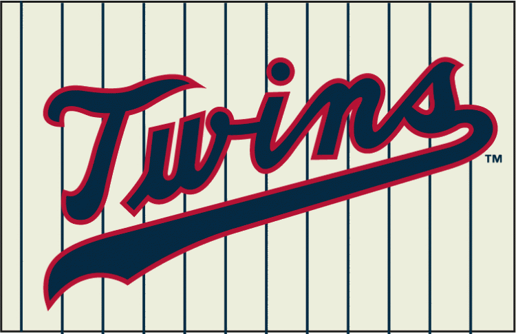
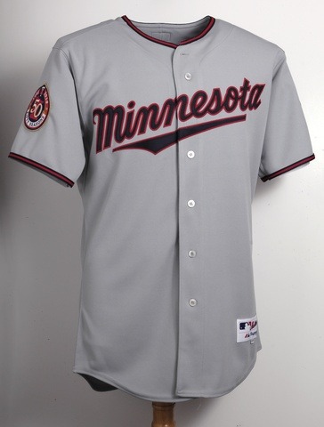
The biggest change of the winter goes to the Minnesota Twins. They are the only team to change their primary logo (from this to this) since October. I still find that the script used on the primary logo (and primary home jersey) makes them look like Tony's Twins, but it's better than the inconsistent typography of this wordmark, which makes an appearance on the throwback-inspired home alternate uniform. The road uniforms lose the pinstripes and block letters in favor of this script on a solid grey uniform. If they had edited the script on the home alternate to be consistent with the "Minnesota" script, they would be onto something.

The Twins also unveiled a couple new logos that will appear as jersey patches. One is a patch for the inaugural season of play at Target Field, which appears on the home, blue, and sleeveless jerseys. The other is a 50 Seasons patch, on display on the right sleeve of the road uniform and throwback alternate. Overall, the changes are in line with what I would expect, but there is a bigger issue that affects branding in MLB. Eleven of 30 teams in MLB use blue and red on their uniforms. And that doesn't include teams like the Brewers and Yankees, who only use red in their logo sets. This phenomenon led me to be somewhat disappointed with the Twins' changes because, on the field, they will look similar to a number of teams, most notably division-rival Cleveland.

The Twins aren't the only team with something new for fans this spring. Giants fans can expect to see an orange alternate jersey and an orange-brimmed cap. The Royals added a powder blue cap to be paired with their powder blue jerseys, introduced in 2008. The Rays also added a light blue jersey as an alternate. The Mets added a new alternate, an off-white jersey with royal blue pinstripes, which is very similar to their previous home jerseys. It looks like Mets fans who want to "ditch the black" will have to wait at least one more season. The Marlins sought addition by subtraction by removing the Florida wordmark from their away jersey, and they replaced it with the Marlins wordmark that also adorns the home set. This was done to transition the team for its name change to the Miami Marlins. Lastly, the Brewers added an alternate road jersey, which sports the rarely-seen "Milwaukee" wordmark.

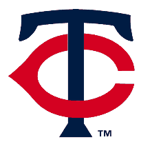
This week, I have decided to show my concept for the Minnesota Twins. Naturally, the first thing I changed was the color palette. Since over a third of the league uses blue and red and 29 of 30 teams use either red, royal, navy or black as their primary color, I felt that the Twins didn't need that color scheme to convey their identity. As a twin, I can say that the idea of twins is not bound to a navy-and-red color palette. I decided to make use of a rarely-seen color in MLB: green, which I paired with navy and a steely light blue. The argyle represents the idea of two entities (the solid diamonds) sharing a bond (the outlined diamond). In addition, I developed an MT mark that would replace the TC. My issue with the TC is that it utilizes the wishbone-C, made famous by the Cincinnati Reds and Chicago Bears and worn by the Cleveland Indians.


The home uniforms rely on kelly green as the base color for the caps and feature navy blue lettering and numbers, as well as accents of argyle. The home alternate is a kelly green jersey to be worn with white pants.


The road uniforms feature a concept that I believe MLB desperately needs: non-grey and off-grey road uniforms. 29 of 30 teams in MLB have grey road sets, regardless of color scheme, and with the advent of Cool-Base (breathable jerseys for hot-weather games), all those greys are now uniform. This Twins concept goes with a steely light blue that complements the navy in the palette. The away sets feature a navy cap, and the away alternate jersey is navy as well.


The Sunday Alternate (a term I gave to the once-a-week home alternate jerseys that are generally throwback-inspired) goes back to the 80s. The cap features a white front on a green base, and the jerseys have the MT on the left chest with the player's number to the right. The sleeves and collar have trim in the "faux v-neck" style. The batting practice uniform has a navy cap with a green jersey that features the primary logo on the chest and the tertiary logo on the cap.


Feel free to sound off on MLB's 2010 uniform changes, the Twins design above, or anything sports design related. And don't forget to Name-The-Team (check last week's post for details).

Wednesday, February 17, 2010

The Washington (Insert Name Here)

By Bowen Hobbs

As of mid-November, the Supreme Court decided to not even hear the suit brought against the Washington Redskins regarding their name. This action brought a close to the case, but not the movement. The Supreme Court did not comment as to why they chose not to hear the case, which only raises more questions than their decision answers.

Starting at the beginning, here is a recap of the events that led up to the Supreme Court's decision:

• (1933) The Boston Braves of the NFL change their name to the Boston Redskins. In the team's brief to the court, the name change was "in honor of the team's then-head-coach, William 'Lone Star' Dietz, a Native American."

• (1937) The Redskins move south, to Washington D.C.

• (1946) A Federal Law is passed that prohibits the government from registering a trademark that disparages any race, religion or group.

• (1967) The U.S. Patent and Trademark Office grants a formal trademark to the Redskins, which has since been renewed several times (possibly against Federal Law).

• Other trademarks have been issued to the team in 1974, 1978 and 1990 (also possibly violating Federal Law).

• (1992) Seven activists, led by Suzan S. Harjo, challenge the Redskins trademark issued in 1967.

• (1999) The Trademark Trial and Appeal Board finds in favor of the activists.

• (2003) U.S. District Judge, Colleen Kollar-Kotelly ruled in favor of the team.

So now that we have a time line of events, let's review the issues at hand:

• The suit was brought based on the 1946 Federal Law that prohibits the registration of a trademark that disparages any race, religion or group.

• Those who ruled in favor of the team recited the Doctrine of Laches, which essentially states (in the context of this case) that the activists waited too long and are causing a disadvantage to the team, which has invested millions of dollars in its name.

• The activists' claim that the trademark never should have been issued in the first place, since the law was written in 1946 and the trademark was first granted in 1967.

• Whether the Doctrine of Laches applies to the Federal Law regarding the trademark of symbols and names deemed disparaging, since someone new could find the name offensive essentially everyday, in theory, as more people turn 18 and become legal adults who can bring suits.

As I had previously mentioned, the movement is far from over. A new group of plaintiffs, ages 18 to 24, have filed another suit which has been on hold for the last two years while the most recent case was decided. Since this group of plaintiffs filed right as they became of age, the Doctrine of Laches theoretically should not apply.

What I find more disturbing is that the Supreme Court did not even hear a case in which Federal Law appears to have been broken. I wonder if their unwillingness to comment stems from the knowledge that once the procedural hurdles are no longer a factor, they will have no choice but to weigh the case on its merits, not its technicalities. The court's unwillingness to rule essentially punishes all Native Americans for the actions of some who didn't exercise their rights.

What does this mean for the "Washington Redskins" brand? If the court revokes the trademark or decides not to renew it in the future, then anyone and his/her mother can sell "Redskins" merchandise without penalty. At this point, I would think the NFL would want to step in and protect its assets, thus forcing the Washington franchise to re-brand to a trademark-able moniker.

Another question raised by the suit is why those in power (Dan Snyder, Washington Redskins owner, and Roger Goodell, NFL Commissioner) would want to be associated with this negative stigma which affects their brand(s). With Dan Snyder, the answer is simple: he grew up watching the Redskins and refuses to alter them in any way in his personal pursuit of nostalgia. Goodell is trickier, though. Since becoming Commissioner, Goodell has worked diligently to clean up the league's image, imposing strict and lengthy suspensions for players who violate the law and the NFL's Personal Conduct Policy. At what point does he hold the owners as accountable as the players for their actions? The Redskins name tarnishes the NFL as much as Pacman Jones or Michael Vick ever could.

In light of these developments, I am going to propose a "Name-the-Team" contest. Anyone who would like to provide a new name for the Washington football franchise only needs to suggest a name in the Comments section at the end of this post. I will take the best answers and provide identity schemes including logos, colors, wordmarks and uniforms. Let the contest begin!

The design portion of this week's post features a treat for the Wisconsin readers out there. I have developed a re-branding concept for the Milwaukee Bucks. The colors throwback to the 80s with forest green and lime. Orange is also involved as a connection to Wisconsin's rich deer-hunting tradition. The logo features a buck in profile, while the secondary mark is a B with antlers. The uniforms also draw inspiration from the 80s with bold trim and inserts on the sides. The alternate uniform features a "Milwaukee" wordmark and antlers on the shorts.


Feel Free to comment on the Redskins' legal issues or the designs above. And don't forget to Name-the-Team.

Wednesday, February 10, 2010

Mardi Gras: New Orleans Style

By Bowen Hobbs

As many of you know, next Tuesday is Mardi Gras. The New Orleans Hornets knew this as well, especially when they decided to develop these uniforms. The Mardi Gras alternate uniforms are to be worn only a few times per year, and do not replace these uniforms. Here's a breakdown of the Mardi Gras uniforms' nuances:

• Let's start with the obvious: it's a tri-color uniform. By tri-color, I mean it's purple on the front, green on the back, and athletic gold on the sides. Normally, I would prefer there be one primary color, but like Mardi Gras, these uniforms are a party.

• The NOLA wordmark appears on the chest in yellow outlined in green. I like it, but I would prefer seeing one of their jerseys (ideally the home) say "HORNETS".

• The side panels feature an ornate pattern reminiscent of the wrought iron architecture found in the Crescent City. Although it may be tough to see on TV, it's no more difficult to discern than the back of this Duke jersey.

• The side panels also use a unique trim of alternating circles in green and white. What are the circles? Mardi Gras beads of course! Like I said before, this uniform is a party.

• The back of the uniform is green with yellow type (the numbers are outlined in purple). The Fleur-de-Bee logo graces the back of the collar. Lastly, the NOLA Trumpet logo appears on the back of the shorts, near the waistband.

Overall, this is a uniform full of aesthetic gambles. From the tri-color scheme to the patterned sides and "bead trim", most teams would not be able to get away with this. New Orleans, however, makes this work. I don't know how, but they do.

This week's design features New Orleans' former basketball team, the Jazz. The Jazz moved from New Orleans to Utah in 1979, and have since struggled to develop an identity that marries the concept of jazz music with the state of Utah. Here is a picture of their current logo, which accomplishes telling the viewer where the team is from, but says nothing regarding jazz. Further confusing the identity, the Jazz primarily use navy and light blue. Six teams, including Utah, use two shades of blue in their designs. There are also another five teams using blue with black. With that in mind, I decided on a purple/silver/light blue scheme that is unique to all sports. The primary logo I developed utilizes a saxophone-J with mountains and a basketball in the background. The secondary logo is the Sax-J by itself, while the tertiary logo is a revised version of the team's J-Note logo. The coloring on the ball of the J-Note is consistent with the ball in the primary logo.


The home and away uniforms feature the Jazz wordmark and music-staff-inspired side panels. The numbers and NOB (name on back) utilize the same typeface as the wordmark. The Sax-J appears above the NOB, while the J-Note appears toward the bottom of the left leg on the shorts.


The alternate uniform is noticeably different from the home and away, and in basketball it should be. The third uniform generally gives fans either a blast from the past, and alternate style, or a combination of the two. My alternate is light blue and features a custom UTAH wordmark, complete with mountains. The side panels are purple with white trim. The J-Note is placed on the back of the collar, while the Sax-J is positioned on the left hip. I have also included number sets as a reference.


Feel free to comment about the new Hornets Mardi Gras uniforms, the designs above, or anything sports design related. Thanks for reading.

Wednesday, February 3, 2010

Top 10 Super Bowl Logos

By Bowen Hobbs

With Super Bowl XLIV around the corner, I have decided to compile a list of what I believe to be the 10 best Super Bowl logos of all time. Granted, most of the logos are from Super Bowls after 1991, but that has more to do with the development of the big game from a match between rival conferences to the international event that it has become. Most of the logos for the first 15 Super Bowls were nothing more than a stylized typeface, and therefore, are not on this list. Without further adieu…

#10 SB XXX - Arizona: Super Bowl XXX's logo does an excellent job of immediately telling the viewer where the game was held. The design style says "Southwest" so clearly, using shapes that complement the three X's. The color scheme, especially the use of burgundy, reinforces the Southwestern vibe.

#9 SB XXXIX - Jacksonville: A well-designed and technically sound logo, SB XXXIX's mark focused on Jacksonville's aquatic proximity by showing one of its trademark bridges in shades of blue and athletic gold. SB XXXIX's mark would be ranked higher if not for its similarity to…

#8 SB XXXVII - San Diego: Similar to SB XXXIX, this logo uses an aquatic color scheme similar to that of San Diego's own Chargers. The lighthouse is well-rendered and the waves offer just enough detail for the space they occupy.

#7 SB XXXI - New Orleans: Few logos capture the character of a city better than the Super Bowl XXXI logo. I mean this logo is dripping with Mardi Gras style, from the colors to the crown and ribbons. Although the style it is rendered in looks slightly dated, it would only require mild touching up for this logo to be a top-flight mark today.

#6 SB XLIII - Tampa: Yes, this logo is somewhat basic. Yes, this logo could have worked for another city. But that speaks to how good of a logo it is. Tampa is not the most recognizable city, so a logo that is football-centric instead of city-centric works. SB XLIII's logo is simply well-designed.

#5 SB XIII - Miami: This logo, more than anything, is so far ahead of its time, it's ridiculous. The scoreboard look of XIII could easily work for a current Super Bowl logo, with a few adjustments. The logo also utilizes a strong sense of alignment and a balanced color palette.

#4 SB XXXVIII - Houston: This logo was a significant departure from the 3-D, beveled logos that preceded it. The simple one-color lettering combines the Old West with a deep navy holding shape that implies the Final Frontier. Throw in the swooshes that reinforce the connection to space, and you have a great logo.

#3 SB XXXIII - Miami: It's Art Deco. It's bright. It's Miami! With XXXIII having a neon appearance, and "SUPER BOWL" in a classic Art Deco typeface, this logo personifies its host city. Add the fact that it's technically sound and conveys a sense of motion, and you'll see why it's #3.

#2 SB XXVII - Pasadena: Now this is a logo that gives a clear sense of the location of the game, but isn't over the top. The roses are worked into the mark with sophistication and do not distract the viewer from the most important information (SUPER BOWL XXVII). Considering this logo was used in 1993, it isn't particularly dated (except for maybe the color palette).

Drum roll please………………………………………

#1 SB XLI - Miami: This logo has so much going for it. Starting with the color palette, the orange, red, and blues scream "Miami". In addition, this mark represents the spectacle the Super Bowl has become. The flash between the L and the I reminds everyone that the world is watching. The pylon is perfectly executed and shows off the object of the game: scoring touchdowns. Super Bowl XLI's identity also lends itself to the creation of this secondary logo. Add the recent trend of showing one red and one blue star to denote the conferences, and you'd have a difficult time finding a more complete mark.

As promised, here is a preview of what Super Bowl XLIV could look like. Starting with the AFC, we have the Indianapolis Colts. The Colts' shade of blue has varied somewhat over the years. For the purposes of this concept, I have gone with one of the slightly darker shades. Something that has long bothered me regarding the Colts' uniforms (aside from the grey facemasks and black cleats) is the single blue stripe on the helmet. The rest of the package utilizes a double-stripe! To truly make this a concept, I have added the dot pattern of the horseshoe logo into the striping. The dot pattern gives this classic set a modern twist. I have also added blue pants as an option for more combinations.


For the Saints, I decided to start with the logo set. While I kept their trademark fleur-de-lis in tact, I added an updated wordmark and a corresponding lock-up treatment for combing the fleur-de-lis and wordmark.


With the uniforms, I wanted to create something truly unique, yet indicative of New Orleans. This thought process led me to develop an ironwork pattern similar to something that could be seen in the French Quarter. I applied the pattern to the shoulders and pants. I also used the typeface from the wordmark for the numbers and placed the wordmark right under the collar. Once again, I have added options for black and white pants, as well as an alternate gold jersey.


That concludes the 44th & Goal Super Bowl Preview. I hope everyone that watches XLIV has a great time and GO SAINTS! Feel free to leave a comment about your favorite Super Bowl logo, the designs above, or anything related to sports design.