
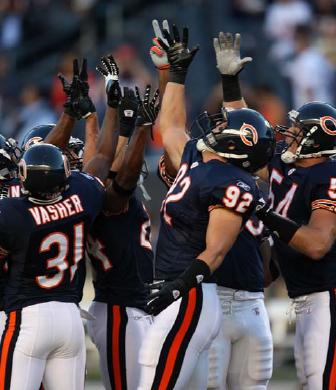
Traditionally, many NFL teams employed a two-color uniform scheme, such as the Packers or 49ers. Sure, each of those teams uses three colors (or more), but the base colors of their helmets, jerseys, and pants are based on a two-color scheme. The Packers use gold (yellow)–green–gold (yellow) at home, with white swapping in for green on the road. The 49ers use gold–red–gold with white replacing red for away games. The Chicago Bears use another version of the two-color scheme in which the home uniforms are navy (helmet)–navy (jersey)–white (pants).
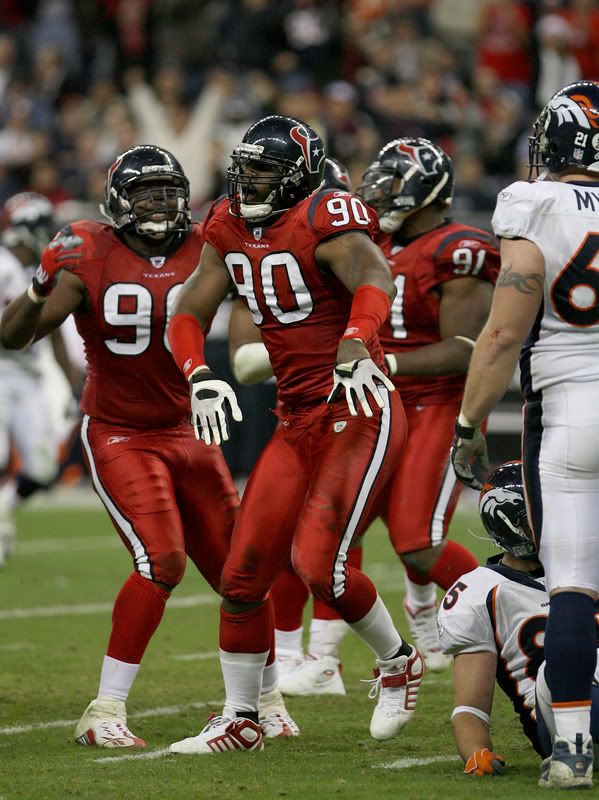
Aside from the two-color scheme, there is also a scheme called monochrome, in which the helmet, jerseys, and pants are all the same color. The Seahawks are the most famous example of a monochrome home uniform, but the trend is not new. The Dolphins and Jets have been known to sport the "Storm Trooper" look in which the teams wear all-white. More recently, the Ravens have sported an all-black look, and even the Bears have gone all-navy before. There is also a group of teams who have been lumped into the monochrome category, but aren't actually monochrome. Teams like the Bills and Texans (alternates) fall into this category. While the jerseys and pants match, the helmets are a different color. This group seems to be viewed as monochrome because the helmet takes up significantly less visual space than either the jerseys or pants. We'll call them 1.5-o-chrome teams. The 1.5-o-chrome look is fairly common on the road, but less so at home.
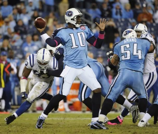
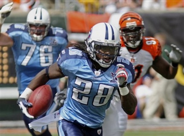
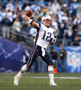
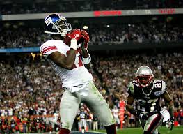
At the other end of the spectrum are the tri-color teams. Some of the current tri-color teams include the Bengals, Browns, Ravens, Jaguars, and Falcons. Most tri-color teams have white pants, paired with a bright helmet and dark jersey or a dark helmet and bright jersey. But one team employs the tri-color look while using a white helmet: The Tennessee Titans. And does it look ridiculous! The team has yet to pair its columbia blue jersey with white pants. If the Titans went white–columbia–white, it would be, by far, their best look. However, we the fans, have to look at a disjointed combination of elements, each a different base color, each with different striping. Certain teams that go two-color at home, opt for a tri-color road ensemble. Among them are the Steelers, Giants, and Patriots.
Due to the proliferation of alternate jerseys in today's NFL, there will always be tri-color looks. With teams only being allowed to have one helmet (except for throwbacks) matching three different jerseys will include possibilities for either monochrome or tri-color. Which one is better depends on the individual situations teams create. Monochrome generally looks better when a team has a significant block of a contrasting color on its jerseys, although exceptions can be made. Tri-color, however, generally looks best when paired with white pants or some other light color of pants. (And certainly not white helmets…)
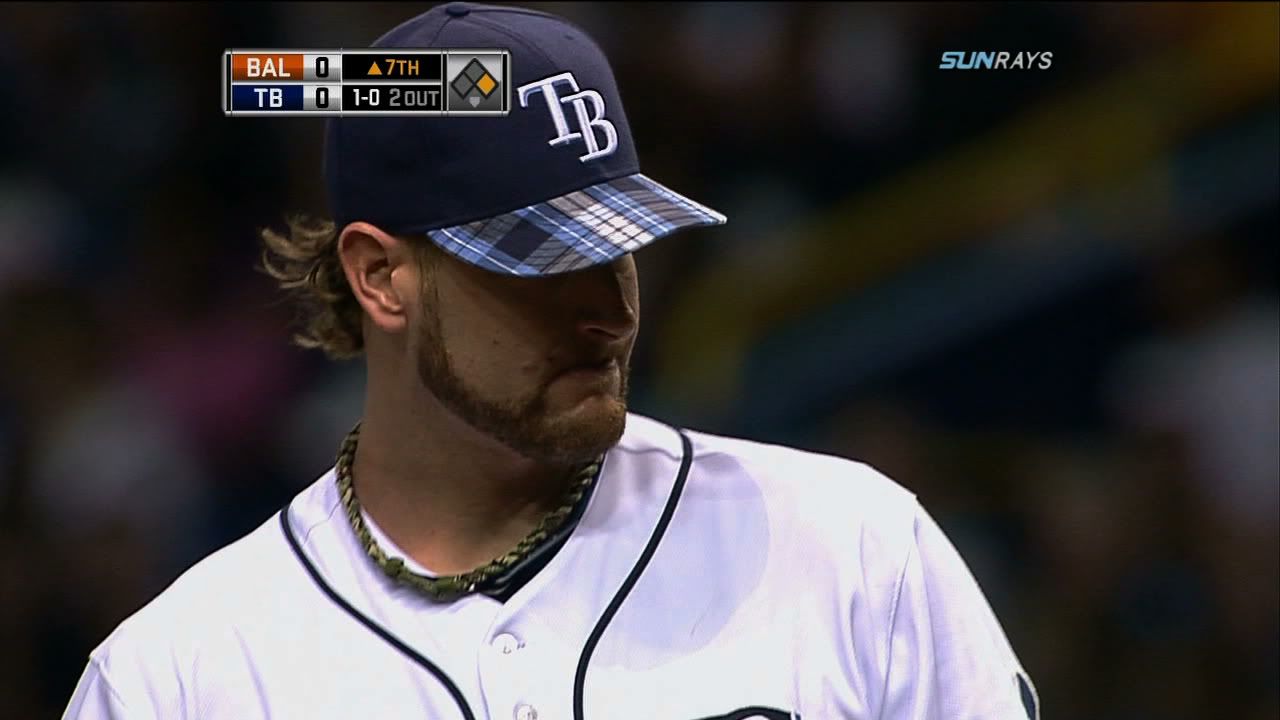
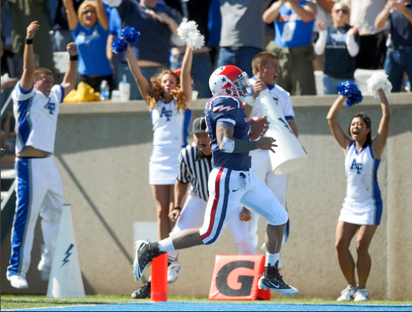
In Other News… Last Wednesday, the Rays decided to trot out in plaid-billed caps. Pretty interesting… Michigan State forgot one thing in their re-brand: to make the S-logo consistent with the other type. The plain block S looks too close to Stanford. At least the field numbers were in the new typeface… Jay Valai of the Badgers had some seriously tiny two's on his sleeves Staurday… Air Force wore their "Thunderbird" uniforms, inspired by this. They even had abstract concepts on the backs of the jerseys instead of names… Oregon wore all-green versus Stanford Saturday night. The jerseys had the yellow numbers instead of the silver. It looks like the silver-numbered green jerseys are no more… The NFL kicked off its month o' pink last weekend… The Panthers wore their light blue alternate jerseys against the Saints… The Falcons wore their throwbacks in an old school looking game against the 49ers… The Rams rocked white pants instead of their typical gold… The Redskins wore their burgundy jerseys on the road with white pants… Joseph Addai is still wearing the Video Game Jersey… The first time I've ever seen a football Badge of Cowardice, and it's on Dolphins center Joe Berger. Sorry, no photo…
Designer's Corner
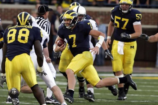
Today's design stays with the recent Big Ten trend. The University of Michigan has had the same uniforms (at home at least) for decades. The team's current logo is outline-heavy for a team with such simplicity uniform-wise. I simplified the logo to better match the overall scheme of Michigan aesthetics. In addition, I created custom typography for the wordmark and jersey numbers. The home uniforms are a break from tradition, but in an old school way. The jerseys feature striped shoulder yokes to match the striping on the classic Michigan helmets, and the M logo appers just below the jersey collar. The team's away uniforms are generally subject to the whims of the manufacturer. My rendering of the away uniform uses the same style as the home uniforms, instead of embracing the team's current mismatch paradox. (It's a paradox because despite how much fans cling to the tradition of the home uniforms, they seem not to care too much about the visual brand of the roads.) Both the home and away uniforms include an option for white pants. The alternate is a maize-out option in which I have paired maize jerseys with maize pants. The fauxback, however, keeps with the tradition of the wolverines by utilizing plain navy jerseys with maize numbers and plain maize pants. The helmet is also slightly different from the standard. I altered it to comply with these historical gems, making the facemask grey and adding the player numbers to the front of the dome.


 Feel free to leave a comment about monochrome or tri-color uniforms in the NFL, the designs above or anything sports branding related.
No comments:
Post a Comment