
44th & Goal continues its look into the aesthetics of Minor League Baseball with Part 6 of the 14-part series, The Good, The Bad, & The Ugly. Today, we look at the Carolina League, one of the three leagues in Class A Advanced. Much like the other leagues, some teams have recognized the value of a well-designed brand, while others have yet to reach that apex. Here is a team-by-team look at the Carolina League:
The Good
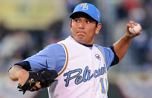
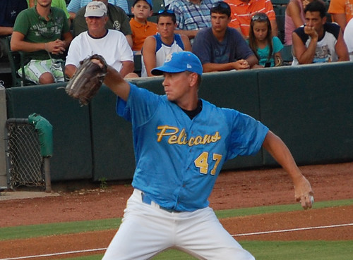
Myrtle Beach Pelicans: The Pelicans re-branded before the 2006 season, and by doing so, they greatly improved their look. The previous logo featured a pelican ready to bat in front of a teal MB rendered in Copperplate, with a particularly awkward spot where the italicized B meets the horizontal streaks behind the ball. In addition, the team's jersey wordmark didn't match the logo. Uniform-wise, the caps matched the logo. However, the new logo is a vast improvement over the previous attempt. As you can see, the team traded the black and teal for navy and light blue to complement the yellow in the scheme, which is a major upgrade the helps set a calm, relaxing mood in the scheme. The logo further accomplishes the theme with a rope border encompassing the night time waterfront. The pelican in the logo is perched on a bat, giving the logo just enough of a baseball-specific touch. Two of the caps use an MB that matches the newly consistent typography, while a third cap uses an abbreviated logo featuring the head of the pelican from the primary logo. The team's home and away uniforms opt for the vest look, complete with light blue undershirts, while the alternate jerseys are light blue with yellow type. Overall, the Pelicans mix a bright, unique color palette with well-crafted logos for a look that is original within the MiLB landscape.
Wilmington Blue Rocks: The Blue Rocks current look has been on display for only a season, but it's already worlds better than the previous set. The current logo features a new mascot, named "Rocky Bluewinkle" and a new color palette of light blue, navy, yellow, and silver. (The old color palette was made up of royal, navy, yellow, and silver.) The team also utilizes a set of alternate marks, including a BR logo, a standalone Rocky Bluewinkle head, and two marks of the team's other mascot, Mr. Celery. The Blue Rocks have room for four caps: a home cap, a road cap, an alternate cap, and a batting practice cap. The Wilmington squad also rocks vests at home, much like the Pelicans, but the color scheme is much more focused on light blue and navy, not light blue and yellow. In addition, the Blue Rocks have some sweet socks. The home alternate jersey is light blue with navy type, while the road and road alternate jerseys focus more on navy. The Blue Rocks are a great example of a team incorporating various pieces of its history into a new brand, while still leaving room for new history to be made.
The Bad
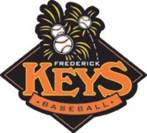
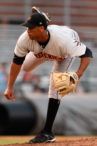
Frederick Keys: The Keys have been in existence since 1989, and haven't changed their logo once in that time. I think its time for an update. The font is campy, and the banner with "BASEBALL" looks slapped on, as it intersects the K and S in an odd way. Furthermore, the baseballs are poorly rendered and appear to be exploding into bananas. (A side note: the team is based in Maryland and named after Francis Scott Key, writer/composer of the National Anthem. They are in no way affiliated with the Florida Keys.) And if you thought the primary logo was bad, check out the cap logo. Is there a need for the three outlines around the F or the gradient? This is a classic example of cramming five pounds worth of design into a two-pound bag. The home jerseys are aesthetically in the other direction, as the team just copied the simple stylings of the Baltimore Orioles circa 1995 – 2003. The road jersey isn't much better, as it uses plain block letters arched across the front. I can't believe I'm saying this, but the Keys should just switch their name to the Frederick Orioles and just get this "We're not the Orioles, but we are" dance over with.
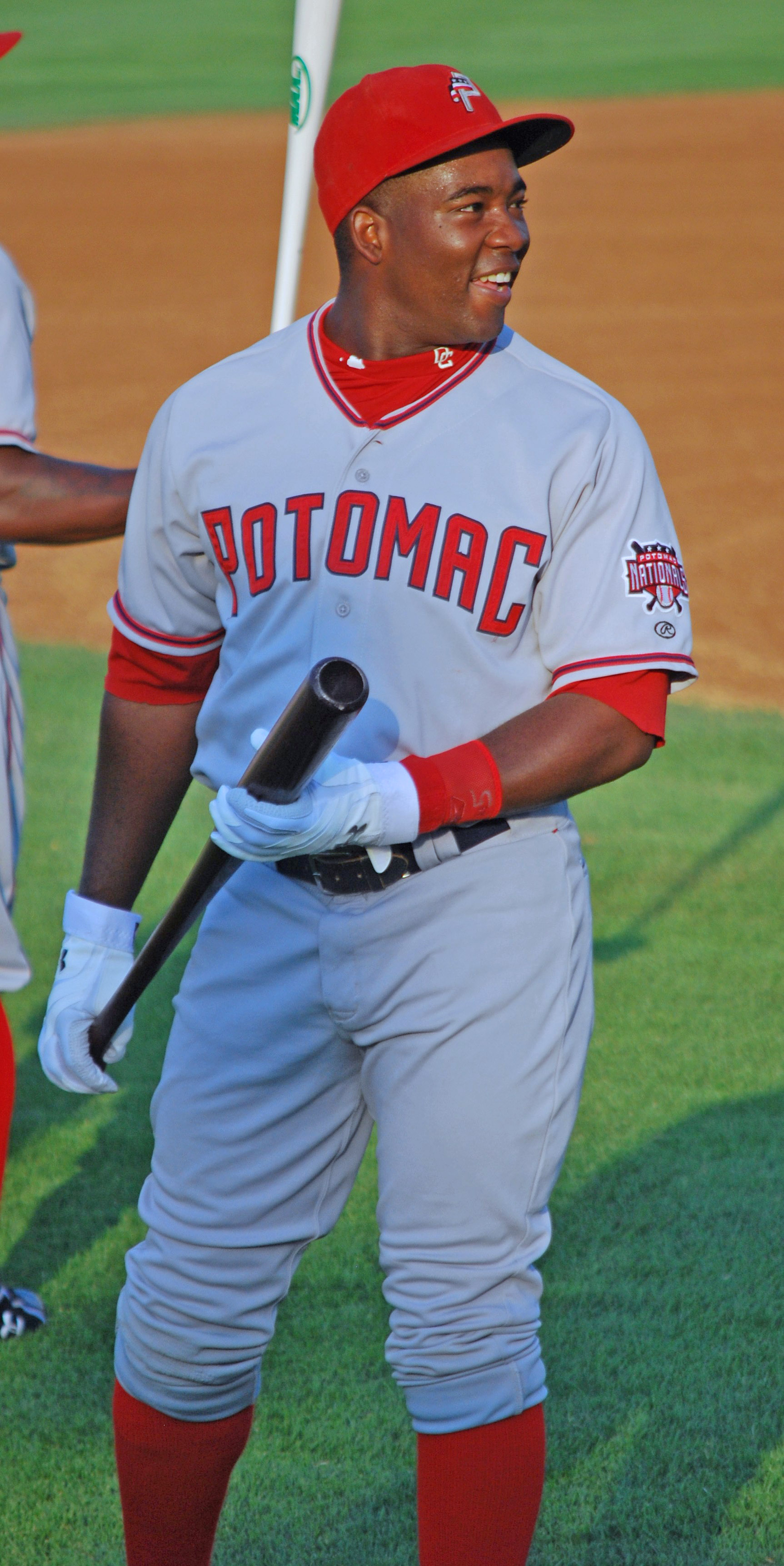
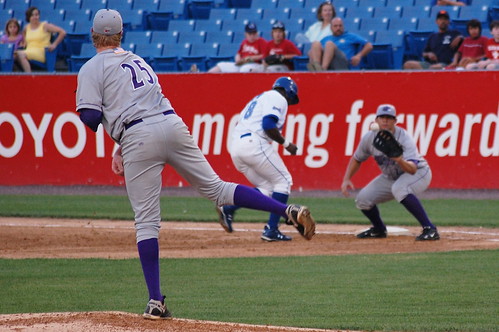
Potomac Nationals: I wonder who the parent club is? Before the 2005 season, the Potomac Nationals were known as the Potomac Cannons. Then, instead of refreshing the Cannons brand, the team decided to re-hash the parent club's identity. The current primary logo differs from the Washington team's logo only slightly, as it uses a diamond holding shape instead of a circle and features a pair of crossed bats that aren't in the parent club's marks. The P-Nats also have an alternate logo that uses a stylized P over a baseball encompassed in a circle. The caps feature a standalone version of the P. The home jerseys feature navy type, while the away jerseys go with red type. The P-Nats were impressively diligent in applying the graphic standards of the home club, down to the inconsistent color treatment between home and road.
Salem Red Sox: More brand borrowing from a Red Sox affiliate. In fact, here is a list of the Red Sox affiliates are as follows: AAA – Pawtucket Red Sox; AA – Portland Sea Dogs; A-Advanced – Salem Red Sox; A – Greenville Drive; A-Short Season – Lowell Spinners. All of these teams use a navy and red color scheme, and the PawSox, Sea Dogs, and Salem Red Sox all have uniforms that almost replicate the parent club's threads. The Salem squad's primary logo looks more like a Red Sox vacation destination than a team logo. The home uniforms feature a red cap with a Tuscan-style S and red-sleeved jerseys. The team also has away and alternate caps, both of which features a navy crown. Overall, it's just another substandard re-hashing of the Red Sox identity.
The Ugly
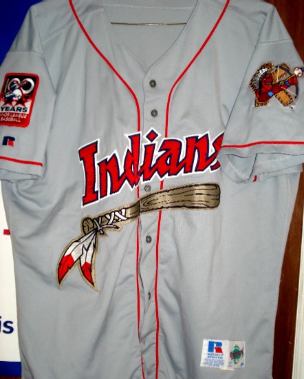
Kinston Indians: If you think Chief Wahoo is inappropriate, then the Kinston Indians logo is over-the-top absurd. The bulk of the logo package relies on an offensive caricature of a Native American. The home and away caps feature the "mascot", while the alternate and batting practice caps opt for a slightly more tasteful approach. The wordmark is interesting, but I cannot appreciate the identity because of its extremely distasteful nature. Maybe it's time for the team to become the Kinston Eagles again…
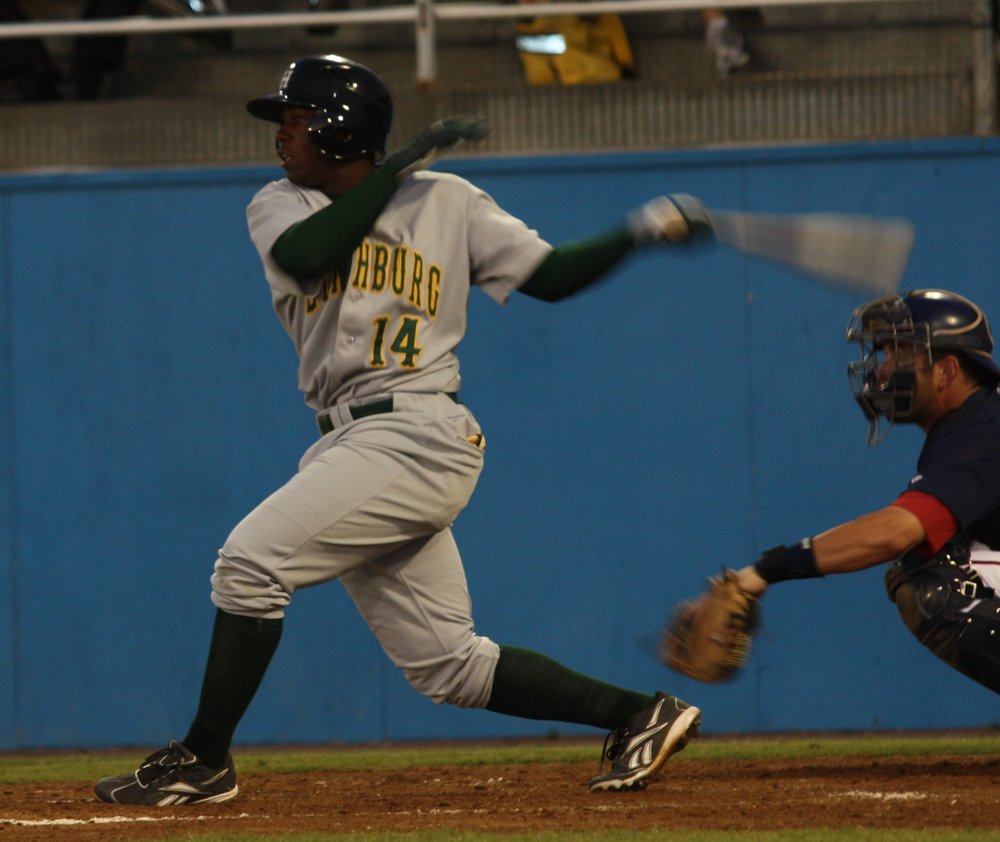
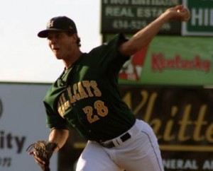
Lynchburg Hillcats: The Hillcats are the only Braves affiliate not to be called the Braves, but instead of owning their unique identity within the organization, they continue to use a sloppy, outdated logo. Take another look, I'll wait………… OK, starting with the type: it is awful. The thin offset outlines make the team look soft, graphically, and the gradiated letters on "HillCats" are almost illegible. Furthermore, the crossed bats (which look like clip art) just barely touch the type the the most awkward of ways. The mountains have the same clip art look as the bats, made possible by the extremely dainty black outlines that the bats also use. Then there's the bobcat head, which is the only piece of the logo that uses a thick, bold outline. The problem with the bobcat is that the bold outline is so sloppy, it looks like it was rendered in MS Paint. The logo is so bad the caps use a simple Tuscan LH logo. And the jerseys are as bland as the rest of the package, with the home jersey using a variation of the logo script while the away and alternate jerseys go with the Tuscan theme. With such a great name and color scheme, a good graphic designer could do a lot.
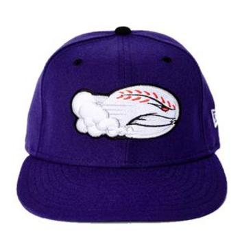
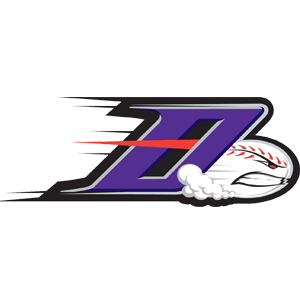
Winston-Salem Dash: So I got a text message from Brett Favre, and it had a picture of this logo. I'm kidding, of course, but the logo does look a lot like a certain part of the male body. Every time I look at this logo, I wonder how a team could spend thousands of dollars on an identity, have it look like what this looks like, and nobody caught the error. To make things even worse, Minor League Baseball is marketed as family-friendly, and this logo is absolutely not family-friendly in any way. Aside from the main error, there are also issues with the parts of the logo. The type is over-designed to the point where it is difficult to read, while the choice of a baseball as the mascot is simply uninspired at best. The team also has a set of supporting logos, which include a standalone baseball, a D logo, and a WS logo. The home uniforms feature the Dash script and are paired with purple caps, while the away uniforms use a Winston-Salem wordmark and grey-crowned caps. The team also has an alternate uniform with vest tops and a white cap. While the name is unique and interesting, this re-brand failed graphically in every way possible.
Designer's Corner
Today's design is a re-brand for the aforementioned Winston-Salem Dash. My first objective was to create a logo that wasn't inherently perverse, since Minor League Baseball is generally marketed as a family-friendly atmosphere. I opted for a giraffe motif, as the giraffe is a friendly animal. You might be thinking, "What does a giraffe have to do with dashing?" As it turns out, a giraffe is perfect for a team named the Dash, as giraffes can run at speeds of up to 35mph for short periods of time. This is essentially what a dash is: a quick, albeit short, run. Working with the giraffe theme, I decided a yellow/brown/green color scheme would fit the aesthetic qualities of the animal while giving the team a unique identity within the Carolina League and all of Minor League Baseball. The supporting marks include a D with the giraffe's coming through it and a WS logo. The type, as a whole, isn't nearly as detailed as the team's current wordmarks, but still conveys the fast nature of the team name through italics and the triangular notches that accent the custom typography.
After the logo set was in order, my next step involved creating cap concepts for the team. I tried options for the D logo, as well as the WS logo in addition to vintage concepts that feature simplified versions of the type. The primary home uniforms are a cream color that complements the warm tones of the yellow and brown, feature the Dash wordmark across the chest, and are paired with yellow caps. The sleeves are raglan-cut and accented with a subliminal giraffe spot pattern. The WS logo appears as a sleeve patch and the player number is placed on the hip of the pants, a tribute to the parent club White Sox. The away uniforms use a grey base and a brown cap that is emblazoned with the WS logo. Winston-Salem appears across the chest, while the D logo is placed on the right sleeve. Like the home uniforms, the sleeves are accented with giraffe spots, and the player number is placed on the hip of the pants. The alternate home and away uniforms feature colored jerseys. The home alternate uses a yellow jersey and cap, while the alternate road set features a brown jersey with yellow type. Alternate Uniform 3 is a faux-back design, complete with a trucker-style cap and a jersey with contrast raglan-cut sleeves. The type on the jerseys doesn't feature all the bells and whistle that the primary jerseys have, giving the uniform more of a classic look. Alternate 4 is an all-brown look with a green cap and contrasting jersey placket. It also features stripped-down typography for a retro feel. The overall look is original and family-friendly.


 Feel free to leave a comment on the branding of the Carolina League, the Winston-Salem Dash re-brand above, or anything sports branding related.
No comments:
Post a Comment