
With the 2010 NHL season about two weeks in, 44th & Goal has decided to give you, the readers, a look into the new jerseys, logos, and typography in play this season.
Anaheim Ducks: The Ducks' new third jerseys were supposed to be unveiled November 26th, but a photo has been leaked. The new third is black like the home jersey, but contains considerably more orange than the homes, which are primarily black and gold. The new third also features the webbed-foot D logo on the chest instead of the wordmark crest that the Ducks wear on the home and road jerseys. The thirds look better than the home and roads. 44th & Goal sees a distinct possibility that the third will eventually become the home sweater, with a white road version to match. I would have liked to see an orange third sweater, since the team plays in Orange County, but the third the team unveiled is solid.
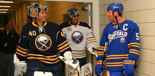
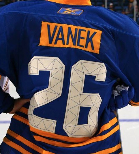
Buffalo Sabres: The Sabres are doing the sweater shuffle this year, as the team's third jersey from last year has become its new home sweater. The team also unveiled a new road sweater to match, thus officially pouring salt on the BuffaSlug. The Sabres also have a new third sweater, which is royal blue, yellow, and off-white and features a Pepsi-style wordmark across the chest. The back of the sweater features a contrasting nameplate and numbers with a unique stitching design. It's a little out there, but NHL third jerseys have long held a tradition of being a significant change from the homes and aways.
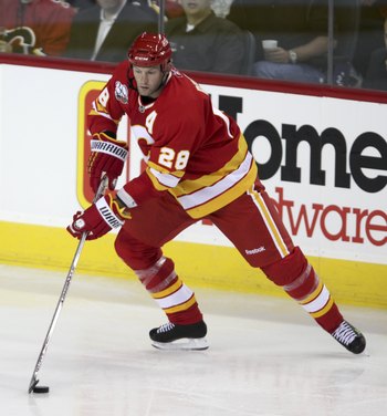
Calgary Flames: The Flames 30th Anniversary uniforms from last year have become, albeit slightly modified to fit the Reebok Edge template, the team's new alternate uniforms. In addition, the Flames will have a special uniform for their Heritage Classic game in February. Can't the Flames just get rid of their current home and road jerseys and adopt the Heritage jerseys full-time. They could look great with a matching white or off-white version.
Carolina Hurricanes: The Canes are hosting the All-Star Game this year, and are wearing the logo, which is sweet, as a jersey patch.
Columbus Blue Jackets: The Blue Jackets are celebrating 10 years in the NHL with a little flag-o-rama. It's a lot of flag art, but it's the team's theme.
Dallas Stars: The Stars are swapping the status of their away and alternate sweaters, with the wordmarked sweater as the new away and the logo-crested sweater as the alternate. Is it time for a re-brand yet?
Los Angeles Kings: The Kings brought back a blast from the past with their "new" throwback jerseys. Also in the works, a white prototype based on the team's current third jerseys. Let's hope the prototype appears in next year's NHL preview.
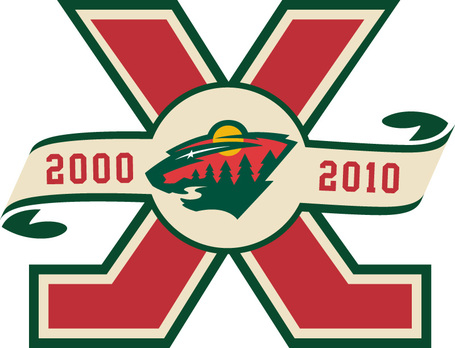
Minnesota Wild: As I mentioned before, the Wild have some new typography. In addition, they also have a 10th Anniversary logo.
Montreal Canadiens: The Habs will be throwing back to a design they wore from the mid-70s to the mid-90s, which is barely different from their current away jerseys. And the point of this was…?
New Jersey Devils: The Devils will once again don their red and green throwbacks for a single game this year. Not bad, although they are slightly stripe-heavy.
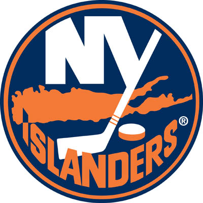
New York Islanders: The Islanders reverted back to royal and orange, and with it, a retro sweater design. It's a shame, because the previous sweaters combined new and old elements very well. The new jerseys do not have the stripes on the shoulders representing the team's four Stanley Cup titles. Instead, the stripes have been moved to the logo, which now has four stripes on the hockey stick instead of three. The jerseys are a bit bland, but the logo update is very clever.
New York Rangers: The Rangers are celebrating 85 years with an anniversary logo and a throwback jersey. Both are pretty cool, especially because of the use of off-white to give the logo and jersey a vintage feel.
Philadelphia Flyers: The Flyers have adopted last year's Winter Classic jersey as their new road sweater to match the home version. Hooray for consistency!
San Jose Sharks: The Sharks are celebrating 20 years in the NHL with a slew of logos. Wouldn't one strong mark have sufficed?
Toronto Maple Leafs: The Leafs have made a few updates to their look this offseason. First off, the added hem stripes to their jerseys, which now have lace-up collars. The team also changed its name and number typography (old / new).
Vancouver Canucks: The Canucks are wearing a throwback this year for their 40th anniversary. The team also created a logo for it.
Washington Capitals: The Caps are starring in this year's Winter Classic with a throwback jersey from the 70s. (Additional photos here.)
That concludes our NHL preview for the 2010-11 season.
Why I Love the Internet
You may remember back in April, when Rattlers Radio felt the need to debunk my Wisconsin Timber Rattlers and Appleton Foxes designs as merely concepts, which they were. Well, recently, certain members on a Nebraska Cornhuskers board were worried that the concept I posted was, in fact, a sneak peek at new uniforms for the team. I would like to reiterate that my designs are merely concepts of what teams could look like. If they were actual designs, I would not be unveiling them before the team did. I do, however, take the fact that the average fan thinks my designs are good enough to at least be rumored changes as a complement. I love the internet.
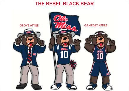
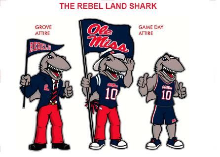
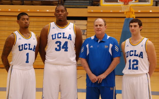
In Other News… Ole Miss got a new mascot to replace Colonel Reb. It's a black bear. The other choices included a "Land Shark" (I'm guessing it was rebelling against water.) and a grey person named "Hotty Toddy". Hotty Toddy really looks like the Greendale Human Being from the show Community… Here's a better picture of the new Maryland Terps basketball uniforms, including the alternates… The University of Miami is also getting basketball uniforms, as are UCLA, Missouri, and Boise State… The Redskins wore their gold pants again on Sunday… The Rams went all-navy versus the Chargers… The Steelers wore their throwback uniforms against the Browns… The Eagles wore white at home again against the Falcons, as did the Buccaneers, who hosted the Saints… The Broncos wore their orange alternate jerseys against the Jets. They should make those the primary home jerseys… The Titans wore navy pants against Jacksonville Monday Night. Not a great look…
Designer's Corner
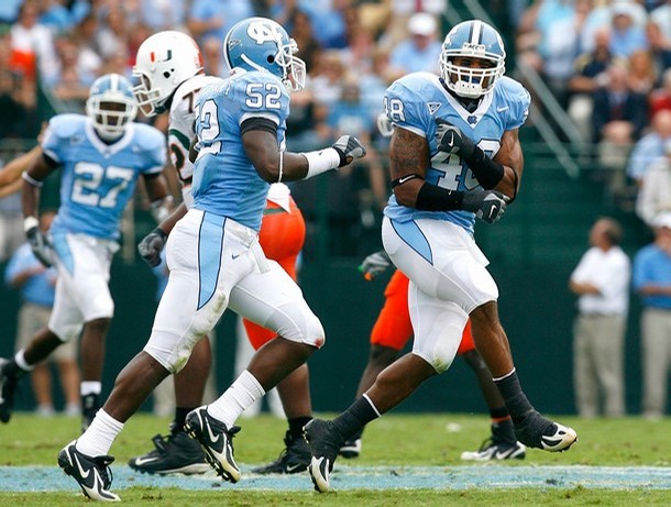
This week's design is for the University of North Carolina. The team's current football uniforms do not make use of the school's single most identifiable sports uniform design element: the argyle pattern the basketball team wears. My concept keeps the classic NC logo and the alternate foot logo. I removed the Nike 90s logos, and brought back the ram in a letter sweater logos. The main changes are on the uniforms, which feature the argyle pattern on the helmet, sleeves, and pants. I gave an option for white helmets, since college football seems to be moving toward having multiple color options for every part of the uniform. The jersey numbers are also consistent with the basketball uniforms. In addition to the carolina blue and white jerseys, I developed a navy alternate jersey. The overall effect is to brand the University of North Carolina's athletics in a consistent manor, a la Michigan State.


Feel free to leave a comment about this year's new NHL logos and jerseys, the UNC Concpet above, or anything sports branding related.
Love the Carolina uni.. I only wish...
ReplyDelete