
Recently, the Golden State Warriors unveiled the logo set of their latest re-branding. While they certainly had good intentions (like the guys in Pulp Fiction who were visited by Jackson and Travolta because didn't give the suitcase to Marcellus Wallace), the end product lacks cohesion and execution. Here is a rundown of the new logo set:

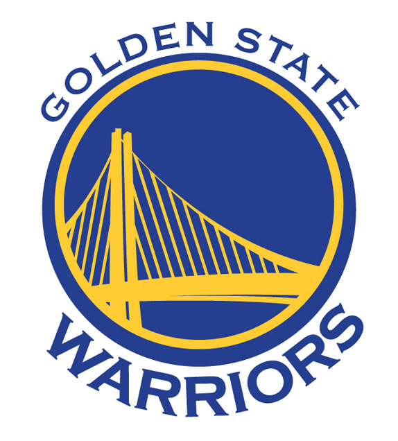
Primary Logo: I respect and appreciate the team's attempt to return to their history. And combined with the popularity of the team's Hardwood Classics jerseys, this was the correct direction to go in. And while the rendering of the bridge and offset containing circle create added motion in the logo, that is where the praise ends. The bridge in the logo is actually an unfinished part of the Bay Bridge, which connects San Francisco and Oakland. The rendering of the bridge, while not terrible, could be improved. Because of the variety of sizes and media in which the logo will be reproduced, there is a chance some of the thinner lines will get lost, especially if the logo is embroidered at a small size.
While the mark itself could be salvaged, the typography does not help it one bit. I mean, Copperplate? Really? Copperplate? Copperplate (the font) reached its peak popularity in the mid to late 90s, and has since been overused as many people only have it and other Microsoft Word fonts to choose from. But the client is the Golden State Warriors, a professional basketball team. They spend millions of dollars every year on player salaries, yet they couldn't afford to have a designer create a proprietary wordmark, let alone purchase a more fitting, unique font for the face of their franchise? To further compound the problem, GOLDEN STATE is spaced further apart than WARRIORS, and WARRIORS isn't even correctly centered below the logo! With the myriad of top-notch design firms and creative agencies in the Bay Area, I wouldn't expect this type of amateur execution.
Partial Logo: The bridge mark is instantly improved without the type next to it, but the basketball lines behind the bridge inexplicably flare at the ends, creating an uneasy tension in the logo. In addition, the bridge in the mark is off-center to the left, and centering the basketball seams does not balance the logo. Ideally the seams would be off to the right to balance the detail of the bridge to the left and create more motion within the mark.
Secondary Logo A: I can't believe this is an "NBA-caliber" logo. There is next to no cohesion between the W and California. It's not so much a unified logo, as it is two graphic elements slapped together. If the blue outline of the W was pushed behind the state, then the pieces might relate to each other better.
Secondary Logo B: At least it's not as bad as Secondary Logo A. However, it still has the flared basketball seams and Copperplate typography. Surprisingly, it's actually the least technically flawed logo in the set, but that isn't saying much. The main issue is conceptual: For a team that used the image of an unfinished bridge in order to unite the Bay Area, they suddenly took a graphic left turn and developed a mark that is exclusively San Francisco. (The Warriors play their home games in Oakland, by the way.)
Overall, this identity is muddled with technical flaws and poor design choices. As it turns out, the eastern span of the Bay Bridge is a perfect icon for this identity, as both appear to be incomplete.
In the name of unfinished business, the design for this week is a continuation of the Nebraska/Wisconsin uniform conundrum. With the Badgers, I wanted to keep the vast majority of the logo set. I did, however, modify the wordmark, using Eurostile for UNIVERSITY OF instead of Copperplate. The uniforms are where I really flexed the creative muscle, as they were inspired by the one-and-only Bucky Badger. The helmets are a wraparound design, reminiscent of the Michigan Wolverines, except the Wisconsin helmets take their cues from the head of an actual badger. Rendered in cardinal and white, the helmets offer a simple, unique solution that differentiates Wisconsin from new rival Nebraska. The jerseys are a vast departure from the current set, using the Badgers' proprietary typeface for the numbers instead of the traditional block font they currently use. In addition, I have added a WISCONSIN wordmark to the chest, and Bucky appears on the sleeves. The main difference is that I exchanged the two-stripe motif for a pinstriped look. The vertical white pinstripes appear on red, starting at the sleeves and extending down the sides of the jerseys, for a unique look in not just college, but all of football. The pants extend the pinstripes, which are contained in a broad red stripe, down to the knee. The primary home uniforms are cardinal jerseys with white pants, with a pair of alternate cardinal pants for special occasions. The away jerseys are white and are also primarily paired with the white pants, with the cardinal pants available for special occasions as well.


Feel free to comment about the new Golden State Warriors identity package, the Wisconsin Badgers design above, or anything sports branding related. Until next week.
No comments:
Post a Comment