
Team USA recently unveiled its new basketball uniforms to be used from the FIBA World Championships this summer through the 2012 Summer Olympics. The jerseys aren't a total re-brand from the previous set, but there are some significant new developments.
The Jersey: The '08 jerseys were on the simpler side, using a block number typeface and a USA wordmark also rendered in block letters. The Beijing squad's jerseys contained contrast panels near the armpits, but that look has gone by the wayside. The new jerseys are based on a new template that features a single strip of piping running down the front of the side panels. "Aerographics" (the sublimated graphics created by intricate perforations) make a return to the backs of the jerseys for this incarnation. The USA wordmark is red on both the home and away jerseys, with navy, white, and silver comprising the rest of the jersey. In fact, outside of the USA wordmark, red only appears on logo patches in this set, which is a stark contrast from earlier versions of Team USA's duds. Lastly, the jerseys have lost a significant amount of fabric between the extra tailoring and perforated designs that Nike has employed.
The Shorts: Nike boasts that the new shorts are half as light as a pair of normal shorts. In addition, the new shorts are lighter when wet than a pair of the old shorts are when dry. The simple white piping from the jerseys makes its way onto the shorts for a tech-inspired design. The perforations on the shorts are larger than their jersey counterparts. In fact, they appear to be almost the size of a pencil eraser. It's a good thing Nike decided to put a thin layer of fabric under the side panels that contain the Swiss cheese look. Lastly, USA Basketball's secondary logo of a basketball and a star appears on both legs of the shorts, while the primary logo appears on the front of the right leg.
So how do the new Team USA uniforms compare to the team's past looks? If the names on back are subtle like the 2008 version, I'd say pretty good. The uniforms are toned down, but not boring. The detailed oarts (read: Aerographics) are subtle and don't detract from the key information, like the numbers or USA wordmark. And if the players feel a competitive advantage from the lighter threads, then I'd say Nike did its job. France, China, Puerto Rico, and Brazil are also wearing the new-model uniforms as well.
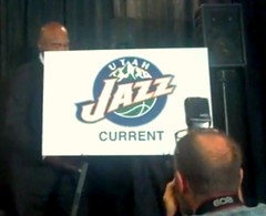
In other news, yesterday the Orlando Magic and Utah Jazz have unveiled updated logos for the 2010-11 season. Orlando's new logo updated the typography of the old mark to match the type work on the jerseys. Overall, I'd say it's an improvement from the cartoony type the team previously used. In addition, the new typeface is more vertical, and fits better with the uniform's pinstripes. There is a slight disconnect between the wordmark and streaking basketball, but compared to the previous logo, it's a step in the right direction.
The Jazz have changed their color palette from navy, columbia blue, purple, silver, and white to navy, green, yellow, silver, and white. In addition, they've recolored their exisiting primary logo and reintroduced the classic "Music Note J". Here is a color comparison of the old and new primary logos. I use that term loosely because the music note will appear on the court, on the uniforms, and the "primary" will likely be phased out in the coming years. The uniform unveiling will occur in mid-August. It will be very disappointing if the Jazz opt for a navy road jersey. With only two teams in the league currently wearing green on the road (Bucks and Celtics), this is a major opportunity for the Jazz to create a unique on-court identity for themselves. A navy based scheme, however, will compare to the looks of the Pacers, Grizzlies, Nuggets, and Warriors, although Golden State is set to unveil a new logo and color scheme this summer.
This week, we have another "Double Play Design" with the current Brewers' opponent, the Los Angeles Angels of Anaheim, leading off. With the Angels, I started with the name. A few years back, the "Anaheim Angels" decided to change their name to the "Los Angeles Angels of Anaheim". They still play in Anaheim, although they are in the Los Angeles metro area. I decided to go back to "Anaheim Angels" and embraced the team's home in Orange County by adding orange to the design. Along with orange, the color scheme features scarlet red, and powder blue. This combination gives the team a distinctly Southern California vibe, and a unique color scheme in all of sports. The primary logo takes a Tuscan style A and anthropomorphizes it with wings and a halo. An "ANAHEIM ANGELS" wordmark appears above the stylized A. The secondary logo is a standalone version of the A, and is placed on all the caps. The tertiary takes the existing A and places it on a circular patch for a "Hell's Angels" feel. The caps add a retro flair to the identity by bringing back the famous halo, but in orange. The uniforms use the Tuscan font on the wordmarks and numbers. The home uniforms start with a white base and red caps, typography, belts, and shoes. The primary home jerseys use an orange/red/orange sleeve trim, while the home alternates use an orange/white/orange trim. The away uniforms feature a powder blue caps with a red brim, to match the powder blue base of the uniforms. While the primary away jerseys using the orange/red/orange trim that the primary home uniforms do, the alternate away uniforms use an orange/powder blue/orange trim in addition to powder blue type. The Sunday Alternates features white caps and a white uniform base, but add a retro vibe with powder blue/orange/red/orange/powder blue stripes running down the sleeves. The Sunday Alts also use the secondary logo on the left chest instead of having the ANGELS wordmark running across the chest.


On deck, we have the Brewers' next Interleague opponent, the Seattle Mariners. Seattle has used its current identity since 1993, and it looks that way. The current logo is a compass rose rendered in navy, teal, silver, and white, with SEATTLE MARINERS in the circle around the compass. The team currently minimizes it's use of teal, leaving them with primarily navy and silver uniforms. Talk about boring! In my re-brand, I took a page out of the playbook of the Seahawks (slate, navy, & lime) and Sounders (royal, lime, & navy) and focused on blue and lime green. This particular incarnation features navy as the primary color, with slate blue and lime green complementing the nautical theme. Logo-wise, my inspiration came from the Mariners history, more specifically the Trident-M they used late 70s and early 80s. I modified the Trident-M by removing the star and smoothing the curves with the mark. Then I had to think, "What goes with a trident?" The answer: Poseidon! Poseidon, God of the Sea, was the perfect mascot for a nautically-themed team. I rendered the aquatic deity in percentages of the blue and lime, perfecting his underwater-green skin and shadows. Then I added a wavy wordmark to give the viewer a visual conncetion with the ever-changing sea. The final touch to tie the logo set together was incorporating the Trident-M on Poseidon's crown. The tertiary logo is a standalone version of Poseidon's head, to be used a a sleeve patch on the jerseys. The uniforms (except the Sunday Alternate) showcase the "racing stripe" style with the twist of flaring the stripes as they approach the edge of the sleeve, resulting in a modern, yet retro look. The home uniforms start with a white base, and focus on the interaction of navy and lime green. They also feature the MARINERS wordmark and slab serif numerals. The home cap uses a white Trident-M with a lime outline. The tertiary logo appears on the right sleeve, instead of the left, so the logo faces forward. The away jerseys start with a sea green base and showcase the juxtaposition of navy and slate blue to complement the away cap, which uses a sea green Trident-M outlined in slate blue. A SEATTLE wordmark graces the chests of the two away jerseys, one in sea green and the other navy. The Sunday Alternate is a faux-back styled uniform with caps that feature white front panels. The uniforms are simple and consist of a white base with a contrast placket and sleeve trim. The secondary logo appears on the left chest of the jersey.


Feel free to leave a comment about Team USA's new basketball threads, the Angels or Mariners concepts above, or anything sports-design related. Next week, the discussion will focus on the Big Ten (12?), the Big 12 (10?) and the Pac-10 (11? 12?) and their possible branding issues. Stay tuned!
Ordered a few days ago and just received it today. The quality of Sublimated Team Uniforms by Evo9x is good.
ReplyDelete