
As college athletics encountered a small shake up this off season, I was reminded of certain branding issues within the realm of collegiate sports. In addition, some new issues developed as a result of the realignment. Here is a look at some of those issues:
First off, the SEC has a team name issue. Ideally (and in most conferences), only one team within a conference should have a specific mascot. The SEC defies this logic with two "Tigers" (Auburn and LSU) and two "Bulldogs" (Georgia and Mississippi State). Since these schools have shared the SEC for a while now, the chances of them correcting these overlaps is slim to none.
The Pac-10 recently added Colorado and Utah, giving the conference 12 teams. Chances are the Pac-10 will become the Pac-12 because they were the Pac-8 previous to Arizona and Arizona State joining the conference. In addition, the conference recently updated its logo (here is the old one, for comparison), which it will have to update again for the increased number of teams.
The Big 12 lost the aforementioned Colorado Buffaloes, as well as the Nebraska Cornhuskers, giving the conference ten teams. But the Big Ten is already taken as a conference name. Speaking of the Big Ten, I've never understood the logic of naming an 11-team conference a member short. This inaccuracy stems from Penn State's inclusion, as they are the 11th member team, but I've always thought it was wrong to keep calling the conference the "Big Ten". It sounds like they are trying to leave a team out. Especially now, with the Big Ten adding Nebraska, the name just sounds outdated. So do the Big 12 and Big Ten switch names? Even though that would solve the issue, it will probably never happen due to copyrights. But in order to get the discussion rolling here are some alternate names for the conferences to try out in lieu of swapping or doing nothing:
Big 12
Big Plains Conference (Pretty self-explanatory)
Great Plains Conference (Similar to Big Plains, but could also work)
Big Central Conference (Pretty self-explanatory)
All-American Conference (A name that could work for any conference throughout the country)
Great American Conference (See: All-American Conference)
Big Prairie Conference (Most of the conference is is Prairie country)
Heartland Athletic Conference (It would be perfect, if not for the D2 Heartland Conference)
Southwest Conference (Sure, Iowa State and Missouri aren't Southwest, but it has equity from the past)
Big Ten
Big Lakes Conference (Only Nebraska and Iowa don't border a Great Lake)
Great Lakes Conference (See: Big Lakes Conference)
Big North Conference (All the schools are in the Northern half of the country; good thing Missouri didn't join)
Classic 12 Conference (Still has that old-school feel, but it's free of the "Big" logistic issues)
Northern Athletic Conference (The NAC is somewhat generic, but it's open without a numbering headache)
A big part of why they may not re-brand is the amount of equity the conferences have invested into the existing names. However, at a certain point, they have to take accuracy into account, as they are affiliations of educational institutions. The easiest way to move forward (other than doing nothing and confusing children everywhere) would be to choose a name without a number. This would also be helpful in the event one (or both) of the conferences expands or contracts again.
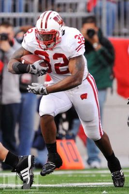
To further confuse the situation, Nebraska and Wisconsin appear to be separated at birth. Both teams are red and white. Both teams use a two-stripe motif. Both teams use white helmets with red facemasks. Both teams have put a patch on the left chest of their jerseys (the Badgers moved the patch to the left hip of the pants) and place the TV numbers on their sleeves, instead of the shoulders. The only noticeable differences between the two teams (in football) are the logos and helmet stripes. The two teams' “official" colors aren't the same (Nebraska is Scarlet & Cream, while the Badgers are Cardinal & White), but the application (and variation) of their colors make the two teams almost identical. I have two proposals for a solution to this conundrum: 1) Both teams change and consult each other to ensure each team emerges with a unique brand. 2) Play for it. In Nebraska's inaugural Big Ten season, they should play Wisconsin for the right to keep the uniforms, with the losing team making significant stylistic alterations. In addition, it would make a great start to an emerging rivalry. It could even be played at a neutral site, like Lambeau Field, not to mention the added stakes would certainly help draw a national television audience. Of course, this would have to happen at the end of the season, so the losing team could have enough time to make the uniform change.
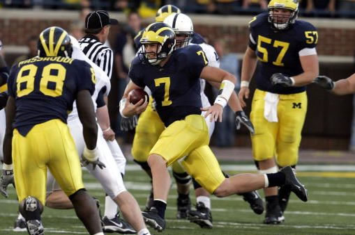
“Playing for the uniforms" could also help historical powerhouses whose styles have been imitated. Michigan could play Delaware for the helmets, while USC could vanquish Iowa State from its look. This concept could also have helped Oklahoma keep Indiana from playing copycat a few years ago. And the SEC's Bulldogs and Tigers could play for the mascots.
This week's design concept takes the Nebraska Cornhuskers and strengthens their identity. I started with the colors, making Scarlet & Cream mean scarlet and cream. All of the white has been converted to the cream color, giving Nebraska a vintage, aged look. Keeping a modified form of the current primary logo, I removed all traces of the Huskers script, replacing the outdated font with a slab serif, giving the identity a tough, no-frills look to match the team's style of play. The secondary logo is based on the patch the team wears on its jerseys. The tertiary logo is based on a long-held Nebraska tradition: the “Blackshirts". Instead of using the skull-and-crossbones, I decided to work in a black ear of corn. The wordmark is a slightly tweaked version of one of their current versions.

With the uniforms, I took the single stripe design of the helmet and consistently applied it throughout the uniforms. The helmet logo is now the primary logo, instead of the “default N" the team currently uses. The jerseys are scarlet at home, cream on the road, and there is also a black jersey to honor the Blackshirts. The secondary logo appears on the left chest of the jerseys, while the tertiary would appear on the back of the helmets of the Blackshirt group of defensive players. The jersey numbers switch from the standard block font to a proprietary typeface that matches the slab serif type and helps give the uniforms a vintage feel.


Feel free to comment on the naming issues facing the NCAA, the Cornhuskers concept above, or anything sports branding related. Stay tuned for next week, when I will show a design concept for the Wisconsin Badgers.
No comments:
Post a Comment