
Attention class. History 101 is now in session.
Over the years, pro football uniforms have changed drastically. Even teams like the Browns and Packers, who stylistically have tried to remain consistent, have made tweaks and adjustments to their sets. A large part of this evolution has to do with technological advances in equipment, which are necessary in keeping the bigger, stronger, faster players of today safe when they collide. Pro football uniforms took an aesthetic turn with the advent of the AFL. Before that point there were some firsts, such as the beginning of helmet designs (Rams). However, things accelerated with the beginning of the AFL.
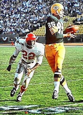
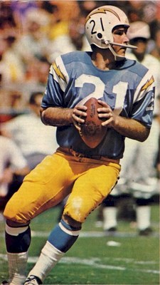
1960s
Much like other segments of society in the 60s, pro football saw an explosion of color. The Chargers were sporting light blue and yellow uniforms with lightning bolts. The Dolphins dared to wear aqua. The Vikings even stepped onto the field in purple pants! The Cowboys featured a contrasting shoulder yoke design, and the Broncos sported vertically-striped socks. Experimentation wasn't just for hippies, it was everywhere.
1970s
While the 60s laid the foundation, the 70s refined it. The general themes were bright colors and broad stripes. The Buccaneers started play wearing bright orange and red, while the Seahawks donned royal and green. The Eagles wore jerseys with 12 stripes per sleeve (similar to this). Colored facemasks also appeared in the 70s.
1980s
The 80s saw a more conservative swing in the general aesthetic. Sleeve stripes were subdued, as were many teams' color schemes. Teams were realizing the potential their logos had. Colored pants also became more commonplace. The most innovative design of the decade would be the Cincinnati Bengals' tiger-striped uniforms.
1990s
Logos were becoming bolder and fiercer. The NFL's 75th Anniversary was the birth of the retro look. As teams celebrated their history, fans grew fond of the experimentation of the past. Teams began incorporating sweatbands and cleats into their color schemes.
By the end of the decade, multiple teams edited their color schemes to darker, fiercer options. Philadelphia unveiled midnight green, while the Jets and 49ers tweaked their colors towards the deeper end of the spectrum. Tampa Bay was now red and pewter, while the light blue and red Oilers were now the navy and light blue Titans. Many teams were letting the colors and logos do the talking, as jerseys featured simple trim with specialized numbers and team logos on the sleeves. Denver revolutionized the football uniform landscape with their Nike-designed duds.
2000s
The 2000s seem to be the beginning of a new era. Sleeves shrank over the course of the 90s, and designs in the 2000s reflected that change. The idea of alternates and various combinations took hold. Today, most teams have a third jersey and some teams feature three sets of pants. The Seahawks developed a metallic slate blue, which would be paired with navy and lime green. Many of the modern designs feature piping and swooshes, giving players a faster, more aerodynamic look. More than half of the NFL's teams feature their own proprietary number font, ranging from modified block numbers like Arizona and New England, to more creative solutions like Philadelphia and Cincinnati.
Where is uniform design headed? No one can say for sure, but my guess is as sleeves shrink and teams look to one-up each other, designs will center more on the shoulder pad area and small logos and wordmarks will continue to pop up in new places.
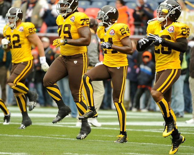
This week, I am showing designs for teams that unfortunately ended their seasons. Let's start with last weekend's first loser, Cincinnati. Although the Bengals' current uniform has some good things going on, it's hard to tell because there are simply too many things going on. The tiger-striped helmets have to stay; they're the best part of the brand. My design rids the jerseys of the white side panels that affect the pant stripes and places the emphasis of the tiger-striping on the shoulder yoke. I think this version allows the stripes to flow, instead of being chopped off where the sleeves connect to the body of the jersey. I have also decided orange is a stronger primary jersey color to distance the Bengals from their in-state rival, Cleveland.

Next, we have the Eagles. My main issue with the Eagles is their color scheme. The current midnight green often appears dull and too similar to the black they use, so I substituted it with kelly green. Back are the silver pants, for a historical tie-in. The jerseys feature a wrap-around piping design and a custom collar. I have also included options with green pants and an all-black set.

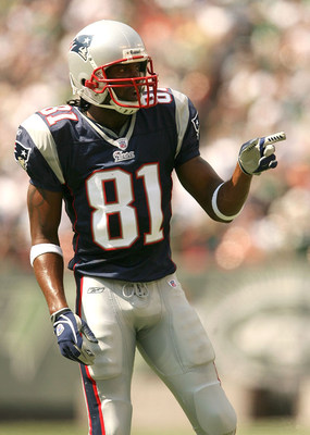
Moving on to Sunday's games, we have the Patriots. With this concept, I wanted to strike a balance between old and new. I removed the silver for a more patriotic red, white, and blue scheme. The shoulders now feature a three-stripe pattern similar to the Patriots of yesteryear, but with a twist: sublimated stars are within the center stripe. I have additionally incorporated the "stars & stripes" pattern into the pants and used striped socks.

Finally, we have the Packers. When it comes to teams like Green Bay, I approach the design from the perspective of realism. By realism, I mean putting together a design that, if ever implemented, wouldn't cause fans to revolt in the streets. That said, I took the sleeve striping that the Pack currently sports, and applied it to the helmets, pants, and socks. I have also added the G logo to the chest, to give the jerseys a modern touch. In addition, there are home and away monochromatic combinations, as well as a yellow jersey for hot-weather road games or possibly a "cheesehead appreciation" game.

And that concludes our history lesson for today. Feel free to sound off below about anything sports design related.
I can't believe there aren't any comments. These mock ups are great.
ReplyDeleteMade of lightweight, sweat-wicking, and soft fabric, compression shirts and apparel perfect for workouts, games, and quick muscle recovery. custom made compression shirts keep you energetic and fit. At EVO9X, you can get custom compression shirts for men, women, and youth in many styles. They offer excellent flexibility, style, and a smarter outlook.
ReplyDelete