
Last week, it was brought to my attention that the Badgers bowl-game opponent, the University of Miami, was wearing new uniforms. I wanted to know more, so I looked for photos online. It didn't take me long to realize "The U" was wearing their installment of Nike's new Pro Combat Series. Nike had some great ideas with the development of this line, and yet there are certain things that could be improved upon. Here's a team-by-team breakdown of three of the more intriguing Pro Combat schools.
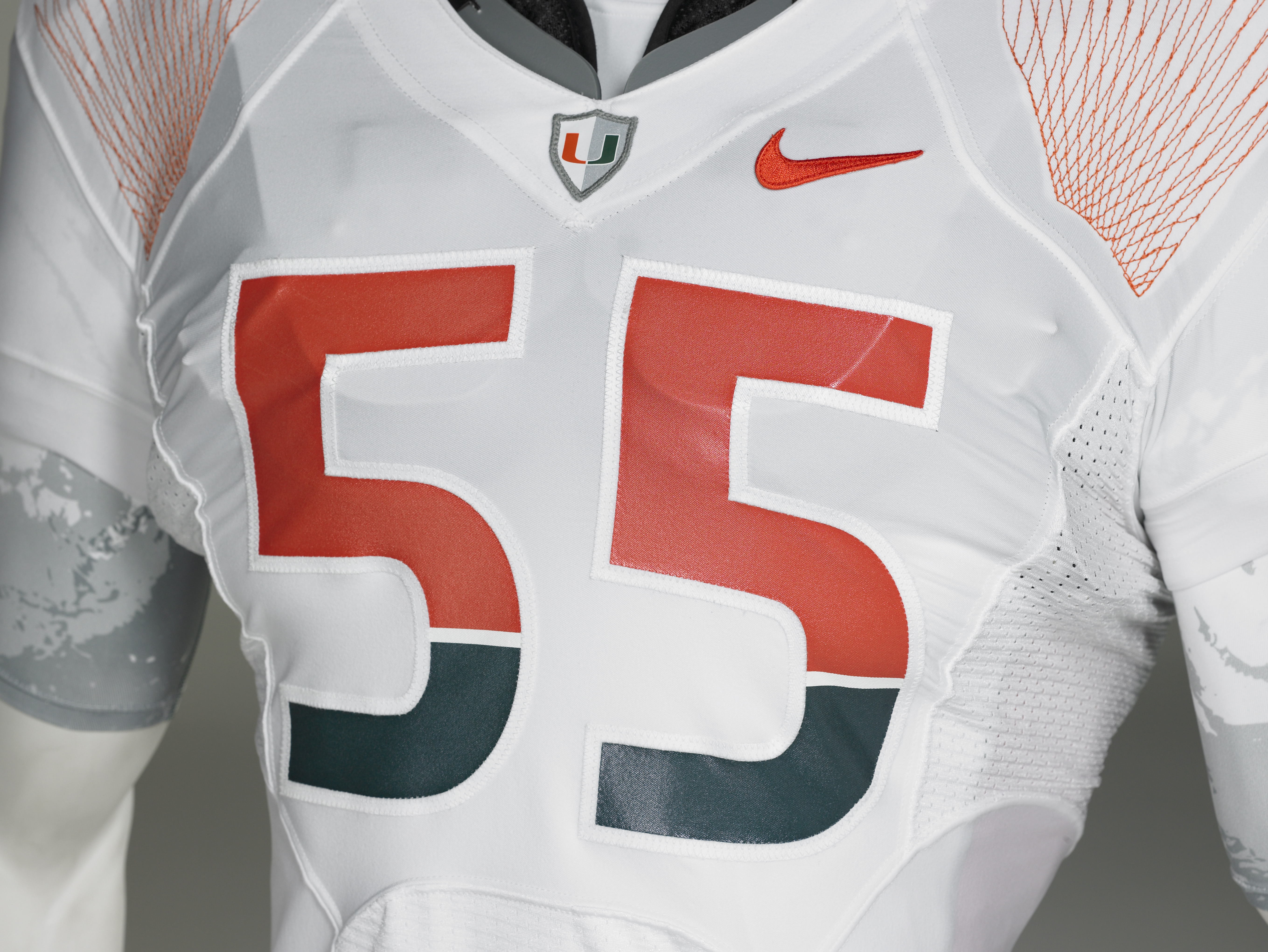
Miami
The Good: I applaud Nike for going with the two-tone numbers. I really like the way the numbers mimic the U logo. In addition, Nike carried that idea through to the pant striping and provided Miami's players with one white and orange cleat and one white and green cleat each. The under-layer also features an interesting pattern based on a weather map of a hurricane.
The Bad: The helmet stripe retained the classic Miami look, but I think it would have fit the concept better if it featured the split look of the numbers and pant striping. I realize the recent trend of putting a slogan on the inside of the collar, but why? Nobody watching from the stands or on TV can see it. Is it purely to pump the players up?
The Ugly: Let's start with the patterned embroidery on the shoulders. Nike says it is to make the shoulder area more durable, but it has nothing to do with a hurricane! It's simply Nike trying to promote their brand over Miami's brand, which I find slightly absurd. If they had developed a different pattern for each team, that would have been more appropriate.
Overall Grade: A-
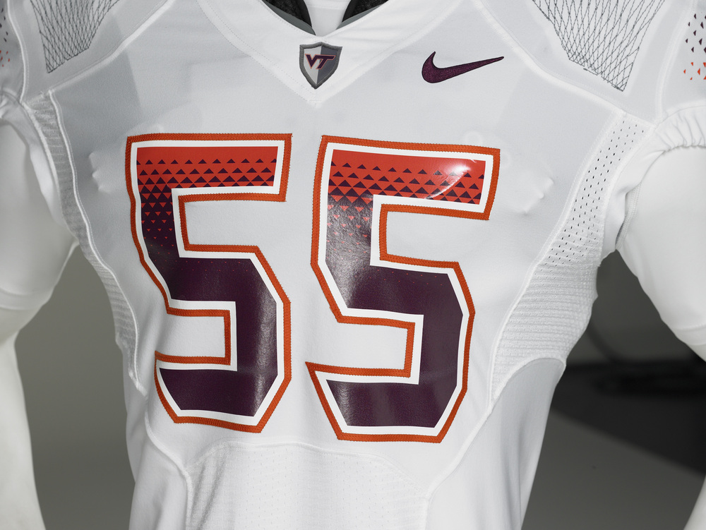
Virginia Tech
The Good: Once again, Nike hit a home run on the numbers. Overall, the triangular halftone pattern is well executed.
The Bad: When it comes to Virginia Tech, the color scheme is so unique that I don't quite understand why they minimized it. Why go all-white when a burgundy jersey would have worked for the halftone? How about a burgundy helmet? That would have made the uniform more unique.
The Ugly: Once again, the shoulder embroidery.
Overall Grade: B+
Florida State
The Good: Just about every part of this. From the feather motif and the use of garnet to the number typeface and even the black helmet.
The Bad: The gloves. It's innovative, but it just isn't as good as the rest of the set.
The Ugly: See "The Ugly" above.
There are other teams in Nike's new line, including Florida (C-), TCU (D), Oklahoma (C), Texas (B), LSU (C), Ohio State (C-), and Missouri (B-).
Since the NFL's regular season is over and the playoffs are under way, I thought I'd share some off my favorite designs of non-playoff teams.
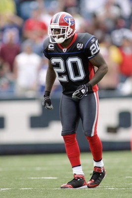
Buffalo: Their current uniforms are a mess. They have too many colors, and mismatched side panels and pant stripes. My main goal was to create a look with mix-and-match possibilities. Where as the current shoulder design doesn't fit the shape of a player's upper body, my design utilizes more natural lines for a design that flows better. Red has become a trim color with the focus now on the interaction of the two blue. The helmets are now white as well.

Carolina: First off, I dropped the silver. It made the Panthers look too much like the Raiders. The design features sharp curves and "slash mark" inserts, to better match the helmet striping. The loss of silver allows the light blue to stand out more. The black helmet also gives the uniform a stealthy, panther-like appearance. Lastly, I have edited the numbers so they are less generic.

Houston: When I think of Texas, I think of western-style button-down shirts, which were the inspiration for this design. I have also added stars by the collar to give the look something extra.

Jacksonville: I have always thought the Jaguars copied the Dolphins when they chose teal as their primary color. I was , however, intrigued by their new "color-changing" helmet, so I incorporated it into the design. I changed the teal to jungle green and inserted accents of a jaguar pattern.

Kansas City: My biggest problem with the Chiefs uniforms is inconsistency. The helmet features black when the rest of the uniform doesn't, and the uniforms use yellow, which is non-existent on the helmets. I have also edited the numbers and added an abstraction of a feather to the pants.

Tampa Bay: While I see the current Buccaneers identity and uniforms as a vast improvement over the Creamsicle Era, it could be better. I have decreased the black and increased the orange. I have also given the design a more ragged feel, to match the logo.

Tennessee: I decided to edit the colors from navy and light blue to light blue and maroon, for a more contemporary feel. I have also removed the flaming thumbtack from the helmet in favor of the T-sword. The shoulder design is a modernization of the current jersey, while the pants now match the look of the shoulders.

In the following weeks, I will show designs related to the teams that have ended their seasons. Please check back to see the upcoming designs, and feel free to post a comment regarding Nike, college football, or any of the designs above.
try to change the colors of the helmets too....like the buccaneers on black helmets with black jerseys would look sick haha....and white packer helmets would look pretty cool too
ReplyDeleteNike air force one mujer
ReplyDeleteOferta al por mayor nike air force one mujer