
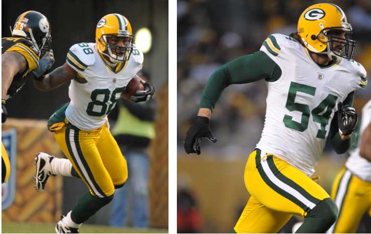
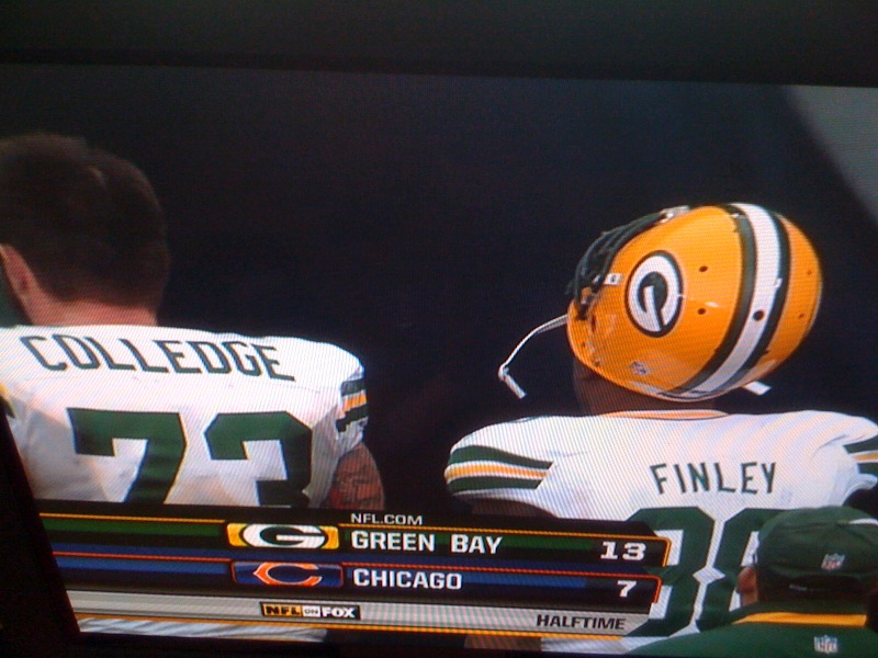
Have you recently noticed that certain Packers players appear to be wearing a different style of jersey than the rest of the team? More specifically, Jermichael Finley, Nick Barnett, and Brandon Chillar are wearing the new Reebok prototype. Here's a rundown of some of the differences between a standard NFL jersey and what I am dubbing the new "video game jerseys". (They remind me of what the players look like in Madden.)
• The names on the back of the video game jerseys are significantly smaller than their traditional counterparts. This doesn't really bother me because referees use a player's number to identify him on the field. Also, we live in the era of hyphenated last names, so this is probably necessary.
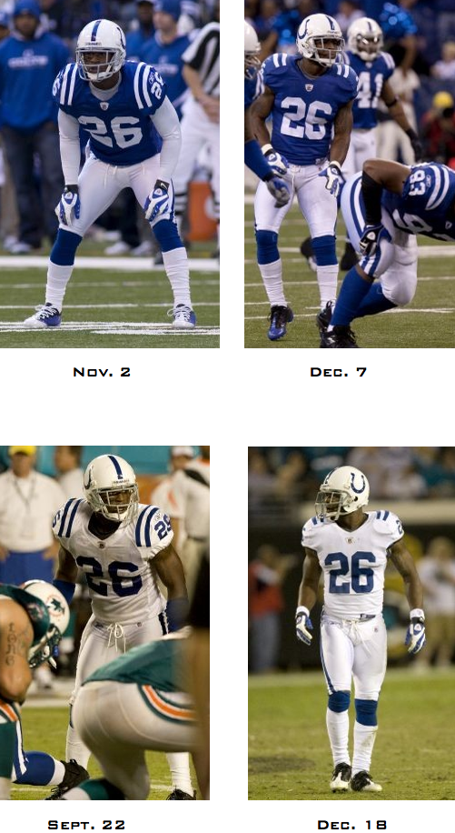
• The TV numbers (numbers on the shoulder pads or sleeves) are also smaller, at least on some teams. The Packers and Colts both use the small numbers, while the Giants and Jaguars have been able to keep the normal-sized TV numbers.
• The fabric is very different on the video game jerseys. It was designed to be super-stretchy, and has resulted in the teams' designs looking somewhat warped.
• The NFL equipment logo has moved to a lower position on the new jerseys , which has in turn pushed the front numbers to a lower spot as well.
• The collar on the video game jerseys is more of a tapered collar, with the front of the neck hole featuring a thinner collar than the back.
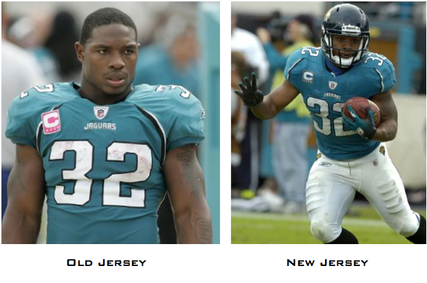
The new tailoring has caused some less-than-attractive results in teams' designs. The Packers collars have a sharp, pointy look due to the taper, and the sleeve stripes are more truncated than usual. (I honestly wouldn't mind the latter if everyone on the team wore it.) The Colts' uniforms are more problematic when applied to the video game jersey template. Their signature shoulder stripes don't look right when they have been reduced to fit the prototype. The Jaguars' case is even more perplexing. Just months after unveiling new jerseys with striping that is supposed to flow around and under the sleeves, why would they switch to a template that chops the stripes off so they don't flow correctly? The video game jerseys would have worked better with their old style. The Giants jerseys work well with the new template because they are so plain (the home jersey, anyway). It's hard to screw them up. In fact the Giants are usually one of the first teams to try prototype jerseys for that very reason. I also saw Chad Ocho Cinco of the Bengals wearing the video game jersey against the Jets in their Wild Card game a week and a half ago. The prototype actually looked pretty good when applied to the Bengals scheme. My only question is why weren't the Raiders (simple jersey) and the Titans asked to try the video game jersey? The new tailoring would have worked well with the Titans' shoulder bar motif.
Moving on to last weekend's Saturday night game, we have the Baltimore Ravens. When I started this concept, I thought about what makes a raven distinct. Its colors were my primary answer. With that in mind, I added a purple shine to the black helmets. I also decided, given the dark, ominous nature of the identity, that black pants would be the primary option across the board. The designs on the pants and sleeves draw from feathers and the style of the logo. I have also added options for purple and white pants.

For the Cowboys, I approached the design much like I approached my Packers concept. The Cowboys do not need a uniform overhaul, they just need some consistency. I kept the navy, white, and greenish silver, and dropped the royal, black, standard silver, and grey. I went back to their classic numerals, which feature block serifs, and made the facemasks navy. I have added a pair of white pants as an option for road games, as well as an all-navy set as an option when teams wear white against the Cowboys.

For the record, I would like to state that the Chargers' current uniforms are almost perfect and are one of my favorite in the league. However, in the interest of creativity, I completely started over. I dropped the navy and darkened the light blue. I also added a strikethrough to the numbers to mimic the wordmark. The bolts on the shoulders and pants are no longer contained within a stripe. Although it is difficult to see on this template, I have also added the numbers to the helmets to draw a connection to the very well-liked throwback uniforms. Finally, I have added yellow jerseys and pants, as well as blue pants for more options.

Thanks for reading. Feel free to sound off below about anything sports design related.
No comments:
Post a Comment