

By Bowen Hobbs
It's re-brand season for Major and Minor League Baseball and a few teams have already started in on the fun. Above you'll see the new uniforms for the Cleveland Indians (full video of the new Away and Home Alternate jerseys here). After looking the new changes over, and digesting them, here is a critique of the new uniforms:
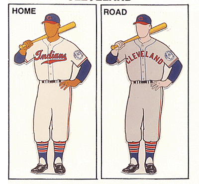
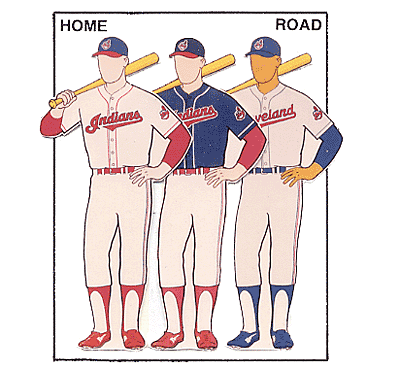
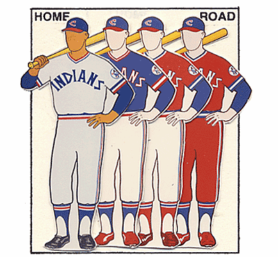
Primary Home Uniform: This one is actually the furthest on the right in the photo above. It has not changed since last season.
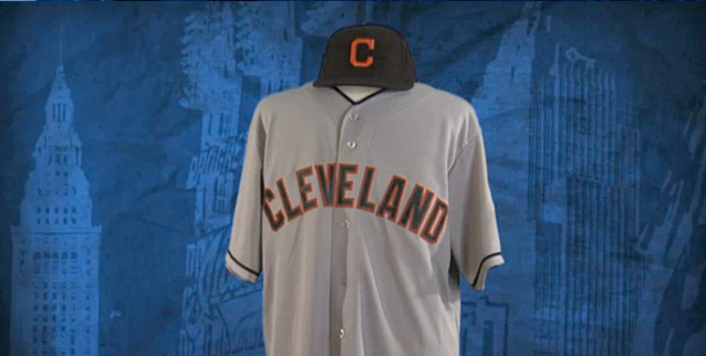
Primary Away Uniform: The jersey is new, while the cap was moved over from last season's alternate home uniform. The caps are all navy with a red block C. The jerseys feature CLEVELAND in navy block letters outlined in red. The player name and number on the back will also be navy blue, with the number also featuring the red outline. Although it's tough to see in the photo above, the jerseys have trim around the sleeves and neck.
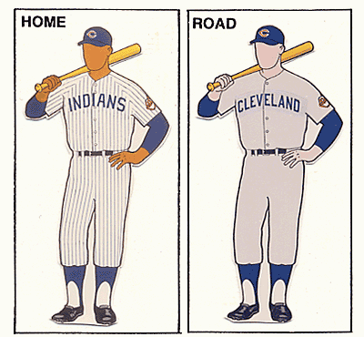
Alternate Home Uniform: The Tribe have been wearing the cream-colored alternates since 2008, but the 2011 version showcases a new red cap with a navy block C. The look remains unchanged below the neck though, with INDIANS in red block letters outlined in navy. The numbers on the back are also red block type with navy outlines, and there are no player names above the numbers.
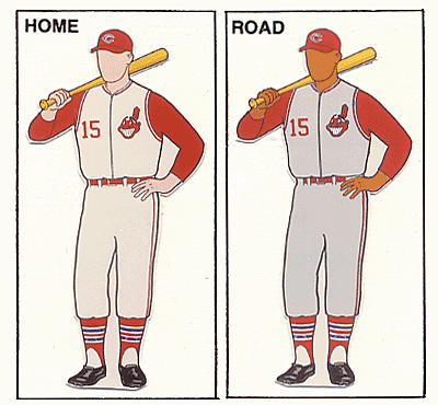
Alternate Away Uniform: The away alternates, like the home alternates, remain unchanged from the neck down. The jerseys feature a red wordmark, double-outlined in navy and white, and silver piping down the placket and around the sleeves. The player numbers are rendered in MLB Block (as are all the other jersey numbers in the Indians' set) and maintain the double-outline from the wordmark on the front. The cap is newly paired with the navy jersey, as it was last season's primary away cap. (Last season the navy jerseys were complemented by the I cap, which is no longer in use.)
Now that we have a base of what the new look will be, we can analyze if it is effective branding or not. My answer: No. The problem with the set is that it fails to deal with either of the issues of the previous Indians uniform sets:
Chief Wahoo: The Chief has been a hot button issue for a while now, as the logo is essentially a stereotype of a Native American. Some people see the logo as incredibly offensive because it is a very distasteful caricature of a race. Others say, "Tradition is tradition, and I don't care who it offends." The Indians had a choice to make going into this re-design: Do we ditch Wahoo because it could turn off emerging Ohio baseball fans to our team, or do we keep it because we would anger the traditionalists if we got rid of it? The team decided to ride the line, shifting Wahoo away from the primary away uniform, but keeping him on two of their four caps and on the left sleeve of every jersey. It's a slight reduction in Wahoo usage, but it doesn't go nearly far enough.
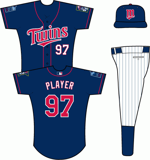
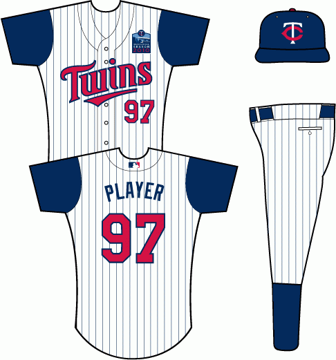
The Twins: The Indians have had to deal with the fact that they are not the only navy/red team in their own division, let alone the AL or all of MLB. This redesign does not address that at all. The home uniforms still use navy caps and red lettering, which Boston, Minnesota, and Atlanta also use. Hardly original. The home alternates use red caps and lettering with navy accents, which matches the home uniforms of the Angels, Cardinals, and Nationals. The away uniforms now have navy lettering outlined in red, which is more unique than navy caps paired with red lettering on the road (Braves, Cardinals, Nationals), but still matches the overall look of the Twins and Red Sox. The Indians lack a signature look, as they have throughout their history while vacillating between being a "navy team" or a "red team". There are only so many ways to create a navy and red uniform, so maybe it's time for the Tribe to switch color schemes.
The other issue is that the new set is very schizophrenic. It's not unheard of for a team to have a throwback inspired alternate, but the having a throwback inspired alternate and away uniform, while the other uniforms look quite modern? That very Twins of them (home / away / alternate 1 / 2 / 3) . Also, the Indians have four caps. Four! Is that really necessary? The Twins, with their five jerseys, have only three caps. Couldn't the Tribe wear the one Wahoo cap with the primary home and alternate away uniforms? Do they need the red cap, when the navy block C cap worked just fine with the cream uniforms last year?
While I'm all for the team minimizing Chief Wahoo, they didn't go far enough to that end. And in the process of slightly downgrading Wahoo's status, they developed a scheme that lacks a true identity. They copied the Twins, a division rival, at every turn (except the red cap), and came out with two separate identities: one throwback, one modern. It'll be difficlt for the team be achieve the instant recognition that the Yankees and Cubs enjoy with their current scheme.
The Nationals will be unveiling their new uniforms at 7:15 PM (6:15 Central) tonight. The team has mentioned there will be "major changes". Let's hope they do not continue their current schizophrenic identity of waffling between beveled block letters and script.
Other changes in MLB this year include the Mariners' return to a teal jersey and the A's getting a gold alternate jersey to replace their inexplicable black jersey. Also in the AL West, the Angels will celebrate their 50th anniversary by changing the halos on the caps and wordmarks from silver to gold.
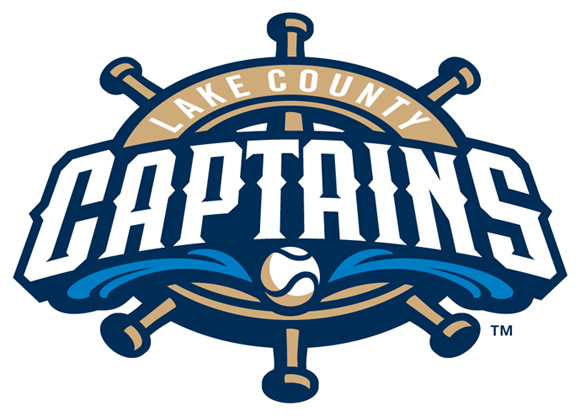
In the Minors, the Lake County Captains and Asheville Tourists unveiled new identities in the past week. While the Captains' old logo used a cartoon steamboat captain, the new identity uses a ship's steering wheel with a splash of water as the primary logo. The team has three caps: a primary, an alternate, and one for batting practice. The home jerseys use a wordmark almost the same as the logo, but with a lighthouse substituted for the I. In addition, the numbers are consistent with the feel of the wordmark by utilizing notches that are cut into the numbers themselves. The home jerseys also have a patch on the right sleeve of a ship in a circle. With a streamlined color pallete, consistent typography, and well-rendered logos, this re-brand was a major upgrade.
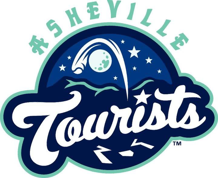
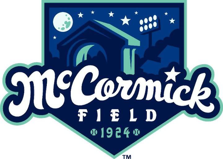
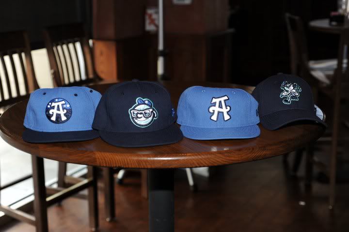
The Asheville Tourists were also in need of a redesign, as their previous logo lacked flow and a cohesive style. The new logo plays on the idea of a nighttime ballpark scene. The supporting type is a little over-stylized, but the rest of the logo is well-rendered and the color scheme uses a very unique seafoam color to illustrate the glow of moonlight. The Tourists also have two alternate logos of a moon-based mascot that resembles Mr. Met, in addition to a matching stadium logo. The team uses four caps: a navy home cap with the moon man's head (It glows in the dark!), a light blue road cap with an A, a light blue alternate cap with a navy brim and the A inside a nighttime scene, and a navy batting practice cap with the full body moon man. Although the set isn't perfect, it's very good and constitutes a major upgrade over the previous package.
In Other News… The Oregon Ducks basketball program unveiled a new court design. Can't tell what it is? Here's another look. Interesting, but I will have to reserve judgment until I see it on TV… The Wisconsin Badgers and Michigan Wolverines got new hoops uniforms, complete with senseless looking collars… Monochrome Madness struck in the NFL, as the Texans went all-navy and the Vikings broke out the seldom seen all-purple, complete with that weird side block on the pants… The Colts wore their throwbacks on Sunday, which have the horseshoes on the back of the helmet…
Designer's Corner
Today's designs come from the NFL, starting with the Cleveland Indians' neighbor, the Browns. For the Browns, I wanted to develop a modern classic. The first thing I sought to do with the Browns was the unthinkable: give them a logo. Now, I respect tradition and would never try to disregard the passion of Browns fans, but the team need a logo. The helmets can continue to be blank, but for various purposes, the helmet illustration they currently use as a logo falls short. In its place I created a new version of their B football logo (also called the =B= logo) that uses the natural seam of a football to create an accent of orange. The color scheme is also modified, replacing the white with an off-white that fits with the overall warm tones of the team's brown and orange. The secondary logo is the memorial patch the team currently wears for Al Lerner, while the wordmark is a subtle update to their current typography. My main goal with the uniform was to create a consistent striping pattern. In my version of the striping, orange is always placed in the middle (on a cream or brown background), while the cream is always placed on the outsides of the striping ( orange or brown background). The uniforms also feature piping that crops the striping, mixing modern and traditional elements. I also substituted the non-matching grey facemasks for brown ones and rendered the shoes in brown, since both black and white looked out of place with the brown and cream colors.


Next up are the Miami Dolphins. The Dolphins concept is also an attempt at a modern classic, blending new and traditional elements. My first task with the 'Phins was to edit the color palette. The navy that was introduced in 1997 appears dated and, quite frankly, a little kitschy. I replaced the navy with a deep grey that has a slight teal hue, giving the concept an overall tonality in addition to better matching the overall color of a dolphin. I updated the M on the dolphin's helmet as the current M does not flow with the modern direction that this concept was headed in. I also created a new sleeker wordmark that features a wave set into the two-tone type. The uniforms feature consistent striping (the current uniforms don't) that is cropped by piping, as well as a new sleeker number font. The piping on the jerseys highlights the shoulder area, while the piping on the pants wraps around the back of the pants.


Feel free to leave a comment on the new designs for the Indians, Captains, and Tourists; the concepts above; or anything sports branding related.
No comments:
Post a Comment