
44th & Goal jumps back into the aesthetic world of Minor League Baseball with Part 7 of its 14-Part series: The Good, The Bad, & The Ugly. This week, we will cover the visual identities of the California League. Like the other leagues of Minor League Baseball, the California League loasts some great examples of sports branding as well as some teams that could use help with their look.
The Good
Lancaster Jethawks: The Jethawks adopted their current look between the 2007 and 2008 seasons. Their previous logo was rooted the the aesthetics of the 1950s, and used a color pallete of blue, red, black, gold, and silver. The current brand streamlined the color scheme, while the current logo uses a much more fitting fighter jet theme. The new mark features much bolder lines and typography. Where the previous caps used rather cartoony illustrations for logos, the new caps use partial marks based on the primary logo. The Jethawks instantly upgraded their identity package with their most recent re-brand.
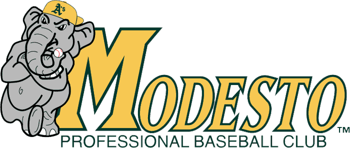
Modesto Nuts: The Nuts used to be the Modesto A's before the 2005 season. If they hadn't re-branded, they would have found themselves directly in the Bad category for brand borrowing. Instead, their current logo balances their quirky name with the boldness of a sports logo. The typography is bold and balanced, without the typesetting inconsistency of the previous logo. The caps are particularly interesting because the each cap has one of the two nuts on it, whereas both nuts appear in the primary logo. The home jersey is a white vest with black undersleeves, while the away jersey is a solid black jersey with placket piping and sleeve trim. The Nuts' graphic scheme highlights every to love about Minor League Baseball: professional logos that are unique due to the the team's one-of-a-kind name.
Rancho Cucamonga Quakes: Although the Quakes' primary logo is a little over-designed, (I don't think the wordmark needs that much distress.) the team's overall graphic appearance is solid. The caps are very unique by featuring an embroidered fault line across the brim. The color and typography are consistently applied, giving the Quakes a fresh, professional look.
Visalia Rawhide: Minor League Baseball returned to Visalia in 2009, this time as the Visalia Rawhide. The Rawhide's logo mainly consists of a westernized script, complemented by a bull whip R. The team's color scheme features red, black, and metallic gold. The home and away caps use a pair of marks that are inspired by cattle branding. The jerseys are fairly basic, with only the wordmark on the front and the number on the back. Kudos to the Rawhide for going all out with their theme.
The Bad
High Desert Mavericks: The Mavs have been a staple of the California League since 1991. In that time, the team has not changed its logo at all. The issues are apparent: The outline on "MAVERICKS" is far too thin, leading it to disappear at small sizes. The supporting text ("HIGH DESERT" and "BASEBALL CLUB") uses two different typefaces when one would do, in addition to the fact that the supporting type is integrated poorly, leading it to look slapped on. Lastly, the way the underline of "MAVERICKS" connects to the S is very poorly done. Although the baseballs on the hat in the logo are clever, the do not lend themselves to reproduction at small sizes. The cap logo is just the M with the hat, while the jerseys say "Mavs" on the front. Overall, the Mavericks are due for an update, whether it's an update or a re-brand.
Inland Empire 66ers: Great name, but that's where the praise ends. Formerly the San Bernadino Stampede, the 66ers employ a royal, red, black ,and silver scheme. The problem with using the Interstate color scheme is that Route 66 was never an official Interstate highway. Actual Route 66 signs look more like this. And while there are times people have taken liberty with the design of the sign, US Highways are officially designated by black and white signage. The home cap is royal with a grey brim, while the away cap uses a red crown. Further confusing the identity, the jerseys use very little red and blue, with the wordmarks rendered in silver and black (although there are picture of Manny Ramirez floating around wearing a red-wordmarked away jersey). Using the signage for inspiration on the logos and caps and then going with a classic car theme on the jerseys creates a visual disconnect that does not reinforce a consistent brand. Once again, great name, but that's where the praise ends.
San Jose Giants: Is there a lazier way to make a primary logo than this? All they did was make the gold grey and swap out "SAN FRANCISCO" for "SAN JOSE". At least the caps have a cool logo, although it doesn't match the "GIANTS" wordmark in the logo. Although the home jersey now says "GIANTS", it used to use the SJ logo as recently as last season. These Giants are using two different style that don't quite work together.
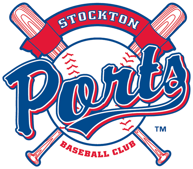
Stockton Ports: It's not the worst logo in MiLB, but it's certainly not the best either. A closer inspection reveals just how poorly the type was rendered. The home and away caps use lettermarks with anchors and baseballs, which unfortunately, are a bit busy. (The baseball is overkill.) The jerseys are nothing special. The home version uses red sleeves and blue piping, while its away counterpart is a plain grey jersey with "STOCKTON" in blue, outlined in white. The Ports would have a solid baseball-centric identity, but execution counts.
The Ugly
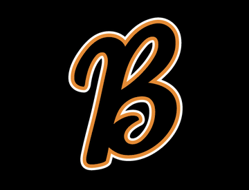
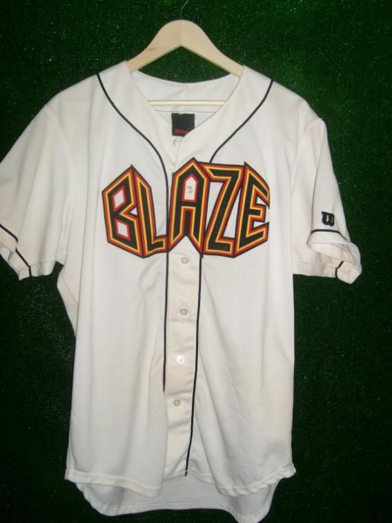
Bakersfield Blaze: Well, where do I begin? The logo? OK, the logo. The Blaze call this their primary logo. As you can see, the letterforms are crammed into a geometric shape, except for a few parts of the letters popping out awkwardly. Making things worse, the inside of the B and A only have a red outline, instead of the triple outline the rest of the wordmark uses. The secondary logo isn't any better. It looks like an abstract butterfly with a flaming maple leaf behind it. Seriously though, the repeated clip art flames are an insult to professional graphic designers everywhere. It appears the team is starting to see the light, as the jerseys use a basic cursive script that, although plain, is far less awful that the previous version. I would say it's time for a re-brand, but the last time they re-branded, they came up with what I've been complaining about for the last paragraph.
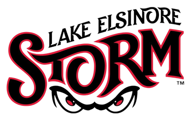
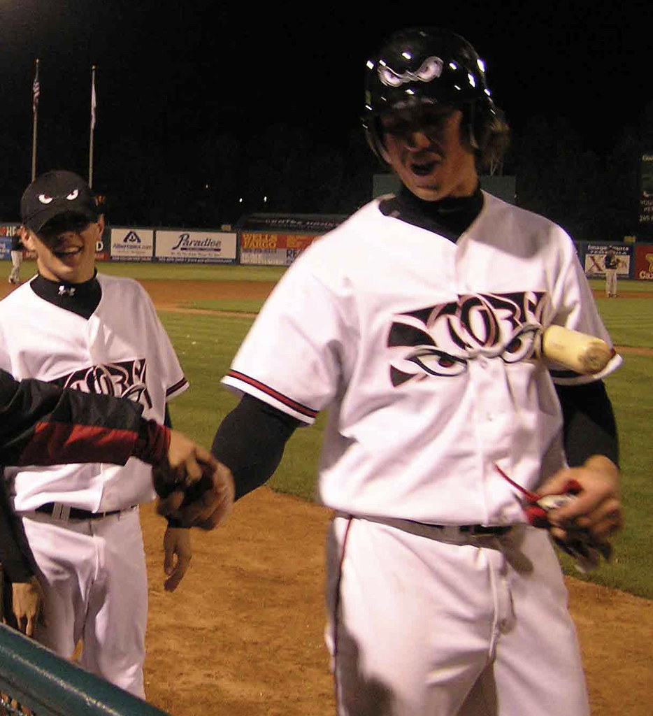
Lake Elsinore Storm: The Storm re-branded before the 2002 season. Unfortunately, their old logo was better. The current logo primarily consists of a Storm wordmark (that's what that is…) with eyes below it. Generally, in the branding world, a logo should be legible, and this isn't nearly as legible as it should be. The team uses three caps, one for home and two for the road, all of which have eyes on them. The jerseys use the primary logo across the chest. Although I admit the numbers are pretty cool. (Well, the two's anyway.) If the fans can't read the logo, what the point?
In Other News… The Bengals wore their standard home uniforms, instead of the coolest Halloween uniforms ever… The Rams wore their throwbacks, which compensated for the poor lighting of the Edward Jones Dome nicely… The Patriots also threw back… The Cardinals wore their black alternates against Tampa Bay… The Saints went all-black (except for the helmets) against Pittsburgh, who finally wore white this season… The Oregon Ducks went storm trooper while beating USC. Turns out, the player names on those jerseys are white too. Nice subtle touch… Army went full-camo on Saturday. I definitely prefer the black jerseys in this set… Florida wore their Pro Combat uniforms… Ole Miss went all-grey…
Designer's Corner
As I mentioned before, the Bakersfield Blaze's identity is a nightmare. My re-brand for the Blaze uses a charcoal grey/red/orange color scheme that implies fire and ashes. Whereas the current Blaze logo forces the letters into a geometric shape, my primary logo concept features a Blaze script in front of a fireball/baseball. The supporting marks include two stylized Bs and a standalone fireball/baseball. The home uniforms use a white base with red raglan-cut sleeves and the Blaze wordmark across the chest. The player number appears on the left below the wordmark. The away uniforms go in a unique direction, using a charcoal base, similar to what the Toronto Blue Jays almost went with back in 2004. Most of the type on the charcoal uniforms is orange, giving the uniform a burning embers look. The alternate home and away jerseys are red with the alternate home jerseys featuring white type, while the alternate away jersey uses orange type. Alternate Uniform 3 has a throwback feel, with a cap the has a bit on old-school piping over the seams. The jerseys for Alternate 3 use the B logo as a crest and a serifed block font for the numbers. Alternate 4 shows off an orange cap (with the fireball logo) and jersey.


Feel free to leave a comment on the aesthetics of the California League, the Bakersfield Blaze re-brand above, or anything sports design related.
the blaze front office hates our old uniforms as well. we've switched our hats to the cursive B that starts the (home) "Blaze" and (away) "Bakersfield" jersey word marks. The "pot leaf" logo is hopefully gone. the awfully dated graffiti-styled geometric "Blaze" is also gone. now we just have to stop changing the logo so often, so there aren't a dozen different options available. but, the current front office staff didn't have anything to do with those awful ideas.
ReplyDeleteThank you for the information. I thought there might have been a change, but I couldn't find enough comprehensive images to prove so. Minor League Baseball hasn't been documented like the major pro leagues. Do you have any thoughts on my concept? I'd love to here what a Blaze fan has to say.
ReplyDeletei like the gray and red colors. although i will admit that i think i prefer our "bakersfield" script. but anything is, obviously, an improvement over the pot leaf. i would love it if we went away from the name "blaze" altogether. folks here know its hot. we don't need to remind them. i like the baseball/fire logo as well. our "b" is classic, and i like that about it, but it's also sort of boring and non descript. the burligton royals "b" logo (with crown) is awesome, but ours is...eh. when we were the bakersfield dodgers, the team used the brooklyn dodgers hats, and that was weird as well. but i like your logo. its a little bit like the logo we used in the mid 90s, when hideo nomo was here, but up to date, and with better colors. if we ever get to a point where we're going full re-brand, i hope to get a lot of opinion on the design...
ReplyDelete