
 By Bowen Hobbs
Nike is at it again.
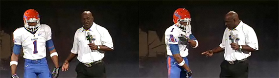
As it turns out, last year's wildly successful Pro Combat uniforms were a one-game special. To keep the Pro Combat train rolling along, Nike unveiled the 2010 edition of Pro Combat this morning. Here's a look:
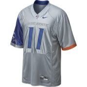
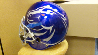
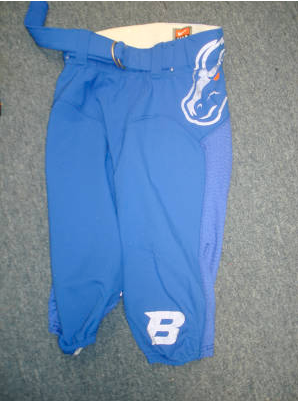
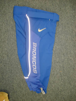
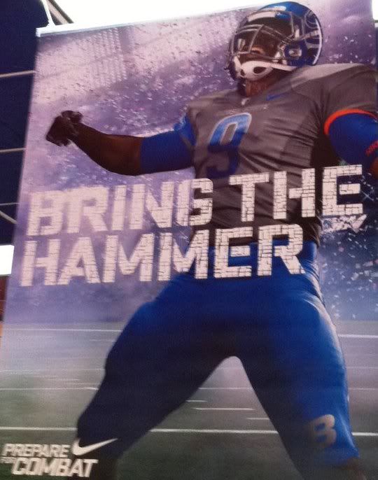
Boise State: Famous for beating Oklahoma in the Fiesta Bowl in 2007 and blue turf, Boise State was selected as one of this year's 10 Pro Combat teams. Their new uniform features a grey jersey with one blue sleeve, which has a large, cropped image of the Boise State Broncos bronco head. The oversized logo theme continues onto the helmet, where the bronco head is displayed proudly… and massively on a blue shell. The pants are, like the jersey, asymmetically designed, complete with another large bronco head on the left hip, the BRONCOS wordmark down the right leg, and a silver B on the left knee.
Virginia Tech: Inspired by VT's relationship with the military, the uniform is all-black with grey accents (symbolic of military dress uniforms) to accompany the team's burgundy and orange. The helmet is a flat black shell with the VT logo in orange outlined in burgundy and white. The uniform numbers feature a computer-chip pattern signifying the school's technological background. The "tech-y" pattern is also used throughout the uniforms on orange accent panels that crop the shoulders and run down the pant legs.
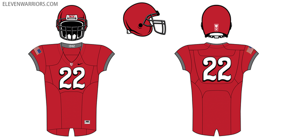
Ohio State: Like VT, The Ohio State University unveiled its second Pro Combat uniform in as many years. This year's Ohio State uniform looks to honor the 1942 team. The helmet is rather basic, featuring a red shell, grey facemasks, and the Bronze Star of Charles Csuri, the MVP of the 1942 squad. The jerseys are also rather simple, only adorned by an American flag on the right sleeve and stylized jersey numbers that pay homage to the 1942 squad. The pants are simple, as well: grey with the Ohio State O logo on the hips. The under layer shows off a sublimated camouflage pattern to tie the scheme together.
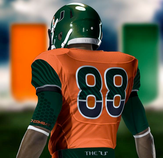
U of Miami: Especially compared to last year's white-out Pro Combat set, this year's uniform is dripping with color. The helmet is a metallic shade of green that falls between Miami's normal forest green and emerald, complete with the U logo on each side. The jersey, by contrast, is bright orange with green sleeves which have a sublimated palm tree pattern on them. The numbers are the same font as last year's model, but instead of being half-green and half-orange, they are half-green and half-black with a white outline. Rounding the set out are orange pants that feature a green stripe that runs across the backside and down each leg. "The U" adorns the top of the pants on the back, while the U logo is placed on the left knee in silver.
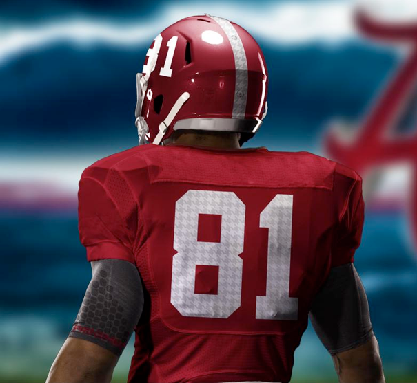
Alabama: The Crimson Tide win the "Texas Longhorns Award" for the least change from their regular uniforms to their Pro Combat threads. The only difference between the standard and Pro Combat helmets is the addition of a sublimated houndstooth pattern on the helmet stripe of the Pro Combat version. The new jersey is also incredibly similar to the standard, with the only changes being the addition of an American flag to the right sleeve and (of course) the use of the houndstooth pattern on the numbers. The pants add a logo to the hip where there wasn't previously one, but to the average fan, not much has changed.
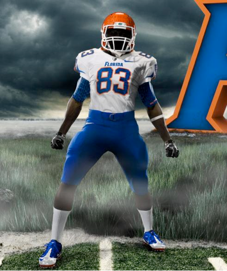
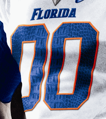
Florida: The Gators really adopted the gator skin pattern that Nike experimented with last year. This year's Pro Combat uniform uses said pattern on the helmet, sleeves, numbers, pants, and undershirt. The helmet is different from last year's (which was white), as it is orange and uses the classic Gators script. This year's jersey is white and is paired with blue pants.
Oregon State: To be worn in the "Civil War" (the school's rivalry game against U of Oregon), the Beavers' new pro Combat duds are modeled after the 1967 team known as the "Giant Killers". The uniforms use a black helmet and jersey with off-white pants and feature a consistent striping pattern of off-white/orange/off-white on a black background (black/orange/black on the pants). Other than the stripe, the helmet is solid black. Nike helped push the throwback look to this set by adding the sthttp://www.blogger.com/post-create.g?blogID=3798142622684331953riping pattern to the sleeves of the undershirt, as the jersey sleeves are too small for such a thick stripe, in addition to the jersey number.
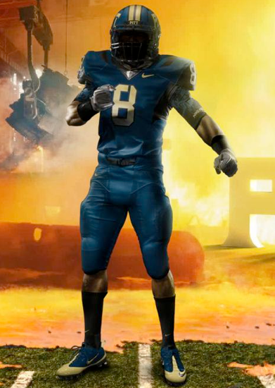
Pittsburgh: The Panthers are new to the Pro Combat game, but that didn't stop them from trying something different. The uniform is all navy with black and metallic gold accents and is supposed to represent the steel industry. The PITT wordmark and jerseys numbers are designed to look like they are cut from steel, while the helmet stripe is supposed to look like an I-beam.
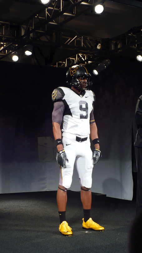
West Virginia: Like Pitt, West Virginia is new to the Pro Combat game. The Mountaineers themed their set to honor the coal mining industry. The helmet features a thin strip of yellow to represent the headlamps worn by miners and a smudged black pattern is used throughout the uniform to further convey that message. The jersey and pants are both white, with the thin yellow stripe running down the sides of the pants.
TCU: Ah yes, TCU. They're the ones who trotted out this look last year. They kept the frog skin pattern, although this year it's "icier" to reference a memorable quote from celebrated coach Leo "Dutch" Meyer. ("We'll fight 'em 'til Hell freezes over, then we'll fight 'em on the ice.") This year's version will pair a silver frog skin-patterned helmet with a black jersey and matching silver pants. The jersey features purple side panels and shoulder accents, in addition to frog skin numbers. Overall, not that different than last year's model, but slightly better.
Nike did a good job fixing some of last year's issues with the Pro Combat set, particularly the use of the shoulder feather pattern and the overabundance of white. Many of the uniforms still use colors not associated with the teams (like black for Miami and silver/grey for Boise State), but since the jerseys are one-and-done, it's acceptable. The Alabama uniform's new additions are so subtle they could even be used as a full-time uniform. Pro Combat is here to stay, at least for the next few years.
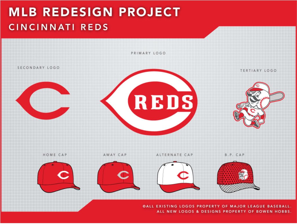
Today, we have another Double Play Design, starting with the Cincinnati Reds. The "Oldest Team in Baseball" currently has a pretty strong identity. I didn't look to overhaul the existing scheme; instead, I sought to improve upon it. The current primary logo uses block letters for the REDS wordmark encapsulated within the C. I have replaced the block letters with the Reds' proprietary font, giving the overall scheme more unity. I have also eliminated black from the identity and replaced it with charcoal grey, adding a unique twist to the color scheme. For Mr. Redlegs, I swapped the two-stripe pillbox hat for something slightly more contemporary. The primary home and away uniforms use sleeveless jerseys with red undershirts, while the home and away alternates use red fax-vests (the jerseys have sleeves, but the piping still resides on the shoulders). The home hat is the same as the Reds used to wear before their foray into black accents, while the road cap is solid red with a grey C, to match the red/grey look of the road uniforms. The Sunday Alternate opts for a white crowned cap with a red C and is paired with a simple no-frills sleeveless jersey.


Second, we have Ohio's other team, the Cleveland Indians. Many people find the Indians' current logo offensive, and I can't necessarily blame them. The caricature is outdated and insulting. My main goal was to bring a level of dignity to the brand. To accomplish this, I decided to rely on abstract symbols of Native American culture, such as the feather and dream catcher. It was also important to not paint the team as warriors, since they are not specifically named after warriors, like the Braves. Baseball has a long tradition of not necessarily using fierce or intimidating mascot (read: Cubs, Orioles, Rays), so the more peaceful iconography isn't out of place. The color palette is brown and red to avoid the overuse of navy and red that currently plagues MLB. My primary logo uses a dream catcher with a baseball inside of it as a base. I then placed an interlocking CI in the center and an INDIANS wordmark above it. The secondary logo is a C with two feathers, while the tertiary is the CI by itself. The uniforms are very traditional, with the home using a cream-colored base. The jerseys feature placket piping and sleeve trim, while the pants have matching piping running down the sides of the legs. The home sets use more red than the roads, with the hats having a red brim in addition to the red home alternate jersey and the red type on the primary home uniform. The primary away features brown type outlined in red on a grey base, and the alternate away consists of a brown jersey with grey type to match the grey pants. The Sunday Alternate uses a red cap and a contrast-placket jersey with the feathered-C logo on the left chest.


Feel free to leave a comment on the 2010 edition of Nike Pro Combat, the Reds or Indians concepts above, or anything sports branding related.
OUtstanding stuff. I stumbled upon you're blog while i was looking for pictures of the pro-combat uniforms. I couldnt be happier that I did. You've got a new daily reader. - Chip
ReplyDeleteGood info and right to the point. I don't know if this is actually the best place to ask but do you guys have any ideea where to employ some professional writers? Thx :)
ReplyDeleteVESTIL Steel Cargo Bars
I will immediately grasp your rss feed as I can't find your email subscription hyperlink or newsletter service. Do you've any? Kindly allow me recognise in order that I may just subscribe. Thanks.
ReplyDeleteLa Canadienne Women's Felicia Boot