
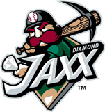
On Monday, the West Tenn Diamond Jaxx unveiled their new name and logos. When the 2010 Southern League Playoffs end the Diamond Jaxx will officially be known as the Jackson Generals. While the old primary logo consists of a miner holding a diamond in one hand and resting a bat/pick axe on his shoulder over a "Jaxx" wordmark, the new logo features a bulldog wearing a WWII-style battle helmet biting a bat. The three stars on the helmet represent Tennessee, as they appear on the state's flag. The GENERALS wordmark is rendered in a Tuscan typeface, giving it a baseball-specific feel, while the JACKSON wordmark above it is displayed in a simple, no-nonsense sans serif. The mark employs a shield holding shape to frame the logo and bring the other elements together as a cohesive whole.
The Diamond Jaxx used a color palette that was rather expansive, containing black, two greens, burgundy, mid-grey, silver, tan and, of course, white for a grand total of eight colors. The Generals' brand has a paired down palette, focusing on black, emerald green, silver, tan and white. This reduction in the number of colors used allows for a more streamlined aesthetic and lower production costs.
While the Diamond Jaxx employed a beveled wordmark to match the rendering style of the diamond, the Generals use a Tuscan-style font arched over the bulldog's head with green accents below the wordmark, giving it volume and mass. The shield employs a similar shading style to the bulldog's mouth, giving the logo a sense of rhythm.
The Diamond Jaxx used a miner cropped by a J as their secondary logo, as it appeared on their home, road and alternate caps. The new secondary logo uses the Tuscan typeface from the Generals' primary logo to create an interlocking J and G, which is rumored to appear on the new caps.
To the million-dollar question: Is it an upgrade? While the miner and type in the Jaxx logo set was well-rendered, the brand featured too many colors and the name "Diamond Jaxx" is rather kitschy, considering the two Xs that end the word Jaxx. The Jackson Generals moniker brings with it a significant amount of history, evoking names like Shoeless Joe Jackson and Yogi Berra, both of whom played for past Jackson Generals teams. The Generals brand also gives fans a unique animal mascot (instead of this; it's apparently a bear, which is the same animal mascot used by the BayBears and Smokies, who are also in the Southern League). Overall, the re-branding effort was a significant upgrade, especially when it comes to the color scheme, name and mascot.
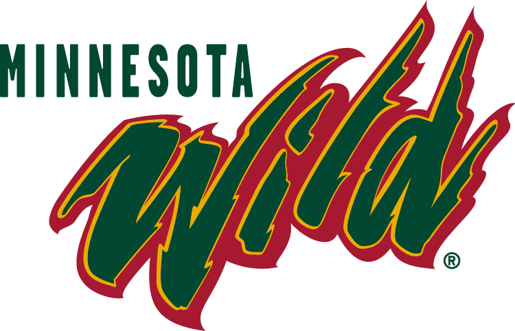
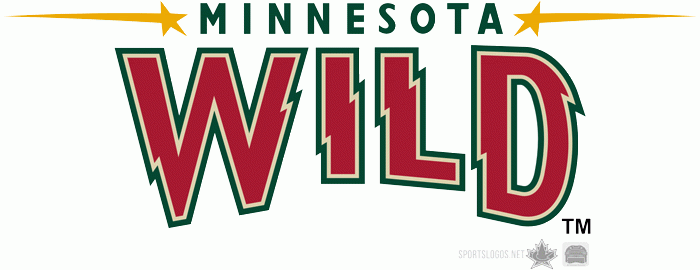
In Other News… The Minnesota Wild have replaced this wordmark with this wordmark. It certainly fits with the logo better than the previous wordmark, which was absolutely horrid… The NFL introduced 2010 sideline cap for players. It apparently has technology to allow fans and players to interchangeably wear the brim flat or curved. Too bad the design is garish… Penn State University will be wearing new basketball uniforms this year. They aren't bad, although the collar seems a bit thick.
This week is the finale of my MLB Double Play designs. Starting in the NL, we have the New York Mets. The Mets' current scheme came to be when the team added black preceding the 1998 season. Previously, the team was primarily royal blue and orange. Since the addition of black, however, the Mets' brand has increasingly relied on the combination of black and royal blue, relegating orange to an accent color. My design seeks to rectify that injustice (and trust me, most Mets fans I've met find it to be an injustice), restoring royal blue and orange as the team's primary colors. However, I also warmed the white to a cream color, similar to what the Mets currently use for their alternate jerseys. The royal, orange, and off-white color scheme gives the Mets a unique, retro look, which is a stark contrast from this. I developed a standalone M as an alternate mark, which appears on the batting practice caps. The home and away uniforms feature the famous "racing stripes" pattern made famous by the '80s Mets teams (without the pinstripes, however). The primary home uniform uses an off-white base, with the option of an alternate blue jersey. The numbers are a proprietary block numeral, since MLB Block is overused as it is. The away uniforms start with a cool grey base, giving the team a unique deviation from the standard Cool Base grey. There is also an alternate blue jersey for the road with NEW YORK on the chest in cool grey, outlined in orange. The Sunday Alternate looks to evoke memories of the Amazin' Mets of '69. The pinstripes are spaced further apart from standard pinstripes to give the jersey a unique element that helps reinforce the vintage look.


The Baltimore Orioles are up second. The team's current primary logo is of an oriole sitting on a script "Orioles" wordmark, while the secondary logo is a standalone bird, facing left, and the tertiary logo is a sleeve patch based on the Maryland flag. My version of the primary logo makes the bird the focus instead of the script, which is relegated to the uniforms. The oriole appears within a circle, making it a less horizontal logo. My version of the secondary is a standalone oriole head. I've always thought the current caps were rather cluttered. The oriole head, however, lets the viewer see more of the oriole's face, instead of its body. The tertiary in my concept is similar to the existing sleeve patch, but with revised typography to fit the rest of the design. The uniforms use a special style of trim that was inspired by the Maryland flag. The numbers are a slab serif in the same family as the supporting type on the logos (as I mentioned before, MLB Block is far too overused). The home uniforms use a white base and orange type and are complemented by a black hat with an orange brim. The home alternate jersey is orange with black type. The away uniforms use a neutral grey base and orange type, with an option for a black alternate jersey. The Sunday Alternates rely on a retro feel, illustrated by the trucker-style caps and thick sleeve trim.


Feel free to leave a comment regarding The newly-named Jackson Generals, the Mets and Orioles designs above, or anything related to the sports branding world.
No comments:
Post a Comment