
Baseball is the most traditional of the four major U.S. team sports. And, for better or worse, that aspect of the game permeates almost every part of the sport, from the look and feel of ballparks and uniforms to the league's reluctance to expand the use of instant replay. One aspect in which it hinders the sport is in the application of sleeve patches. It would seem that the tradition of the left sleeve as the primary placement option for logo patches is completely arbitrary. It also leads to what I will dub the "Badge of Cowardice".
The Badge of Cowardice occurs when a team uses a logo that naturally faces right (like the Marlins' F) and places it on the left sleeve of the jersey (like the Marlins' home jerseys). The result is the logo appears to be moving away from the front of the player, as if it is retreating from any action the player may find himself in. This is especially obvious on logo patches that include a person or animal mascot. The issue, for the most part, is exclusive to baseball, although some hockey teams can be included. Here is a rundown of the offending teams:
The Blatant Offenders
Florida Marlins: As described above, the Marlins' home jersey features the Badge of Cowardice. The black alternate jerseys also feature the Badge, but the grey away jerseys do not. A simple fix would be moving the patch over to the right sleeve, where it looks much more appropriate (as showcased by Hanley Ramirez).
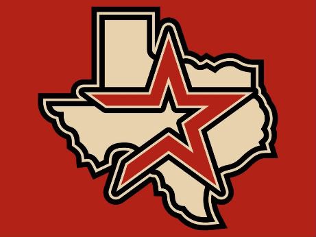
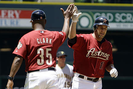
Houston Astros: The Astros also sport the Badge, but it doesn't contain a person or animal mascot. It's of one of the 'Stros alternate logos, the streaking star over Texas. It appears on every jersey the team is using (not counting batting practice or throwbacks). Part of the logo's effectiveness is that it conveys a strong sense of motion, but that only works when the logo is positioned properly.
San Diego Padres: I like the Swinging Friar as much as the next person, but it should be placed on the right sleeve. When it appears on the left sleeve, like on the team's blue alternate jerseys, the Friar doesn't appear to be in mid-swing; instead, it appears the Friar has just struck out.
Boston Red Sox: The Red Sox only wear a sleeve patch on the away jerseys. Maybe that's one jersey too many. It's not that I don't like the hanging socks logo, but it literally looks like two little feet running away when placed on the left sleeve. It definitely looked better on the Home Run Derby jerseys.
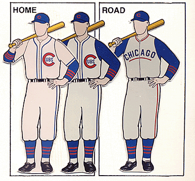
Chicago Cubs: The Cubs are an interesting story. As a team known for falling short, they should be doing everything possible to change that mentality. But, since 1997, they have been sporting the Badge of Cowardice on their home and away jerseys. Apparently the cub has had enough of losing and decided to just walk away.
The Borderline Offenders
Milwaukee Brewers: The Brew Crew are flirting with the Badge of Cowardice, as the M-on-Wisconsin logo displays a sense of motion toward the right, while being placed on the left sleeve on the home, home alternate, and road alternate jerseys. At least the primary away jerseys use the Milwaukee logo.
Cincinnati Reds: The Reds use Mr. Redlegs on their home and alternate jerseys, and that patch looks great. The road jerseys, however, are a different story. The primary logo is used, and it is placed on the left sleeve. Although it's not as obvious as the Marlins, the wishbone C implies some movement, and shouldn't be placed "against the grain", so to speak.
Los Angeles Dodgers: The Dodgers qualify as borderline because people in Western culture read left to right. Their home and away jerseys use the LA logo on the left sleeve, although the logo, by nature, would flow better on the right sleeve.
Colorado Rockies: Staying in the NL West, the Rockies primary logo is pretty symmetrical, except for the streaking baseball. That ball, however, is the reason they've ended up in the borderline category, as it gives the logo a direction.
Pittsburgh Pirates: The Pirates barely make this list, but they do because of the pirate's bandana. It may be nitpicking, but great design is in the details.
Kansas City Royals: The Royals also barely made this list. But they did make it (for all of their jerseys), and it's for the same reason as the aforementioned Dodgers.
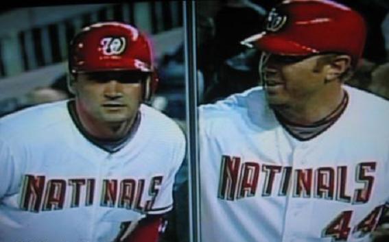
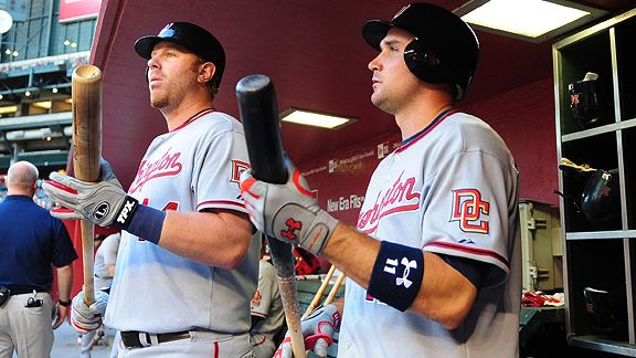
Washington Nationals: Uniform-wise, they've been one of the most maligned teams in MLB for the Natinals debacle and more recently for placing an upside-down number on Miss Iowa's jersey. They also have the dubious distinction of making this list for the DC logo on the left sleeve of all their jerseys except their navy alternate.
There you have it, 12 teams of 30 are either blatantly sporting the Badge of Cowardice or are on the borderline of doing so. Maybe some day that will change.
Today, we have another Double Play Design. Up first are the current Brewers' opponent, the Chicago Cubs. For the Cubs, I decided the logo set was iconic enough to stay, but the uniforms needed some work. The primary home uniforms keep the pinstripes, and the primary logo stays on the left chest, but the Badge of Cowardice is no more as the patch moves to the right sleeve. The home alternates feature a blue jersey that is similar to the current blue jerseys, with sleeve trim added and the National League logo removed in favor of the primary logo. The home alternates also use plain white pants, which also appear on the Sunday Alternates. The primary away uniforms have a new script that is reminiscent of the Chicago Theatre. In addition, the uniform numbers are no longer red. Instead, all the type on the aways is blue with a single red outline to match the elements within the jersey, as well as matching the road jersey to the homes. The away alternate jersey is the same as the home alternate, but is paired with the grey pants. The Sunday Alternate is a sleeveless jersey and a take on this classic, except altered to fit within today's specifications. The tertiary logo appears on the crest, while the primary logo appears on the right sleeve. To cap it off, the hats feature a white C, similar to the current batting practice caps.


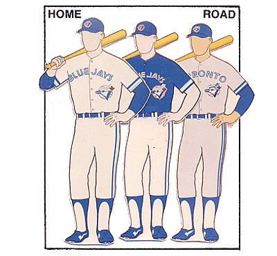
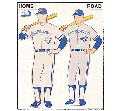
The Toronto Blue Jays are next in the order. Historically, they've had uniforms that were very… un-traditional. In 1997, the team moved slightly toward tradition with these until 2004, when the Blue Jays inexplicably removed most traces of blue to the point where their jerseys simply say Jays. Black took over as the team's main color and remains so today. My goal with the Jays was to take this logo and modify it to create a consistent, unique, and most importantly, fitting identity. The primary logo takes the current blue jay head, places it against a stylized maple leaf, and changes the color scheme to royal and powder blue. The secondary is a standalone jay head, and the tertiary is a partial of the primary without the wordmark (which now features the team's signature inline style). For the primary and alternate homes, I brought back the contrast paneled caps, with white panels at home and light blue for the roads. The home uniforms are bold and feature the wordmark within a broad chest stripe that is complemented by equally broad sleeve stripes, creating a modern, yet retro look. The type is a stylized block font, with the inline added, and the logo appears below the wordmark on the front of the jersey to remind fans of the glory years. The home alternate jersey is blue with a white chest stripe. The away uniforms use a powder blue base (Could you picture anything else for the Blue Jays?) and utilizes the broad stripe theme from the homes. The away alternate jerseys are also blue, but with a powder blue chest stripe. The Sunday Alternate is a sleeveless jersey, worn with a royal blue undershirt, and features a less aggressive chest stripe. The Sunday cap is solid blue and uses the jay-head-and-maple-leaf logo.


 Feel free to leave a comment on the Badge of Cowardice, the Cubs and Blue Jays concepts above, or anything sports branding related.
I like slide 4 picture A on the chicago cubs!
ReplyDeleteAll of the blue jays uniforms are amazing! NAILED IT 100%