
Earlier this week, the Arizona Diamondbacks unveiled their logo for the 2011 MLB All-Star Game. Traditionally, All-Star Game logos are unveiled during the previous year's game and are prominently displayed in the upcoming host city's ballpark for an entire year or longer. The Diamondbacks' unveiling was considerably low-profile in comparison. The logo was not unveiled at this year's ASG in Anaheim, nor is there any visual representation (last I heard) of the logo or event currently at the stadium.
Much of the lack of promotion has to do with SB 1070, the controversial Arizona Immigration Bill. Numerous businesses and some MLB players have, in response to the bill, publicly stated that they will boycott the game and the state. Protestors have even petitioned Commissioner Bud Selig to move the game away from Arizona, although there is no indication that he will oblige.
Regardless of the politics surrounding the event, the logo has been unveiled and the game (barring an unforeseen event) will take place in Arizona. Speaking of the logo, there are some issues with it that could be improved and some things the team did well. The overall shape of the logo combines the ideas of the Southwest and a baseball diamond well. In addition, the use of the Diamondbacks' proprietary typeface instantly gives any viewer with baseball knowledge an indication of the the game's location, while the mountain in the background helps those without baseball knowledge identify where the game will be held. On the other side of the coin, the logo could use help in some areas. The D'backs A logo is placed at the top of the mark and is centered. The issue is that the A logo is italicized and while the bottom of the mark is centered, the top of the mark isn't, leaving the upper right corner of the A logo dangerously close to the edge of the diamond. Color-wise, the team could have chose something other than the sky blue/periwinkle color, which clashes with the black/sedona red/cream color scheme of the D'backs. An orange or a blue closer to aqua would have balanced the color scheme better. Lastly, the black outline on the diamond is noticeably thicker than the black outline of the text and the off-white outline surrounding the mark. If the outlines were evened out the logo would have more impact.
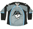
In Other News… The Milwaukee Admirals unveiled a new road jersey. It's black and features the team's skull crest. It replaces the former grey road sweaters. Overall, not bad, but I prefer the crest on the light blue alternate jerseys… The San Diego Padres are rumored to have new uniforms for next season. Here's hoping they're brown!… The Dallas Cowboys are looking into editing their uniforms. Maybe Jerry Jones did see the inconsistency on his giant JumboTron… As I had mentioned before, the New Jersey Nets are considering a name change. They even filed the official paperwork to do so within the last week. The leading rumored new name: Knights… The University of Texas Pan-American has updated its logo from this to this… Lastly, I recently did an interview with the Clinton Lumberkings (Class A; Midwest League) Director of Media Relations, Dave Lezotte. We discuss design, sports, and the 2009 Midwest League All-Star Game. To listen to the interview, click here.
Today, we have another Double Play Design. We start with the Brewers' current opponent, the aforementioned Arizona Diamondbacks. Starting with colors, I wanted to keep the red/black/gold scheme the team currently uses over their old purple/teal/copper scheme for two reasons: The purple and teal are incredibly dated, and the red/black/gold scheme ties in nicely with the color schemes of the Arizona Cardinals and Phoenix Coyotes, giving the Phoenix area (aside for the Suns) a unified color palette, a la Pittsburgh (black/gold). I decided to get rid of the A logo, as it has seen better days. In its place, I developed a new primary logo featuring a modified version of the team's db-snakehead logo within the team name. The secondary is the modified db-snakehead, while the tertiary is a hybrid of the A logo and the D-snake. The uniforms feature a unique style of trim that I like to call "diamond trim", which was somewhat inspired by these jerseys. The home jerseys start with an off-white base, featuring the D-backs wordmark and the tertiary logo on the right sleeve, and are paired with the db cap. The away uniforms use a sand colored base, similar to the current Padres away uniforms. They away jerseys are emblazoned with an Arizona wordmark and utilize the db logo as a patch on the right sleeve. They are paired with the new A logo caps. The Sunday Alternate is similar to the primary home jerseys, except it is a vest with a black undershirt and uses no sleeve patches. The Sunday Alternates also use a black hat with a red brim instead of the all-red cap found on the homes.


Up second, we have the Tampa Bay Rays. The Rays have had a slew of identities in the short existence. The current identity is one of the most generic in MLB. The Rays' current colors are navy, light blue, and yellow. Navy is the team's primary color, which doesn't help them differentiate themselves from the Yankees and Red Sox. With that in mind, I decided to scrap the existing color scheme for a dark green/orange/yellow scheme that gives off a much more tropical vibe. The logo set (aside from the tertiary) is completely new. the primary logo consists of a baseball/sun rising over the RAYS wordmark, which features a segmented gradiation that implies sun rays. The secondary is a custom interlocking TB that also features the segmented gradiation. I kept the manta ray logo as the tertiary but edited the colors to fit within the scheme. The jerseys and pants contain compound placket piping. The home uniforms start with a white base and green caps with orange brims.The RAYS wordmark appears on the front of the jersey while the manta ray is placed on the left sleeve. The home alternate is a green version of the primary home jersey. The aways use a solid green cap and pastel yellow jerseys and pants. Both away jerseys use the TB logo on the left chest in addition to the manta on the sleeve. The Sunday Alternate is an orange cap paired with an orange jersey. Like the home sets, the jerseys have RAYS across the chest and the manta on the sleeve.


Feel free to comment on the new 2011 MLB All-Star Game logo, the Admirals new road jerseys, the rumored changes for the Padres and Cowboys, the Nets possible new name, Texas Pan-Am's new logo set, or anything sports branding related.
I like what you did for the Rays. I think the biggest change they need to make however, would be to move that fantastic team out of Tampa and into a city where their fans would actually appreciate them!
ReplyDelete