
Minor League Baseball has made major strides in terms of team branding, but some efforts were misguided, and some teams were completely left behind. In the first part of a multi-part series, I examine the Pacific Coast League's teams and their graphic identities.
The Good
Buffalo Bisons: While the old Bisons identity was cartoon-like, and featured green, red, and gold, the new identity re-worked the buffalo and incorporated the parent club's (Mets) colors. Although there are a few too many colors, they seem to work together pretty well. In addition, the detail seems like it could pose problems in reproduction. However, as judging by the BP cap, they seemed to have cleared those hurdles. Rounding out the identity are two letter-based marks, one consisting of a standalone B, the other adding an NY below the B. As a whole, the identity is fairly well crafted, even if there is more detail than necessary.
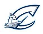
Columbus Clippers: Re-branded between the 2008 and 2009 seasons, the Clippers used to use a circular C with a clipper inside. The baseball seams on the sail were a great touch! The new primary logo emphasizes a sense of speed and altered typography. The new wordmark is a script with slight overlaps where the letters connect. There is also an alternate logo that features an anchor wrapped around their signature C, as well as a C with a ship. Overall, it's a great update to a strong identity.
Lehigh Valley IronPigs: This has to be one of my favorite brands in MiLB. Formerly the Ottawa Lynx, the team move the Pennsylvania after the 2007 season. The primary logo places a half robot, half pig head over a script with rivets. The pig head also works as a standalone mark, as seen on the caps. There are also a few full-bodied pigs, monograms, and a "Saturday Cap" to round out the set. Vastly superior to the Lynx identity, it should be referenced as a blueprint for mixing a fun concept with sleek, tough design.
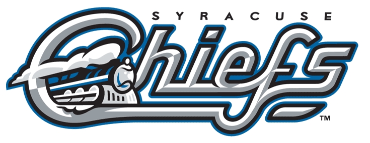
Syracuse Chiefs: After a 10 season hiatus as the Syracuse SkyChiefs, the "Sky" was falling and returned to the Chiefs moniker. The new primary logo consists of of a beveled "Chiefs" wordmark with a train placed within the C. The train-in-C also breaks out into a secondary logo, and a baseball-faced conductor (please ignore the circle, as Pops was hard to find) rounds out the logo package.
Toledo Mud Hens: The Mud Hens went from a logo that was mediocre at best to one of the better marks in the Minors during the 2005-06 offseason. The new logo, features an updated mud hen and custom script set against an egg shape, which is not only unique, but incredibly appropriate. While the home cap has not changed in years, the road and alternate caps received an updated mud hen head. In addition, there is also a cap that features a feather logo. All it took was a re-brand to turn a terrible identity into a good one.
The Bad
Gwinnett Braves: There not much to say with the Gwinnett Braves because they didn't do much. They are using the parent club's name, colors, and a modified form of the logo set. I expect teams in Single A, Rookie Ball, and various short season leagues to use the parent club's identity, but a Triple A team should be able to hire their own graphic designer to give fans a fresh take on a classic name.
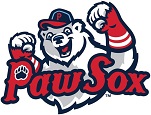
Pawtucket Red Sox: The PawSox added their own spin on the classic Red Sox monkier, but they did not integrate the two theme into a unified identity. The primary logo and cap logos follow the Red Sox theme, but the secondary logo and wordmark look like Pick 'n Save (a Wisconsin-based grocer) was involved. If they could incorporate the polar bear theme with consistent typography, their identity would be much stronger.
Rochester Red Wings: The team's identity hasn't changed in some time, but looks like it could be one of the next clubs on the re-branding short list. The primary logo features a muscular red bird holding a bat sitting on a winged baseball. The secondary has the same bird against a diamond, and an abbreviated version of it appears on the caps. The alternate cap is emblazoned with an FC, an obscure reference to "Flour City", while the battling practice lid contains a winged baseball insignia that could use more definition. Overall, they need to work on their appearance.
Scranton/Wilkes-Barre Yankees: This is another example of a team using the parent club's identity without adding anything of value to the scheme. The primary logo is a modified version of the New York club's primary, although it's at least navy, and not royal. The home cap and jersey use a Y/hat/bat logo. The away jerseys feature a modified Yankees script with the location in the tail. There is also an alternate cap with just the Y. As much as I like the use of the Y, it would have been nice to see more originality in the development of this set.
The Ugly
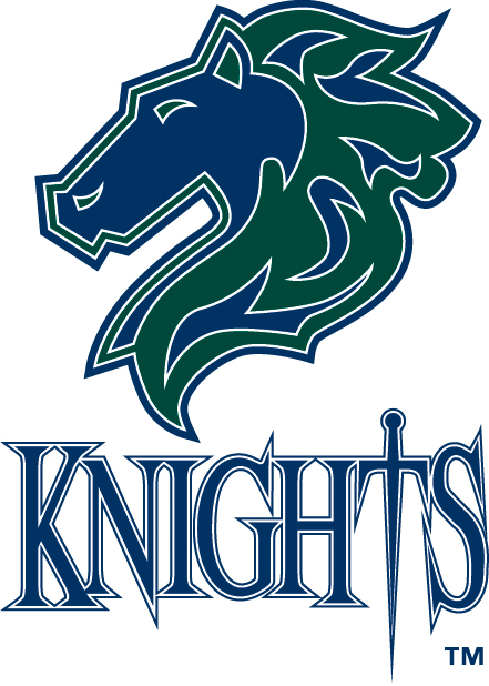
Charlotte Knights: Another team that should be looking for a re-brand, the Knights' primary logo features a horse head above a Knights script. The rendering of the horse head is extremely dated and, quite frankly, somewhat sloppy. In addition, the color scheme does nothing for this. Forest green and navy blue are too close in hue and value for fans to be able to differentiate the two from the stands. The home jersey is rather plain as well. Whichever way the team goes in its next redesign, it needs to address the color scheme and eliminate or lighten either the green or blue.
Durham Bulls: I realize this is one of the most classic logos in MiLB, but that doesn't excuse it. The bull looks like it got stuck while jumping through the D. A good modernization would help this dearly. At least the alternate cap is a step in the right direction.
Indianapolis Indians: Generally, Native American themed mascots are tricky to deal with, and the primary logo of the Indy squad doesn't have the finesse of the Spokane team by the same name. While the mask isn't necessarily "savage", it is still a stereotype, and that will generally cause issues with at least part of the fan base. A feather I would probably be an improvement over the current cap logo as well. But hey, at least it isn't this.
Louisville Bats: You'd think a team with such a cool and original name could do better than this, right? Well, if I actually saw a bat that looked like that, I'd assume I lived in a video game from 1990. Not to mention the typography does the identity absolutely no favors. However, in the interest of giving credit where credit is due, I have to admit the alternate/child-friendly logo is well done. Which leads us to…
Today's design is a re-branding concept for the Louisville Bats. With a name like Bats, there's really only one direction to go: spooky. Batman knew it, and so do I. the primary logo features a more realistic bat coming up from behind the BATS wordmark, which contains a bat at the top of the T. The typography helps give the logo set the spooky look that most people associate with these flying mammals. The secondary logo is a standalone version of the bat, which appears on the home caps. And the tertiary is a lime green L with bat wings that was somewhat based off the current road cap for the Louisville squad. The home uniforms feature a BATS wordmark and two-color placket piping. The left sleeve contains a patch of the bat with crossed bats behind it. The home alternate is essentially a purple version of the white jersey. The road uniforms start with a grey base with LOUISVILLE across the chest in purple and lime. And the road alternate is a black jersey with lime green typograhy that could be glow-in-the-dark similar to what the Casper Ghosts use.


I really dig the redesign for the Bats dude. Integrating the actual bat as the top of the T and as a perch for the flying bat...genius.
ReplyDelete