
A while back, I gave a history lesson on the evolution of NFL uniforms. this week, we explore the use of "trendy" colors and color schemes in sports throughout history. Let's start at the beginning:
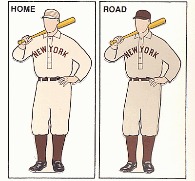
1900 – 1959: Many of the sports leagues we enjoy today were in their infancy during this period, with the exception of MLB. Naturally, many of the color schemes in play during this era were dependent on the equipment the teams could find. Simple combinations, such as red/white, blue/white, and black/white were commonplace. Since there were fewer teams at this time, teams could identify themselves with one signature color, or possibly two (and white). Brown could be thought of as the vogue color of the era, since it has yet to reach the level of use that it enjoyed during the early days. In the football world, many teams used basic colors as well, once again based on what equipment teams could find.
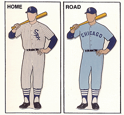
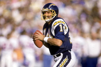
1960s: With the 60s came the rise of brighter colors. The Vikings and Lakers made a statement in purple, while the Dolphins branded South Florida as teal country. Powder blue seemed to be the color of the decade, with the Chargers and Oilers representing the NFL and the White Sox starting the trend in baseball.
1970s: Bright colors continued to dominate the sports scene in the 70s. Although there were numerous teams wearing what could be described as "Bicentennial Chic", a few teams went the route of pairing royal blue with kelly green. Orange was also rather popular at this time. Even the Packers' and A's greens appeared brighter. MLB had teams in light blue, yellow, and orange from head-to-toe.
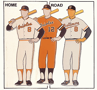
1980s: Although there wasn't as much change as previous decades, there were certain trends. The light blue road uniform era came to a close in the 80s. A few teams moved toward darker, more traditional schemes. The 80s (except for the expansion Charlotte Hornets) were essentially the calm before the storm…
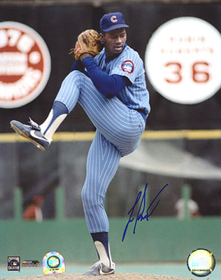
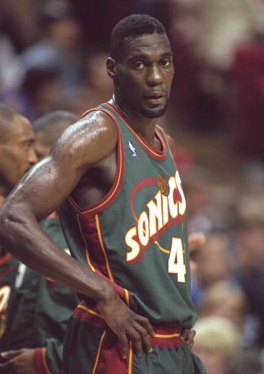
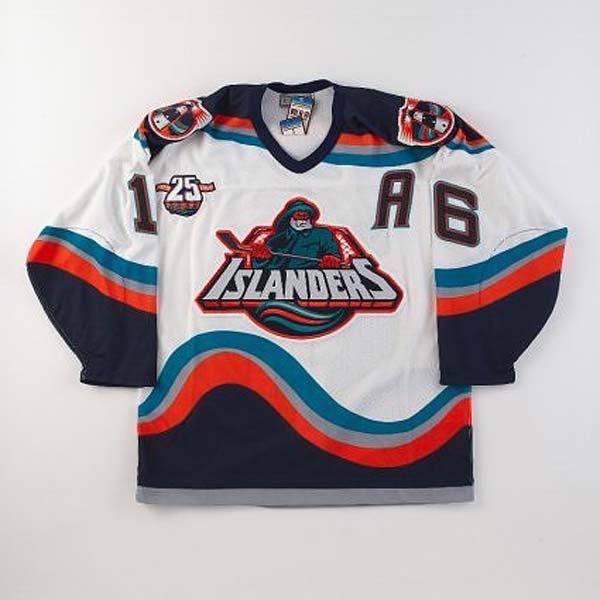
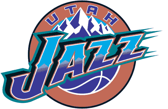
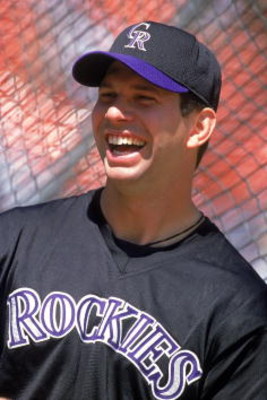
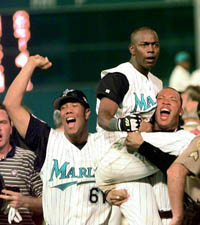
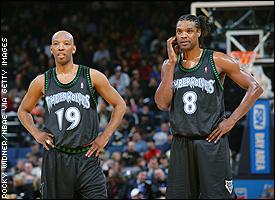
1990s: The uniforms of this era defined many trends, including the use of teal, purple, and later in the decade black and other dark colors. The decade started with moves to teal and purple. Under the teal trend (which some claim started with the Hornets) you will find the Pistons, Jaguars, Marlins, Eagles, Diamondbacks, Grizzlies, Spurs, Mariners, (Mighty) Ducks, Islanders, Sharks, and Jazz. For purple, it's slightly more complicated because the Rockies, Sacramento Kings, L.A. Kings, and Ravens used purple to fit into their themes. The teams that used purple to be trendy include: Diamondbacks, (Mighty) Ducks, (Devil) Rays, Bucks, and Raptors.
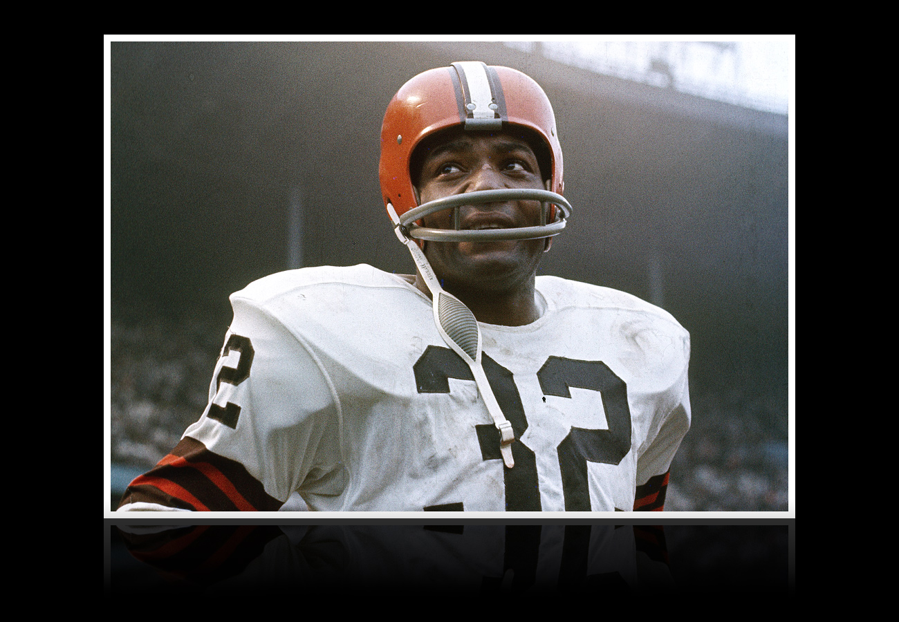
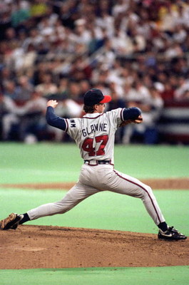
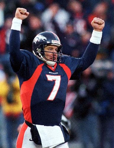
Later in the decade, black became the avant garde color.Don't believe me? Just ask the Mets, Reds, (Devil) Rays, Diamondbacks, Rockies, Marlins, Grizzlies, Raptors, Coyotes, Capitals, Timberwolves, 76ers, Cavaliers, Pistons, Knicks, Suns, Wizards, Flames, Hurricanes, Sabres, Stars, Eagles, 49ers, and Buccaneers. That's 24 teams that added black into their schemes during the decade. Some teams simply darkened their existing colors, such as the Rams, 49ers, Broncos, Blues, Jets, Titans, Dolphins, Brewers, and Nets.
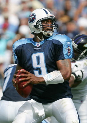
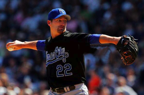
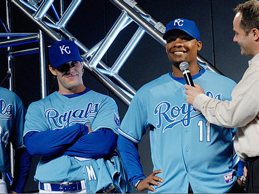
2000s: Although some teams still continued the black trend (Royals, Blue Jays, Astros, Lions), the new fad in sports for the 21st century is two-tone blue. Presumably started by the Titans, Blues, and Angels in the late 90s, two-tone blue swept through sports over the last decade. teams like the Bills, Chargers, Seahawks, Rays, Royals, Thrashers, Mavericks, Nuggets, Cubs, Grizzlies, Thunder, and Jazz all jumped on the big blue bandwagon. Another trend involves teams returning to their retro colors (sometimes with a twist), such as the Canucks, Sabres, Islanders, Capitals, 76ers, Hawks, Pistons, Bucks, and Cavaliers. If I had to predict the trends of the upcoming decade, I would suspect the retro trend to continue, while some teams add bright, shocking colors. I also predict royal blue to make a comeback as some teams buck the navy trend of the 90s. Then again, only time will tell.
This week's design features the Atlanta Braves. With the Braves, I didn't feel it was necessary to overhaul the logo set, since they have one of the most recognized brands in MLB. I did, however, edit the colors by adding a bright blue to give the team a unique scheme within MLB. In additon, I added a B-tomahawk logo as a tertiary option as an upgrade from this. The caps feature contrast front panels to evoke the days of Hank Aaron hitting home run number 715. The A appears on the home and road caps, while the B is used on the Sunday Alternate and Batting Practice caps.

The uniforms feature contrast raglan-cut sleeves with piping trim, with the home sets using navy and white, and the road versions featuring navy and grey. the typography on the primary home and road jerseys is red, but on the two navy jerseys the type matches the color of the pants. An "Atlanta" wordmark graces the road jerseys as well. The Sunday Alternate focuses on the bright blue, but otherwise is similar to the primary home set.


Feel free to comment on trendy colors, the Braves concept above, or anything sports design related.
No comments:
Post a Comment