
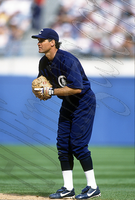
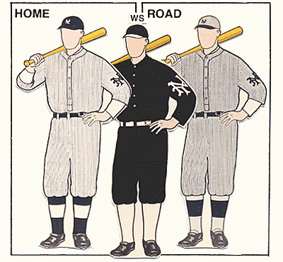
Back in December, I penned a post discussing the inconsistent use of grey facemasks. Well, I also have another issue with the use of grey in sports: the default use of grey as the away uniform base for 29 of 30 teams in MLB. Recently, some teams have added cream-colored uniforms as home alternates, but only the Padres have decided to move away from grey on the road. Combine that with the fact that 29 of 30 teams feature royal, navy, red or black as their primary color (the Oakland A's are the exception, but even they have a black alternate jersey), and you get some repetitive (and boring) combinations. The solution to this lack of diversity rests in baseball's long, storied history. There are quite a few teams that used all-navy or all-black looks during the early 20th Century, and many teams opted for powder blue in the 70s and 80s. The Padres and Pirates even wore all-yellow duds.
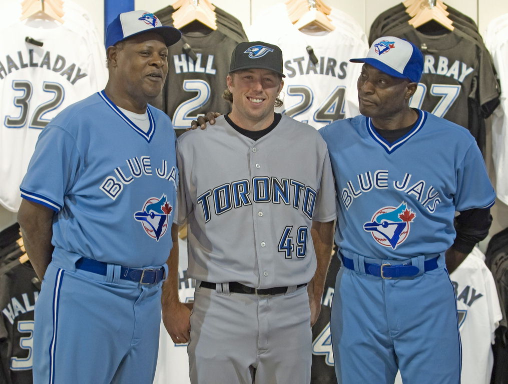
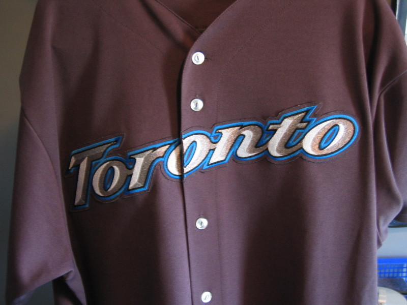
Further reducing the opportunity for a colorful comeback, the Royals and Rays wear light blue jerseys with white pants, and the Blue Jays wear an all-powder set at home. If the Royals, Rays and Jays decided to convert these sky-hued garments to their primary road options, they could get rid of some of their worst-selling jerseys in favor of some of their best-selling. Most Brewers fans I know love the powder blues and would relish seeing them on the field again (with the ball-in-glove logo, of course). Another deterrent for a color revolution in baseball is the Cool Base™ jersey. Since MLB introduced Cool Base™ and teams have adopted it, the unique shades of grey that some teams used have gone by the wayside in favor of a standard "Cool Base™" grey. There have been exceptions, however. The Padres are still using their sand-colored away set, and the Blue Jays almost unveiled a graphite away set in their last re-branding.
From a sales/marketing perspective, if MLB wanted to profit from a segment of uniforms that hasn't seen the popularity of home jerseys and dark-colored alternates, it would embrace the idea of adding color to road uniforms. And when you stop to consider the amount of love the fans generally show to throwbacks and retro sets, it seems like a no-brainer.
This week's design features the Milwaukee Brewers. My concept for the Brewers attempts to blend various eras in the team's history. The color scheme pairs Lake Michigan blue, powder blue, metallic gold and white. The primary logo prominently displays the ball-in-glove logo (which is probably the best use of typography in a sports logo) with MILWAUKEE and BREWERS arched over the top and the date the Brewers moved to the Badger State flanking the glove. The secondary logo is a standalone version of the ball-in-glove, which I have updated by adding shading to show the roundness of the ball and glove. The tertiary logo is an M inside a baseball, which appears on the left sleeve of the away uniforms A standalone M graces the alternate cap, while the primary home and away caps feature the ball-in-glove.

The home uniforms utilize the BREWERS wordmark from the primary logo and the ball-in-glove on the sleeve. The jersey number appears on the front of the jersey, as well as on the back, in its usual spot. The numbers echo the type treatment of the wordmarks, and tie the current Brewers era into the scheme. The uniforms feature a three-stripe trim that ties the set to the 80s throwbacks. The away sets are powder blue and emblazoned with MILWAUKEE across the chest and the M-Baseball on the left sleeves. The "Sunday Alternate" (a term I use for a once-a-week retro inspired uniform) features metallic gold pinstripes for a uniquely beer-y feel and is paired with the M hat that evokes memories of the Barrelman era. The BP jersey follows the template that MLB currently uses, complemented by the ball-in-glove on the chest and the M-Baseball logo on the hat.


Should baseball adopt more diversity in their away uniforms? Should the Brewers return to the ball-in-glove? Feel free to sound off on these questions or anything sports design related by clicking the COMMENTS link below.
No comments:
Post a Comment