
An aside: Last week there was a rumor that my Timber Rattlers concepts were speculated to be official changes for the team. I have stated clearly in this blog that the designs I post are ideas on what the teams could do, not what they are doing, design-wise. If I ever were to be contacted by a professional team for the purposes of a re-design, I would never post such sensitive information on the internet before it was unveiled by the team. I do, however, appreciate the complement of someone taking the time to "officially" debunk my design as actual changes. It's good to know that upon viewing my designs, there was no clue that they weren't real (except the paragraphs I've written describing them). Now, on to the topic at hand:
Continuing the discussion of MiLB's logo and uniform changes, Part 3 of the series will focus on the re-branding efforts of the Wilmington Blue Rocks and Delmarva Shorebirds. I will also outline some of the tweaks, alterations, anniversary logos, and All-Star Game logos that will appear in the 2010 season.
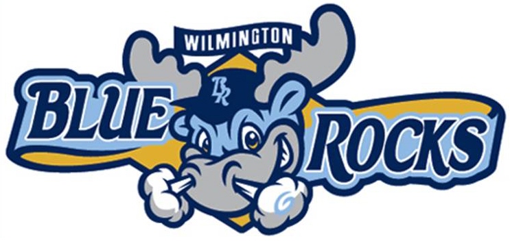
The nation's first state seems like a good place to start, so here we go. The Wilmington Blue Rocks unveiled their new logos and uniforms at the end of January. The old logo consisted of a B and an R with a pick axe and radial motion lines. The colors were royal, yellow, navy, silver and white. The new logo shifts the color scheme away from royal toward powder blu. In addition, the newly unveiled mark focuses on Wilmington's primary mascot, dubbed "Rocky Bluewinkle". Rocky appears snorting over a diamond, flanked by the words BLUE and ROCKS. Rocky's hat contains a clever nuance: the state of Delaware appears inside the B of the BR monogram. The type treatment is a little off, however. The navy line under BLUE curves, while the script itself does not echo the curve. In addition, the navy line doe not even appear in relation to the word ROCKS. The centered treatment of WILMINGTON doesn't appear centered because the moose is asymmetrical, not to mention the awkwardness of where it overlaps the antler. The concept is good, but the execution could be refined. The supporting marks, though, are very well done. The standalone moose head is far more pleasing than the primary, while the BR logo looks great in the in the primary and by itself. The Blue Rocks also have a second mascot, and given their kid-friendly atmosphere, they decided to incorporate Mr. Celery into two additional logos. Mr. Celery is a long-celebrated part of Delaware baseball, and his incorporation into the scheme is unique and long overdue. The home and away caps feature the standalone Rocky logo, while the home alternate shows off the BR logo. Mr. Celery makes appearances on the batting practice (BP) cap and as a patch on the left jersey sleeves. Overall, the supporting marks are great, but the primary could use work. B-.
Just a little to the south, in Maryland, the Delmarva Shorebirds also updated their appearance. While a slightly simplified version of the old logo and color scheme (an Orioles tribute) remain, the Shorebirds have made significant changes to almost every other part of their identity.

The team's new primary logo features a fiercer bird and the secondary logo has that bird peaking out from the inside of a D. An interlocking DS is emblazoned on the BP caps. The team also unveiled new SHOREBIRDS and DELMARVA wordmarks for the home and away jerseys. While the package is an improvement, it also leaves something to be desired. I would have liked to see more consistency between the two new bird heads. B-.
The Jacksonville Suns recolored their primary logo over the offseason from royal, red and yellow to black, athletic gold, and old gold. Although I like the athletic and old gold combination, the use of black doesn't make sense, as black is the absence of light, while the sun is a source of light. The team also unveiled an alternate logo of the sun caricature behind a stylized J. The sun in the alternate logo is colored differently than the primary logo version. The team also features an away cap with the alternate logo in greyscale and an alternate cap with a Pittsburgh Pirates-inspired J, which seems out of place given the Suns are a Marlins affiliate. Overall, this set is chock full of inconsistency. C-.
The Reading Phillies unveiled a few new items, including a pair of patriotic caps, a new road cap, and a new road jersey that is very similar to the parent club. The San Jose Giants added a new SJ logo, as seen on the new home and road caps. The Brooklyn Cyclones celebrate their 10th Anniversary this year, and the logo has a nice Coney Island feel. The Casper Ghosts are also celebrating a decade of baseball with a great logo, which features the Ghosts' halftone pattern and script. The Delmarva Shorebirds, in addition to their re-branding effort, unveiled a 15th Anniversary logo for their ballpark, Arthur W. Perdue Stadium. The logo leaves a lot to be desired. The white type on cream is difficult to read, while the overall look would be more at home in 1996, not 2010.
Last, but not least, there are a couple All-Star Game logos that have been unveiled for the 2010 season. The Lehigh Valley IronPigs will host this year's Triple-A All-Star Game with a logo that ties into their branding. There is also an all-type version, as well as jersey wordmarks for the International and Pacific Coast Leagues. To the South, the Texas League's All-Star Game logo slaps together an amalgamation of Americana. Where's the apple pie? Seriously, though, whoever was responsible for this one needed to pick one or two of the images and run with them, not use every idea they had in one logo.
The design section of this week's post features Wisconsin's other Minor Leagure Baseball team, the Beloit Snappers. Beloit's current logo features Snappy the Turtle holding a bat against a field with "Snappers" over him. Thicker, bolder lines and fewer colors would greatly improve the logo, as it currently sports navy, two greens, yellow, metallic gold and white for a grand total of six colors. My re-brand also features six colors (including white), but three of the greens are the same color at different percentages, so in print, it would be three colors ( white would be the paper). The logo I developed features a turtle on all-fours with a baseball-seem shell, standing on Snappers with BELOIT arched over the top. The secondary logo consists of a turtle shell speeding across an S. The tertiary is the standalone version of the turtle, while the quarternary logo is the streaking shell. I have included options for four different cap styles that correspond to jersey options. The home uniforms feature a "Snappers" wordmark with a speeding shell, as well as the turtle on the left sleeve. The primary option for the away uniforms takes a grey base and adds a "Beloit" wordmark and the turtle as a patch. I have also included options for alternate jerseys, one of which is emerald green and could be worn at home or on the road. The yellow alternate would be strictly for home games, and features a yellow cap with the S logo. The lime green alternate features the streaking shell on the cap with emerald green contrasting raglan-cut sleeves. Lastly, I have included a pastel yellow option for the away uniform that truly stands out from the plethora of grey road uniforms in baseball.


Feel free to leave a comment on the concept above, MiLB's new 2010 designs, or anything sports design related. Thanks, for reading!
No comments:
Post a Comment