
With Super Bowl XLIV around the corner, I have decided to compile a list of what I believe to be the 10 best Super Bowl logos of all time. Granted, most of the logos are from Super Bowls after 1991, but that has more to do with the development of the big game from a match between rival conferences to the international event that it has become. Most of the logos for the first 15 Super Bowls were nothing more than a stylized typeface, and therefore, are not on this list. Without further adieu…
#10 SB XXX - Arizona: Super Bowl XXX's logo does an excellent job of immediately telling the viewer where the game was held. The design style says "Southwest" so clearly, using shapes that complement the three X's. The color scheme, especially the use of burgundy, reinforces the Southwestern vibe.
#9 SB XXXIX - Jacksonville: A well-designed and technically sound logo, SB XXXIX's mark focused on Jacksonville's aquatic proximity by showing one of its trademark bridges in shades of blue and athletic gold. SB XXXIX's mark would be ranked higher if not for its similarity to…
#8 SB XXXVII - San Diego: Similar to SB XXXIX, this logo uses an aquatic color scheme similar to that of San Diego's own Chargers. The lighthouse is well-rendered and the waves offer just enough detail for the space they occupy.
#7 SB XXXI - New Orleans: Few logos capture the character of a city better than the Super Bowl XXXI logo. I mean this logo is dripping with Mardi Gras style, from the colors to the crown and ribbons. Although the style it is rendered in looks slightly dated, it would only require mild touching up for this logo to be a top-flight mark today.
#6 SB XLIII - Tampa: Yes, this logo is somewhat basic. Yes, this logo could have worked for another city. But that speaks to how good of a logo it is. Tampa is not the most recognizable city, so a logo that is football-centric instead of city-centric works. SB XLIII's logo is simply well-designed.
#5 SB XIII - Miami: This logo, more than anything, is so far ahead of its time, it's ridiculous. The scoreboard look of XIII could easily work for a current Super Bowl logo, with a few adjustments. The logo also utilizes a strong sense of alignment and a balanced color palette.
#4 SB XXXVIII - Houston: This logo was a significant departure from the 3-D, beveled logos that preceded it. The simple one-color lettering combines the Old West with a deep navy holding shape that implies the Final Frontier. Throw in the swooshes that reinforce the connection to space, and you have a great logo.
#3 SB XXXIII - Miami: It's Art Deco. It's bright. It's Miami! With XXXIII having a neon appearance, and "SUPER BOWL" in a classic Art Deco typeface, this logo personifies its host city. Add the fact that it's technically sound and conveys a sense of motion, and you'll see why it's #3.
#2 SB XXVII - Pasadena: Now this is a logo that gives a clear sense of the location of the game, but isn't over the top. The roses are worked into the mark with sophistication and do not distract the viewer from the most important information (SUPER BOWL XXVII). Considering this logo was used in 1993, it isn't particularly dated (except for maybe the color palette).
Drum roll please………………………………………
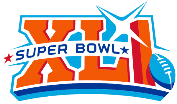
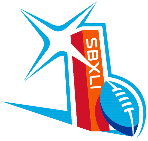
#1 SB XLI - Miami: This logo has so much going for it. Starting with the color palette, the orange, red, and blues scream "Miami". In addition, this mark represents the spectacle the Super Bowl has become. The flash between the L and the I reminds everyone that the world is watching. The pylon is perfectly executed and shows off the object of the game: scoring touchdowns. Super Bowl XLI's identity also lends itself to the creation of this secondary logo. Add the recent trend of showing one red and one blue star to denote the conferences, and you'd have a difficult time finding a more complete mark.
As promised, here is a preview of what Super Bowl XLIV could look like. Starting with the AFC, we have the Indianapolis Colts. The Colts' shade of blue has varied somewhat over the years. For the purposes of this concept, I have gone with one of the slightly darker shades. Something that has long bothered me regarding the Colts' uniforms (aside from the grey facemasks and black cleats) is the single blue stripe on the helmet. The rest of the package utilizes a double-stripe! To truly make this a concept, I have added the dot pattern of the horseshoe logo into the striping. The dot pattern gives this classic set a modern twist. I have also added blue pants as an option for more combinations.

For the Saints, I decided to start with the logo set. While I kept their trademark fleur-de-lis in tact, I added an updated wordmark and a corresponding lock-up treatment for combing the fleur-de-lis and wordmark.

With the uniforms, I wanted to create something truly unique, yet indicative of New Orleans. This thought process led me to develop an ironwork pattern similar to something that could be seen in the French Quarter. I applied the pattern to the shoulders and pants. I also used the typeface from the wordmark for the numbers and placed the wordmark right under the collar. Once again, I have added options for black and white pants, as well as an alternate gold jersey.

That concludes the 44th & Goal Super Bowl Preview. I hope everyone that watches XLIV has a great time and GO SAINTS! Feel free to leave a comment about your favorite Super Bowl logo, the designs above, or anything related to sports design.
No comments:
Post a Comment