
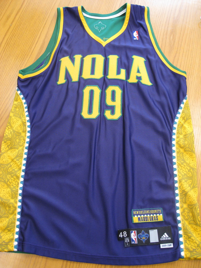
As many of you know, next Tuesday is Mardi Gras. The New Orleans Hornets knew this as well, especially when they decided to develop these uniforms. The Mardi Gras alternate uniforms are to be worn only a few times per year, and do not replace these uniforms. Here's a breakdown of the Mardi Gras uniforms' nuances:
• Let's start with the obvious: it's a tri-color uniform. By tri-color, I mean it's purple on the front, green on the back, and athletic gold on the sides. Normally, I would prefer there be one primary color, but like Mardi Gras, these uniforms are a party.
• The NOLA wordmark appears on the chest in yellow outlined in green. I like it, but I would prefer seeing one of their jerseys (ideally the home) say "HORNETS".
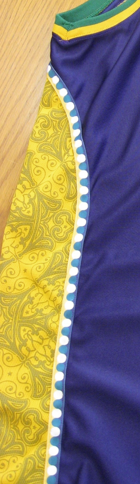
• The side panels feature an ornate pattern reminiscent of the wrought iron architecture found in the Crescent City. Although it may be tough to see on TV, it's no more difficult to discern than the back of this Duke jersey.
• The side panels also use a unique trim of alternating circles in green and white. What are the circles? Mardi Gras beads of course! Like I said before, this uniform is a party.
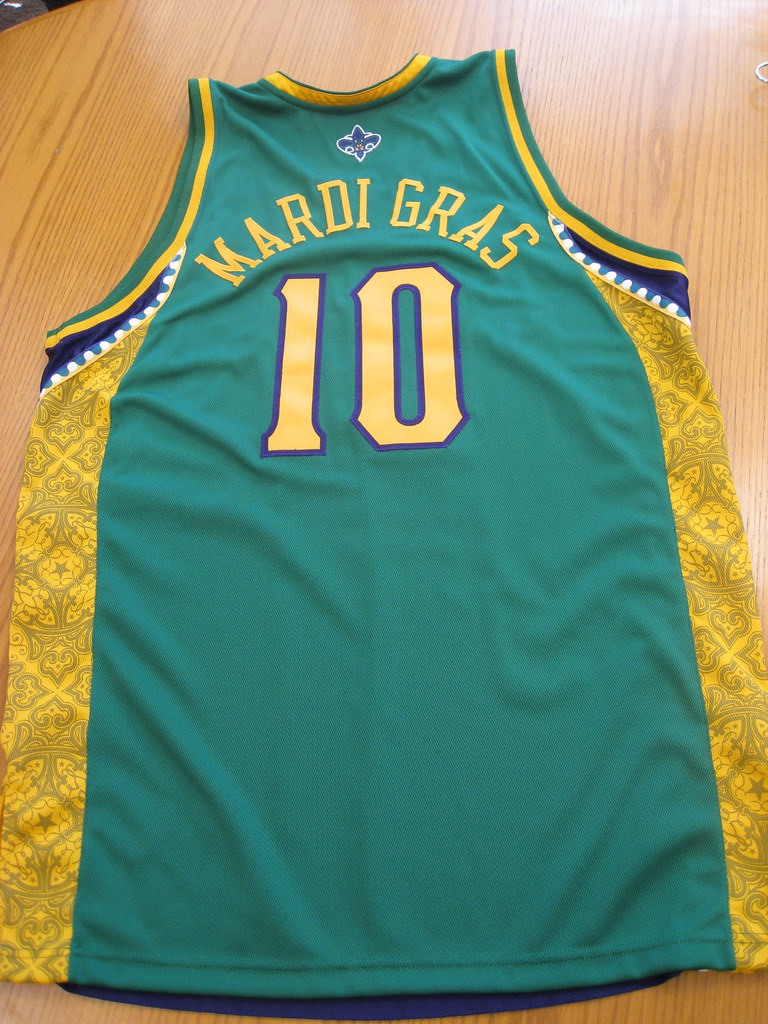
• The back of the uniform is green with yellow type (the numbers are outlined in purple). The Fleur-de-Bee logo graces the back of the collar. Lastly, the NOLA Trumpet logo appears on the back of the shorts, near the waistband.
Overall, this is a uniform full of aesthetic gambles. From the tri-color scheme to the patterned sides and "bead trim", most teams would not be able to get away with this. New Orleans, however, makes this work. I don't know how, but they do.
This week's design features New Orleans' former basketball team, the Jazz. The Jazz moved from New Orleans to Utah in 1979, and have since struggled to develop an identity that marries the concept of jazz music with the state of Utah. Here is a picture of their current logo, which accomplishes telling the viewer where the team is from, but says nothing regarding jazz. Further confusing the identity, the Jazz primarily use navy and light blue. Six teams, including Utah, use two shades of blue in their designs. There are also another five teams using blue with black. With that in mind, I decided on a purple/silver/light blue scheme that is unique to all sports. The primary logo I developed utilizes a saxophone-J with mountains and a basketball in the background. The secondary logo is the Sax-J by itself, while the tertiary logo is a revised version of the team's J-Note logo. The coloring on the ball of the J-Note is consistent with the ball in the primary logo.

The home and away uniforms feature the Jazz wordmark and music-staff-inspired side panels. The numbers and NOB (name on back) utilize the same typeface as the wordmark. The Sax-J appears above the NOB, while the J-Note appears toward the bottom of the left leg on the shorts.

The alternate uniform is noticeably different from the home and away, and in basketball it should be. The third uniform generally gives fans either a blast from the past, and alternate style, or a combination of the two. My alternate is light blue and features a custom UTAH wordmark, complete with mountains. The side panels are purple with white trim. The J-Note is placed on the back of the collar, while the Sax-J is positioned on the left hip. I have also included number sets as a reference.

Feel free to comment about the new Hornets Mardi Gras uniforms, the designs above, or anything sports design related. Thanks for reading.
No comments:
Post a Comment