
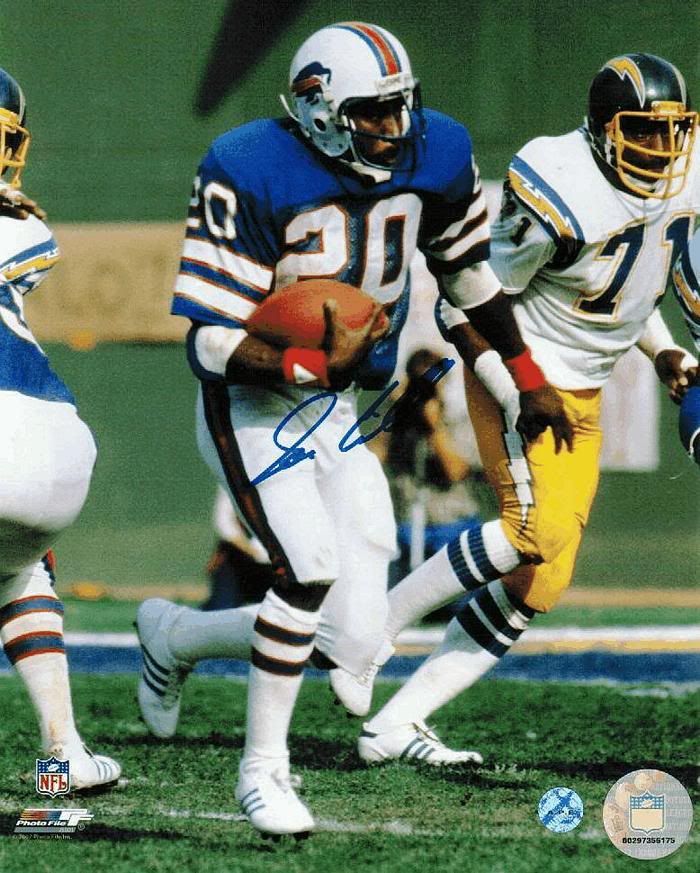
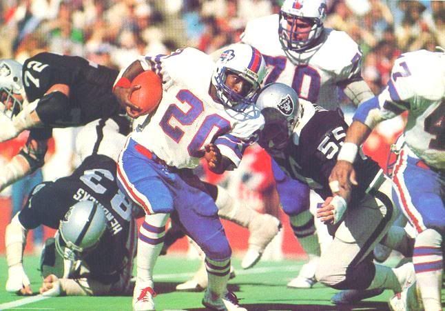
The Bills announced to season-ticket holders on the 9th that they would be wearing new uniforms for the coming season, whenever that will be. The uniforms will incorporate the current logo with elements from the team's past. Supposedly, they are going to be based on these uniforms, but with some navy blue trim added in. It seems intriguing, but certain questions remain unanswered. For example, how will the navy blue be added in? Will it be just around the edges like the Lions did with their black trim, or around each stripe? Will the team use the 90s era number typeface? Or a standard block typeface? What color will the facemask be? Grey? Navy? Royal? Will they use the striped socks? Of course there is more to come as details emerge…
I, for one, think a look based on those uniforms would suit Buffalo quite well. Much like Green Bay or Cleveland, football in Buffalo in winter has a certain charm with old school uniforms involved. While I prefer create some very modern concepts, I can understand when a concept incorporates classic elements as part of the design moving forward. But there are certain things the team will have to be sure of before they unveil the new duds.
• Do the sleeve stripes fit on the sleeves, across all players? This is important, because the team will undoubtedly have players of various sizes from defensive backs and kickers to lineman. The stripes can't be too wide because they will get cut off on certain players. Or too low for that matter.
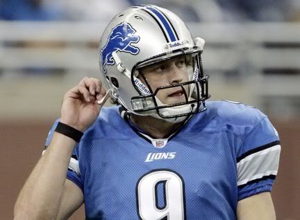
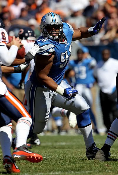
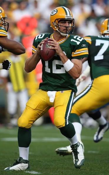
• Is the striping consistent? Well, there is some leeway here. While I appreciate the consistency of the newest Detroit Lions uniform striping, I also don't mind the consistency of a well applied striping system such as that of the Green Bay Packers, in which two sets of stripes fill very distinct roles. Those Packers uniforms would be even better with striped socks though… but I digress. It gets tricky when each element is striped, but none of the patterns match.
• Grey facemask or blue? Well this one is more up for debate, but the team's choices in number font and how the navy is applied will determine whether they should go with a grey or navy mask. While I generally do not prefer the use of a grey mask with a color scheme that doesn't include grey, it can be useful in promoting a classic look. If the uniform numbers have multiple outlines, I'd say navy or royaal facemask, but if they opt for stark typography, then all bets are off.
Not Your Traditional Marketing Strategy
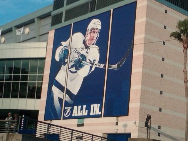
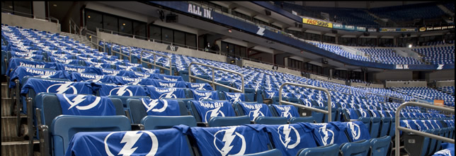
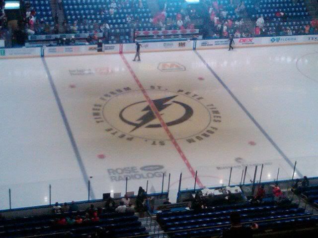
The Lightning have already started phasing their marketing materials over to the new brand, which was bound to happen since they unveiled the new uniforms in the middle of the season. The website has changed over. And there are some new environmental graphics around the arena. And to get the fans ready, they gave authentic home blue jerseys to their season ticket holders and t-shirts to some of the other fans. I understand getting everyone in the team's blue to create a more better fan experience.
But painting the new logo on center ice just looks weird. It crosses the television line: the boundry of experience between watching a game in person and on TV. It's one thing to watch a game and see the whole crowd wearing the new t-shirts and jerseys, since the mob of the crowd would just blend together and create a (mostly) blue field. In addition, the signage and website changes can advertise the new brand while not interfering the presentation of pro sports' most lucrative product: televised events. While ticket and merchandise sales do account for a hefty sum themselves, the television contracts get money from numerous sponsors and allow fans to view many more games than most of them are able to attend. Painting the new logo on center ice while the team is wearing the old uniforms interferes with the seamless ideal fans have in their heads when they are watching a game. On a more general note, the whole timing of the event was really awkward. Unveiling the new brand during the last homestand would have made much more sense, especially as a thank you to the fans before the offseason or playoffs.
Designer's Corner
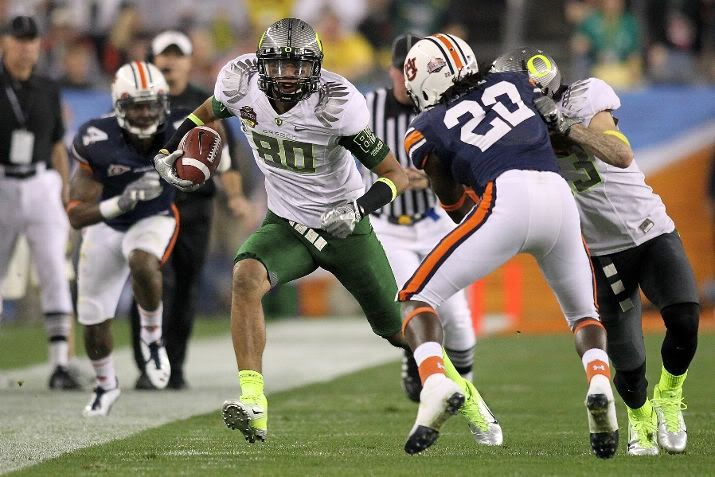
This week's design is for the University of Cincinnati. The Bearcats have had a fairly modern identity since their affiliation with Jordan Brand in the 90s. Currently, their football team is getting more attention, but the team's uniforms lack finesse. The slashes on the pants do not flow and look gaudy. For this concept, I wanted to incorporate the slash theme in a way that it would make sense throughout the logos and uniforms. The slashes were incorporated into the logo set horizontally to flow across the typography, while also not disrupting the team's trademark C-Claw logo. The uniforms incorporate the slashes down the sides of the jerseys and pants. The more graphic presentation of the slashes creates more impact as it helps the eye flow throughout the uniform. . I also decided to incorporate charcoal grey. Cincinnati is a fairly new football school, especially when it comes to playing in a "power" conference. So while their are other teams with black and red, charcoal grey is a unique shade that has yet to be paired with red on the college football landscape. (Nike has used "carbon" or charocal with yellow for Oregon and West Virginia.) The sleeve are black on all jerseys, creating a consistent presentation of black across the uniforms. There are also options for white helmets and pants, in addition to the grey.


Feel free to comment on the Bills upcoming new uniforms, the Lightning's brand strategy, the concept above, or anything to do with sports branding.
No comments:
Post a Comment