
 By Bowen Hobbs
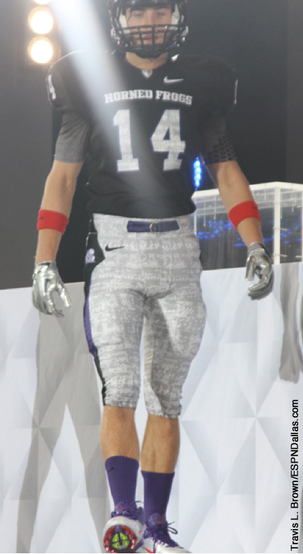
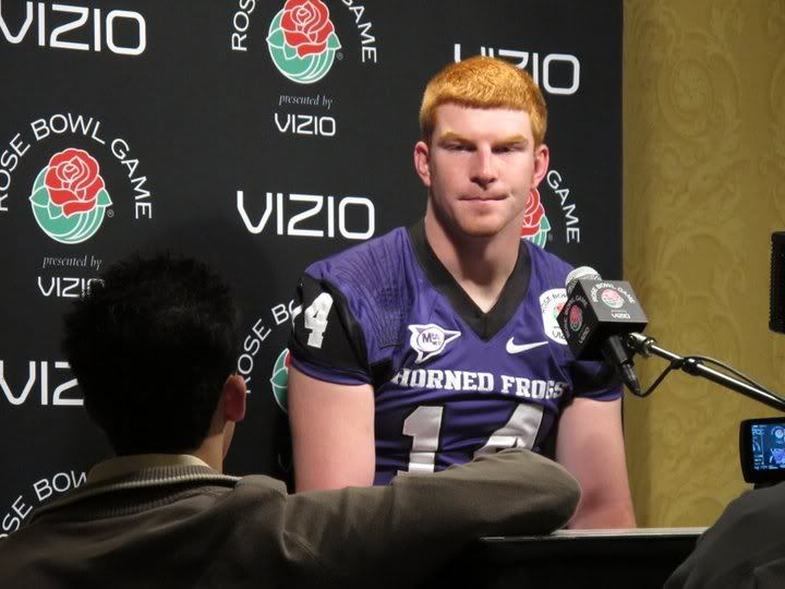
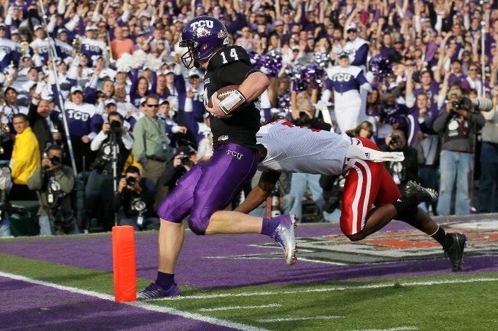
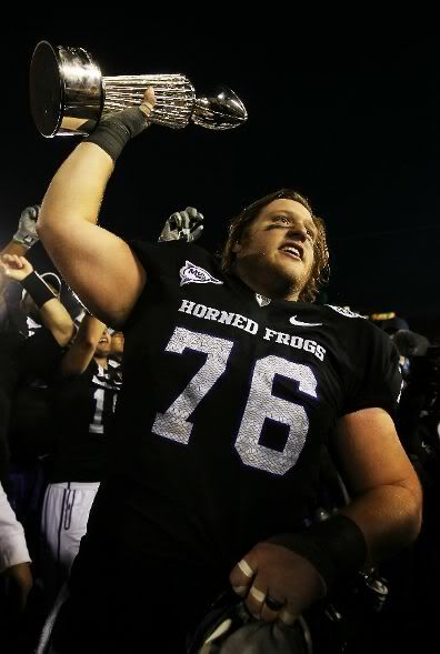
On New Year's Day Wisconsin and Texas Christian squared off in the Granddaddy of Them All, the Rose Bowl. Except something was different. Leading up to the event, Nike had unveiled this uniform, which was similar to the Horned Frogs' 2010 Pro Combat uniforms. But during the Rose Bowl's media day, TCU players were wearing this jersey, which is their current home jersey (although it is almost identical to last year's Pro Combat jersey). Word on the street is Nike had a little chat with TCU, who was disappointed by the complete lack of purple in the new threads. So the two sides compromised, leading to the Horned Frogs wearing the new black jerseys and flashy shoes, but neither the frog-skinned helmet nor pants. Instead, Texas Christian donned solid purple pants and special purple helmets (I really like the added rose). Glad to see an agreement was reached between the two sides and TCU still got to incorporate a little red in their shoes to match the rose in the frog's mouth.
I have to wonder exactly how much say TCU had during the creative process. Their school colors are technically purple and white, but they have worn black and some silver as far back as the LaDainian Tomlinson era. As a graphic designer, I know you have to listen to your clients, even if you are convinced that another direction is a better option. Did TCU have a chance to preview the design before the unveiling? If so, why didn't they speak up? If not, were they given the opportunity? And if they weren't given the opportunity, why on Earth would Nike unveil a design nationally without the client approval? Clearly, a link in the client-designer communication chain was broken.
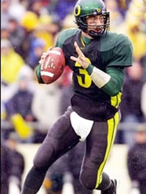
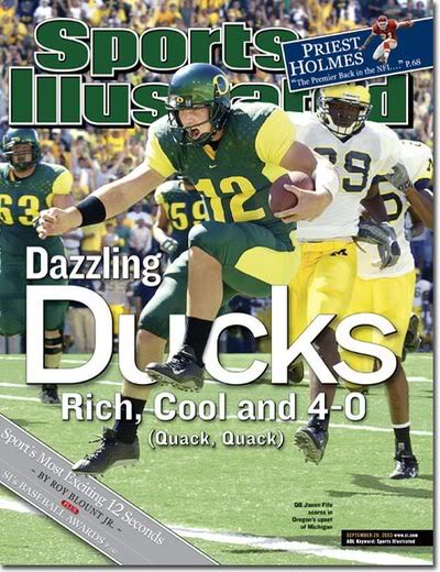
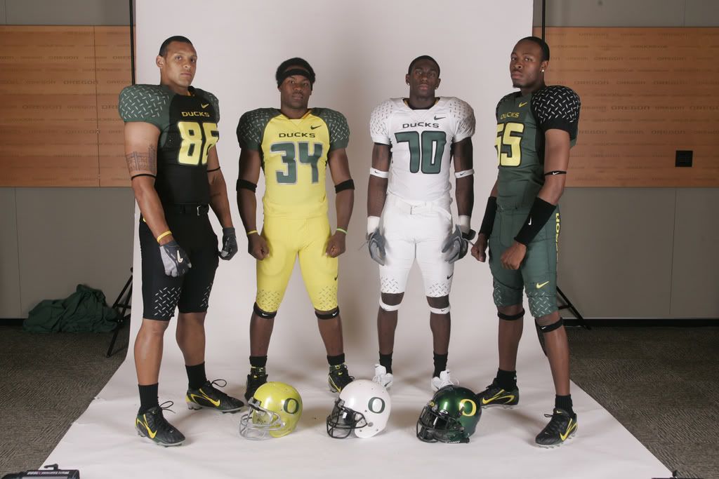
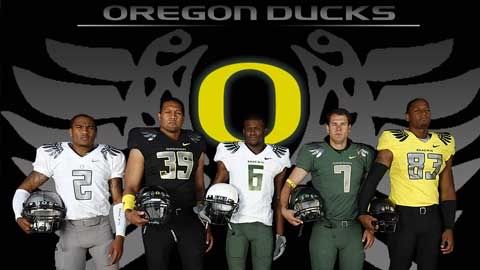
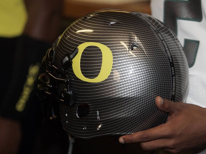
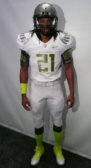
But the TCU fiasco illustrates a larger point regarding Nike's design sensibilities: the extreme overuse of black, grey, carbon, and silver. This all started with Oregon. Remember them, that quaint little team draped in green and yellow? Well Nike got a hold of them, and black was pumped into the uniforms. The Ducks then went back to their colors briefly, but after that last stand the flood gates opened. With the last set, green and yellow went from school colors to possible colors. The team had four helmets the first year of the winged shoulder set, with one being green and another white. That meant there was also a carbon helmet and a black helmet. This year, Nike even went to the logical endgame of reducing the role school colors played and completely subverted the Ducks to Team Nike. And then there's the uniforms the Ducks plan to wear for the National Championship. Lots of white, silver, carbon, and… highlighter? Really? I guess when Nike runs out of grey tones, they start with neon hues. Seriously though, would Oregon yellow not have worked for this design? Would it have clashed with all of those greys? (I'm being sarcastic again.) Many of the Ducks more recent combinations look like they came out of a Nike cross country catalog.
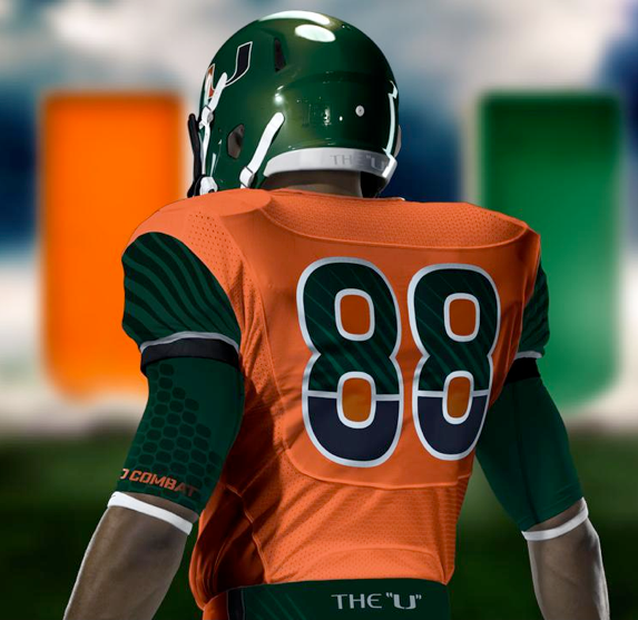
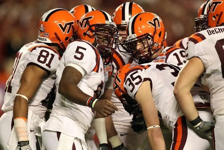
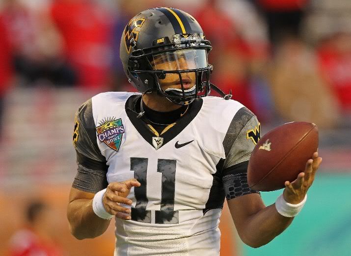
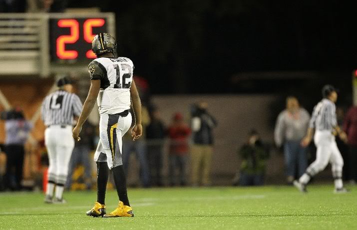
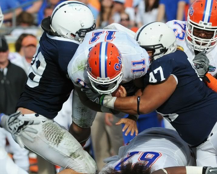
And it's not limited to TCU and Oregon. Florida State has used black in their Pro Combat uniforms, Ohio State has swapped out their silver for Nike grey in 2009. And Missouri added dark grey to black that year. But the 2010 set is even more neutrally enhanced, with Boise State getting a silver jersey and Virginia Tech using a black helmet and everything else. Ohio State, naturally, went back to Nike grey for their 2010 Pro Combats, while the U of Miami, perhaps the school with the most interesting colors used black on their numbers. The Backyard Brawl showed degrees of Nike-ness, with Pittsburgh adding black for the occasion and West Virginia almost completely forgetting that they wear navy.
At what point will this black/grey/silver overload end? When will original color schemes, like Miami's green and orange or Virginia Tech's maroon and orange, be celebrated again? While I love some of the things Nike has brought to the uniform design table, like sublimated patterns on numbers (the frog skin numbers are growing on me), segmented gradiation, and Oregon's winged shoulders, their overuse of black, carbon, silver and grey makes those unique elements stand out less than they would if each team used its own, unique color palette. Furthermore, why would teams abandon their color schemes, a major part of their brand, and subvert themselves to Team Nike? It must have been an offer they couldn't refu$e.
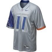
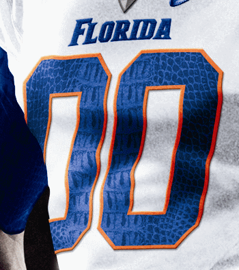
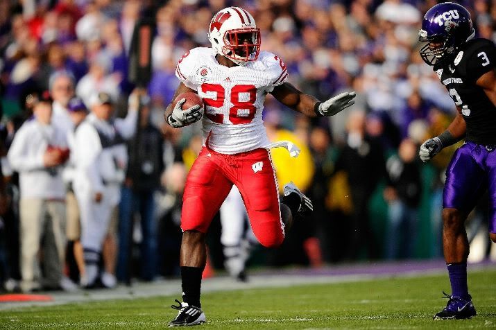
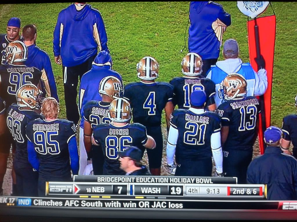
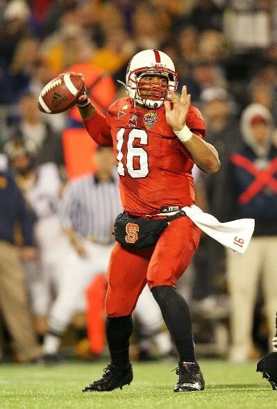
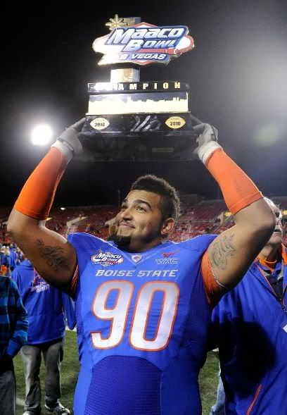
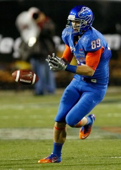
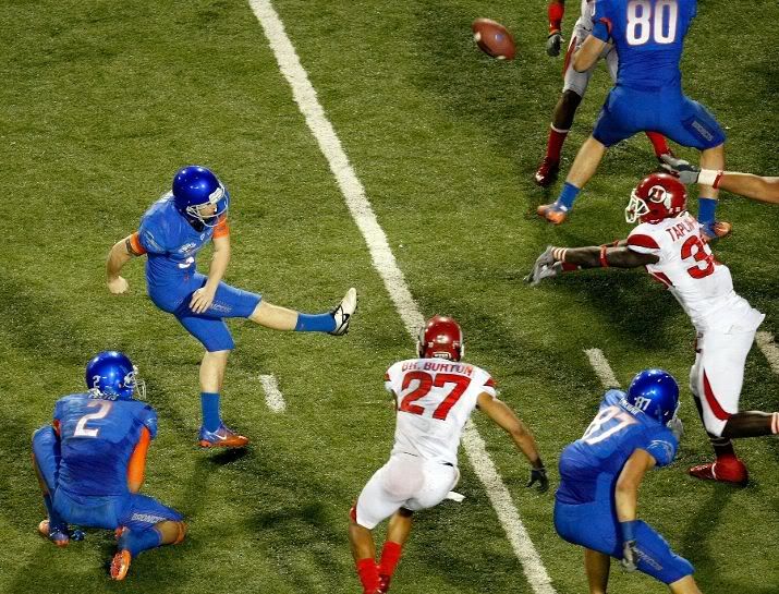
In Other News… Rounding out the bowl game action, the Badgers wore red pants for the first time in a long time. Pro: Upping the red was a nice tie-in to their Rose Bowl appearance. Con: They looked even more like Nebraska… The Washington Huskies went all-black in the Holiday Bowl… Virginia Tech wore their special orange helmets, as promised… The Mountaineers went to the Champ Sports Bowl, but left their school colors back in West Virginia (those pants stripes are awful though)… Also in the Champ Sports Bowl, North Carolina State brought enough red for two teams… As for Florida, their gator skin helmet pattern was so subtle, it was barely noticeable… I hadn't noticed, but Boise State's numerals on their bowl uniforms used a gradient. I thought it was just a lighting effect when I first saw the design… Also on those Boise State uniforms, the left side looked pretty normal, but the right side, with the blank helmet and close-cropped logo on the sleeve, looked pretty weird… In the NFL, the Jets waited for the final week of the season to go all-green… The Dolphins wore their teal pants against the Pats… The Saints went all-black against the Buccaneers… The Broncos were feeling blue about the season… And of course the Redskins and Giants fought in the Battle of the Stripe-o-Maniacs…
Designer's Corner
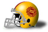
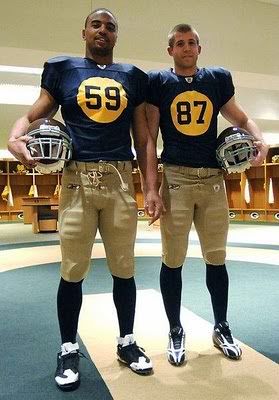
This week, we go back to the Pac-10 (or 12 once this season is over). The Arizona State Sun Devils have an iconic logo, but the rest of their graphic identity is pretty bland. And the uniforms aren't much better. The black trim around the numbers is unnecessary, and the uniforms themselves could be used for any team with a quick change of the colors. I took some inspiration from their previous uniforms, utilizing a less-is-more approach and sticking with a general feel that Sun Devils fans have grown comfortable with. I did add some necessary detail, opting for a custom number font that is worked in throughout the package. For the logo package, I developed several marks that incorporate a large sun with the custom letterforms. The Es in the primary logo and wordmark are stylized into pitchforks. I have also kept Sparky the Devil, as he is simply too iconic to lose. Back to the uniforms, The stylized numbers are complemented by a simple, single-stripe theme that runs throughout the concept. Sparky stays on the helmets, but the ASU Sun logo appears on each hip of the pants, while the A-State logo is placed above the front player number. There are options for maroon pants and a yellow jersey. The fauxback uniform takes the idea of this classic helmet and mixes it with the Packers' throwback uniforms. The result is the ASU-Sun logo residing on the helmets and a large sun on the front of the jerseys for the player number to appear in.


Feel free to leave a comment on Nike's limited color palette, the design above, or anything sports branding related.
The "number in the Sun" design for the "faux"back is unique yet fitting idea.
ReplyDeleteThanks. I've been very interested in throwback uniform ideas, particularly playing with the size of front number.
ReplyDelete