
Welcome to 44th & Goal, a blog about Sports Identity and Uniform Design. Since this is the first post of 44th & Goal, I wanted to choose a topic that would be noticeable and thought provoking. I've decided to talk about the difficulty some teams have with getting their sleeve stripes to look right on their modern-cut jerseys.
The worst violator of this appears (at least to me) to be the San Francisco 49ers. The Niners have a history of wearing three white stripes across the sleeves of their red home jerseys and three red stripes across the sleeves of their white road jerseys. The recent installation, however, leaves much to be desired. It's not so much three stripes as it is one stripe and parts of two others (as it appears on receivers and running backs) or two stripes (what I've seen on the linemen). A uniform is part of a brand, and branding needs consistency to communicate a unified image to the consumer. To further confuse the matter, the jerseys from the 80s had the TV numbers on the sleeves, which have since been moved to the shoulders for… (drum roll, please) lack of space on today's tiny sleeves. Other teams have this issue too. The Lions decided to keep dealing with this issue in their most recent re-design. (Look at #51) The Browns and Cowboys (as well as a few others) deal with this too. Kudos to the Packers for realizing this trend and moving from a 5-stripe pattern to a 3-stripe pattern between Super Bowl appearances in the 90s.
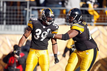
The Packers' upcoming opponent, the Pittsburgh Steelers, also feature the large, difficult-to-fit-on-a-sleeve stripes. Although they do try to put the stripes high enough on the sleeve, I can't help but think of the 70s when I see them. (And this is coming from someone born in the 80s.) My vision for them takes the idea of the sleeve stripe and brings it into the 21st century, while maintaining their brand of representing Pittsburgh's long-fabled Steel Industry. Other changes I have made include:
• Editing the color palette by removing the red and blue and adding a second grey. I think people can still see it's a US Steel-based logo without being so literal.
• Editing the number font to something tougher than the Kordell Stewart era numbers.
• Making the facemask grey, for a touch of tradition.
• Adding a yellow alternate jersey and black and white pants, to add the opportunity to switch the look for special occasions (i.e. night games, or Saturday games, etc.)
(Click image to enlarge.)

Feel free to leave a comment regarding your thoughts on sleeve stripes, the Steelers concept above, or just anything to do with Sports Branding.
No comments:
Post a Comment