Wednesday, September 15, 2010

Texas League: The Good, The Bad, & The Ugly

By Bowen Hobbs

As a continuation of my look into the branding of Minor League Baseball, today's 44th & Goal will examine the visual identities of the Texas League. (You can also read my breakdowns of the International League, Pacific Coast League, and Eastern League.) Like the other leagues, the Texas League features some teams that have well-executed brands, others that are in need of an update, and some that should blow everything up (graphically speaking, of course) and start over. Without further adieu:

The Good

Corpus Christi Hooks: The Hooks were previously the Round Rock Express, which is now a Triple-A team in the Pacific Coast League. This was possible when the ownership group that owns the Hooks bought a Triple-A team from Alberta (the Edmonton Trappers) and moved them to Round Rock, allowing the then-Round Rock Express to make the move to Corpus Christi. The Hooks' primary logo features a "Hooks" wordmark in which the o's are the eyes of fishing hooks. The fishing hooks loop down below the underscore to reinforce the theme of submerging into water to catch fish. The city name appears inside a Texas flag-inspired banner above the "Hooks" wordmark. The team's mascot, a hook wearing a hat and holding a bat, is stitched onto the home caps, while the away caps are emblazoned with a CC logo (for Corpus Christi) made from two fish hooks. The jerseys are vests with placket piping. While the home jersey uses a modified Hooks wordmark with non-fish hook o's, the road jersey uses the CC logo as a crest, placed on the left chest.

Northwest Arkansas Naturals: The Naturals are a new team, having only been the Naturals since they moved from Wichita following the 2007 season. The name "Naturals" is a reference to Arkansas's nickname, "The Natural State". The primary logo consists of a mountain, a waterfall, and a baseball streaking to the left, in addition to a "Naturals" wordmark. Speaking of the wordmark, it uses an italicized and arched sans serif with a bevel. In addition, the N at the beginning of the wordmark features a lightning bolt, which is possibly a reference to Roy Hobbs from "The Natural". (Roy Hobbs carved his bat, "Wonderbat", from a tree limb that was struck by lightning.) The caps use the N monogram for home, away, and alternate. The home jersey and alternate jersey display the "Naturals" wordmark from the logo, while the away tops opt for "Northwest Arkansas" across the chest. Overall, the identity is pretty cluttered, but the N mark from the hats is very strong.

Tulsa Drillers: While the Drillers have called Tulsa home since 1977, the team's current scheme has only been in use since 2004. The primary logo consists of a man drilling into a baseball, flanked by "Tulsa" and "Drillers". The color scheme is very unique, as it is comprised of royal, graphite, black, copper, and light blue. The team also uses a set of alternate marks to reinforce the brand. The caps feature one of said alternate marks: a beveled T with oil dripping from it. The other supporting marks include a baseball with a drill through it, a version of the man drilling sans wordmarks, and a drop of oil that is on fire. The home jerseys have no placket piping, trim, or pinstripes, just a "Drillers" wordmark. The away jerseys do use placket piping to complement the "Tulsa" wordmark, and the alternate jerseys are royal blue with copper piping and the "Drillers" script.

The Bad

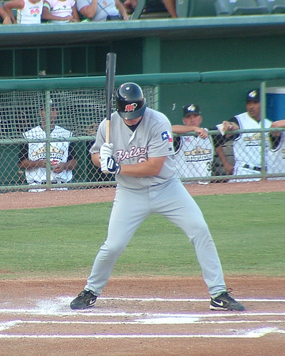
Frisco RoughRiders: The RoughRiders moved to the Dallas metro area from Shreveport, where they were called the Swamp Dragons. The RoughRiders use a black, red, and silver color scheme, which is surprisingly unique within the Texas League. The primary logo features a cowboy riding a horse under a western style "RoughRiders" script. The logo is a bit detailed, and some of the thinner lines appear to be difficult to reproduce in various media, such as embroidery. The logo could be very strong with a stylistic update. The secondary logo is a double-R with a black horse coming out from the right side. The secondary logo appears on the home and road caps, which are black and red, respectively. The home jerseys use a Riders wordmark that matches the logo, while the away jerseys rely on a "Frisco" wordmark in cursive script. The alternate jerseys are red with a embellished version of the "Riders" script. With a stylistic update, Frisco could have a great identity.

San Antonio Missions: The franchise has called San Antonio home since 1977, but between the '87 and '88 seasons the team re-branded and became the Missions. They were previously known as the San Antonio Dodgers. The Missions' primary logo is fairly basic: it's a depiction of the Alamo over "MISSIONS" in a bold slab serif. The problem is the use of white type against a white background. While the bold black drop shadow helps with legibility, the fact that the viewer does not see half of the edges of the letters hinders the logo when it is reproduced in small spaces. In addition, "SAN ANTONIO" appears tacked on, as if it were an afterthought. The secondary logo isn't much better, but at least it appears on black home and away caps. The team also uses a gold Sunday cap. The Missions' home jersey is a vest with trim around the armholes near the shoulder area. The "MISSIONS" wordmark appears across the chest with the alamo proudly above it. In addition, the player's number appears below the wordmark on the player's left side. The away jerseys are also vests, but use placket piping and a Dodgers-inspired script in black, outline in gold. One nice touch within the "San Antonio" script is the star that dots the I. The team also uses an alternate jersey with "Missions" in a white cursive script outlined in gold on a black jersey. The player number also appears on the front of the shirt. The basis of the identity is solid, but the identity package could use a facelift and the type work needs to be standardized.

Springfield Cardinals: As I have stated before, I've never been a fan of a team using the parent club's identity. I know it's a common practice in the lower levels of A-ball and Rookie Leagues, and that is exactly what it makes the Springfield team look like. There are plenty of ways to interpret the cardinal theme without simply swapping out a script. The team also has a sleeve patch with the cardinal inside the state of Missouri, which would be better if kelly green, spring green, and light blue weren't added. In addition the lower right corner of the logo has an awkward tension between the cardinal's wing and the outline of the state. The two primary caps feature an S logo with a cardinal, while the Sunday cap uses a batting cardinal and a C. To make matters worse, the team places "Springfield" on both the home and away jerseys, just like the Texas Texas's.

The Ugly

Arkansas Travelers: What can I say about the Travelers? I understand it's a difficult name to work with identity-wise, but how is this the best possible answer? The primary logo doesn't even have the full team name in it. Instead, it uses valuable graphic real estate on a slogan that doesn't even belong in the logo in the first place. It's no wonder none of the secondary logos even follow the branding of the primary. The home, road, and alternate caps use an LR logo with or without a star (depending on the cap) and the word "North" in a script. Once again, I can understand the logic of the LR logo on the the caps, and the logic of complementing it with a star, but the generic script "North" is too much. It's almost impossible to read, and the font used looks like it came from the 80s (and not in a good way). The home and away jerseys, by contrast, are rather simple. This identity isn't much of an identity at all, as it's wildly inconsistent. At least travelers outside of Arkansas understand the idea of matching.

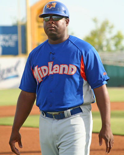
Midland RockHounds: It looks like Scooby Doo and the Flintstones had a baby. The primary logo consists of a hound dog, wearing what appears to be a tunic from the town of Bedrock and a hard hat, holding a bat and a ball. In the background, oil derricks are gushing and the whole scene is cropped by a jagged circle with Mildland in African tribal-styled lettering. "RockHounds" appears in a chipped stone font that is more playful than tough over the entire logo. The sundial watch is a nice touch within the prehistoric theme, but the whole theme should probably be scrapped, as it appears to be left over dino-mania from the Jurassic Park movies. Working within the prehistoric theme, the the hound could have been made of stone or fossilized, instead of wearing prehistoric animal print. In addition, the type could be less goofy. Personally, I would try to bring out the intrinsic strength of rock, over making the rock look fragile by showing it chipping away. The team also has two supporting marks that appear on caps and inexplicably use red, when the primary logo shows the hound in an orange and blue tunic. The cap logos also use a gradient, which doesn't appear anywhere else in the identity. The jerseys (here is a picture of the road jersey) look like batting practice gear due to the side panels, which are modern and do not fit the prehistoric theme. This identity uses all the bells and whistles, but sometimes, too much is really just too much. Simplification would really help.

NFL Week 1 Notes

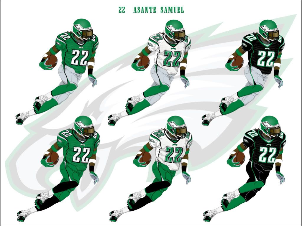
• I loved seeing the Eagles in kelly green this last weekend, now if only they mixed the lighter green with their current scheme.

• Another thought on the Eagles' throwbacks: The sleeve numbers didn't match the the front and back numbers. A team probably couldn't get away with that today, but the throwback's purpose is historical accuracy, not modern aesthetics.

• The Redskins decided to break out gold pants for their Sunday night game versus the Cowboys, along with socks from the 70th anniversary uniforms. On Sunday, the 'Skins sported four non-matching striping patterns: one on the helmet, one on the jersey sleeves, another on the pants, and one on the socks. Considering they were playing the Cowboys, this was a clash of the non-matching (the Cowboys and their loose sense of a color scheme vs. the 'Skins stripe-o-mania). I liked the idea of pairing gold pants with a burgundy jersey, but it doesn't mean all other principles of deisgn can blatantly be ignored.

Today's design is an elaboration of what the San Antonio Missions could do to improve their brand. In my re-brand, starting with the primary logo, I created a single holding shape around the entire mark, so the word "MISSIONS" isn't lost, like it is on the current logo. This also allows for the mark to appear as a unified whole, not a collection of parts. I added silver and a darker grey to the color scheme to create a western-style wordmark with dimension. The baseball is now placed at the top of the Alamo, instead of flying over it, for a more concise depiction. The cap logos are letter-based marks of an M and an SA, both of which are enclosed in abstract Alamo shapes. I have also created a logo to honor the team's mascot, Ballapeno. The wordmarks are consistent with each other, unlike the current scheme, which features the slab serif on the home jersey, and traditional script on the away and alternate jerseys. The cap options include various uses of the secondary logos, in addition to versions of the M and SA logo that do not use the holding shape. I also created a cap based on the helmet in the Ballapeno logo, with a simple star and two white front panels.

The primary home and away uniforms start with vests. Then, I applied a double-stripe of gold as placket piping, sleeve trim, and pant striping. Ballapeno appears as a sleeve patch as well. The home uniforms use a trucker-style cap with a white front, while the away uniforms use a solid black cap with a gold button and silver lettering. The home and away alternates feature black jerseys with the double-stripe scheme. The home alternate is paired with a black cap that features the M-in-Alamo logo, while the away alternate is complemented by a gold-brimmed cap. Alternates 3 through 6 are options for a possible fauxback design. Alternate 3 has an 80s style, complete with the Ballapeno cap, and the Alamo appearing on the front of the jersey, similar to the current uniforms. Alternate 4 features a vintage contrasting placket design, with the more traditional M on the jersey and a white cap. Alternates 5 and 6 are feature black jerseys and pants with more traditional typography. While Alternate 5 is paired with a white cap, Alternate 6 is paired with a gold front trucker-style cap.


Feel free to comment on the branding efforts of the Texas League, the uniforms stylings of Week 1 in the NFL, the Missions concept above, or anything sports branding related.

Wednesday, September 8, 2010

Action Jackson

By Bowen Hobbs

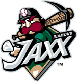
On Monday, the West Tenn Diamond Jaxx unveiled their new name and logos. When the 2010 Southern League Playoffs end the Diamond Jaxx will officially be known as the Jackson Generals. While the old primary logo consists of a miner holding a diamond in one hand and resting a bat/pick axe on his shoulder over a "Jaxx" wordmark, the new logo features a bulldog wearing a WWII-style battle helmet biting a bat. The three stars on the helmet represent Tennessee, as they appear on the state's flag. The GENERALS wordmark is rendered in a Tuscan typeface, giving it a baseball-specific feel, while the JACKSON wordmark above it is displayed in a simple, no-nonsense sans serif. The mark employs a shield holding shape to frame the logo and bring the other elements together as a cohesive whole.

The Diamond Jaxx used a color palette that was rather expansive, containing black, two greens, burgundy, mid-grey, silver, tan and, of course, white for a grand total of eight colors. The Generals' brand has a paired down palette, focusing on black, emerald green, silver, tan and white. This reduction in the number of colors used allows for a more streamlined aesthetic and lower production costs.

While the Diamond Jaxx employed a beveled wordmark to match the rendering style of the diamond, the Generals use a Tuscan-style font arched over the bulldog's head with green accents below the wordmark, giving it volume and mass. The shield employs a similar shading style to the bulldog's mouth, giving the logo a sense of rhythm.

The Diamond Jaxx used a miner cropped by a J as their secondary logo, as it appeared on their home, road and alternate caps. The new secondary logo uses the Tuscan typeface from the Generals' primary logo to create an interlocking J and G, which is rumored to appear on the new caps.

To the million-dollar question: Is it an upgrade? While the miner and type in the Jaxx logo set was well-rendered, the brand featured too many colors and the name "Diamond Jaxx" is rather kitschy, considering the two Xs that end the word Jaxx. The Jackson Generals moniker brings with it a significant amount of history, evoking names like Shoeless Joe Jackson and Yogi Berra, both of whom played for past Jackson Generals teams. The Generals brand also gives fans a unique animal mascot (instead of this; it's apparently a bear, which is the same animal mascot used by the BayBears and Smokies, who are also in the Southern League). Overall, the re-branding effort was a significant upgrade, especially when it comes to the color scheme, name and mascot.

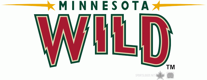
In Other News… The Minnesota Wild have replaced this wordmark with this wordmark. It certainly fits with the logo better than the previous wordmark, which was absolutely horrid… The NFL introduced 2010 sideline cap for players. It apparently has technology to allow fans and players to interchangeably wear the brim flat or curved. Too bad the design is garish… Penn State University will be wearing new basketball uniforms this year. They aren't bad, although the collar seems a bit thick.

This week is the finale of my MLB Double Play designs. Starting in the NL, we have the New York Mets. The Mets' current scheme came to be when the team added black preceding the 1998 season. Previously, the team was primarily royal blue and orange. Since the addition of black, however, the Mets' brand has increasingly relied on the combination of black and royal blue, relegating orange to an accent color. My design seeks to rectify that injustice (and trust me, most Mets fans I've met find it to be an injustice), restoring royal blue and orange as the team's primary colors. However, I also warmed the white to a cream color, similar to what the Mets currently use for their alternate jerseys. The royal, orange, and off-white color scheme gives the Mets a unique, retro look, which is a stark contrast from this. I developed a standalone M as an alternate mark, which appears on the batting practice caps. The home and away uniforms feature the famous "racing stripes" pattern made famous by the '80s Mets teams (without the pinstripes, however). The primary home uniform uses an off-white base, with the option of an alternate blue jersey. The numbers are a proprietary block numeral, since MLB Block is overused as it is. The away uniforms start with a cool grey base, giving the team a unique deviation from the standard Cool Base grey. There is also an alternate blue jersey for the road with NEW YORK on the chest in cool grey, outlined in orange. The Sunday Alternate looks to evoke memories of the Amazin' Mets of '69. The pinstripes are spaced further apart from standard pinstripes to give the jersey a unique element that helps reinforce the vintage look.


The Baltimore Orioles are up second. The team's current primary logo is of an oriole sitting on a script "Orioles" wordmark, while the secondary logo is a standalone bird, facing left, and the tertiary logo is a sleeve patch based on the Maryland flag. My version of the primary logo makes the bird the focus instead of the script, which is relegated to the uniforms. The oriole appears within a circle, making it a less horizontal logo. My version of the secondary is a standalone oriole head. I've always thought the current caps were rather cluttered. The oriole head, however, lets the viewer see more of the oriole's face, instead of its body. The tertiary in my concept is similar to the existing sleeve patch, but with revised typography to fit the rest of the design. The uniforms use a special style of trim that was inspired by the Maryland flag. The numbers are a slab serif in the same family as the supporting type on the logos (as I mentioned before, MLB Block is far too overused). The home uniforms use a white base and orange type and are complemented by a black hat with an orange brim. The home alternate jersey is orange with black type. The away uniforms use a neutral grey base and orange type, with an option for a black alternate jersey. The Sunday Alternates rely on a retro feel, illustrated by the trucker-style caps and thick sleeve trim.


Feel free to leave a comment regarding The newly-named Jackson Generals, the Mets and Orioles designs above, or anything related to the sports branding world.

Wednesday, September 1, 2010

Nike Pro Combat: 2010

By Bowen Hobbs

Nike is at it again.

As it turns out, last year's wildly successful Pro Combat uniforms were a one-game special. To keep the Pro Combat train rolling along, Nike unveiled the 2010 edition of Pro Combat this morning. Here's a look:

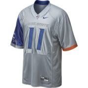
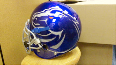
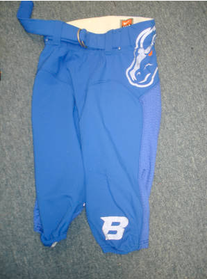
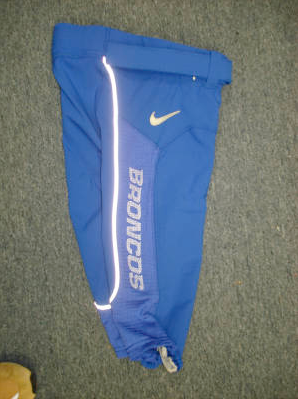
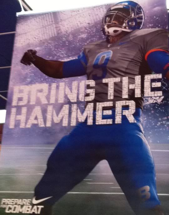
Boise State: Famous for beating Oklahoma in the Fiesta Bowl in 2007 and blue turf, Boise State was selected as one of this year's 10 Pro Combat teams. Their new uniform features a grey jersey with one blue sleeve, which has a large, cropped image of the Boise State Broncos bronco head. The oversized logo theme continues onto the helmet, where the bronco head is displayed proudly… and massively on a blue shell. The pants are, like the jersey, asymmetically designed, complete with another large bronco head on the left hip, the BRONCOS wordmark down the right leg, and a silver B on the left knee.

Virginia Tech: Inspired by VT's relationship with the military, the uniform is all-black with grey accents (symbolic of military dress uniforms) to accompany the team's burgundy and orange. The helmet is a flat black shell with the VT logo in orange outlined in burgundy and white. The uniform numbers feature a computer-chip pattern signifying the school's technological background. The "tech-y" pattern is also used throughout the uniforms on orange accent panels that crop the shoulders and run down the pant legs.

Ohio State:
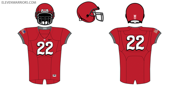
Like VT, The Ohio State University unveiled its second Pro Combat uniform in as many years. This year's Ohio State uniform looks to honor the 1942 team. The helmet is rather basic, featuring a red shell, grey facemasks, and the Bronze Star of Charles Csuri, the MVP of the 1942 squad. The jerseys are also rather simple, only adorned by an American flag on the right sleeve and stylized jersey numbers that pay homage to the 1942 squad. The pants are simple, as well: grey with the Ohio State O logo on the hips. The under layer shows off a sublimated camouflage pattern to tie the scheme together.

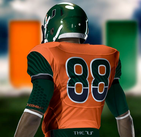
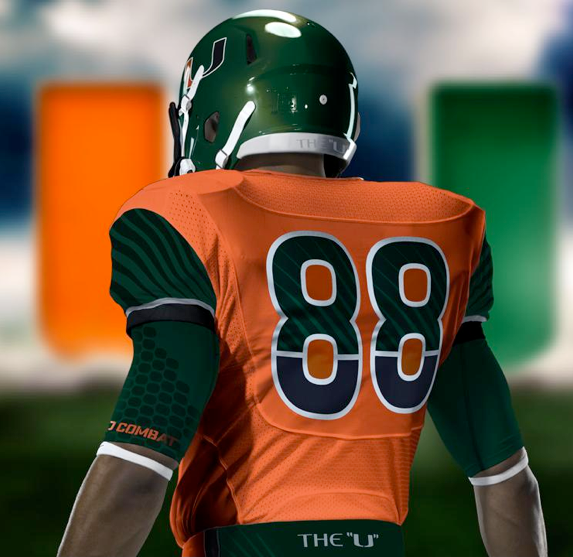
U of Miami: Especially compared to last year's white-out Pro Combat set, this year's uniform is dripping with color. The helmet is a metallic shade of green that falls between Miami's normal forest green and emerald, complete with the U logo on each side. The jersey, by contrast, is bright orange with green sleeves which have a sublimated palm tree pattern on them. The numbers are the same font as last year's model, but instead of being half-green and half-orange, they are half-green and half-black with a white outline. Rounding the set out are orange pants that feature a green stripe that runs across the backside and down each leg. "The U" adorns the top of the pants on the back, while the U logo is placed on the left knee in silver.

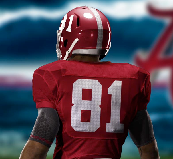
Alabama: The Crimson Tide win the "Texas Longhorns Award" for the least change from their regular uniforms to their Pro Combat threads. The only difference between the standard and Pro Combat helmets is the addition of a sublimated houndstooth pattern on the helmet stripe of the Pro Combat version. The new jersey is also incredibly similar to the standard, with the only changes being the addition of an American flag to the right sleeve and (of course) the use of the houndstooth pattern on the numbers. The pants add a logo to the hip where there wasn't previously one, but to the average fan, not much has changed.

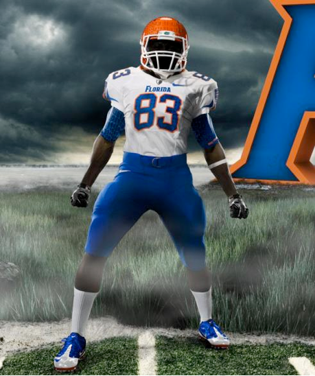
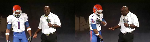
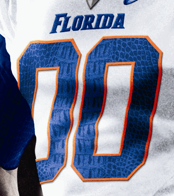
Florida: The Gators really adopted the gator skin pattern that Nike experimented with last year. This year's Pro Combat uniform uses said pattern on the helmet, sleeves, numbers, pants, and undershirt. The helmet is different from last year's (which was white), as it is orange and uses the classic Gators script. This year's jersey is white and is paired with blue pants.

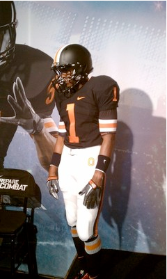
Oregon State: To be worn in the "Civil War" (the school's rivalry game against U of Oregon), the Beavers' new pro Combat duds are modeled after the 1967 team known as the "Giant Killers". The uniforms use a black helmet and jersey with off-white pants and feature a consistent striping pattern of off-white/orange/off-white on a black background (black/orange/black on the pants). Other than the stripe, the helmet is solid black. Nike helped push the throwback look to this set by adding the sthttp://www.blogger.com/post-create.g?blogID=3798142622684331953riping pattern to the sleeves of the undershirt, as the jersey sleeves are too small for such a thick stripe, in addition to the jersey number.

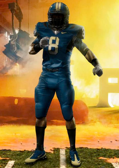
Pittsburgh: The Panthers are new to the Pro Combat game, but that didn't stop them from trying something different. The uniform is all navy with black and metallic gold accents and is supposed to represent the steel industry. The PITT wordmark and jerseys numbers are designed to look like they are cut from steel, while the helmet stripe is supposed to look like an I-beam.

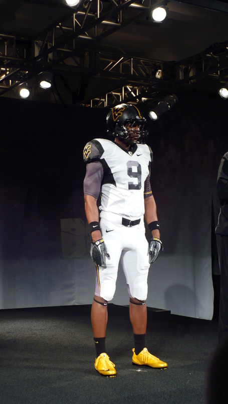
West Virginia: Like Pitt, West Virginia is new to the Pro Combat game. The Mountaineers themed their set to honor the coal mining industry. The helmet features a thin strip of yellow to represent the headlamps worn by miners and a smudged black pattern is used throughout the uniform to further convey that message. The jersey and pants are both white, with the thin yellow stripe running down the sides of the pants.

TCU: Ah yes, TCU. They're the ones who trotted out this look last year. They kept the frog skin pattern, although this year it's "icier" to reference a memorable quote from celebrated coach Leo "Dutch" Meyer. ("We'll fight 'em 'til Hell freezes over, then we'll fight 'em on the ice.") This year's version will pair a silver frog skin-patterned helmet with a black jersey and matching silver pants. The jersey features purple side panels and shoulder accents, in addition to frog skin numbers. Overall, not that different than last year's model, but slightly better.

Nike did a good job fixing some of last year's issues with the Pro Combat set, particularly the use of the shoulder feather pattern and the overabundance of white. Many of the uniforms still use colors not associated with the teams (like black for Miami and silver/grey for Boise State), but since the jerseys are one-and-done, it's acceptable. The Alabama uniform's new additions are so subtle they could even be used as a full-time uniform. Pro Combat is here to stay, at least for the next few years.

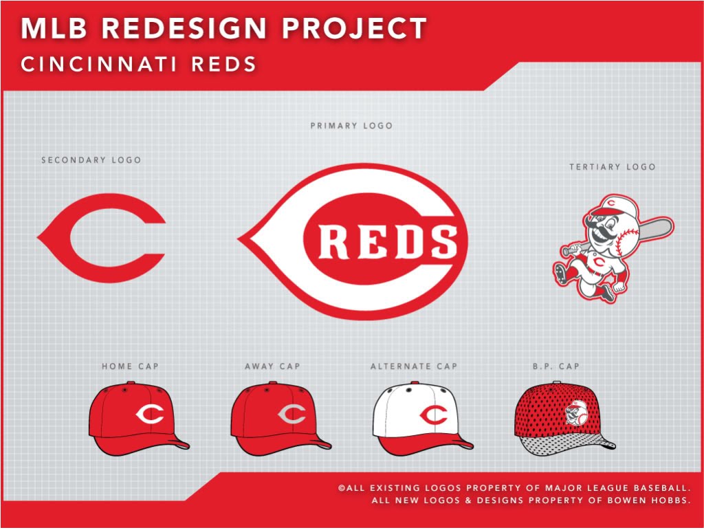
Today, we have another Double Play Design, starting with the Cincinnati Reds. The "Oldest Team in Baseball" currently has a pretty strong identity. I didn't look to overhaul the existing scheme; instead, I sought to improve upon it. The current primary logo uses block letters for the REDS wordmark encapsulated within the C. I have replaced the block letters with the Reds' proprietary font, giving the overall scheme more unity. I have also eliminated black from the identity and replaced it with charcoal grey, adding a unique twist to the color scheme. For Mr. Redlegs, I swapped the two-stripe pillbox hat for something slightly more contemporary. The primary home and away uniforms use sleeveless jerseys with red undershirts, while the home and away alternates use red fax-vests (the jerseys have sleeves, but the piping still resides on the shoulders). The home hat is the same as the Reds used to wear before their foray into black accents, while the road cap is solid red with a grey C, to match the red/grey look of the road uniforms. The Sunday Alternate opts for a white crowned cap with a red C and is paired with a simple no-frills sleeveless jersey.


Second, we have Ohio's other team, the Cleveland Indians. Many people find the Indians' current logo offensive, and I can't necessarily blame them. The caricature is outdated and insulting. My main goal was to bring a level of dignity to the brand. To accomplish this, I decided to rely on abstract symbols of Native American culture, such as the feather and dream catcher. It was also important to not paint the team as warriors, since they are not specifically named after warriors, like the Braves. Baseball has a long tradition of not necessarily using fierce or intimidating mascot (read: Cubs, Orioles, Rays), so the more peaceful iconography isn't out of place. The color palette is brown and red to avoid the overuse of navy and red that currently plagues MLB. My primary logo uses a dream catcher with a baseball inside of it as a base. I then placed an interlocking CI in the center and an INDIANS wordmark above it. The secondary logo is a C with two feathers, while the tertiary is the CI by itself. The uniforms are very traditional, with the home using a cream-colored base. The jerseys feature placket piping and sleeve trim, while the pants have matching piping running down the sides of the legs. The home sets use more red than the roads, with the hats having a red brim in addition to the red home alternate jersey and the red type on the primary home uniform. The primary away features brown type outlined in red on a grey base, and the alternate away consists of a brown jersey with grey type to match the grey pants. The Sunday Alternate uses a red cap and a contrast-placket jersey with the feathered-C logo on the left chest.


Feel free to leave a comment on the 2010 edition of Nike Pro Combat, the Reds or Indians concepts above, or anything sports branding related.

Wednesday, August 18, 2010

NBA Uni-Palooza

By Bowen Hobbs

Over the past week, numerous NBA teams unveiled new uniforms for the upcoming season. While some changes were simply tweaks, others were completely new uniform concepts. Here is a team-by-team analysis of the changes:

Minnesota Timberwolves: The T'wolves decided to go with the theory of addition by subtraction in creating their new threads. The new home and road uniforms are sans green, which the previous uniforms used a significant amount of. The streamlined color palette of blue, black, and silver is also accompanied by a simplified collar and an updated number font that is easier to read.

Overall, with the removal of green, the team took away one of its trademarks and now looks rather similar to the Magic. On the upside, the revised collar and jersey numbers streamline the uniforms and remove some of the wonkiness of the previous set. Grade: C

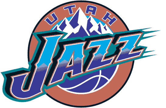
Utah Jazz: The Jazz have been in identity limbo for a while now (and some would argue they've been in identity limbo since they came to Utah). After deciding in 1996 to scrap the music note logo, the team went to a purple/teal/copper/light blue/black scheme and a logo system based on their mountainous home state. While the team played well in those duds, going to two NBA Finals, the uniforms were rather guerish (although they lasted for eight seasons). In 2004, Utah switched to a navy/light blue/purple scheme that lasted for six seasons. Critics of that scheme thought the navy and light blue were too similar to the Denver Nuggets (their biggest rival), and it always seemed the dueling blues were never fully accepted.

The team's new scheme (navy/yellow/green) is unique to the NBA, but not too unique as the Nuggets, Pacers, Grizzlies, and Thunder also use navy and yellow in some capacity. The new uniforms are, like the logo, a celebration of the past. Gone are the piping, wordmark and number outlines, and other modern uniform conventions. Present are simple block numbers and rectilinear side panels. The double outline on the side panels, while matching the trim, looks overdone next to the minimalist numbers. Like the logo set, the uniforms are nothing new, and quite frankly, pretty boring. The uniforms would have been much better with a green-centric scheme. Grade: C-

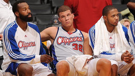
Los Angeles Clippers: Perpetually within the unfriendly confines of the little-brother complex, the Clippers updated their logo. The new logo updated the LOS ANGELES wordmark, the C and S in Clippers, and the basketball (the old version had an extra line that normally doesn't appear on a ball from that angle. The secondary logo was also tweaked, updating the serifs of the letters and adding a silver drop shadow to the LA. The uniforms were edited more substantially, however. The old uniforms used block numbers and solid blue side panels. The new uniforms, however, use an updated number font and a less "default" design for the sides that looks like a modernization of the Bulls uniforms. A Los Angeles script replaces the Clippers script on the road jerseys as well.

Overall, the updated logo doesn't go nearly far enough to differentiate the Clippers from their "big brother" the Lakers. The uniforms, however, are a complete upgrade, giving the Clippers their first semblance of an identity in years. Considering the uniform designers were painted into a corner by having to use a bad logo, their feat is all the more impressive. Grade: A- (uniforms); F (logos)

Cleveland Cavaliers:
The Cavs needed a new identity since their last re-brand coincided with the arrival of a certain someone. It's a weird symmetry, with their latest aesthetic changes coinciding with that player's departure. The new-look Cavs have darkened their red to burgundy and replaced their metallic gold with yellow. The navy takes a back seat in the latest branding effort as it is relegated to the logos only. The uniforms look like the Cavs and Celtics had a baby. The team removed the side panels and piping for a clean, simple, retro-based look. The new uniforms' only embellishment is within the 5-stripe trim and the nuances of the type, along with the phrase, "All for one. One for all." placed along the inside of the collar. The uniforms are designed to remind the Cavs of their history, while allowing them to look forward.

The uniforms, as a whole, are well-designed, clean, and combine the best parts of retro and modern. Pay attention, Utah, as this was the way to go retro but not out-of-date. Grade: A

Golden State Warriors: The Warriors have leaked their home jersey, but they have yet to unveil their full uniforms. The jerseys feature the bridge logo on the front with the player's number with the logo. The trim is problematic, as the armholes are solid blue, the side panels are yellow, and the collar is blue and yellow. A little consistency between the uniform elements would greatly improve the jersey. The side panels and armholes don't look as out of place when paired with the shorts, as on this picture of the away set. However, I will reserve judgment for for when I see the full unveiling. Grade: Incomplete

Dallas Mavericks: The Mavs also have yet to unveil their new uniform set, but it was leaked on the internet. It looks like the team essentially swapped the navy and royal on the road set. It will be interesting to see what the team does with the alternate jersey it unveiled last year.

That covers the NBA's uniform changes up to today. Stay tuned for additional updates on the Warriors and Mavericks.

Today we have another Double Play Design. Leading off are the St. Louis Cardinals, who finish a two-game series with the Brewers today. The Cardinals are one of many teams with a red/navy color scheme. That was the first thing I sought out to change, as the navy (while classic) doesn't say anything about cardinals, and over a third of MLB uses some blue/red scheme. I opted for a red/burgundy/yellow scheme because it was original and worked well for a cardinal. I didn't want to overhaul the iconic "bird on a bat" logo, but I did tweak the typography. I added a slight bevel to bring the team into the 21st century. The jerseys evoke memories of Stan Musial, a Cardinals great by using placket piping with additional piping running down the sleeves and along the belt loops. The numbers are no longer the default MLB Block. Instead, I used a thinner block font, giving the Cardinals a unique look from the back, as well as their trademark jersey fronts. The home uniforms start with a white base and are paired with red cap featuring a white STL. The away jerseys are emblazoned with St. Louis instead of Cardinals. The primary away uniforms are grey and are paired with a red cap that contains a yellow STL. The away alternates use a burgundy jersey with yellow type and are paired with a burgundy cap with a red brim. The Sunday Alternates have burgundy piping on a white base and are also paired with the burgundy caps. The STL logo appears on the left chest of the jersey.


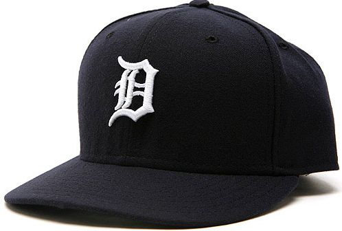
Up second, we have the Detroit Tigers. The Tigers biggest issue is that they use two different D logos: one for the cap, and another on the jerseys. I decided to eliminate the jersey D in favor of the cap D since the jersey D looks a little flat. I developed a new primary logo based on the team's logo from the 80s. The secondary logo is the cap D with a thin outline. The tertiary is a standalone tiger head, which is used on the BP jerseys. The uniforms use placket piping with no sleeve trim, as it is classic Detroit Tigers. The jerseys also uses the primary logo as a patch on the left sleeve. The home uniforms use a white base and are paired with navy caps emblazoned with a white D outlined in orange. One of my goals for the home uniforms was to add some orange in order to differentiate the Tigers from the Yankees (who, like the Tigers, have at least two version of their signature NY logo). The D on the jersey and the numbers are also outlined in orange. The alternate home uniform is similar to the primary home uniform, but uses a navy jersey. The away uniforms feature a new Detroit script that is rendered in an Old English typeface. The new script replaces the cursive Detroit the team currently wears. The away caps feature an orange D outlined in grey and match the colors of alternate away jerseys, which are complemented by orange piping. The Sunday alternates take a different approach than the other uniforms, starting with a white cap that contains orange piping over the seems. The cap is paired with a white uniform that has orange pinstripes, creating a retro look that implies tiger stripes.

Feel free to leave a comment on any of the plethora of new NBA uniforms, the Cardinals or Tigers concepts above, or anything sports branding related.

Wednesday, August 11, 2010

A Mid-Desert Classic?

By Bowen Hobbs

Earlier this week, the Arizona Diamondbacks unveiled their logo for the 2011 MLB All-Star Game. Traditionally, All-Star Game logos are unveiled during the previous year's game and are prominently displayed in the upcoming host city's ballpark for an entire year or longer. The Diamondbacks' unveiling was considerably low-profile in comparison. The logo was not unveiled at this year's ASG in Anaheim, nor is there any visual representation (last I heard) of the logo or event currently at the stadium.

Much of the lack of promotion has to do with SB 1070, the controversial Arizona Immigration Bill. Numerous businesses and some MLB players have, in response to the bill, publicly stated that they will boycott the game and the state. Protestors have even petitioned Commissioner Bud Selig to move the game away from Arizona, although there is no indication that he will oblige.

Regardless of the politics surrounding the event, the logo has been unveiled and the game (barring an unforeseen event) will take place in Arizona. Speaking of the logo, there are some issues with it that could be improved and some things the team did well. The overall shape of the logo combines the ideas of the Southwest and a baseball diamond well. In addition, the use of the Diamondbacks' proprietary typeface instantly gives any viewer with baseball knowledge an indication of the the game's location, while the mountain in the background helps those without baseball knowledge identify where the game will be held. On the other side of the coin, the logo could use help in some areas. The D'backs A logo is placed at the top of the mark and is centered. The issue is that the A logo is italicized and while the bottom of the mark is centered, the top of the mark isn't, leaving the upper right corner of the A logo dangerously close to the edge of the diamond. Color-wise, the team could have chose something other than the sky blue/periwinkle color, which clashes with the black/sedona red/cream color scheme of the D'backs. An orange or a blue closer to aqua would have balanced the color scheme better. Lastly, the black outline on the diamond is noticeably thicker than the black outline of the text and the off-white outline surrounding the mark. If the outlines were evened out the logo would have more impact.

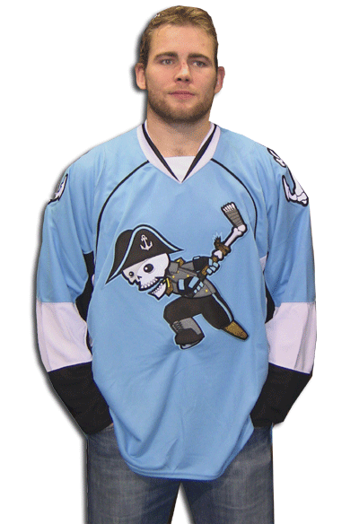
In Other News… The Milwaukee Admirals unveiled a new road jersey. It's black and features the team's skull crest. It replaces the former grey road sweaters. Overall, not bad, but I prefer the crest on the light blue alternate jerseys… The San Diego Padres are rumored to have new uniforms for next season. Here's hoping they're brown!… The Dallas Cowboys are looking into editing their uniforms. Maybe Jerry Jones did see the inconsistency on his giant JumboTron… As I had mentioned before, the New Jersey Nets are considering a name change. They even filed the official paperwork to do so within the last week. The leading rumored new name: Knights… The University of Texas Pan-American has updated its logo from this to this… Lastly, I recently did an interview with the Clinton Lumberkings (Class A; Midwest League) Director of Media Relations, Dave Lezotte. We discuss design, sports, and the 2009 Midwest League All-Star Game. To listen to the interview, click here.

Today, we have another Double Play Design. We start with the Brewers' current opponent, the aforementioned Arizona Diamondbacks. Starting with colors, I wanted to keep the red/black/gold scheme the team currently uses over their old purple/teal/copper scheme for two reasons: The purple and teal are incredibly dated, and the red/black/gold scheme ties in nicely with the color schemes of the Arizona Cardinals and Phoenix Coyotes, giving the Phoenix area (aside for the Suns) a unified color palette, a la Pittsburgh (black/gold). I decided to get rid of the A logo, as it has seen better days. In its place, I developed a new primary logo featuring a modified version of the team's db-snakehead logo within the team name. The secondary is the modified db-snakehead, while the tertiary is a hybrid of the A logo and the D-snake. The uniforms feature a unique style of trim that I like to call "diamond trim", which was somewhat inspired by these jerseys. The home jerseys start with an off-white base, featuring the D-backs wordmark and the tertiary logo on the right sleeve, and are paired with the db cap. The away uniforms use a sand colored base, similar to the current Padres away uniforms. They away jerseys are emblazoned with an Arizona wordmark and utilize the db logo as a patch on the right sleeve. They are paired with the new A logo caps. The Sunday Alternate is similar to the primary home jerseys, except it is a vest with a black undershirt and uses no sleeve patches. The Sunday Alternates also use a black hat with a red brim instead of the all-red cap found on the homes.


Up second, we have the Tampa Bay Rays. The Rays have had a slew of identities in the short existence. The current identity is one of the most generic in MLB. The Rays' current colors are navy, light blue, and yellow. Navy is the team's primary color, which doesn't help them differentiate themselves from the Yankees and Red Sox. With that in mind, I decided to scrap the existing color scheme for a dark green/orange/yellow scheme that gives off a much more tropical vibe. The logo set (aside from the tertiary) is completely new. the primary logo consists of a baseball/sun rising over the RAYS wordmark, which features a segmented gradiation that implies sun rays. The secondary is a custom interlocking TB that also features the segmented gradiation. I kept the manta ray logo as the tertiary but edited the colors to fit within the scheme. The jerseys and pants contain compound placket piping. The home uniforms start with a white base and green caps with orange brims.The RAYS wordmark appears on the front of the jersey while the manta ray is placed on the left sleeve. The home alternate is a green version of the primary home jersey. The aways use a solid green cap and pastel yellow jerseys and pants. Both away jerseys use the TB logo on the left chest in addition to the manta on the sleeve. The Sunday Alternate is an orange cap paired with an orange jersey. Like the home sets, the jerseys have RAYS across the chest and the manta on the sleeve.


Feel free to comment on the new 2011 MLB All-Star Game logo, the Admirals new road jerseys, the rumored changes for the Padres and Cowboys, the Nets possible new name, Texas Pan-Am's new logo set, or anything sports branding related.