
By Bowen Hobbs
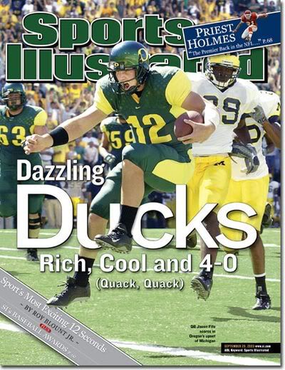
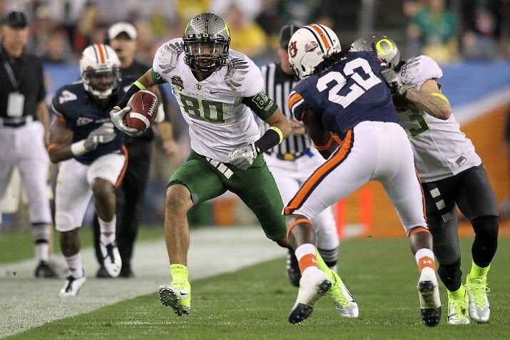
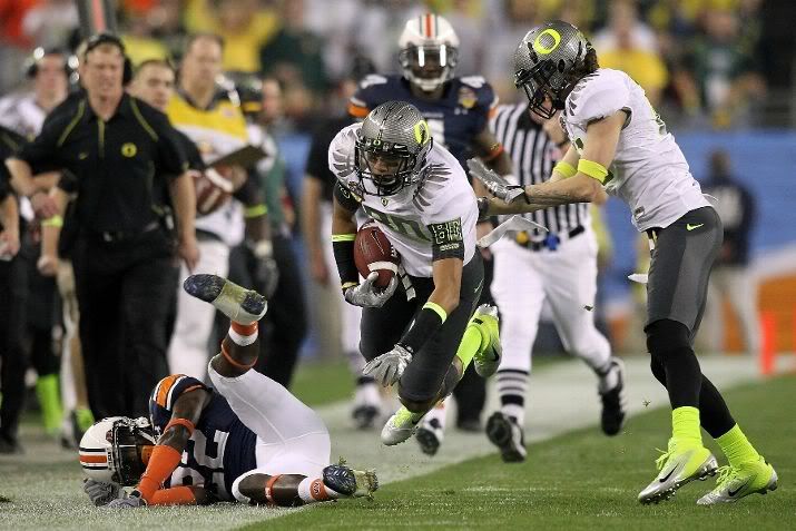
Monday night, Auburn played Oregon for the BCS National Championship. In addition being a clash of very successful football teams, it was a clash of two aesthetics: The über-modern and the classic. Oregon being the talk of the season uniform-wise, throwing away pretty much every convention of uniform design and still coming away with a great set. Auburn, however, is for the purists. Good ol' fashioned stripes on the helmet, sleeves, and pants and standard block numbers. And while a lot of people associate classic design with "better", but take a closer look at Oregon's threads. You might be surprised how well-designed they actually are.
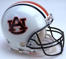
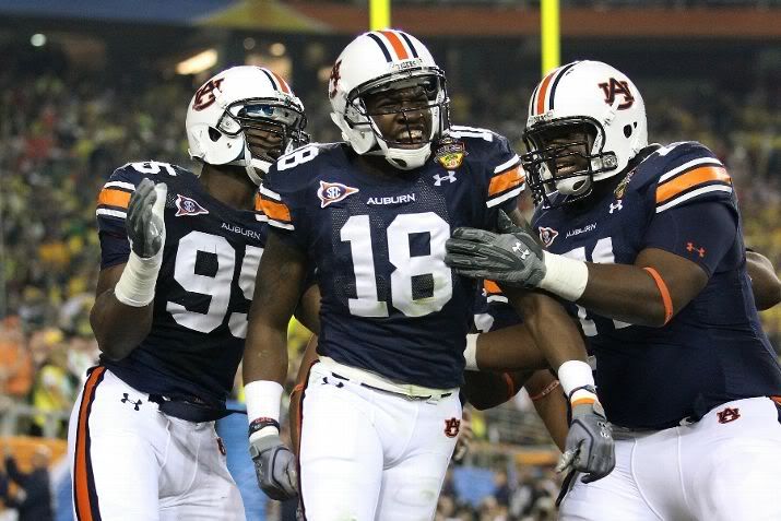
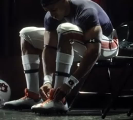
Auburn
The Tigers stay true to their navy, white, and orange color palette throughout their unis, but their striping isn't as consistent. Their helmets start with a spaced triple stripe called a Northwestern stripe (a little hard to see with the black outer stripes, but this should work). And the jerseys continue with that trend. But then the pants have a pro stripe.
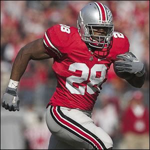
I personally think striping should be consistent throughout the uniform. Ohio State and Florida are good examples in college, and the Detroit Lions do a great job on striping consistency in the NFL. Ohio State and Florida both keep the striping consistently colored regardless of background. And yes, Florida's helmet fits, with the outer orange stripes blending into the orange helmet shell. Detroit opted to swap the blue center stripe for silver on a blue background. Even the Packers, despite their two separate striping patterns, consistently apply the styles, designating the pro stripe for the helmets and pants, which are always yellow, and their signature stripe for use on green and white backgrounds.
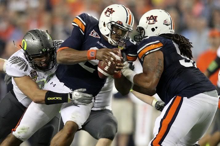
Back to Auburn: if they switch their pant stripe as has been rumored, then they will have good, consistent uniforms. Nothing flashy or spectacular, but solid.
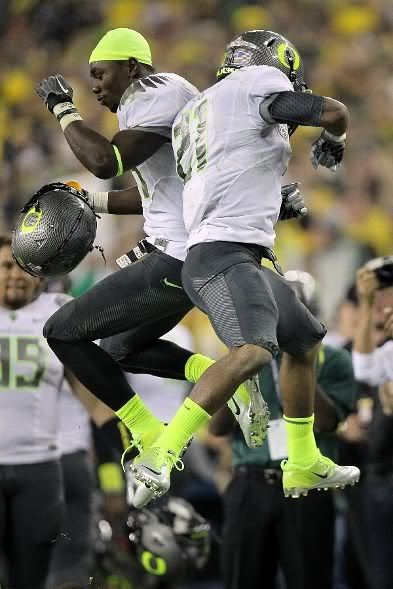
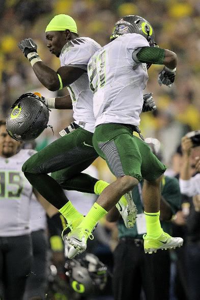
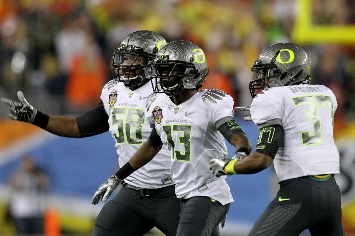
Oregon
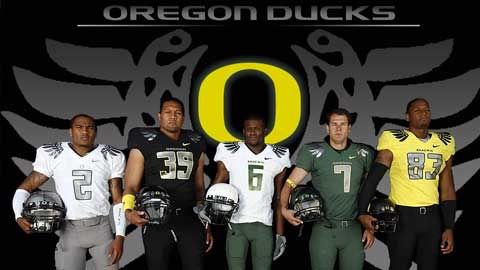
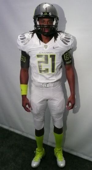
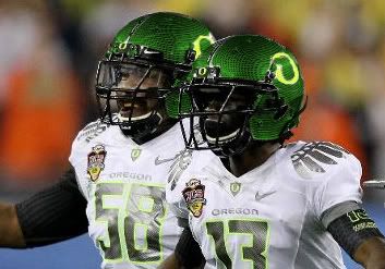
So much to talk about with the Ducks. Let's start with color palette: The Ducks colors are technically emerald green and yellow. But the palette has expanded recently, adding black, silver, and grey. Further to that end, the Ducks unveiled a "bowl game" uniform that used no green, tons of silver and highlighter yellow. Well, like TCU, the Ducks weren't wearing quite what people were expecting. They switched to flat black/charcoal pants with the pattern from the carbon helmets set into the Pro Combat stripe area.
Honestly, I know the highlighter yellow gets a lot of flack, but it doesn't bother me. It's a shade of yellow, and with the number of combinations they have worn this year, they should have a little wiggle room. And the carbon helmets looked pretty cool too. But would it have killed them to use some green? Did the compression undershirts and pants have to be black? They could have been green. The carbon inlay could have looked very nice next to green on the pants. But that's the only flaw I saw in them.The numbers looked good with the subtle texture. And the shoulder wings are a signature element that I hope never goes away. Even the numbers are growing on me. I would also like to see the carbon helmet texture integrated with green for a hybrid look. But overall, I am still a big fan of the generation of Ducks uniforms.
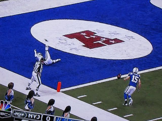
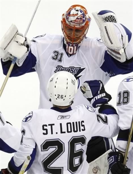
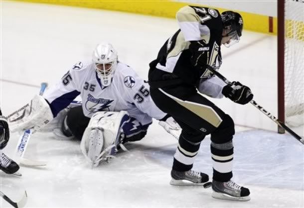
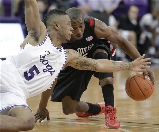
In Other News… Miami University (in Ohio) has interesting throwback helmets for the GoDaddy Bowl… The Colts' endzones finally got four stars for the AFC logo endzones, but the A is still the wrong font. Just in time for the season to end… The Tampa Bay Lightning recently acquired Dwayne Roloson. Can you guess who his old team is? Luckily, the equipment manager found him a temporary mask until he gets his custom one… TCU's men's basketball team wore some interesting throwbacks last week…
Designer's Corner
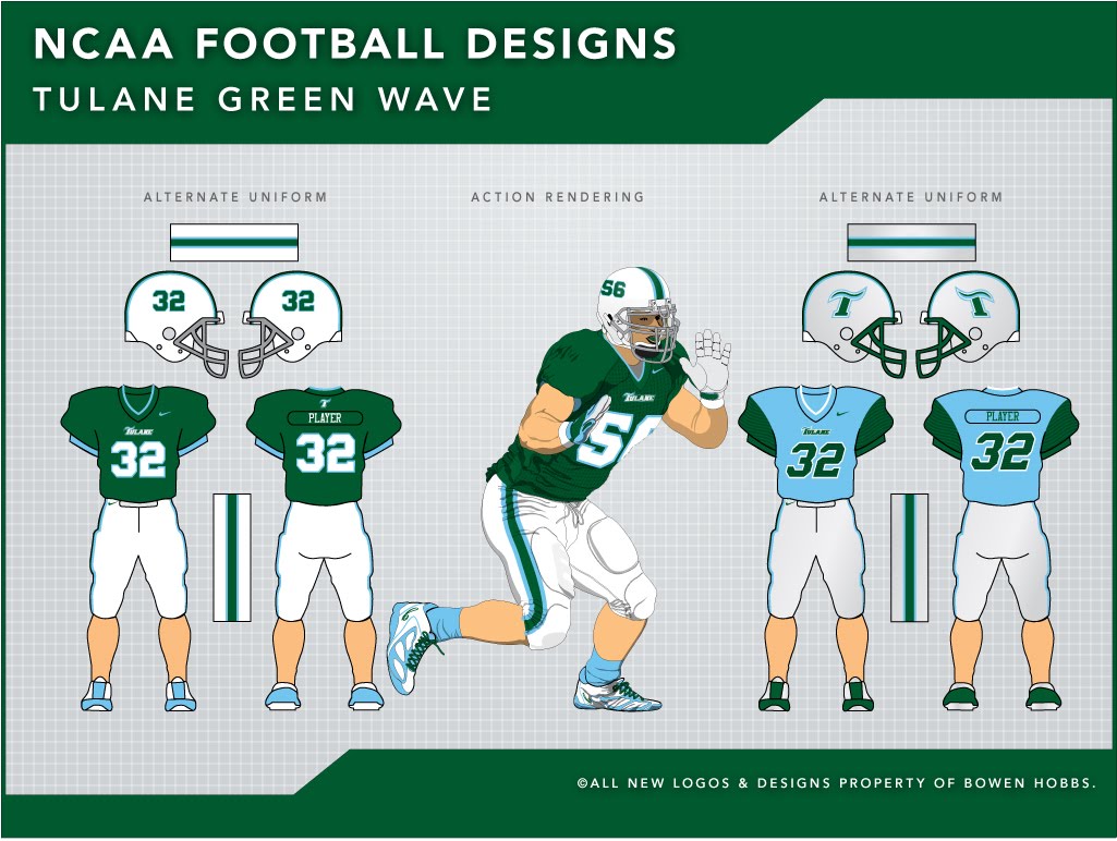
This week's design comes from the bayou. The Tulane Green Wave have one of the most unique color palettes in all of sports: forest green and sky blue. I mixed silver into the scheme. But their logo doesn't do the color scheme justice. I developed a new simplified mark and custom typography. For the uniforms, I scrapped their boring template for something more unique. I created a sublimated wave pattern for the numbers and cap sleeve. In addition, the uniforms have options for two different helmets (silver and green) and two sets of pants (silver and white) in addition to a sky blue alternate jersey. To round out the set, I developed a fauxback that mixes elements of uniform design. The numbers on the helmet and grey facemasks complement the stark jersey design and the simply striped pants.


Feel free to comment on the uniform styles of the BCS Championship, the concept above, or anything sports branding related.
No comments:
Post a Comment